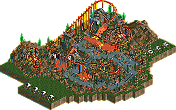
Park / Astro Zombies
-
 22-December 03
- Views 2,148,300
- Downloads 487
- Fans 0
- Comments 1,433

-
 No fans of this park
-
 Download Park
487
-
 Tags
Tags
 22-December 03

 No fans of this park
 Download Park
487
 Tags
Tags
 Similar Parks
 Members Reading
Gymkid: This entry was awsome, it really reminded me of my 2nd fav. game ever, GTA Vice city. The mansion, the city, the wanted stars, forrile(sp?) ( though i never saw his car in the game but i guess it adds to the entry) ect. Nice job Gymkid and congrats on winning.
Deanosrs: Good job! This reminded me of GTA 3. I liked how it was themed but the coaster should have been a car with some effects like Gymkid.
Coasterkidmwm: I don't know wha the game was so i i'll comment by what the name was. I liked the dump theme, it looked all trashy and such just like a dump which is good.
Penguinbob: I really liked that one cause it look so much like the original pacman(fun game.) I like it's realism and watching pac man go around the board. Nice work!
Darkfire: Nice creative entry. It really looked like a flight simulator and i liked to watch the jet fly around. Nice job!
Jacko: I never played finding nemo nor seen the movie ( i will soon though
Mightymouse: Well i am not a fan of gta 1 or 2 but it looked like the 1st and 2nd one. Nice entry though.
Hmm an extra round you say?
And I did think about zeroing clearances, raising the water, etc. for the underwater part, but then the park would be colorless! And I was aiming for a very colorful entry.
As I said before, this was supposed to be in the movie category but was unfinished... I never actually played the Nemo game.. heh
Good luck to those advancing. I haven't checked this round's entries yet, but I will later and leave some feedback. :scarface:
Oh yeah.. and I think all of that glitchiness was because I forgot to restore clearances in the end. I was about 30 minutes away from completing the park, when I was forced to get off the computer.. so I had to wrap it up in about 5 minutes. A lot of things were left unfinished.
Pen.Bob- The Pac-man theme was perfect! I couldn't belive how great that looked. It could've used a couple more gousts (of course) but otherwise it was perfect in what it was supposed to do.
Deano- The consept was great and the city itself was very well done. The coaster didn't really fit though, even with the hacking being so well perfected. I've been wondering how to do a split for a while now... I think i figured it out from watching that ride. Don't be too down about it. You desirve to be in the tour but for me this just means that you can't make me look terrible! YAY!
ride6
And I would have done it that way.. but I figured that innovative/creative ideas placed lower than beautiful or "pretty" entries after seeing how my Urban Sprawl entry placed. And that's why I decided to stray away from creativity with this entry. But it looks like THAT didn't work either! So actually... I'm quite confused.
Anyways:
Gymkid: This was amazing. I like how you used explosions to display the status of what happens throughout the car chase. There were definately some hacks in there that I never would have thought of. Your buildings could have been a little more detailed though..
P Bob: Wow! One of the most creative entries of tour - right up there with cBass. Surprisingly, there were very few hacks. I liked the ghosts and such.. but I agree there should have been some more. There really wasn't a good finale.. but there wasn't much you could do, I guess. I was expecting Pacman to win..
Good entries, looking forward to bonus round.
Or if you did see it, maybe you didn't understand it.
He just tried to make the buildings as true to the game as possible, even if some of them were just big boxes or whatever.
Good luck to everyone entering this last and final round.
I'll annouce what i was gonna do after the final round. I don't want to be giving out ideas for this
EDIT: If i think of an idea i might enter but it is unlikely.
Mightymouse - dude, you've done 5 brilliant entries, but I think the problem was they were all too small. If you'd kind of combined the effort put into 2 or 3 of them into one, you'd have come up with something excellent. This GTA one is great - especially with the ozone buildings and the great coaster pacing, and I really like the roads/flowers and touches like that. Great work.
Darkfire - I have no idea what that readme is going on about, but woah. Nice work, dude! Looking forward to seeing what you come up with for the pro tour.
Hooray for Micool too!
This contest is/was great and one of the first I have ever attempted here...I will definitely try to enter some other contests but I did not have time to enter this one again....good luck to all you guys on that last spot!
Coasterkidmwm - cool landscape idea, but there wasn't much else to this really. A couple of nice inversions, but there could have been more done with the concept.
Jacko Shanty - great colours and theming ideas, but...eh, apart from that there wasn't much. Little touches like the EAC and Jellies were well done, but the buildings had none of the character of Ghost World (I voted for you and agree with you about the vote, btw). Plus the ratings/glitches were a let down.
Deano - Great buildings and really cool idea for the stall outs through the glass. Nice split timing, too. It's a real shame you're not in the tour. You've put a lot of effort in, but each time you've come out as a place to better entries. I think you decided to 'take' your 'break' at precisely the wrong time, and entered all the hardest contests. That's strategy for you, though.
Penguin Bob (Sinister Oz?) - can you post here yet? actually, if the answer's no, then you won't be able to tell me! Oh well. Anyway, great idea and cool scenery pieces (even if they did add another 5 minutes to the loading effort...). I thought the timing was great. I know it sounds like asking for more when there was enough anyway, but it would have been cool to see more ghosts
Gymkid - woah dude. I have no complaints about the architecture because it was fascinating in every way. And the layout was. And the explosions were. This is one of my favourites of the whole qualifying stage. Well done.
Looking forward to the 'special' round
And yes, he's Sinister Oz or whatever.
Mantis:
Well than you would be surprised by the fact that haven't used any custom scenery.
Who else has entered this round or is still planning to enter?
Edited by Splash-0, 13 January 2004 - 02:43 PM.