Park / Silverstarr
-
 16-January 08
- Views 6,992
- Downloads 909
- Fans 0
- Comments 20
-

-
 73.75%(required: none)
 Design

Cocoa 85% geewhzz 80% Liampie 80% csw 75% inthemanual 75% MCI 75% FredD 70% Louis! 70% 5dave 65% posix 65% 73.75% -
 No fans of this park
-
 Full-Size Map
-
 Download Park
909
-
 Objects
232
-
 Tags
Tags
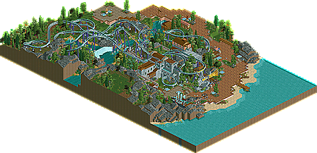
![park_2847 [PT4 R5] I Am the Elephant Seal](https://www.nedesigns.com/uploads/parks/2847/aerialt2500.png)
disneylhand Offline
-disneylhand
-JDP
I like CP6 loved the entry. Yes there was one spot (IMO) at the end where it could seem a bit slow however the rest of the design+theme+atmosphere=excellent design. when it comes to foiliage, there is no one better and this was no exception. As for the actual layout, I really enojoyed this one. It was noce to see something other than a B&M invert or a huge lift hill.
Congrats on the Design Jem!
James - rctnw
I'll go with everyone else by saying turtles is a design. Like CP6 I'm a massive fan of his work and this design does not disappoint. I only noticed there were two coasters running towards the end as one of them broke down so that was a nice suprise. Also the architecture and overall landscaping gives off such a nice tranquil atmosphere. Your foliage is as well undoubtedly flawless.
Congrats on your third design, it's some lovely stuff.
ps. The best design in a LONG time.
-----------------------------------------------------------------------
Congrats turtle the atmosphere is amazing.
I think people need to stop expecting to be blown away by everything released and just appreciate the good work presented here. And disneylhand, I would like to see you back up your comment with some actual facts. Plus I don't see anything like this coming from many people other than Turtle...
I disagree...
The layout isn't perfect and (at least from my angle having ridden Maverick), looks a good deal less aggressive than it's competition: except this one has the roll (w00t). The atmosphere created by the flowing, majestic, landscaping and the well though foliage is amazing. Little details like the fencing along the beach, etc. are what sets parkmakers apart from park builders. Seriously I found this to be quite impressive.
Ride6
In many places it looked like you were taking the easy way out. So where is the Turtle from some years ago? Please do us a favour and build something on that level again.
The foilage was really creative and the beach area pushed this one by far. The pacing of the coaster however was horrible and I don't get why you didn't make it intamin track. The idea to have a lifthill and launch was nice and great to see it in rct finally.
Nice to see you are building again,
Magnus
disneylhand Offline
Just to set things straight, I truly did enjoy looking at this design and thought it was of Design quality.
Exactly,
I really tried while looking through this design to set all names and expectations aside to try and see it for what it was. Many things throughout this such as the already mentioned pacing, the landscaping in some parts, the side-to-side top spins, the B&M track combined with the choice of trains, and the messy entrance sign seem like things that when I think back could be used as reasons against making this a Design. Just please, try to imagine this was sent in by a complete stranger that nobody has ever heard of. I would think that the things I mentioned earlier would give off the feeling of naive and immature building instead of being considered seemingly "the easy way out."
I also want to bring up the point that it seems to me that there's some kind of a double standard among the members here at New Element. Complaints are thrown out there that some Designs shouldn't have been accepted due to the fact that the scenery etc. "Played too big a role in this Design" and that, "Designs should be about the coaster." Then a Design like this one comes along and all that people can compliment are the foliage and atmosphere--It just doesn't match up. Please--pick one side and stick with it, before my respect for some of you diminishes entirely.
-disneylhand
You make some valid points but at the same time I have to wonder how many times could we possibly see something like this released by some "stranger"? And what if everyone was impressed by the quality of the new guy rather than just looking at the faults like you do (knowing that it is released by a Parkmaker)? Your argument is so unrealistic and based on assumptions that it isn't even really worth discussing.
as OLE Said, i think we are expecting too much to be wowed by everything. IMO, while this didnt blow my mind away, it was defintly Design worthy, and kept my attention, therefore deserves the title. i can appreciate the work turtle put into it, and i can see why it got the design. it wasn't the best ive ever seen, but it was something to be remembered.
FK
disneylhand Offline
I don't think so...
-disneylhand
Implying that the name and not the quality won the design. I'd like to know when you became the design overlord.
Do you have, like, a special holiday?
But seriously, Turtle, I keep looking at this. It's pretty wicked.
I'm not sure why everyone's so pissy about the pacing, I thought it was pretty good for rct.
The star sculpture was fairly amazing, there was a good bit of thought put into that. I sat and watched the coaster for a good twenty minutes, it runs very nicely.
It had a great maverick-esque layout with an amazing station, one of my favorites if I do say so.
It was a pleasure looking at this design and it held my attention for a good while. Some things in this are very very good, and it's things you have done great for a long time. I just wish you'd work on other areas I feel you need to improve on.
The Good:
*Custom sign - loved it.
*Tunnels were very well integrated.
*Coaster colors were a good choice--especially the train's.
*Foliage and atmosphere I think are the best parts about this design, which I wish it weren't because I think the coaster could have used a lot of work. I have always been envious of your foliage abilities and ability to create good atmospheres.
*Custom supporting was a plus and it was decent for the most part.
*The LSM motors on the second launch. Just wish you would have taken it a bit further for the lift hill.
*Glad to see you including things like the storage track, I just think it could have been hacked a bit cleaner.
*Heartline roll was a great touch and the placement was beautiful.
*Food stalls on the midway were well done.
The Bad:
*The layout needed a lot of work imo, but it was still pretty decent. For the most part it was all turns and helix's. Different elements should have been included. There were the same two elements out of the lift hill and launch so it felt a bit awkward.
*I wish you would spend more time taking into account realism details and wish you would have spent more time making it look like a real Intamin ride.
*The atmosphere you created was great but it takes away from it when you have entrance and exit huts not fully covered and sticking out of scenery.
*Wish the two halves of the ride dueled some.
Overall a very great design and worthy of the design label. It was nice to see someones take on an Intamin LSM coaster. Hopefully you will like mine when you see it