Park / Silhouette
-
 16-February 08
- Views 4,715
- Downloads 729
- Fans 2
- Comments 14
-

-
 63.75%(required: none)
 Design

csw 70% posix 70% Cocoa 65% FredD 65% Liampie 65% MCI 65% 5dave 60% geewhzz 60% Louis! 60% Poke 35% 63.75% -
2 fans
 Fans of this park
-
 Full-Size Map
-
 Download Park
729
-
 Objects
251
-
 Tags
Tags
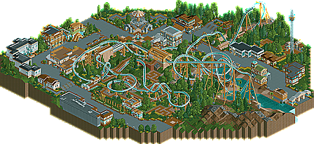
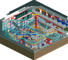
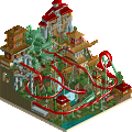

Good job, zodiac.
FullMetal Offline
Yeah, the coaster layout was good, but I've seen that layout a million and one times before. I know it's the standard B&M style, but this is Rct, you don't have to stick to real life.
As for the theming...the landscaping (or lack of) was horrible. The only actual bit of landscaping that I could see were the two mounds of dirt that went about 20ft higher than the ground. You could have made it so that the coaster lift hill went up a mountain, and made the two mounds bigger. Even that would have been enough to satisfy my landscaping needs. The architecture was good, but didn't have any real theme. Also, why did all the buildings have backs...apart from one, which just had steel? It struck me as a little weird.
Anyway, congrats on the design.
Now I'm jealous.
The 'theming' was boring and messy, the landscaping as well.
It was definitely not bad, but just not Design worthy.
Good job and congrats though.
I particularly liked the overly fast portion of the layout after the Immelmann... With the way B&M heartlines their rides that's be so smooth, fast, and aggressive... Three of the best qualities you can have in a steel coaster imo.
Ride6
The MCBR needs to be a quick breather breaking point, not feel like the final brake run. This hurt the 2nd half of your layout a great deal. 8 cars per train would be better for this size of ride also and with a MCBR on the ride and that big of a 2nd half should call for three trains instead of two.
Also you didn't really have to remove the block from the top of the lift if you just used the min/max time settings and set the ride to open.
Overall I thought it was a good design I just hope that from now on you really tweak the ride more before starting to theme it and become stuck with it. The foliage and landscaping was a bit above average from what I see from most people these days and the archy wasn't too bad, about as good as you can do with the PT1 bench.
I'm sure you'll continue to get better with each release.
man i really expected higher for silhouette. it's really charming i think
Welp, good thing we ignore top and bottom votes. This isn't even a 35% by today's harshest standards.