Park / X-Sector (X Gon' Give It To Ya)
-
 05-November 03
- Views 2,148,300
- Downloads 717
- Fans 0
- Comments 1,433
-
 No fans of this park
-
 Download Park
717
-
 Objects
164
-
 Tags
Tags
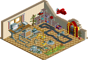
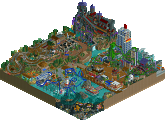
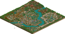
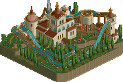

I really didn't care as much for the Imperial Riyadh. The building seems random and cluttered to me. Beautiful surroundings, though. And rocks.
Great job all around!
2.john
3.rwadams
that would be my placement
but well done to john going through and the rest for entering (especially outlaw, i loved the mini waterpark and the play area)
Dean won it for me, followed by Micool and rwadams.
Holy shit...
The first week...
Already there are 6 outstanding entries...
This is going better then I had hoped ALREADY...
Raven-SDI
§
Best Steel Twister.
However, I found rwadams' hotel the best. Large, nice, detailed and I loved the swimming pools.
My second favorite was dean's hotel/resort, very detailed and its got a great 'feel' in it.
And third John's, maybe as others said a bit too messy. But the detail is awesome.
I'm gonna do my best at my entry...
And I'm very curious what great work this contest is gonna bring!!
Defenitely the best contest ever!!
SF
They were all excellent entrys...
Anyway, John's was impressive but it seems like to many parkmakers these days are getting recognition and gaining respect for picking up on things or trends that are already in full gear. The first one that I can remember was Prince Ashitaka. That was fine because he had been around a whole long time before becoming a parkmaker but nowadays it's like everyone just picks up the trends. I know sometimes it's hard to learn and master the RCT techniques (I'm still trying) but what I look for in parks is the ideas that went into the parks. That's one thing Ashitaka in particular, as well as OZONE and gymkid, to name a couple, have really picked up on. They started as the trendy type but as they and others started to lose interest in their trendy styles they began to implement new and innovative ideas. (Both their hi roller's entries were very creative and I enjoyed each more than anything else either has made.)
That's why, with respect to John, I wouldn't have had him even close to winning. John: you have the form and techniques of RCT(2) down quickly, and I commend you for that. However I don't think I've seen the kind of thing from you that I need to see before you're one of the guys to be expected to place 1st or 2nd in a contest no matter what. It seemed like before the contest most people, mostly newer members, had John at the top. He even said himself the hotel was his best work ever by far, but I don't see that. It basically looks just like the two hotels from his Disney park. Not that they're bad by any means, but especially with the much over used middle eastern temple scenery and the walls surrounding them (and the quarter things sticking out, the ladders, the colors, the bushes on balconies, etc.) the entry just holds no excitement for me because it's just another big building with the quickly "cliched" scenery, if I may. I hate the word myself, but its meaning is just so perfect.
Nevertheless, John is definately one of the top non-parkmakers around and deserves to be in the final.
Good job to everyone though! All the entries were amazing. I have yet to develop those kind of skills in RCT2 because I haven't tried, but that makes the parks even better because some of the stuff in these parks I have no idea how you did! Brilliant. I love hotels. :scarface:
I don't know what to enter next! Not the rapids, it's too crowded, but I can't wait for next week!
I'll post my thoughts in reverse order of their placings, cos that's how I looked at them.
The Everglade Majest
Micool - you're on fire! The hacks on this hotel were brilliant - the stacked fences/bushes/paths, the bird, the shrubbing...THE ENCLOSED ROTO-DROP! Plus, this is one of the few times the green wall texture has been made to look passable, which is a massive compliment from me! Lovely
Hacienda Resort Mexico
I thought Micool's was damn good, so I was pleasantly surprised by deanosrs's hotel! The buildings are complicated, with several overhangs and balconies, and I think the use of stairs/climbing plants is beautiful. The tennis courts, swimming pools and side-buildings all added up, on top of the cliffs, make for a striking resort. Great job - this is indeed much better than Dolphin Parc
Ritz-Carlton South Beach
Having seen deanosrs, I thought rwadams must have pulled something magical out of the bag...I should have known you would, seeing as your art deco park looks so wonderful. DAMN! This hotel scared me, because even though I tried to delete scenery from the outside inwards, it was impossible to get anywhere, it was so layered! The waterfalls, between layers, next to windows, behind glass, separated by vertical columns...really frightening. The swimming pools were beautiful, the foliage was lovely, the tennis courts were nice and the beach was pretty. I think you're the real rct2 architect on these forums
Imperial Riyadh Resort
O...K... I said rwadams scared me... Well,
It's impossible to compare this to rwadams' park, so I think it must have been very difficult to judge...personally I would have given rwadams the win, but not for the most obvious reasons.
If this quality is kept up throughout the competition, I think it's going to be even bigger than Hi Rollers.
NE is the place to be at the moment!
Here's how I'd rank them if I were voting, MiCool's not included until I actually view it of course:
1)Roger's RCSB - Let me put it this way: I work for Marriott (owners of RC), and this is a hotel I could see realistically being used. It's crisp, the rooms are all nicely spaced, the pools are astounding, and these are but a few details! The fans, flamingos, and even the lone fisherman just add to the effect! I fear that the lush green lawns out front were mistaken as blank space...
2)Dean's Hacienda and 'NW's Pacific Grande - Both unique in their own way, these are excellent hotels. Both have the beige/brown thing going on, with NW's arches competing with Dean's canopied balconies. The waterfronts were great (I love the boats and lighthouse NW!), though the terrain change in Dean's might set it apart. Parts of the Hacienda had the feel of primary hotel, with nearby condos...very cool...
4)John's Imperial - Nice color accents, but I don't see what the rage is all about. To me, for a hotel especially, it's quite unorganized (blobish if you will), and the multi-layering is a bit much. I do like the usage of the abobe/round window pieces (I don't know how to describe them), but that's about it. Also, the slide in back - poor, especially compared to the other accessories in the other entries. All in all, this one was a bit too much LL style for me (a la Euroscape)...oh well.
5)Outlaw's Port Royal - Well...this one I didn't really care for. I love color, but the red and white was a bit overbearing, and the design not quite as crisp as the others. If this was done about a year ago (or 9 mos maybe), I can see this being viewed differently. Still, a nice effort, and I've seen a lot worse. You did enter, so props to that.
OK, so I was more specific that planned...heh...
Kai
Kevin Offline
I loved all of these entries.
Imperial Riyadh Resort
At first, I thought this hotel was amazing. The colors were nice and I loved the landscaping. Unfortunately, the more I looked at it, the more I disliked. I soon started to realize that it was way to cluttured for my tastes and it hurt my eues just looking at it. The slide was o.k but it wasn't anything special. Overall it was o.k but I wouldn't pick it as the winner.
Hacienda Resort Mexico
Great job Deano! The overall look of this resort was beautiful. I love the architecture and the layout of everything. The colors made it a bit dull though. I understand why it was mostly brown. But maybe it could of used more trees and colorful flowers. That is just my opinion though.
Ritz-Carlton South Beach
w......o........w....... This was definately the best of all the entries in my opinion. To me, it showed what a hotel really looked like. I completely agree with what Kai said. This was beautiful. The colors and the use of shrubs and trees was one things that made this entry outstanding. The building itself was completely breathtaking. The size and look of it was so..... wow. The pool off to the side was pretty cool to. The fountains were a nice touch also.
Here is my list.
1. Ritz-Carlton South Beach
2. Hacienda Resort Mexico
3. Imperial Riyadh Resort
But that is just my opinion. All the entries were incredible either way. I look foward to the coming weeks and hope to see more things that are just as good as this. I also look foward to see where my entry will place in the upcoming rounds. Congratulations to everyone who was involved with the hotels.
Good luck to those doing the rapids competition.
Kraken
I still have to look at Micool's and Outlaws.
Anyway, the others that I didn't do earlier:
Pacific Island Resort
Hmm...I don't know what to say...I think this was my least favourite of the entries. Firstly, it's far too geometrical for my tastes, and although I appreciate the effort put into the scale of the hotel, I think it's just too large. It suffers because of that - I found the other entries much more interesting and absorbing - this one looked 'nice', but there didn't really seem to be much to explore...
Port Royal Bay
Ooh, I love the colours of the main hotel bits, and the funky patterns on the roof! I think this a really cool piece of rct2. Perhaps not as complex as some of the others, but very effective (reminded me of Mondrian). I liked the little additions too, but it's a shame Dinghy Ride 1 wasn't named
Congratulations everyone who entered - it'd be cool to see some of those unfinished entries too *hint hint*
Thanks to everyone for the wonderful comments on my entry. I seem to have found a style that agrees with me and hope to stick with it for awhile
To Micool I'm not so sure.
I had 30 hours in just the structure.
Thanks again
Rog
Deanosrs
Rwadams
John
While John is certainly getting better and better, he doesn't seem to have a plan or purpose to his building yet. You need to keep your style but get a little more organized and purposeful....like the comments before me…less messy and random. I just didn't get any good feel for what you were trying to accomplish atmosphere wise…..like I did deanosrs or rwadams parks. It was still a great hotel and very well done.
Rwadams has the South Beach atmosphere and detail down to a T. Elegant, simply elegant. The little details were great here...the use of the ceiling fans on the tops of those tall buildings to the Toon stairs leading into the pools....all I kept saying was wow...and I cannot wait to see your South Beach park.
Deanosrs - great use of color, trees, shrubs, flowers, water...the buildings were realistic but yet so detailed...the map was planned out and you had a great atmosphere...you knew what you wanted to create and you did it with great style....amazing stuff...I am quite impressed. And also Happy Birthday!
Outlaw and Micool both had some great ideas in their parks, Outlaw’s hotel just too blocky and like Coaster Ed said…Micool just had the misfortune to go up against some great RCT2 buildings, but a great entry for RCT1 and innovative as hell….RCTNW was realistic as ever, not as much detail in the buildings but nonetheless showed his style and atmosphere as usual.
I cannot wait to see the rest of these contests...and I hope the strong competition continues.
Still, Im hoping RWAdams enters another contest because his entry was unbelievably good.
I think RWAdams was a better apple than John was an orange, slightly, but still what can you do.
Heh, and I always thought that RwAdams sucked.
?
Hacienda Resort Mexico by deanosrs - Very nice, I loved the amount of detail you put into it. The only negative that I can see outright is the size. Maybe I am just crazy and huge buildings are my thing, but if you would have magnified this, it would probably have won. Other than the size, all it needed were a few splashes of color. I loved this entry alot. Can't wait to see more from you, deano, you've really shown your talents here.
Ritz-Carlton South Beach by RWAdams - I thought it was nicely done, but I am failing to see what's so "wow" about this because the colors were very dull and boring, and the structure in itself wasn't all too imaginative. IMO it is easier to base your buildings, like hotels, off of real structures because its been done before, so it can't NOT work. The realism was fantasic though... nicely done, but I'd like to see you do something more fantasy-orientated. Realism isn't the only outlet in RCT2.
Pacific Island Grand Hotel by RCTNW - To be truthful, I didn't like it. The lack of actual windows, monotone colors, and the very repetitive style weren't my thing at all. I like variety.
Secondly, I am pleasantly surprised by the outcome. I honestly didn't think I was going to win (even started a wooden coaster, I wasn't confident at all, the whole thing in the thread was all a facade
Now, I'd like to take some time to defend my entry. lol When I first heard of the Pro Tour, the Imperial Riyadh Resort was going to include a little shopping village (as seen by the amount of water there), and a larger array of waterslides. I then set out a floorplan for the gigantic hotel... building time came and went and it was finished within three days. So, I had seven days to complete the village and landscaping, etc. As the deadline approached I figured I should instead focus on the hotel itself, beings that's what would be judged, instead of a village. That idea was scrapped and my entry was the result. Had I had more time, this would have been better and less rushed.
Onto comments:
RCTNW - The hotel itself took around 3-3.5 days to complete. The porticullis doors substituted for windows (the round ones) is quite simple. The round windows look hideous. I HATE them. They are a nice alternative and look great IMO.
thorpedo2589, sloB, Outlaw, gymkid, freak, Scarface and Glitchwolf - Thanks alot!
OZONE, ToonTowner, Marshy and Kai - IMO deano's hotel size was his major fault. Otherwise I absolutely loved it. Sorry that it was "blobbish" lol, I actually thought all the symmetry was bad, and had to counter-act it somehow.
Coaster Ed - I too, looking back, think the hotel structure is simple. But, look at deano's, RCTNW's, and rwadam's, that's just how hotels really are. The landscaping was rushed as it was last completed, and the main focus was on the hotel.
cBass and Six Frags - I'm quite puzzled as to the "random" comment as everything is very, very symmetrical. I can understand "messy", but randomness and symmetricality don't really "go" IMO.
Micool - It's very difficult to had an assload of variation in a hotel as big as the IRR was, my size was probably a fault in itself. I'll be careful from now on about overusing certain things. But, I don't understand how the balconies can be cliched when it's just a part of most hotels. I was trying to shy away from those, which you can see from the middle portion of the hotel.
mantis - I'm glad that you liked the hotel so much! And I would be inclined to agree, rwadam's and mine are TOTALLY different. Uncomparable time ten. They are so different in every aspect.
Kraken, rwadams and Austin Powers - Again, I can understand (partially) unorganized, but for a hotel it is very uniform and symmetrical. The layered detail may seem unorganized, but that too is highly symmetrical.
Wow, that took forever! Again, congrats to everyone. And let this be another attribute to how diverse NE's styles and likes are.
Mine was a definite hit-or-miss.
Also, sorry if I missed commenting on a certain part of your post, I lumped together those that said the same thing.
Good luck for future contests!
One thing I did get out of this was I now know how to take a park back into the SG to add scenery. After all these months, I never knew you could do this and by the time I found out, it was too late and the park had already been submitted. Learn something new everyday.
Coaster Ed - Thanks, the arches again are a key element to the entrance plaza and I see how they seem out of place without it.
Mantis - Interesting. One thing I try to do is keep things to scale. I know this sounds strange from me but hear me out on this. I've seen some RCT2 hotels where the room sizes are 2x2 or smaller and that's including the balconies and I see comments like outstanding and great detail. I think that a hotel room of that size is too small compared to the peeps. The rooms on my version are all suites at 2x3 (not counting balconies) and I also account for hallways. When you do this, the structure is going to grow so if I'm guilty of this, then I'm guilty as charged. I do think I could have made a few smaller suites and make them just rooms but again, I had no time to take this on.
John - Actually there are more windows on this than you think. Just inside each balcony is a full glass wall (with a sliding glass door) for each room. You get a glimps of each but the arch hides it a bit. Again the colors tie into the entrance plaza.
Again, thanks everyone for the comments and even though I didn't win, I'm still very proud of my entry.
rctnw