Park / Karizima
-
 11-July 08
- Views 4,652
- Downloads 719
- Fans 1
- Comments 15
-

-
 68.13%(required: none)
 Design

][ntamin22 80% Cocoa 70% Liampie 70% Louis! 70% MCI 70% posix 70% 5dave 65% FredD 65% geewhzz 65% Sulakke 60% 68.13% -
1 fan
 Fans of this park
-
 Full-Size Map
-
 Download Park
719
-
 Objects
256
-
 Tags
Tags
disneylhand Offline
-disneylhand
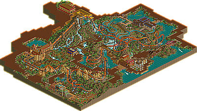
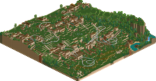
Anyway, I love this design. IMO, this layout is amazing and way better than el encierro. Your landscaping is amazing, I would not have been able to pull off the landscape interaction, especially the amazing double helix. Maybe some trees would help though.
Edited by RaPiPo, 12 July 2008 - 01:37 AM.
I did like the lay-out of the coaster though and every building was really nice. So there were things to look at for me, but the landscaping wasted the whole image for me.
And a "wow" goes to the staff for the new page, it is wonderful.
Keep building on this level!(sorry for my bad english, i'm from holland)
one thing i did catch though is would a line seriously be that long for front car?
otherwise it all looks great.
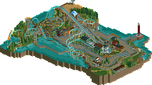
EDIT: ok, this is beautiful. this design is one of the few designs i've seen that was able to hold my attention for a while. first, the layout was gorgeous. it was smooth and flowed very well. it's interaction was also impressive. the log flume, while compact, was very detailed, and held my attention for a while. the details on the lift covers were very beautiful, as well as the supporting. the architecture was beautiful, while sparse in some areas. the detailing on the buildings by the edge of the map gave them a very exotic feel, which just added to the atmosphere. the queue lines for the coaster were very different from what you usually see, and gave it a rugged jungle feeling. the landscaping must have taken forever, but it was worth it, because it's very well done. the only thing i didn't like was the foliage, which was too sparse for me. remember, full-tile trees are your friends! however, something like that couldn't ruin this, it's just too amazing. great work FK, keep working.
Edited by zodiac, 12 July 2008 - 11:35 AM.
I like it very much...
I liked the idea of the layout but at the end the layout seemed to be done without too much effort. I didn't like the unbanked curves for example and the drop before the Cobra Roll looks ugly. The rest of the layout is fine.
I really disliked the foliage as there is no tree in the whole design. You should vary it a bit more and you shouldn't try to put foliage and landscaping on every square as there are other possibilities to fill them.
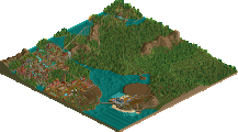
The architecture was good. It was neither perfect nor bad or average but there should have been more buildings.
So overall I really think you could have used more of the ruins or just some more buildings and paths and trees and something to break the setup up because nearly everything that's under the coaster is dirt with grass and bushes on it. Though i have to give you a lot and I really do mean a LOT of respect for the landscaping as that costs amazingly much time. When you spend that much time for the landscaping next time too then please think of variing it a bit and use rock and grass textures too as this looks a bit onehanded.
Congrats though on winning design and probably I shouldn't have said all those things which could be reflected on my next coaster too.
Fisch
On the canvas above the bridge near the cobra roll is there any real need for the canvas? I removed the scenery and I personally think it looked much simpler and a LOT better. I also believe you forgot to place any lamps... Also the foliage as said before should contain full tile and large quarter tile trees as it really spoilt the park with the foliage as it is. One last thing that I reallly didn't like was the dead end path that you used. Yes that is used sometimes but it seemed quite large so large that I think if I was there I'd walk up it then be surprised I couldn't walk anywhere.
Anyways overall it was alright, you had supports used far too often. The layout was alright nothing great. Congrats on design, but please tone down the 'details' as they are being used just for the sake of it rather than benefitting or enhancing in anyway. They seemed to be the basis of the park. To me those kind of things are things that are added on top to enhance existing features rather than to be built from. More often than not.
Good job though and congrats on Design. Next time try some full tile foliage though.