Park / Mordred
-
 14-July 08
- Views 5,046
- Downloads 624
- Fans 1
- Comments 15
-

-
 67.78%(required: none)
 Design

][ntamin22 80% 5dave 70% Cocoa 70% FredD 70% geewhzz 70% MCI 70% Arjan v l 65% Liampie 65% Louis! 65% Sulakke 65% posix 60% 67.78% -
1 fan
 Fans of this park
-
 Full-Size Map
-
 Download Park
624
-
 Objects
156
-
 Tags
Tags
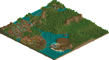
![park_2434 [H2H6] R5 - The Replacements - New Fantasyland](https://www.nedesigns.com/uploads/parks/2434/aerialt2181.png)

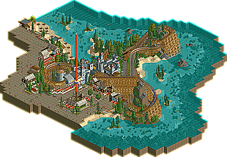
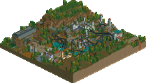
The New Element Staff is proud to bring everyone a new design by Fisch. Today we present a fantastic compact wooden coaster. This is Fisch's second NE design, both feature no custom scenery.(click logo to go to page)
Congratulations Fisch!
i thought this was very nice.
and double points for using no custom!!
No cso again, Fisch? Ahaha.
Im looking forward to that custom-free park of yours!
Edited by nin, 15 July 2008 - 10:12 AM.
hpg Offline
But that doesn't say anything about the quality! I love this design, I think it's the best non-customs 'park' I've ever seen!
fisch, i am astonished what new age german parkmakers are able to do. (thinking of freak, also). i remember back in the early days of ne, all germans sucked ass. now you guys are rather good. my respect.
superb stuff, your work is pretty much the only non cso work i like.
congrats on design
I'm really proud of it atm because it seems you'd really like it and that suprises me a bit.
I didn't expect you to like it that much. I thought there would be a lot more criticism and now I'm looking at this thread and can't really find any post with criticism.
Sulakke: Thank you but maybe you should see my solo and my new project first as both are easily better than this one is.
Nokia: Thanks!
nin: Thank you, too! Hmm...this was actually the only project without CSO I thought I could finish before my exchange to the USA. But I started a park without CSO and without any money cheats while back. Maybe I can finish that one!
zodiac: Thanks!
hpg: didn't know a comment could bring me this kind of proudness.
Liampie: Thank you very much! I haven't seen too many other non custom scenery parks yet but I think there are a lot out there which are as good as this or even better!
posix: Thanks, I don't know if it fits the style you're expecting a park to be but if you like this one wait till you see my solo!!
Louis!: I'll come back again! You better promise me still being active in a year!
So really many thanks to everyone who enjoyed looking at this!
I'm looking forward to seeing some detailed reviews!
Fisch
Edited by Fisch, 16 July 2008 - 06:20 AM.
How long have you worked on this?
However, the time has been profitable.
I`m proud of you!
What's really good about it is - I know it sounds sort of obvious - the ride itself. There's a lot of designs out there which are all about the ride area; its architecture, theming, immense detail etc - and often the ride itself isn't actually that great.
Not that the architecture and theming isn't good on this. It's impressive and pleasantly realistic; it really suits the area and conveys a theme, but never overshadows the coaster itself. And it's particularly good considering there's no custom scenery.
The ride just rules though. Its layout is wicked, and has just about everything you could ask for in a wooden coaster. I mean, there's a bit of out-and-back to the design, a bit of twister... some overbanks, some sharp turns, lots of airtime hills, an AWESOME looking first drop. Its setting is great, managing to have its own area on the waterfront, but also having enough interaction with nearby paving/queue-lines. Pacing is spot on. All of this without feeling like a recycled layout too. It just looks like such a blast to ride, love it.
Sey: Thank you and I'm proud of myself, too, because you all seem to like it and that just makes me glad.
eyeamthu1: Wow, i haven't seen you around here for a while. Thanks for you comment! I don't really remember the day anymore when I built the layout but if I remember right I tried to do the layout first and then concentrate on a theme it could get. I think that might be the way for me how I'll start and work on my next designs also. Again thank you for your comment.
Xophe: Thanks!
I really feel happy that you all like this one so much...
...and I'm looking forward to further reviews and such stuff!
Fisch
Edited by Fisch, 17 July 2008 - 11:19 AM.
My only complaints were that maybe some more thought could have been put into the que and some of the outer buildings and if you have peeps some stalls might have been nice but I really enjoyed looking at this. Great job.
Really good points you have there. I totally agree with you but as this was for a contest at first I had to take this VERY limited bench which had no stalls or flatrides. That's why I had to build an observation tower. At first I wanted it to be something else. The queue is indeed one of the worst things but I just didn't find a way to let it look better and it was very short also. At the end the outer buildings were kinda rushed. They don't look detailed anymore in my opinion. I could have done that better but I just wanted to finish this one.
Again, thanks for the comment!