Park / Charybdis
-
 19-July 08
- Views 4,851
- Downloads 708
- Fans 0
- Comments 11
-

-
 73.50%(required: none)
 Design

5dave 80% FredD 80% ][ntamin22 80% geewhzz 75% Liampie 75% MCI 75% Arjan v l 70% Cocoa 70% csw 70% posix 70% Sulakke 70% Louis! 65% 73.50% -
 No fans of this park
-
 Full-Size Map
-
 Download Park
708
-
 Objects
238
-
 Tags
Tags


![park_6130 [NEDC6] The Metal Moss](https://www.nedesigns.com/uploads/parks/6130/aerialt6376.png)
![park_6118 [NEDC6] Valley of Huanglong](https://www.nedesigns.com/uploads/parks/6118/aerialt6364.png)


![park_6135 [NEDC6] Unfriendly Invader](https://www.nedesigns.com/uploads/parks/6135/aerialt6375.png)

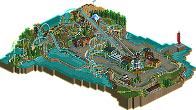
The New Element Staff is proud to bring everyone a new design by Fr3ak. Today we present a sleek B&M floorless coaster. This is Fr3ak's first NE design and second NE accolade. Quite an achievement, congratulations Fr3ak!(click logo to go to page)
The second thanks goes to the NE staff, who made this great page and
thanks to 5Dave and X250 for the comments on this, too!
In addition to that I want to post the downloadlink for the version with peeps
here:
Download here [edit: file added to ne download archive]
Would be great if someone of the staff would be able to put this archive up
instead of the actuel one.
Thank you all again! And I'm waiting for your comments
Good work, Fr3ak
Like always
Other than that, good work. Congratulations, Fr3ak.
-ACE
inVersed Offline
great job!!
i must say, i wasnt amazed by the desing itself. it had alot of very nice elements and was smooth, but i felt it was short, while it was boasted as long. the best park was the big loops, but after that it seemed alittle boring and kinda like it was floating over the paths IMO. the surroundings were great. the buildings worked very well, the mountain was very nicely executed and you managed to combine grassy lawns, and rock faces together excellantly. the details in the power lines, elevator, and buildings were great. i wasnt a fan of the lighthouse ride, because it seemed so bare and just stuck out there. if it was just a lighthouse, i think more scenery would have been better, if it was a ride, some sort of line and operation building would have been good. the water ride was interesting fun to look at, but i felt it was abit boring and awkward looking. the atmosphere was great, but it wasnt something amazing. so overall, i liked this alot, it had some flaws but nothing making it unworthy of design. congrats again!
FK
gee, great work. nice page, the best write-up so far (imho), and the list combo again makes for a sweet update.
And I hope that you've enjoyed the coaster as much as I did and still do.
About the Splash and the speed of the boats:
I first started of without peeps but I then I've realized what they're adding
to the athmosphere so I went with having them in there.
That's the reason for the to fast speed of the boats, cause without peeps the
speed would've been perfect.
For the trams and their high changes I have to say, that I started building the tram layout up there in the mountain and I really loved how they
looked like travling underneath the lifthill and trough the turn of the
coaster. So I have had to bring them back down to ground level again and
I think the huge bridge was the best sollution.
Last but not least, Posix, yep it's supposed to be a cornfield =)
Thank you all again and thanks again for the great page layout, write-up
and the comments!