Park / Fire Mountain
-
 15-July 05
- Views 21,585
- Downloads 694
- Fans 0
- Comments 40
-

-
 No fans of this park
-
 Download Park
694
-
 Objects
234
-
 Tags
Tags

Corkscrewed Offline
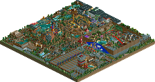
Another Mountain claims the prize this week in Pro Tour 2 preliminaries... hmm, maybe Magnus should make a "German Mountain" or something.
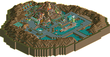
This time, the congrats go to Xcoaster, for his personal interpretation of one of Disney's legendary never-built ideas. Fire Mountain is set in a sort of DisneySEA Mysterious Island environment, and the coaster itself sends riders into the heart of the mountain and even erupting out the top! The theming here is definitely very nice, though there are a few inconsistent parts at different views. Still, the entry was enough to get Xcoaster, another one of NE's rising stars, the win. I'm sure he's shocked at the win, but he did a great job, and we look forward to seeing what he has in store for the actual Pro Tour!
1. Download FIRE MOUNTAIN [RCT 2]
Now, in judging the other three entries, Iris and I were at a bit of a standoff, both of us having strong opinions over which entry should be second and which should be third. I'm sure posix will support Iris's rankings... sorta... but here are both orders for you guys to discuss.
IRIS:
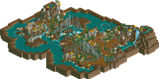
2. Poseidon by yyo [RCT LL]
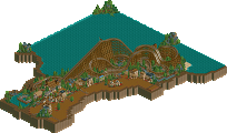
3. Xenon by TracidEdge [RCT LL]
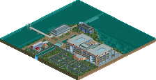
4. Test Flight by yeshli2nuts [RCT 2]
CORKSCREWED
2. Xenon by TracidEdge [RCT LL]
3. Poseidon by yyo [RCT LL]
4. Test Flight by yeshli2nuts [RCT 2]
So congratulations to Xcoaster for making it. It wasn't a horrible round either. Even yeshli's was creative, tho he didn't really make a B&M coaster as much as he made an adventure ride.
A REMINDER: Entries for the next PT2 Prelim Round (Build the Best Bridge) are still due to IRIS' mailbox by Monday, July 18.
Send all entries to iris2486@bellsouth.net
OMG. I'm crying, and just so perplexed by this decision. Fire Mountain wasn't that great. There was barely anything there at all. Tracid's entry was top notch, kickass, LL goodness. And, I must say the same about yyo's. Two beautiful entries, that imo, blew Fire Mountain out of the water.
Fire Mountain was a mountain, with orange waterfalls, and a few things here and there. It definitely didn't have any sort of spectacular quantity or quality, that it takes to win a win prelim.
Yyo's entry had beautiful landscaping, and foilage that captured such ingenious elegance. The architecture is so inspiring, and freshly traditional. Tracid's entry screamed quality and quantity at the same time. Everything was so well placed and creatively done; the colors, the architecture, the track-i-techture, THE FOILAGE--and to top it off, a fun ride. He so well balances the futuristic style of the theme, and the natural landscaping and foilage you would expect to see in a perfected jungle theme. I think it could've gone to either of them.
I still respect your guys' decision, and if there is something I'm missing from Fire Mountain, I'm all ears.
I'll look at the entries later, congrats Xcoaster for the win.
I agree with Xcoaster winning, but tracid's entry was pretty strong to.
The land blocks with the rides name in Fire Mt. was exacuted perfectly, awsome touch. Neat details all over the place, a very refrashing design, not the "norm" imo, but thats why I liked it.
Tracids entry was really cool, I liked the Q covers and little details and funny ride names, even the music was great, got me into the mood, or dizzy, not sure... I think your only big mistake was calling it Xenon, that's taken, and more then once.
yyo had the best B&M coaster, but that was all, the rest was just the same stuff we have all seen loads of times and that's just not gona cut it anymore.
yeshli, ok nice airport, but that just has nothing to do with anything, oh well at leased it was pretty neat, fun to look at for sure.
i'll go with...
1. Xcoaster
2. tracidEdge
3. yyo
4. yeshli
Fire Mountain: Ew. Too... i dunno, it was just weak. Didnt like the coaster design or the concept, really.
Test Flight: Good idea, wrong results. I would've kinda liked to have seen another version with the track visible, as showing it wouldve been nice but ruining the idea.
Poseidon: looks EXACTLY like my Elegancia design, no further comments.
Xenon: Easily should've won this round IMO. Great looking design, too bad it didnt win.
1. Tracid
2. Xcoaster
3. yyo
4. yeshli
If your referring any of the dozens of coasters you've released here, you can be sure I haven't dowloaded any. And I'm sure this design was started long before that.
Originally this was to be an entry into the first rcpro contest in a long while, where the goal was to build a B&M theamed to a mythical ocean creature or something, based off of kraken. I started the design, then attempted the theaming. I really liked the coaster, and I didn't have to adjust it too much, but when it came to theaming, I was stuck for ideas. So I built some run-of-the-mill, generic looking "greek" architecture, and any enthusiasm I originaly had was gone. Not to mention, the original foliage, which was about 50% complete, was godawful, and even though it doesn't look much better now, I persisted in restarting it.
By this time the competition was already over and the winner announced (morag is a pretty kickass coaster), so somewhere along the way I decided to finish this up for the BM round. So, slowly, I finished the remaining architecture and foliaging with as little energy as possible. Fuck man, I didn't even get to
naming most of the stalls, over a +3 month period. That's pretty damn sad. However, the one thing I do like, is the coaster. Probably my best Beemer so far.
So there, this doesn't excuse my sub-par entry, but it does explain it.
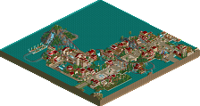
Ok, let's look at the entries. First of all...Tracid's was a complete map, fully themed with great-looking small architecture, good treeing, and a nice sprawling layout. The coaster design was pretty quality and the theming was his best yet. Hell, he even bothered to all but finish the map for you. Yyo's was also complete as far as what needed to be there, with some of the most charming architecture I have seen in a while, a flowing, realistic layout, and good landscaping. These were both complete entries, and high quality. #1 and #2, easy.
Now for X's. And again, I like the guy a lot in general so this is objective. First, I know the mountain in the center of DisneySea/the mountain in which Fire Mountain would have been housed was probably supposed to be bare, but I ask, how much fucking slack does that buy this entry as far as completeness and looks go? Maybe it makes the entire difference. If you look at it any other way, this entry is glaringly incomplete compared to the above two coasters. The coaster layout's all right, but there's a mountain, a couple sculptures, a ship, and that's it. I'm not sure I'd even want to ride the thing in real life. The theming in Tracid's and Yyo's is stuff you take away from it with you, the stuff you remember in your mind how nice it looked. Hell, I looked at Fire Mountain twice as long as either of those and I can't remember what a single building looked like. It's not memorable in the slightest. Tracid's and Yyo's entries exceed X's in quality and quantity. But then - of course - you get the Disney background attached to the latter entry, and suddenly all is forgiven, seemingly. Higher quality of other entries is forgotten. Evidently more time spent (and I know when Tracid and Yyo started these things, I'm talking like weeks more time compared to how much time it looks like went into Fire Mountain) is forgotten. The presence of solid theming is forgotten.
Hell, you know what this is like? I'll give you a perfect analogy based on my own crappiness. This is like everybody buying the argument that Excavation de la Forclaz, probably the least memorable H2H park of the year, was buried under a lake for 300 years and got covered in silt, and suddenly all the shittiness of what I did in that park is excused, even the fact that like Fire Mountain, there is basically not one fucking tree. And suddenly it beats Redwood Downs. And it's a near unanimous vote. That's exactly what this is like.
You know, if things continue like this and RCT2 sweeps the prelims or comes close, I hope you guys might look back when the last and best of five or so LL entries is released in the Pro Tour itself, and ponder that maybe it was a mistake to wave the checkerboard flag at certain points for this massive exodus to RCT2 that has happened. Maybe it was a mistake to deprive The Milieu of a runner-up but give Ports of Magia a spotlight a couple of weeks later. Maybe it was a mistake to deprive Obelisk of a design honor while granting certain RCT2 designs the award, whose names I will not mention because I like their creators immensely but that would make awfully nice Deathmatch entries. And maybe it was a mistake to suppress two clearly stronger designs here, unanimously, and to keep the proverbial head of LL underwater in this strong and hopefully not singular attempt to come up for a breath.
Oh and, I am, as is evident, rather mad now, so everyone that I ranted on in this thread, I still love you all.
p.s. ride6 brings up a good point below so I think I'll respond. I don't believe that RCT2 bias really had much to do with the judging here. I didn't mean to come across as accusing the judges of that in this particular context; the likelihood of that being glaringly apparent here is rather far-fetched. I think that there are some questionable incidences in the past such as those mentioned above, underlined by a promoted mindset that the best LL work must somewhat be equal in quality to the best RCT2 work to be worth its salt anymore, these two things further encouraging people to play RCT2 instead. But I don't think that's the case here any more than it is anywhere else. I think it's just unfortunate that the only chance LL has had so far to get a spot in this has been taken down by the presence of, as ride6 said, what may be something of a subconscious "Disney forgiveness principle." And thus, even if not entirely unilateral in its causes, the pattern of RCT2 dominance and LL subversion continues.
as for the entries:
Fire Mountain: I'm not a big of a fan of this, probably because I'm a bitter asshole, but what was there wasn't bad. I really liked the atmosphere, but all the animated scenery slowed down my computer, which is probably another reason I didn't really like it. But I'll probably go back later and look at this and realize all the cool shit about it. Congrats, again, on the win.
Poseidon: I liked this probably the best out of all the entries. I really loved the theming of it, and the design is probably one of the best I've seen in a while. I liked the architecture, real cool and everything. Good job.
Test Flight: Sorry, but I didn't even see a point to this. The actual coaster was pretty boring, as was the scenery. I see what you were trying to do, but, in my opinion, it just wasn't pulled off well.
Test Flight-yeshli2nuts Cool concept. Coaster execution was poor. The planes were very cool, and the terminal was ok. I thought you could have done a little more with that aspect, but the surroundings, including all of the stuff around the runway like the baggage carriers, were good for the most part. Really cool idea. The coaster is great until after the launch. I don't know what you could have done, but what you did with the layout was pretty dissapointing. I hated how it just went around and around. I know you said you couldn't do anything about it, and it was too late to fix, but that's the main part of the contest. You gotta figure the coaster out. Other than the poor layout, the fact that it wasn't really a multi-element coaster got to me. I would have preferred the whole attempt without invisible track, and after the takeoff, having a normal layout, kind of like the way a ride would be themed at a theme park. Good attempt, there's always next time.
Fire Mountain-Xcoaster Congrats. I thought the surroundings were kind of boring, but I realize you were going for realism, and that's acceptable. I thought the layout was poor, yet very Disney-ish at the same time. (I don't know how that would be possible.) Anyways, what won it for me were the details. I really liked a lot of the touches like the fastpass little nook, I liked the Vulcan drill, pretty sweet. The support work on the first inversion was top notch, too. I thought you pulled off what you were going for nicely, aside from little shops and restaurants and stalls and buildings Disney would have. I didn't like how all the animated scenery made my computer slow down, though.
Now, I don't know the quality of the LL parks, so I can't exactly be sure on who I feel should have taken the round, but out of the ones I've seen, I definitely thought Fire Mountain deserved it. Good round. Congrats, Xcoaster.
still <3 cork and iris.
p.s. yay thorp is back.
Really I think Tracid or Yyo desirved the win. Not really sure which. I liked the theming of Tracid's better but I liked the layout of Yyo's more too. Xcoasters design was weak and the animated sceanery just made things painful. The only things I got off on were the drill and sub since they were away from the poor layout and glitchy framerate around the mountain itself. That kinda defeats the point doesn't it?
yeshli should be getting more credit here really. The concept was pulled off well except for the rides layout and the terminal could've been cooler. Still those planes are by far the coolest thing in rct I've seen in recent times and the colors and textures where thought out. I really liked it and I feel that if it had launched then merged on to track for a sorta sprawling inversion & helix fest before "landing" on the other runway and heading back to the "station" then it would've won. Really this entry had all the potential but the ride just lost it... It's really sad too because this is the only entry where I could really get into the theme.
This round had a great coaster layout (Yyo's) a great themed entry (Yeshli) an entry that was good in both (tacid's) and a winner that imo did nothing as well as the other three.
ride6
1.tracid
2.yyo
3.xcoaster
4.yelshi
For shame, tracid's entry is probably going to be the best LL entry the whole prelims and yet he doesnt get in. Fire Mountain was well umm a mountain with orange colored water. And I'm going to say Disney sucks, yeah I said it. It has dissorted most people's views in this community.
I had yyo's coaster second because it sort of looks like yet another coaster in a long series of near-identical clones that started with sacoasterfreak, moved to Schuessler, was then adopted by Andrew, and are now used almost always by like GigaForce and such. Still, it's a very good display of classic LL parkmaking, it just missed something that would have gotten it in the win in my opinion...perhaps more theming around the actual coaster itself.
TracidEdge's I liked a lot at first glance. The more I looked at it the less I liked it. I began to find many faults that gradually brought it from 1st...to 2nd...to 3rd on my list. First of all, the coaster layout itself was fun and creative, yet still used boosters to help contain the speed, something I really hate. Also, the theming around the actual coaster itself was very poor. Unmowed grass, amateur landscaping (like where the unmowed grass hits a completely even square pit filled with sand, or sand pits separated from grass merely with a fence..), etc. I felt like it was a nice themed area around a badly themed coaster, and the competition didn't ask for the best themed area. Not to mention that if you do take into account the themed area, the landscaping, architecture, and atmosphere of yyo's was vastly superior.
Yeshli's was awesomely creative, but didn't really make the designated coaster type so he kinda automatically fell to last place.
Anyways...enough of this 'RCT2 Bias'/'Disney Bias' bullshit. It's very childish and immature. Me and Corkscrewed both felt Xcoasters was the best, we just disagreed with the order of the rest of them.
For the record, if I'm a little more combative then usual of late, I apologize. I'm slightly intoxicated and have had a less then stellar night. Which brings me to another point...I'm pretty wasted yet I still manage to form complete sentences and maintain sentence structure, making me completely convinced all those people who make those 'imm sodooo wwatsted!!!1!' posts are completely full of shit and just searching for attention.
I swear, they do it on purpose.
Xcoaster Offline
Anyways, a few replies for the comments so far. Very sorry about the animated scenery. I always thought it ran badly with that stuff just because of my computer. It won't happen again, and if I finish this area up and release it, I'll take enough of it out so that it doesn't slow down. And Panic, I'm pretty sure there weren't any trees. And despite the hate fest on my entry, I still love your avatar. And finally, that mountain was a pain in the ass to make. I swear, never make an structure that big mostly just out of 1/4 tile land blocks. That was a very stupid idea. It probably took the longest amount of time, and was still the ugliest thing on the map.
I couldn't view either of the LL entries, since I've been lacking a RCT1 disk for a while (I have the LL one still, it just needs to be installed). From the descriptions, Xenon sounds nice. I liked the airport in Test Flight, but the ride itself wasn't very good, especially since it couldn't do any flying, or much of anything. I got the idea though.
Too bad K-2 didn't win earlier. Then we could've had three mountain logos all in a row!
P.S. do a Rama Revealed themed PT entry.