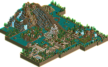
Park / Monsoon Mountain
-
 12-July 05
- Views 11,581
- Downloads 296
- Fans 0
- Comments 49

-

-
 No fans of this park
-
 Download Park
296
-
 Tags
Tags
 12-July 05


 No fans of this park
 Download Park
296
 Tags
Tags
 Similar Parks
 Members Reading
Corkscrewed Offline
Congratulations to Jazz for becoming the latest parkmaker to join the NE Pro Tour! Although this round was a bit disappointing in terms of turnout (a ravishing total of two entries received by Iris), both entries actually showed some interesting work. It was Jazz, though, besting NemesiS with the ol' "Mala Woodie Off a Mountainside" formula (named for the credited originator of this technique, not for the theming style). Monsoon Mountain kicks off with a great first half, and some excellent landscape interaction, thrilling drops, and great scenery. There were some slow parts in the second half that detracted from the overall score, but it was enough for the win.
1. Download MONSOON MOUNTAIN
Coming in second place was NemesiS, who went the Twisted formula and sent in an entry no one except him can pronounce.
2. Download HET LAND VAN ODOAKER
Comments on both entrys when im awake.
Anyways this was a toss-up for me, I couldn't complain about the ruling much. Jazz's theming was much more interesting and organized but I thought Nemesis' coaster was more realistic and well built. However, I did very much enjoy the almost complete lack of supports on Jazz's first drop, instead letting the landscape cover almost all of the height difference.
If such new faces are cranking out material this prodigious and fantastic then I guess this place is a pretty good school for RCT2.
This round most certainly lacked in quality. Briefly, here's what I thought:
HET LAND VAN ODOAKER-NemesiS
Totally cluttered. The coaster's layout was a mess and lacked any sort of variation. On the up side, this park clearly required a lot of time and skill. The architecture was weird, and the foliaging was totally bad. However, there was a pretty cool atmosphere, and I liked a good deal of the rapids. I also really liked the transfer boat to the transfer track. That was really cool. Cork, you have to forgive the chain on one hill, because in Het Land Van Odoaker it doesn't appear to be uncommon. Well, on the whole, this was totally weird, unrefined, cluttered, yet it was much better than Monsoon Mountain.
MONSOON MOUNTAIN-Jazz
I don't understand how this won. The cons were abundant and the pros were few and far between. Firstly, the park was flooded, and I hate it when people raise the water up to the land level. I also hate it when people don't even slant the sides of the land underneath the water, although that is very common, it's still a pet peeve of mine. Another problem in this entry was the architecture. It was Entirely 2x2, with the only variation being 1/4 tile balconies.
That was really harsh, and I feel bad about that. I do think both of you have improved a lot. Congrats Jazz. I will point out again that HLVO required far more skill than something so cliched, and Cork, you should have rethought this one. Sorry again for being rude.
but congrats JAZZ
Jazz - There were little bits of really nice stuff, like the theming on the first drop and the details on the mountainside. But most of it looked disjointed and ill thought out. The theming was lacklustre at best, and the layout left a lot to be desired. Needed to be a lot smoother.
Nemesis - Coaster layout was poor, and it spent far too much time underground. On top of that, no thought was put into the underground parts, as if they didn't matter. The theming was too cramped and crowded, and although I can nearly identify a theme, I don't really like it.
Sorry to completely pull apart your work, guys, you did well to get entries in.
But anyways, his entry. It was nice, I guess. Pretty sloppy. Looks like he was trying to copy some prevaling "styles" from NE, but really didn't do them any justice. Props to using that big mountain though. The coaster itself was really weak. The first helix sequence looked really painful. and boring. Also, there was too many slow hill crests. Oh well, good job on the win though, and good luck in the finals.
I'll comment about the other after I open it sometime today.
inVersed Offline
NemesiS-- Having never seen any of your work I cant say about your improving. Wasnt to crazy about your entry, seemed very messy and randomly placed. Their was too much brown shrubs for my likings also. I dont know if its just me, but the coaster would never run it seems like it broke down every time
Too bad I couldnt've finished my woodie, guess it'll have to wait till the bonus round
Corkscrewed Offline
Postit... in short, I disagree with most of your opinions. I thought Jazz had more sophistication than NemesiS and pulled off his entry well. NemesiS had good ideas but lacked sophistication in comparison, and his landscaping could not have been better than Jazz's. It seems like your personal biases set the decision more than actual judgment... a majority of your complaints centers on your personal dislike of 2x2 architecture and on the way the water was used (once again, I direct your attention toward the theme: IT'S FLOODED!). So it sounds more like an opinion thing rather than an assessment on skill, at least IMO.
But meh... opinions are opinions. Iris and I stand by ours, but I'd have to agree that overall, it wasn't as strong of a round as I'd hoped. But I can only go with what I'm given.
maybe it works again
I'll be in the next event again.
Corkscrewed Offline
I enjoyed your entry. Loved the hill you used to drag the coaster up. The archy was not blowing me off, but really pleasant enough. Very nice station for sure. The theme was worked out with consistency and attention was payed to details.
Yes, the coaster was a bit too slow on some points for my liking (not suggesting that I could do better
Nevertheless I like it.
Wishing you and all others lots of luck and succes in the final round.
To Nemesis: viewing your entry confused me at times: in the small part of the large map that was worked out, it had very much to focus at, but it got a bit too much of the same things without variation or surprises, and not much worked-out landscaping. The coaster was interesting to follow and had some nice surprises, but being a Noob I had problems with stats lacking any excitement and an unrideable intensity, and besides that it broke down every minute, and even without seeing the stats I don't know if I would be thrilled by it as I was a rider on this coaster, or just awed. Still I could see there was much effort put into it.
At last I am surprised to read complaints from many people like "If there were only 2 entries I wish I'd had the time to finish mine and send it in".
Come on guys, is this a toddlers site?
The big difference between you whining ones and Jazz/Nemesis is that THEY managed to send in an entry in time and you did not. May be you could have done better, but that could only have been proved if you had sent in, so I experience it as a bit 'cheap' to suggest that afterwards, without being able to see what you are able to accomplish in this round., in time.