I don't give a damn about 3rd or 4th place. Give me 2nd places to beat Kumba's record.
The only fact I want to point out here is that I had great fun making this minetrain and I really liked it in some parts, though I completely missed my plans. [color=white]You might see those plans "somewhere" else.[(color] Maybe that was cause I build like 45% of it within 3 hours. (Mainly the part that didn't turn out too well.) Expect to see one more PT2 prelims entry from me and this time I will put in all the heart and energy I have. (That should be much more than this time as I do not have school now for 6.5 weeks.)
Congrats to CoasterForce for winning this round.
Steve could have made first place easily if he had put in some content and not only built archi for the sake of having archi.
hmm... I'll be truthful, i think Steve had the best entry imo. The buildings were architecturaly perfect, with an amazing amount of detail. The coasters layout was fun to watch, shame about the custom supports though, they needed to be hacked right up to the track. Otherwise, great entry. Coasterforce, what a surprise! Neat little entry, with one hell of a mine-train! Foilage was a little sloppy, but that was about all i could say negative about this park. Layout, archy was all good.
I also checked out Postit's and Magnus' entry, in my opinion, Magnus should have been placed higher. His coaster was quite fun to watch. Postit also caught me by surprise! Very nice effort, architecture was great- but i had the feeling the mine-train was too segregated from the rest of the park. Next time try to incorporate the coaster layout more with the paths and scenery a little.
Levis and Tomdj's entries, well, i thought they were pretty average. Some nice archy in there. But however, seemed to lack that something. Keep trying you two, and fingers crossed you will make it through!
I didn't like any of them, of course, but, I thought CoasterForce's was especially terrible. I'm shocked it won! I probably would have went for Magnus' as it was the most solid entry, imho, but even that was completely underwhelming.
I only viewed steve's and coasterforce's and tbh i didnt really like either. Steve's imo was so much better than CF's but hey congrats on winning. Steve's entry was of course incomplete or looked that way, i mean cmon guys you want to get in the pro tour then prove you can finish something. Anyways both very nice but nothing really special in my eyes. CF's foliage and archy was too sloppy for me. sorry.
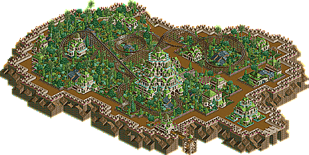
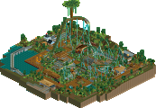
Project Dino: Nice entry, congrats on the win CF. Don't have much complaint, it was an enjoyable layout with nice interactions. It was very creative, and the archy was good.
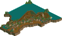
K2: Good. The archy here was superb; excellent. However, it was very incomplete, and there were a couple slow parts during the ride. And all of the different land types looked out of place IMO... But still very good.
Well I checked them all out and it was a pretty damn good round.
CF - Big entry and clearly a lot of effort put in, but nothing in it was really that great, like all the other entrys (other then Steves) the treeing was pretty bad, and the archy was plain and too brown. Nice effort, good luckon the tour
Steve - #1 imo, really great entry, just I think its size and the type of mine train you used kinda hurt you, but other then that it was awsome, keep at it steve.
Postit - Nice layout, but it was totaly barron, it did kinda look nice but something should be happening. The archy was kinda odd, like a simi neat litle jumble, but I liked it and the dome was pretty cool.
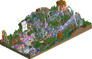
Magnus - I hate opening a park and then boom, its raining, this sorta reminded me of Comstock Dash, but thats about 3 years old and was a dueler, sorry but I just was not really feeling this, tho in the screens you showed me I did like it. imo the best part was the new Toon poles you made, thx for that
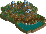
Levis - Nice, I liked the theming in some spots and the mountains where good, just it was not very consistent, you had good parts, but they seemed scatterd. Good work tho, your becomeing a pretty good parkmaker.
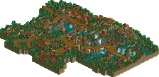
Tom DJ - I thought the layout was pretty good, a bit small but good. The border fence was nice, but other then that it did not have to much going for it, the buildings where something, but I don't really know what...
-Project Dinosaur, by CoasterForce
Definately quantity over quality if your ask me... and that bothers me actually since the actual pro tour will be about quality... this entry didn't do much to me...
-K-2 Mine Train, by Steve
I liked the theming very much. It just a terrific atmosphere. You should have used 6-seater wooden coaster trains though.
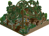
-Seranaur Cove Mine Train, by postit
Indeed a pleasant suprise. Just too bad it wasn't finished
-Devil's Mine, by Magnus
Looks quite old school and simply doesn't cut it. I liked that track works you had at the beginning though
-Route to El Dorado, by Levis
Very good structure in the temple and although it doesn't appeal very much at first glance you'll need to get into it.
-The Apocalipta
Liked it quite well, but your structures become a little vague if you ask me. A littl bit more though to it maybe
My order:
1- Steve
2- Postit
3- Tom dj
4- Levis
5- CoasterForce
6- Magnus
Oh and Trav, define minetrain: the actual minetrain coaster type or just a ride resembling a mine. The last offers more freedom if you ask me.
i did not see any meaning or sense in steve's entry. i found it horribly thrown together. steve, you can make nice and elegant looks but please give them theoretical content. i was confused about the coaster. it was so slow in places it almost stopped to then roll back. purpose?
I really don't understand why people are giving CF crap about his entry. Obviously a ton of effort was put into his park, and he actually finished it. Congrats on the win.
I agree with Posix about Steve's entry, there was really no particular theme, and the coaster layout was slow at parts. I also don't see why a few people think it's "finished". I think the only reason his entry got 2nd was that the archy was perfect, and had no flaws. The actual coaster has a pretty sloppy layout IMO.
Now, for the rest:
Tom Dj: A pleasant suprise, I thought it should of placed higher. Although the arhcy colors were repeatitive, it still was nice. The layout was also good too, with an impressive station building.
Levis: I see what you're trying to pull off, but it's just kinda odd. The huge structure was unique, but the landscaping was repeatitive, with the land all at the same angle. It just wasn't my cup of tea. Pretty good foilage selection though.
Magnus: Interesting entry. I thought this was very good; neat landscaping, great foilage... IMO, this deserved a much a higher placement than 4th.
Postit: From what was completed, it looked great. It's too bad, it would have had a much more promising outcome if you completed it the way you started.
My list:
1. CF
2. Magnus
3. Postit
4. Tom Dj
5. Steve
6. Levis
I believe that Steve's layout was slow in places to create suspense, really. I thought his themeing was detailed and well thought out.
CF deserved to win, very creative coaster, and nice themeing.
58 Comments
Magnus Offline
The only fact I want to point out here is that I had great fun making this minetrain and I really liked it in some parts, though I completely missed my plans. [color=white]You might see those plans "somewhere" else.[(color]
Maybe that was cause I build like 45% of it within 3 hours. (Mainly the part that didn't turn out too well.) Expect to see one more PT2 prelims entry from me and this time I will put in all the heart and energy I have. (That should be much more than this time as I do not have school now for 6.5 weeks.)
Congrats to CoasterForce for winning this round.
Steve could have made first place easily if he had put in some content and not only built archi for the sake of having archi.
I'll have a closer look at all the entries later.
Turtle Offline
Congratulations to everyone, especially CoasterForce.
trav Offline
I didn't like the others, and I dont see how K2 was a mine train?
Coasterforce's was ok, and was a good coaster, but the archy wasn't for me. 2nd Place for me.
Steve's was just bad and didn't have much thought imo. I didn't like the archy neither. 4th place for me.
Postit's was very nice, but a little unfinished. I really liked the archy in this one. 1st place.
Levis' was not very good at all. I didnt like any of the archy, and the foliage was poor. Last place.
Magnus', hmm, I didn't like the fact that it the archy looked like a noob LL player imo. The coaster was good though. 5th place.
Tom DJ, maybe a little repetitive with the colours, but it looked very nice nonetheless. 3rd for me.
RCTDude2316 Offline
trav Offline
We download these without screens because one screen would show the whole thing, it is only a coaster with theming afterall.
X250 Offline
I also checked out Postit's and Magnus' entry, in my opinion, Magnus should have been placed higher. His coaster was quite fun to watch. Postit also caught me by surprise! Very nice effort, architecture was great- but i had the feeling the mine-train was too segregated from the rest of the park. Next time try to incorporate the coaster layout more with the paths and scenery a little.
Levis and Tomdj's entries, well, i thought they were pretty average. Some nice archy in there. But however, seemed to lack that something. Keep trying you two, and fingers crossed you will make it through!
-X-
GigaForce Offline
cg? Offline
artist Offline
Congrats CF.
Jazz Offline
Project Dino: Nice entry, congrats on the win CF. Don't have much complaint, it was an enjoyable layout with nice interactions. It was very creative, and the archy was good.
K2: Good. The archy here was superb; excellent. However, it was very incomplete, and there were a couple slow parts during the ride. And all of the different land types looked out of place IMO... But still very good.
Kumba Offline
CF - Big entry and clearly a lot of effort put in, but nothing in it was really that great, like all the other entrys (other then Steves) the treeing was pretty bad, and the archy was plain and too brown. Nice effort, good luckon the tour
Steve - #1 imo, really great entry, just I think its size and the type of mine train you used kinda hurt you, but other then that it was awsome, keep at it steve.
Postit - Nice layout, but it was totaly barron, it did kinda look nice but something should be happening. The archy was kinda odd, like a simi neat litle jumble, but I liked it and the dome was pretty cool.
Magnus - I hate opening a park and then boom, its raining, this sorta reminded me of Comstock Dash, but thats about 3 years old and was a dueler, sorry but I just was not really feeling this, tho in the screens you showed me I did like it. imo the best part was the new Toon poles you made, thx for that
Levis - Nice, I liked the theming in some spots and the mountains where good, just it was not very consistent, you had good parts, but they seemed scatterd. Good work tho, your becomeing a pretty good parkmaker.
Tom DJ - I thought the layout was pretty good, a bit small but good. The border fence was nice, but other then that it did not have to much going for it, the buildings where something, but I don't really know what...
1 Steve
2 CF
3 Levis
4 Postit
5 Magnus
6 Tom DJ
chapelz Offline
2. Postit
3. CF
4. Levis
5. Magnus
6. Tom_DJ
tyandor Offline
Definately quantity over quality if your ask me... and that bothers me actually since the actual pro tour will be about quality... this entry didn't do much to me...
-K-2 Mine Train, by Steve
I liked the theming very much. It just a terrific atmosphere. You should have used 6-seater wooden coaster trains though.
-Seranaur Cove Mine Train, by postit
Indeed a pleasant suprise. Just too bad it wasn't finished
-Devil's Mine, by Magnus
Looks quite old school and simply doesn't cut it. I liked that track works you had at the beginning though
-Route to El Dorado, by Levis
Very good structure in the temple and although it doesn't appeal very much at first glance you'll need to get into it.
-The Apocalipta
Liked it quite well, but your structures become a little vague if you ask me. A littl bit more though to it maybe
My order:
1- Steve
2- Postit
3- Tom dj
4- Levis
5- CoasterForce
6- Magnus
Oh and Trav, define minetrain: the actual minetrain coaster type or just a ride resembling a mine. The last offers more freedom if you ask me.
tracidEdge Offline
Anyway, congrats CoasterForce, I sure didn't see that coming.
posix Offline
i was confused about the coaster. it was so slow in places it almost stopped to then roll back. purpose?
Coaster Ed Offline
yyo Offline
Nice, though.
The only other entry I downloaded was steve's. I didn't like the coaster at all, but the architecure was great, if generic.
inVersed Offline
1. CF
2. Steve
3. Postit
4. Tom DJ
5. Magnus
6. Levis
Jazz Offline
I really don't understand why people are giving CF crap about his entry. Obviously a ton of effort was put into his park, and he actually finished it. Congrats on the win.
I agree with Posix about Steve's entry, there was really no particular theme, and the coaster layout was slow at parts. I also don't see why a few people think it's "finished". I think the only reason his entry got 2nd was that the archy was perfect, and had no flaws. The actual coaster has a pretty sloppy layout IMO.
Now, for the rest:
Tom Dj: A pleasant suprise, I thought it should of placed higher. Although the arhcy colors were repeatitive, it still was nice. The layout was also good too, with an impressive station building.
Levis: I see what you're trying to pull off, but it's just kinda odd. The huge structure was unique, but the landscaping was repeatitive, with the land all at the same angle. It just wasn't my cup of tea. Pretty good foilage selection though.
Magnus: Interesting entry. I thought this was very good; neat landscaping, great foilage... IMO, this deserved a much a higher placement than 4th.
Postit: From what was completed, it looked great. It's too bad, it would have had a much more promising outcome if you completed it the way you started.
My list:
1. CF
2. Magnus
3. Postit
4. Tom Dj
5. Steve
6. Levis
JBruckner Offline
CF deserved to win, very creative coaster, and nice themeing.