Park / K-2 Mine Train
-
 06-July 05
- Views 23,825
- Downloads 624
- Fans 0
- Comments 58
-
 No fans of this park
-
 Download Park
624
-
 Objects
140
-
 Tags
Tags
Still, great entry CoasterForce. I really liked the layout, and the adventurousnesss of the ride really surprised me. Congratulations on that.
By the way, is it too late to send in a woody?
Anyway I liked Coaster Forces entry okay... Just after seeing Artists top-notch area of the same theme it just seems weak. I agree that Steve's was far and away the best entry and it would've been my pick to win any day of the week in any weather... Magnus just keeps going but this was (imo) possibly his weakest entry yet and posit, well... Let me put it this way: it was good until I saw the coaster. EHCK!
Anyway I'm not terribly excited by any of them. Congrats CF and better luck to all the rest of you. I see CF being like me in the last PT though; getting in with a big entry out of nowhere then sorta fizzling in the main round when he can't build 3X what the rest of us do because the map size is the same. I know how that feels.
Anyway the comments here have strangly renewed my interest in working on my entry. mawahahahaha!!!
ride6
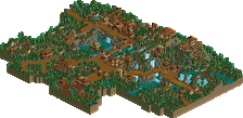
For me it just comes down to this: I wanted to make a ride going through a dinosaur resarch area, and speeding up through a villlage secluded in dense foliage. People say my foliage was sloppy (and I agree it was, any comments to help me with that are appreciated) but unlike Steve's, for what I was trying to do, I needed it to be dense, with bushes and trees hacked over it. Having bare spots would lose the jungle dense-ness I wanted. Feel free to criticze my entry and give criticism to help me with that, but it's just important that you know that first. But like I said, I'm satisfied with what I did and it was what I wanted to do with it.
Anyways, here's what I thought on the others.
Steve: It was pretty good in my eyes, I liked the feel with the old railway you had going. But I felt you made the archy just for the sake of having archy, and that wasn't good for me. But still it was solid.
Postit: Yeah, would've loved to see it finished. The areas that were completed looked great, too bad about the loss of inspiration.
Magnus: I agree with yyo in that it reminded me a LOT of Vesuvius Stampede, everything from the lift to the feel of the ride in general. I thought your entry was okay; it would have been received much better if it was made months ago, but now the standards are higher for the "standard" theming. Still I didn't see that much wrong with it and I would have placed you higher in my book.
Levis: Too weird for me. The mountains would've been better had they been more natural. But I didn't get what this whole thing was all about, really. Creative though, and not many people are willing to take risks like that, so congrats to you.
Tom DJ: Compared to the others this deserved last IMO. The foliage and landscaping were weak IMO, but the layout itself was solid, but short. Had it been better themed and slightly longer it would have been better.
Corkscrewed Offline
A visual explanation: I'd say that Steve's quality was 9.0 and his quantity was 6.5. CF's quality was more like a 8.0, but his quantity was a full 10.0. 9 x 6.5 = 58.5 8 x 10 = 80. 80 > 58.5
Not that it came down to such a simple equation, but that's the best way I can explain my overall point. Steve might have had parts of his entry that were better than the best parts of CF's entry, but overall, CF had a better submission. I really loved the coaster layout and thought the ride itself was stronger than Steve's.
But I agree on the "develop this into a full area." I mean, I really do love that Expedition Everest-esque look of the area!
Looks like Iris basically answered this, but c'mon... if you entered the actual Pro Tour with half a park, even tho that half is the most amazing thing ever, you wouldn't beat someone who entered a full park with some pretty awesome stuff. We've seen it before... Micool's park is one example... remember Mantis's Hi Rollers submission? Amazing work... but the remaining 2/3 of the map was like water. On the other hand, a quarter map of hi quality will always beat a map full of absolute crap. Unfortunately for Steve this time, the full map ahead of him wasn't anything close to absolute crap (unless you're Chauncey maybe
Actually, I thought the coaster was pretty cool. I especially loved that turnaround at the beginning leading into the lift hill, but the ride as a whole had a pretty fun layout. It's just that nothing ws there, so it became a bit misleading.
iris... heh, I highly doubt I'm going to be in this thing at this point, unless you find it in your heart to give me a bonus spot!
I won with an 8.0 (but full map) over Kevin's absolutely amazing rapids (which became Helios). But I would of still liked to have seen Kevin in that...
So Steve, just get in this thing.
I personally prefer Steve's
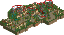
Project Dinosaur: I really wasn't too fond of this one at all. The architecture (mainly the textures used) just didn't seem to work for me. I can't really explain why, but they just didn't seem appealing. The foliaging didn't work for me either. Just a total overload of jungle bushes became overwhelming. The mine train had a nice enough layout...a few awkward bits. I see you have caught the dreaded fake double drop disease. Not as bad as some I have seen (coughx250cough
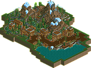
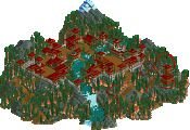
K2: What was there was stunning. I loved the architecture...I really did. Perfect detail level (though I didn't see it quite necesary to have all of those barrels and stuff infront of the buildings on the path) and wonderful colouring etc. which I have come to expect from all Steve work. You really are a master at perfection. The landscaping was awesome with only a few awkward bits concering landblocks (which is to be expected due to the extensive usage of landblock usage...some areas were bound to look a little dodgy) I loved the ice on top of the mountains (apart from that ice bit you used by the shoreline near the path...totally unnecesary) The coaster was very cool...though a little hard to get into due to the slowness (I know you did that purposly) It just seemed whenever the coaster was gaining speed or going to do something interesting...it went up a really slow hill or got slow by some brakes. Really disrupted the flow rather than giving the out of control kinda feeling you seemed to be going for. A couple of really slow hills would have been nice...but whenever it went uphill, I just knew it would barely make it and it lowered my enjoyment of the ride unforunately. It's a shame there wasn't that much to the ride. As Turtle said, I'd love to see this expanded upon with a larger section and path interaction etc. In a way...also...it wasn't a mine train. Although it did give out a mine trainy feel...there was nothing really there promoting it as a mine train. Steel Family Coaster track with a steel coaster car... Anyway...great job on it...quality wise, definately should be a deserved winner.
Metro
PS- Coasterforce's entry was better, too.
1. Project Dinosaur by coasterforce - Great entry, but no stalls?. I enjoyed the completed-ness the more than anything here. The theming was pretty good, in areas imo. The architecture had its moments as well. The ride design ok, nothing more than ok tho. It had some enjoyable details, but wasn't really an action packed ride like I expected. I loved what you did with the queue line and earthy lift hill. It really tied in the natural beauty. An incredible all-around entry that just wins for all its solid demonstration of skills. Congrats and I'll be interested what you put up in the pt CF,..
2. K2-Minetrain by steve - I could feel this entry. Beautiful buildings nestled next to a nice meandering train that cut its way thru the jagged mountians. Looking at it made me just want to see more buildings and a bigger, faster mine ride. You certainly have a knack for theming steve, because the theming here was top notch no doubt about it. A larger area would've been un-beatable in this contest imo. Your buildings always seem to drip with style so much that I tend spend more time looking at them than I do the ride itself (happened with Mandarin). Doesnt matter tho, steve will be in the pt this year, i'm quite confident.
3. Devil's Mine by magnus - A pretty cool entry. I got a rushed sense from it. Again, the rides seemed slow, with minimalistic theming imo. I sorta liked the web of transfer track, but didnt' really understand its purpose. Not bad, but not great.
4. Seranaur Cove Mine Train by postit - Not a terrible entry, but how could buildings be more important that theming?? That poor coaster looked naked!!...although this entry faired a little better for me because its whole-hearted effort and its one touch of brilliance, the lighthouse...
5. The Apolipitica by Tom_dj - A weak coaster imo. Scattered architecture and over organized foliage; didn't really like it much at all.
6. Route To El Dorado by Levis - Mountains made of wood and an extremely glitchy ride design. Not a good combo. good attempt, not much more for me.
Clearly my plans didn't work out as...planned.
Main reason I gave up on entering prelims. Same shit would happen.
Richie Offline
I would have said steve, but he wouldnt finish the finals park!
Coasterforce's didnt really interest me, the textures seemed boring and i didnt like the foilage, seemed too messy for me. The idea for the 'escape from meteor shower' was good, but didnt work AT ALL. If it was an adventure (not tracked) then yes, but the fact it was supposed to be the end, then suddenly finds alot of extra track seemed silly.
You should enter though...who knows...you might get inspired in the finals. And if not..there's always the water button.
I actually tried doing that part with it not being tracked, and the merges, etc. worked in the normal track but when I changed it to the "crooked house" track, it worked fine until when it merged back to normal track for the brake run, where it crashed. So I could never get that to work (and yes, there wasn't any diagonal track or anything like that). All in all figuring the time I had, I didn't want to waste the time figuring out different ways for it to work, so I ended up doing it tracked, and I could get a bit more with the last part of the layout.
Also, it was supposed to kinda be like Revenge of the Mummy @ USF...if you know what I mean, with the ending.
Thanks for all the other comments; they're much appreciated. I'll step everything up for the big show...