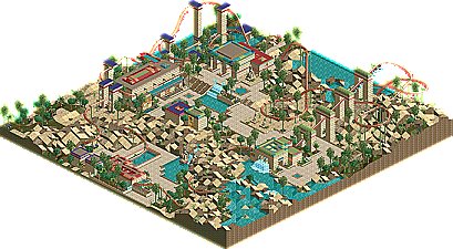
Park / Eye of Horus
-
 25-June 05
- Views 37,524
- Downloads 306
- Fans 0
- Comments 49

-
 No fans of this park
-
 Download Park
306
-
 Tags
Tags
 25-June 05

 No fans of this park
 Download Park
306
 Tags
Tags
 Similar Parks
 Members Reading
Inverts:
PenguinBob: Wow, this was awesome. The main thing that I loved was the station with those statues in the landblocks arches. Awesome. A wonderfully pulled off egyptian theme with the barrennness looking awesome. I didn't think the pacing on the coaster was too nifty though, some inversions and turns were taken at extremely high speeds which didn't really work for me. Awesome looking layout though. The supports were an awesome idea, even though they didn't look that pleasing to the idea. I couldn't help that notice that some were on the outside of banked turns which didn't work for me, should always be on the inside IMO. Anyway, awesome entry, congradulations on the deserved win. EDIT: Just Realised how many times I said Awesome in that^....awesome.
Splash-O: Apart from the great looking fort walls, the entry didn't appeal to me too much. The coaster layout wasn't all that good with some awkward looking sections and lack of direction. The colours were generally dull too with the brown and white of the coaster mixed with the classic brick and faded green architecture combination. Nothing really stood out to me, but the landscaping was very nice and the coaster fit nicely into it.
Trav: Didn't enjoy this at all. About 70-80% of the coaster was underground which didn't really work for me. I really disliked the layout, especially with the lift hill at the end then the slow turnaround etc. The architecture colours were horrible, total overload of purple, and the custom supports were purple too! Didn't work for me, though I did like the coaster colours. Also, too many trees etc. on the hills with rock.
Suspends:
Jacko: A good job with no custom scenery. A nice enough suspend and pretty good architecture. I liked the cog wheel inside the arches, that looked nifty. The main problem I used to find with your work was your landscaping, but you have come far since then and this shows great landscaping skill. A nice entry, good job.
Ekimmel: I actually enjoyed this quite a bit. Nothing was spectacular, and nothing was perfectly executed, but it was enjoyable nevertheless. Kinda hard to comment on it really, but I think you nned to make the landscaping a little more flowing...hm.
Shameless: What was there of this entry did nothing for me at all. An interesting mix of colours......that simply didn't work in my opinion. The sand path really didn't work either. The suspend was an extremely short layout..with a weird name. And it was all incomplete, so yeah.
As I said, I'll look at the others tomorrow.
As for Inspiration: Yeah, it looks similar to my old stuff as Iris mentioned, and it was based off Galbadia (obvious architectural influence there) I just wanted a better version of it, which I think I achieved. I personally really liked the layout, but maybe I should have taken out the brake run near the end...hm. As for the bare mountains, i just couldn't imagine much growing on them in real life, so didn't put much on them...meh. If you saw my Suspend coaster, i think you'd find it quite different to my usual stuff...
Metro
Pbob - This was a nice ride. For some reason, it reminded me a lot of Phatage. I think you are the mini Phatage, honestly. There was hardly any architecture, but there didn't need to be and it was cool how you could make it seem that way. It reminds me of that ride Phatage made a long time ago for one of those rct2.com road rallies. I forget what it was called. But anyway, I liked all the secrets and poems as well. Good job!
Metro - Another nice entry, but the only problem I found here was just that it was too small which made the ride uninteresting. Your strength is your coaster designs, and that's clearly displayed here, but it felt like the coaster just stayed in one general, compact area. I don't know if I'm making any sense. PBob's coaster stayed in one general area too, but his idea made it seem on purpose. I really liked the little tunnel on the mountain though. And I enjoyed the barren mountains. And as always, the supports were perfect.
Splash-O - I enjoyed the ride when I first opened it. A lot actually - it reminded me of Geoff's design. You have great landscaping and foliage choices. The fort walls were very cool too. But. The architecture just got a little boring after a while. It seemed like you used the same pieces for everything building. Nice coaster design though. Very pleasing.
X-boy - Wow. Total surprise here. One of the best entries this round, I thought, if it wasn't for the quality of the coaster design itself. Your landscaping had its flaws but you seem to have that department pretty much covered. Your archicture was great. Seems like something artist would build. That break run though would kill your (proverbial) passengers. It also made the train stuck after the second run-through.
Suspendeds.
Can't view LL, sorry steve.
jon - Eh, I guess it was okay. It seems like you could have thrown that together in 5 minutes with the scenario editor and then another 2 minutes building the actual coaster. The landscaping was not all that great I thought. There were awkward parts were the land is completely straight and then just drops off into the water. It was a cool idea though.
That's all I've viewed so far.
Mine - I sent the entry in a week early because I was going on vacation. Some of you may have seen those no-custom scenery screens I put at one of the fiestas. I got some fairly good feedback with them, so I decided I'd enter this thing with that same idea in mind. Turns out, I really love building without custom scenery. It's just so much easier and a lot more fun, so maybe I'll start doing that more often. This was actually the third entry I started (i built one for the hotel and one for the 4d which I lost interest in). Both are nearly complete so maybe I'll release them some time. Anyway, thanks for the comments everyone.
Invert:
X-Boy: I was very impressed as I had never seen any of your work. I thought the coaster colours were top notch, but the train colours let it down somewhat. Some nice architecture and landscaping work. I didn't like the random yellow floweres dotted around here and there though. The coaster layout looked excellent, but when you ran the coaster, it was way too slow over the inversions, especially the 2 loops and the cobra roll. The supports you did do were nice apart from on the cobra roll where they didn't hold the coaster up, but meant the train went smack bang into a metal pipe. It's a shame the whole coaster wasn't custom supported. In my opinion you should either support all of it or none of it. In this department, the entry lacked consistancy. But still, a very very nice entry.
Wicksteed: Another nice entry. A pretty good layout with some fantastic supports, unlike most I have seen before. The architecture was pretty good, maybe a slight overuse of the graveyard wall texture. There wasn't that much landscaping in the area making it seem a little sparse in the theming department. Some nice patches of foliaging here and there with good use of the creepy trees. Good job.
Suspend:
Jon: Wasn't impressed by this at all. One of the most boring rides I've seen in a while with absolutely no theming attempts. No path interaction (as there was no path) no architecture. The highlight of the ride was where it went through a waterfall...and that's not really saying much. The icy sections were good, but didn't go with the jungly foliage you had there, so kinda inconsistant. The landscaping was generally good, but the entry was just generally boring with no theming/exciting bits in the ride. Ah well, good effort anyway.
Metro
rct is meant to be fun and all those competitions and deadlines do not really fit that.
as long as you are happy with it jon go on with the work, though based upon what people at NE want to see especially for competitions it does not really work out at all.
Downloading now.