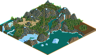
Park / Terra X
-
 25-June 05
- Views 37,524
- Downloads 353
- Fans 1
- Comments 49

-
1 fan
 Fans of this park
-
 Download Park
353
-
 Tags
Tags
 25-June 05

 Fans of this park
 Download Park
353
 Tags
Tags
 Similar Parks
 Members Reading
@ jacko -> there is a path (dirt) I mis wen I open the file
Congrats to Jacko and Pbob.
I'll check out the entries later.
Metro
Corkscrewed Offline
The whole entry is based on a poem, which you can find typed out across signs in the front of the park. And yes, it should be Ozymandias.
To adress the comments about it's sprawledness--I just wanted it to flow real well and look "perfect" from one angle. I think I acomplished that, however un-realistic it might be. As for the theming being messy, that is derived from the layout of the coaster. Also pulling off an (interesting) egyptian theme is simply put: kinda hard. I had to add random folliage and barrels and other junk to keep it from being bland. So yeah, after a certain amount of that, it'll definately get messy. The messiness with the station was due to the amount of 1/4 rocks (methinks) and I don't think I'll ever make the land on top of stuff look like it's 1/4 tiles again. And the supports. If I used traditional or traditional custom supports, the theme would loose so much umph. While putting them in, I realized it was either an all or nothing type process. I got frustrated with the monotony and the amount of them, but there wasn't really anyway around it. Oh, and thx Artist about the comments (and everybody else), I realize that the bazzar archy sucked. Hopefully that wont happen again.
BTW, nothing was hacked (that I remember) except for the paths, the custom mesage, and the land owned stuff. So yeah, the supports werent hacked. Also, if anybody could give some feedback on the landscaping and tree selection, that'd be great, because I'm kind of weary in that area.
Congrats for all the other fine entries! I'll comment on them, hopefully, after I take a look at them all.
Also, here's a link to the file with the exported objects:
http://www.rctd.ft6..../Ozymandias.zip
P_BOB - I loved that station, and the layout on the invert was outstanding and even had 0 slow spots and keept its speed. Tho, other then the station and layout there was not to much, I disliked the car ride wondering around, it seem out of place.
Metro - Same as BOB, great coaster layout and station, tho in your case the paceing was not to notch and the rest of the buildings and themeing were really boreing, but props on that useless waterfall thing, it was neat.
Jacko - Neat stuff, kinda like SG. I liked the look and could hardly tell you did not use custom scenery.
Steve - Nice theme, its always nice, all 100+ times I see it. The coaster its self was pretty soild, but I think you should stick to RCT2.
Splash-0 - Really neat entry, I think an invert hyper is a nice idea, I did one in LL once. I hope you keep entering.
Pbob: Interesting idea, it's not often that I've seen a good Egyptian theme, and this was pulled off nicely. The pacing was very fast and it seemed "out of control" -- which was good in this case. The fact that it went over the car ride made it cool and added a lot to it. Props to using the Vekoma track too, they're a bit harder to do. Just by a little, this deserved the win IMO.
Metro: Good layout and all that usual Metro-ness. The beginning was especially good with the initial drop into the butterfly element. You came close to Bob, but it was just lacking in overall quality and could have used some touching up, possibly with some more foliage on the mountain instead of it being completely barren. But what was there of the foliage was great IMO. The archy was nice too. What separated this from Bob's was overall quality and this didn't come together as well as his did, IMO. Looking forward to seeing what else you do.
Splash-O: Very high coaster which brought good speed and height throughout, it was the same height as Alpengeist I think (195). Good idea as well with the whole fort thing. I found not much fault with the layout, but like Metro this didn't come together as much as Bob's. But very impressive from a very impressive parkmaker, looking forward to seeing what you do after this.
X-Boy: I was pleasantly surprised here, this was impressive to me. The color scheme appealed to me and the coaster was nicely landscaped in parts, most notably the first drop. Only thing that brought it down were the blocks, especially the first midpoint brakes that really brought the ride to a screeching halt in the middle of the course. But I think you did that because the ride had that high intensity rating that was nearing extreme. Also I didn't like the whole "double queue" thing. But nevertheless it's impressive.
Wicksteed: Another surprising entry that's actually pretty decent. I hated the path, though, and it was way too wide in some parts. I would have liked to have the coaster have a different color for rails or something or use some accent just to break it up a bit. But good entry, would've liked to see some more effort in parts.
Trav: You're getting better, just keep at it. I suggest you take Iris' advice and put all your time into one round to win, instead of entering so many of these rounds. Two problems I found here were the archy, which was nice for one building but could be varied up a bit, and the layout, which spent most of the time underground, which is not good in most cases, especially with something like an inverted. Keep at it, and take your time to finish one major entry.
-----------
My feedback for the suspended round will come tomorrow.
PBob...that was in-sane. Great job.
Now i just want to see the ride that beat out Galahad.
SplashO: Right when I opened this, I thought, "Man this is great, it should have won." BUT, after looking more in detail to it, the coaster design wasn't all that solid--wasn't really an invert type of design--the buildings were pretty good, but the station was just like the all the others. The aqueduct thing was silly, especially without the water tiles. There was a bridge that's design I didn't like at all. And what was with the fort thingy, and the name, and the transfer track. All dumb. Also, way too many purposeless poles. But you managed to make all the flaws look really pretty, so props to that.
X-boy: Again, exellent theming. I liked the lush and bold colors, except for the green on the coaster, which I never like using too much of that one unless I have to. Architecture was good, not exceptional, and you had a proper station
Wicksteed: Great coaster! I think I liked the design the best of the round. Station was too small, though. Buildings could use some work, and more theming in general would have helped. Also, there was a lot of path, and a not so great looking one at that.
Trav: My tips to you are: Build the coaster first. Imagine what you want it to go through and do while making it. I think that could help a lot on your layouts. Also, take a look at rcdb.com. That place is awesome... anyways, yeah the rest of the park. It looked like you made a section for buildings, a section for the ride with a mountain in the way, and a part for water around the whole thing. Make stuff interact with other stuff instead of being dividing it all up. The underwater stuff did not work. Folliage could use some work, look at some spotlight parks for ideas as far as that goes. Normally I keep plants off of big rock masses, and here I'd make no exception. So yeah, just keep with it and get ideas from all over the place.
Jacko: Excellent entry! You're doing all sorts of stuff right, so I won't comment about the theming except by saying it was nice and quaint. I only have two gripes about the entry, and thos being fairly minor, so here it goes. I wish the entrance to the ride was more clearly marked. I searched for it for about a minute because the only thing that noted it was a small sign on some random building. It would have been better if you had a different path or something. And the other complaint was what I saw as flaws with the coaster. After the second lift, the drop was really screwy. And there was a really slow part as well. I went and messed with it and worked it out for my satisfaction though. lol.
jon: Landscape was pretty good, but I'll say what I said to metro. but with more emphasis. The mountains could have been a lot better. The flow wasn't there as far as they went. A lot of them were just mounds, and the whole thing where you could tell where all the land tiles were thing was going on as well. If that was worked out it would have been at least twice as good. I liked the coaster, but again
A message comes up that says something along the lines of, "Cannot open - requires Time Twister expansion pack."
Jacko's was pleasent but not really all that impressive to me. Really now JS, if you want to 'break out' you've got to stop with the classical exicution of crazy ass themes. This was just a classical thing, yippy. But look at some of your other stuff... I guess my biggest problem is that 90% of the time you take an idea that Phatage or cBass might use and then try to exicute it like Slob or SA and it just doesn't work imo. I liked this alright though, didn't notice the lack of custom sceanery at first, and that's an achievement.
ride6
inVersed Offline
Great Job.
I also checked out metro's. His was nice i migh have like his more than pbob's but still both were great entries.
I also checaked out both of Travs. Your getting better.. but I've seen your newer work, and I know you can do better, which you ever told me. I look foward to your future entry(s)
Good job everone on their entries.
Still wish I could see Jacko's
I've checked out a couple of entries so far and I'll try to get my comments up soon too.
http://www.rctd.ft6..../Bloodwood2.SV6
I haven't had a chance to look at the other ones, hopefully I will later.