Park / Firefly
-
 26-July 08
- Views 8,403
- Downloads 967
- Fans 2
- Comments 26
-

-
 82.69%(required: none)
 Design

5dave 90% nin 90% robbie92 90% Sulakke 90% ][ntamin22 90% Arjan v l 85% Liampie 85% Roomie 85% Cocoa 80% MCI 80% csw 75% FredD 75% geewhzz 75% Louis! 75% posix 75% 82.69% -
2 fans
 Fans of this park
-
 Full-Size Map
-
 Download Park
967
-
 Objects
329
-
 Tags
Tags
Xcoaster Offline
Will reply in depth once the damn thing actually downloads.
-ACE
Will comment more when I am back from holidays.
Congrats CP6.
This should be a strong contest for best design this year. Looking forward to seeing who else is in the contest.
But I just wasn't convinced entirely by the coasters themselves. Ok, this is a unique idea, it hasn't been done this well before (if done at all), and there are some really good bits to the rides, but I think the fact that you had to fix the stats of the inverted coaster shows that something's up with the intensity. Yes, we all know inverted coaster stats in RCT are a bit wonky - they make the ride more intense than it is. But looking at both coasters here, particularly the inverted, the trains are absolutely flying around the track. I mean, there's no hold-up, or slowing down over some inversions - the pace is waaay too extreme. The first inverted loop - the train doesn't slow down at all on the top; likewise on its zero-g roll. And both trains are literally powering into the final brakes.
Sorry to sound so negative - I don't mean to be. There's loads more good things about this design - LOADS more. But for me, the actual coasters themselves (seeing as they are the focal point of the design) need to be perfect. And in terms of pacing, I thought they were way off. As I said, I don't want to sound harsh cos this is a really great little map, with so much going for it, and there's so much more good going than bad. And of course, pulling off a floorless/inverted coaster duel is going to be incredibly difficult anyway -you did do a pretty damn good job with it.
Did we look at the same park?
Did you ever ride a B&M inverted coaster?
Totally didn't notice any pacing problems and liked the fast and furious layout.
As I already said. More comments when I am back from holidays.
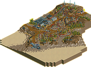
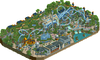
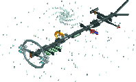
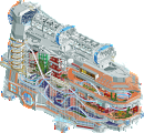
I think I agree that there are some pacing issues and that the layouts could have been improved a lot over what he stuck with, but that doesn't change the fact that the overall presentation of the design doesn't lack, because everything else is top notch and very well done. The theme was pulled off great. Good landscaping, good foliage and good architecture with amazing detail on all of the interiors. The Rotoshake was also wonderful.
Also good job on the peep friendly part, as it's much more fun to watch peeps on duelers.
The surroundings were also excellent. I love how you theme the interiors. I don't know if this is something of a "trademark" in your work, but I hope it never goes amiss in your future parks; they definitely add something special to it. The queue for the duelers was especially eye-catching. However, I couldn't help to notice that I found no restrooms in the park? Maybe I missed them. But, regardless, excellent work on all the architecture. The landscaping was also equally impressive.
Also, I agree with eyeamthu1 on the pacing of the invert although I didn't feel it took away from the overall design.
Good work though and a well deserved accolade. I can't wait to see your next project.
Rather then reply individually, I'll just do kind of a generic thing here.
I guess the main thing to address is the pacing. I knew people would point it out, but I didn't think it would garner this many negative views. Perhaps it's just my previous history of realism. Like I said in the readme, I chose to take liberties with these designs that aren't entirely realistic. I wanted interlocking loops and crossing zero-g's from the beginning-- for the effect. As anyone can probably figure out, this is nearly impossible in real life because they have to be the same distance along the respective layouts and one must have a peak lower then the other. So in that case, I chose to sacrifice realism for effect. I'm not too bothered by it, and if I had to do it again, I would leave the loops as they are. The rest of the layout I thought was pretty strong, if I were to critique my own work, but I can see how people would dislike things. (Just for the record, I have 12 real-life B&M inverts under my belt-- so I know that the pacing is a slightly unrealistic thing).
To Steve-- yes as long as the object limit is not a problem, I will continue to do full interiors. It's the only way I can do architecture now. It gives things meaning. The restrooms were on the first floor, righthand door of the building next to the coaster's lift hills. I may not have added the actual stall, but the interiors were themed... I cut away the back of the building so it's visible (slightly)
Again, thanks for the comments. I'm disappointed that the coaster pacing has kind of overshadowed other things, so I guess I'll just have to keep with the fully realistic style from now on. I've got 3 projects actively being added to, so hopefully these will also be enjoyed.
This was what I was trying to get across in the last bit of my post -- the coaster pacing doesn't OVERSHADOW the other things. As I said, there are so many great things going on here, and whilst I didn't think the pacing was that good, I didn't think it detracted from, and overshadowed those great things. Don't think that you should stick with a 'fully realistic' style from now on; because the fantasy element of this project is what's best about it, it is pulled off so well. I'm not a fan of fantasy, but the whole ride area is absolutely stunning, and by the best example of 'fantasy' park building. The ride layout just could be tweaked a bit to change how fast some of the elements are taken - that's the one complaint - everything else about the map is awesome.
That being said, I very much appreciate the comments so far and I'm glad people have enjoyed 5 months of my life!
I thought the coasters themselves were very good, nice and smooth. It's just a shame that the game's physics are off when it comes to peeps. It's kind of weird how the floorless was slower than the invert even when both trains were fully loaded.
Anyway, congratulations on the accolade, it's well deserved!
I love the foliage in this and the landscape is really awesome, too.
The interaction of the 2 coasters is awesome and so are the supportings
and the station.
You're queue-line theming is lovely mainly because of your
great interior design.
Overall this is really nice!
I am not missing anything here, great coasters, wonderful theming, a great
spaceship sculpture and I nice costum flatride, great!
Never seen the show, but i still really had a lot of fun observing all the architecture, theming, etc. Probably one of my favorite designs. Good work and looking foward to your future projects!