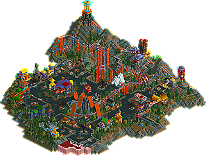
Park / IT II
-
 06-June 05
- Views 29,737
- Downloads 509
- Fans 0
- Comments 34

-

-
 No fans of this park
-
 Download Park
509
-
 Tags
Tags
 06-June 05


 No fans of this park
 Download Park
509
 Tags
Tags
 Similar Parks
 Members Reading
Six Frag's coaster was just not good on the eyes... very thrown together scenery and a very odd style.
Chapelz's would've probably won, had it been fully themed. Sorry mate.
Tom DJ.. you're improving, but you still need to separate buildings by style, not color. Too colorful and too much underground for my tastes.
Yeshli's was VERY mala-esque. The launch, the archy, the spooky theme... everything. Cool layout, but it missed my tiny soft spot for unrealism, while magnus hit it.
Master Jay had a very nice layout and simple theme. I liked this one a lot as well.
Sadly, I wont be keeping any of these on my computer... except for maybe Chapelz's because I liked the landscaping.
magnus: So close, so close. This was definitely a solid entry, but it had some critical flaws imo. Mainly, all the animated scenery. I think it was way more detrimental rather than beneficial to the park. I know it was part of the theme, but I think it was easy way out. The coaster being trackless (despite the story behind it) just seemed unnessecary. It also had some slow parts. This entry didn't really hold my attention too long, but I'd place it 2nd, as it was complete and had a good theme. magnus, I wouldnt worry, I know you'll get thru these prelims, I just know it.
master jay: A great coaster to say the least, but I quit looking at this after it made one circuit. There just was nothing else to see. The theme seemed non-existant if there even was one. Plain old 2x2 buildings that really served no purpose with a sweeping color scheme, yawn. The custom coaster supports however, were well-done and coaster layout was great. period. 3rd place in my book.
yeshli: I don't think this entry is as bad most people are making it out to be. True, it borrows some ideas from GCC and only executes them minimally. On the other hand, it had good theming and the coaster had its moments. i'd place this 4th. Nice effort.
chapelz: This entry left a strange taste in my mouth. The best word to describe it is blotchy. The ideas were there, but imo, you really need to expand your color palette. The white "blotches" were so busy and complex, and with the big blank grass areas nearby, it all really made for an eyesore. The coaster itself really did nothing for me either. Still, had this been finished with less monotony and more color, it would've placed much higher imo. 5th place for me.
tomdj: Was there a coaster in there? Ok, there was, enough sarcasm, but really whats the point of a coaster you can't see? It also seems to me that you are in a rut which is making you a really predictible parkmaker. While you're buildings are somewhat fun to look at, they are really monotonous and non-themed. You're also not using landscaping to your advantage. oh, plz try your next park without those Spanish roofs. Keep using colors, but try using them in a less forced manner; or just tell me to shutup and keep building
Sorry if I sounded harsh guys, just being honest. Great round, cant wait for the next.
Thanks for the comments guys..
SF
But chapelz first drop just spun exactly how i remember spinning my 4Ds. =P.
http://nedesigns.com...69&park_id=1112
[attachment=4388:IT_II.SV6]
I'll delete it once the old parks are available again..
SF