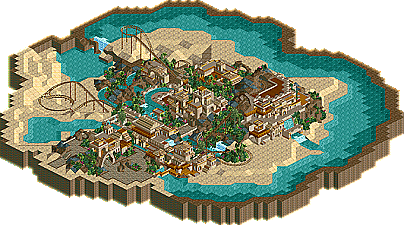
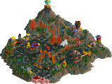
X250: The best entry from this round IMO as well. It was an eye pleasing entry, good architecture and appealing colors. Then there is the coaster that interacted perfectly with the little 'village', and it had some nice custom supports...It just did it for me. A well deserved win!
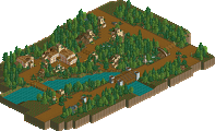
Leighx: Also an very good entry. Your architecture is impressive with those 1/4 tile blocks, but sometimes it gets a little too cluttered to my liking. I did like the rest of the ride though, i thought it had a very good lay-out and was set in a nice solid theme.
Geoff: Now, this was the first park I opened up for some reason. While looking through it i thought that it was excellent, and surprised me that it only ended up third... when i saw the other one's i understood why it didn't win but i still don't understand the third place. The ride was fantastic, the landscaping and the theming were just wow. You’ve really got your own style going which i love, it looks so organised. A shame that you didn't finish it because i think it would have stood a good change in winning this round if it was finished.
Egg: Nice, i had hardly seen anything from you before so i was a little surprised. I thought the ride was great, just sad that the duelers didn't really 'duel' like the others have said. It just wasn't that impressive as the other entries, but i'd be proud to be able to built something like this.
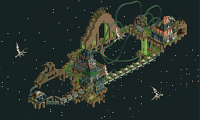
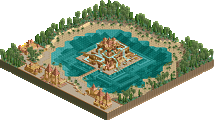
Levis: Original for sure, but why did you make it so small? I thought it was nice as it was now but you could've expanded on the idea and build something massive what would have been a lot more impressive. Although i wonder if my computer woudn't crash since my computer slowed down like hell when i looked at it.
X: Very visually attractive and a good color scheme. The coaster layout itself was okay but the interactions made up for it. Well deserved win in my opinion...but maybe not as innovative as I would have liked to see.
Geoff: I wasn't really amazed with this either, but eh. It was still cool. The most dynamic layout of all of them, so I give you congrats for that. Would've been awesome if finished as others have said.
Leigh: Your style has never appealed to me and always seems to be cluttered with the 1/4 blocks everywhere. But this was still impressive, but it just wasn't my cup of tea.
Levis: As others have said interesting idea but it just slowed down my computer too much to enjoy it. I basically just saw boats flying out of a castle with waterfalls everywhere, seriously. But, it was a good idea and would've been interesting to see what you could do with it.
I'll edit my post later with reactions from egg's; I forgot to download his for some reason, I'll look at it when I get the chance later.
levis's park ran perfectly fine for me and i thought his was the best and most original ride of the contest. i loved the part that was underwater and i think you pulled off the atlantis idea very well (which is used in RCT a lot, but not often original like this).
X250's was overall nice but there was nothing about it that i've never seen before in another park. second place for me.
third place for me goes to leighx. he had a nice layout with nice theming. it was more original than X's but lacked completion.
geoff takes next place with a strong entry that could have took any of the above's places but i just didnt find much that again, stood out. it was a good coaster but the incompletion brought it down.
and last goes to egghead. the layout was pretty darn bad and the theming imo wasnt good either. everall, i thought it was a weak entry.
i dont see why you guys who didnt finish just wait untill the last prelim contest to enter the "any of the above" and just finish it and enter into that one.
I'd have put X through for the win, cos I really liked that raised station and the theming was very nice. Fucked up with that double drop, though, didn't you?
Leigh's was nice - I reckon if you'd actually cut out the bits of the ride that were unfinished and just made it a lot shorter, the entry would have come off a lot better. I kinda think that 2 or 3 lifts is enough for a water coaster, really...most people make them far too long, anyway.
Geoff - not only are your graphics awesome, but this was awesome too. Great job. Hope you get into the finals.
Egghead - could have been a LOT shorter, but I really liked the buildings and the big mountain before the main 'coaster' bit was cool. Nice entry.
Levis - wow funky, but a bit messy. Still, very impressive!
X250: A much deserved win here and probably your most foundational work to date. I loved almost every aspect of this entry, but I think its the fluid consistancy of a well-focused theme that locked it for me. I just loved how you used the red; all the details, it really pulled the theme together well. Incredible job X.
Geoff: Another great entry with high-class theming and some wonderful details. I especially love the catwalk along the second lift. The colors were great too. The only thing holding this park back for me was the unfinishedness. The landscape seemed pretty bare in spots. Definitely worthy of second place for me. great job geoff.
leighx: This had a nice tropical feel to it, but lack of any large trees sorta bothered me. The buildings and ride itself were great, but nothing that really made me remember it. Still a nice entry that deserved third place in my book. Well done
egg_head: A great effort here at dueling liquid coasters. I liked some parts, others i didnt. For some reason, I sorta liked all the waterfall effects; it almost made it seem as if the water was boiling. The architecture didnt do much for me, but the other aspects were there. 4th place in my book.
Levis: Definitely the most hacked entry. Unfortunately, I didnt like it much. The ride seemed very unreleastic and glitchy. It was a good idea with poor execution. 5th place for me.
And everybody else who entered. I was cut short for my entry as i had to go away meaning i didnt get it as finished as i would of liked it, i am deffiently going to enter another round.
As it was i did like mine but looking back on it dont that much anymore.
....
28 Comments
Splash-0 Offline
X250: The best entry from this round IMO as well. It was an eye pleasing entry, good architecture and appealing colors. Then there is the coaster that interacted perfectly with the little 'village', and it had some nice custom supports...It just did it for me. A well deserved win!
Leighx: Also an very good entry. Your architecture is impressive with those 1/4 tile blocks, but sometimes it gets a little too cluttered to my liking. I did like the rest of the ride though, i thought it had a very good lay-out and was set in a nice solid theme.
Geoff: Now, this was the first park I opened up for some reason. While looking through it i thought that it was excellent, and surprised me that it only ended up third... when i saw the other one's i understood why it didn't win but i still don't understand the third place. The ride was fantastic, the landscaping and the theming were just wow. You’ve really got your own style going which i love, it looks so organised. A shame that you didn't finish it because i think it would have stood a good change in winning this round if it was finished.
Egg: Nice, i had hardly seen anything from you before so i was a little surprised. I thought the ride was great, just sad that the duelers didn't really 'duel' like the others have said. It just wasn't that impressive as the other entries, but i'd be proud to be able to built something like this.
Levis: Original for sure, but why did you make it so small? I thought it was nice as it was now but you could've expanded on the idea and build something massive what would have been a lot more impressive. Although i wonder if my computer woudn't crash since my computer slowed down like hell when i looked at it.
Steve Offline
x250's was okay. didn't hold my attention long.
leigh's was pretty cool, but again, it bored me.
CoasterForce Offline
Geoff: I wasn't really amazed with this either, but eh. It was still cool. The most dynamic layout of all of them, so I give you congrats for that. Would've been awesome if finished as others have said.
Leigh: Your style has never appealed to me and always seems to be cluttered with the 1/4 blocks everywhere. But this was still impressive, but it just wasn't my cup of tea.
Levis: As others have said interesting idea but it just slowed down my computer too much to enjoy it. I basically just saw boats flying out of a castle with waterfalls everywhere, seriously. But, it was a good idea and would've been interesting to see what you could do with it.
I'll edit my post later with reactions from egg's; I forgot to download his for some reason, I'll look at it when I get the chance later.
yeshli2nuts Offline
X250's was overall nice but there was nothing about it that i've never seen before in another park. second place for me.
third place for me goes to leighx. he had a nice layout with nice theming. it was more original than X's but lacked completion.
geoff takes next place with a strong entry that could have took any of the above's places but i just didnt find much that again, stood out. it was a good coaster but the incompletion brought it down.
and last goes to egghead. the layout was pretty darn bad and the theming imo wasnt good either. everall, i thought it was a weak entry.
i dont see why you guys who didnt finish just wait untill the last prelim contest to enter the "any of the above" and just finish it and enter into that one.
muuuh Offline
leighx's park reminds me a bit of the latest screens from kevin.
mantis Offline
Leigh's was nice - I reckon if you'd actually cut out the bits of the ride that were unfinished and just made it a lot shorter, the entry would have come off a lot better. I kinda think that 2 or 3 lifts is enough for a water coaster, really...most people make them far too long, anyway.
Geoff - not only are your graphics awesome, but this was awesome too. Great job. Hope you get into the finals.
Egghead - could have been a LOT shorter, but I really liked the buildings and the big mountain before the main 'coaster' bit was cool. Nice entry.
Levis - wow funky, but a bit messy. Still, very impressive!
Well done X250. Good luck in the finals.
JKay Offline
Geoff: Another great entry with high-class theming and some wonderful details. I especially love the catwalk along the second lift. The colors were great too. The only thing holding this park back for me was the unfinishedness. The landscape seemed pretty bare in spots. Definitely worthy of second place for me. great job geoff.
leighx: This had a nice tropical feel to it, but lack of any large trees sorta bothered me. The buildings and ride itself were great, but nothing that really made me remember it. Still a nice entry that deserved third place in my book. Well done
egg_head: A great effort here at dueling liquid coasters. I liked some parts, others i didnt. For some reason, I sorta liked all the waterfall effects; it almost made it seem as if the water was boiling. The architecture didnt do much for me, but the other aspects were there. 4th place in my book.
Levis: Definitely the most hacked entry. Unfortunately, I didnt like it much. The ride seemed very unreleastic and glitchy. It was a good idea with poor execution. 5th place for me.
X250 Offline
Great job all entrants, good round.
-X-
Leighx Offline
And everybody else who entered. I was cut short for my entry as i had to go away meaning i didnt get it as finished as i would of liked it, i am deffiently going to enter another round.
As it was i did like mine but looking back on it dont that much anymore.
....