Park / Sunrise Bay Ballpark
-
 15-September 08
- Views 5,017
- Downloads 738
- Fans 0
- Comments 17
-

-
 55.00%(required: 50%)
 Bronze

csw 60% MCI 60% 5dave 55% Coupon 55% geewhzz 55% inthemanual 55% Liampie 55% wheres_walto 55% FredD 50% RCT2day 50% 55.00% -
 No fans of this park
-
 Full-Size Map
-
 Download Park
738
-
 Objects
275
-
 Tags
Tags
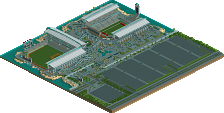
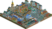
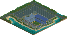
Looks neat from the screens, I don't have rct2 at the mo so I can't really comment. Congrats, though. It looks like it earned it.
I remember the park that you previously made with the coaster just beyond the center field wall. I've always liked that park, although, the name escapes me at the moment.
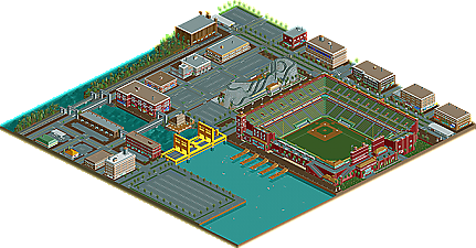
I love all the little details you put into the park and I'm not talking about 1/4 or 1/8 tile work but rather the details that you would find at a ball park (something I really missed with my version). I love the working scoreboard, the bullpens, and misc signage around the park. Now if we could just get those stadium seats in an angled version, we could have some real fun!
Congrats on the CC!
James - rctnw
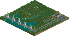
btw - Zodiac - it's not the golden gate bridge but rather the "SUNRISE BAY DRAW BRIDGE".
Todd, that park you are thinking of is Magnolia Gardens.... which is actually the first ever RCT2 park released at NE!
James, thanks for the comments. I obviously took another look at your stadium when building this for some ideas. One thing I did always notice was the little things like you mentioned before..... bullpens, coaches box, signs, etc. And with yours being modern, I wanted classic. And yes, we want diagnol seats!!!!!!!
The red brick look is an eye catcher, giving off that old time look. As Highball said, the dugout could have used more of a roof.. but that's up to personal taste i guess. I liked the fenced windows out in the left field fence, very realistic there, as well as the stadium front windows, near the corporate office.
At first glance of the overview, I wasn't too keen on the yellow bridge. I still feel the same way. Not so much because of the bridge as a structure, it's basically the color. (and that's saying something for me, yellow is my favorite color. it's great for accents.)
The area surrounding the stadium was nicely done, although, I don't get why there are tables on the roofs. Is that so surrounding business owners can watch the game?? If so, it doesn't seem like they are close enough to see anything.
Nicely done, the stadium is near perfect, with loads of details. The sponsor ads on the scoreboard kick. two thumbs up for costco.. had you gone with sam's, I'd a been dissapointed.
p.s. Concerning the lack of responses for the project, welcome to the RCT community of 2008. The game is showing it's age here. It's been almost 10 years!
Edited by Todd Lee, 28 September 2008 - 10:39 PM.
The water feature idea is from Kaufman Field in Kansas City. But that stadium uses the waterfall to a much larger scale.
I wish I could have a mulligan on that bridge to be honest, but oh well.
Tables on the roofs of buildings. Those are just patio tables for residential buildings or if there are a lot of tables, it's just an open air outdoor bar. I've been to these in Charleston, SC and Denver, Co.... Just a great place to drink your beer while getting a good view. And no from the height in this park, you cannot see into the stadium like Wrigley Field.
lol.
edit: Gee from 85% to 55%! Interesting
Not too bad though, overall a 65% to a 55% and probably more accurate as a bronze than a silver.
Yeah but I meant, had it got 65% now, it would be silver, which doesn't seem accurate.
I do the ballpark genre better
I felt like I had seen this before, and felt crazy until I noticed it was over six years old. Kinda surprised at the Bronze but I guess we don't have Concept Creations anymore.