Park / The Ritz-Carlton Five Points
-
 24-May 05
- Views 18,002
- Downloads 328
- Fans 0
- Comments 36
-

-
 No fans of this park
-
 Download Park
328
-
 Objects
94
-
 Tags
Tags


Rog's was simply awesome. The atmosphere, such as foilage, could have been worked on imo, but the structures were faaannntttaassstttiiiicccc. I loved looking at every bit of wall and brick
Great job.
2. what piece were you missing?
and
3.I'm sorry I didn't answer the e-mail, I don't check it that often. I should though.
I agree with the winner here but the hotel isn't that nice.
Good job to rwadams too.
Personally I didn't like any of them much. Non of them had particualarly attractive colors and form in one package. If the purple on rwadams was either the darker one or the bolder richer one I would love it, but as it is I don't really like it. It amost seems like a black and white picture.
Personally I like the ones from last year better, however the first couple weeks are always a bit weak due to rushing.
ride6
Edit: Just so he doesn't feel left out, Mariner's is 100 x 80 x 5.
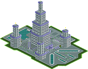
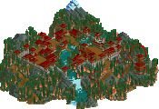
The Ritz-Carlton Five Points by rwadams - Excellent entry but it didn't really hold my attention for too long. It seemed too uniformed and had too much repetition for my tastes, but I can see why it won as it definitely demonstrated your some incredible structure-making skills that you continue to display, roger. Congrats on the qualifying entry, you definitely deserve it.
Hotel and Resort El Mediteranea by magnus - Everything that led up to the hotel was great, but the hotel itself was quite a let down. It looked like an overgrown warehouse and seemed quite rushed. Almost like you spent all your time building the out skirts of the hotel and then realized, "uh oh, I better start building a hotel"
Grand Marquies Hotel and Suites by marinersfan59 - Colors and textures were my favorite aspects of this entry and especially loved the art-deco corner supports incorporated into the hotel structure. The parking lot was very well-done too. However, I didn't like the foliage, monorail or outlying structures surrounding the hotel. Another solid entry.
yyo - sorry, don't have time to get my LL disk out for this one. my apologies.
Hotel d'Amirillo by trav - Well, a nice effort. It seems to me that you tried too hard which lead to an over-symmetrical lump-of-a-building. The balconies and helicopter pad were nice ideas, but execution lacked. I'd try varying your architecture forms more to create more asthetic value in what you present to the viewer to improve. But still, as usual, I appreciate the effort and you've definitely improved from you last work I saw from you.
Xcoaster Offline
I haven't looked at the entries yet, but I will later.
though a 165 x 75 foot pool would be the corect olypic sized one in rct. i'd do that and have a diving well that's 75 x 80 or 85...
Yes. But often times the big picture is boring, and the details are more interesting, and, when that is the case, I look at the details. I found it especially funny that the pool was doubly-olypmic size, and yet, about half as deep as my backyard swimmingpool. That's all. Sheesh.
Besides, how can you not look at the big picture with that entry? I mean, there is no LITTLE picture!
rwadams:
Impressive. I love the theme, it's so different then the usual theme's. The grey mixed together with purple gave it a well captured atmosphere. The structure itself is even better, tall and not blocky at all, you paid a lot of attention to detail and it didn't start to get boring. While is was afraid of that when i first saw the park from the overview, but it turned out great.
Magnus:
Also a very nice hotel, although it was slightly poorer then The Ritz-Carlton Five Points. I enjoyed looking at it, the theme was nice and the architecture was excellent. But something drove me away from the park, i think it's because it was rushed and it was divided into 2 sections...But i still think it's a very nice hotel though, if only you hadn't rushed it then it might have beaten rwadams entry in my eyes. Pitty
marinersfan59:
Nice, especially the structure itself. That showed some skills, it caught my attention, but in the end i think that you didn't pay enough attention to detail (like Metropole has mentioned about the wall's and such...).
Trav:
What was there was nice, but it was extremely little. And the helicopter thing on top of the building ruined it a bit. I'd have suggested a regular roof or a pool, but right now it gave me the feeling of lazyness
yyo:
I have looked at yours as well but i don't know what to think about it really. The little building was good and the foilage too but i didn't really see a hotel. I think that this round wasn't for rct1 since rct2 is a too big competitor because it's so much easier to build massive buildings in such a short time with rct2...
Splash
i started the hotel (main building) when i had like 2 more hours to build. (also had to make staff and shops at that time) didn't even want to do the hotel, but then thought i'd have to make like a main building.
anyways it was very very unfinished and the people who know my plans for the hotel might now that it would have been and easy win (if i had like one more month to work on it)
maybe it was wrong to sent it in, but i really thought it'd have a chance, cause i forgot rwadams also made a hotel. (did he ever mention it in this thread?)
and even if i'm be the Kumba of PT2 i will fight to get my place in PT2.
Thanks for all the comments. I would have spent more time on the surounding area, but I ran out of time. I underestimated the amount of time it would take to do the details on the main structure, and was rushed just to finish what I submitted.
Rog