Park / Silvercity Mine Train

1,093 Comments

This park shares comments with 41 other parks(View Parks)
  • CedarPoint6%s's Photo
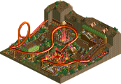
    I didn't get to see OLE's, but overall I'm sorta disappointed. Don't get me wrong- they were all really cool entries, but I was really hoping to see a nice realistic B&M with some cool landscaping and stuff. Chimera came the closest, with a really nice layout, although I always have to cringe when I see a supposed zero-g bookended by turns. Overall, Chimera definitely deserves the win as that had some great atmophere and a nice layout. I liked the dive under that bridge best. That hack in Levis' thing was so cool, although I was highly disappointed with the layout. Of course, you can't do much on a flying boat, I suppose. Still a really nice looking hack and stuff. A strong round all over when it comes to building, I was just kind of disspointed with the lack of a true B&M.
  • lucas92%s's Photo
    Levis@ your hack is freaking awesome, I hope you'll put a tutorial. ;)
    Others entries were awesome too, Pee's one is definatly the best here.
  • tracidEdge%s's Photo
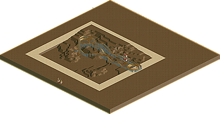
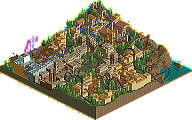
    alright so. judging from the screens only, i'd say this round is seriously not all it's cracked up to be. levis' had that hack, and that's about it. creating a giant ship is pretty neat, but the layout looks extremely weak. ole's entry (PYRO'D HAR HAR), i don't know, it looks unique? i don't know how to explain that one. deano, sorry, but there's no way you should have come in fucking second place with an unfinished entry. and unfinished park, no matter how good, should beat out a completed entry, let alone four of them. you say, Kumba, that you use the idea that the contestant will complete an entry for the event itself contributes to your decision, but you almost let in a person who wasn't able to complete a design in time? other forces aside, that would be pretty fucking hypocritical of you to do that. and as for peee's, it looks extremely juvenile from those screens, both foliage and the layout. i mean, seriously. only interlocking corkscrews and a fucking loop after the mcbr? surely that's not a mid course brake run.

    again, these are all based on the screens, i'll post again with opinions after i look at these in game.
  • PyroPenguin%s's Photo
    I was under the impression Oberon was a completed entry.... the whole area around the coaster is developed with buildings and "landscaped". He purposely chose to leave the land more or less barren and concentrate the foliage in pockets, plus the green plateaus were apparently a somewhat conscious decision. So overall when looking at it in game I never thought for a second it was incomplete, so maybe you want to hold off next time before jumping all over people at a glance.
  • tracidEdge%s's Photo
    well it definitely looks unfinished from here. like that giant vertical slab of land next to the flattened grass. if it was truly what you said, it looks to be a poor cover up for something unfinished. because it definitely looks like a place where he planned to make a building, i know he could have disguised it better.

    also i stated my opinions were from the screens. but i doubt viewing it in game will change my mind on the matter.
  • deanosrs%s's Photo
    It is to all intents and purposes put into a finished state. It is not finished as I would ideally have liked it to have been, but it is most certainly finished in a way that the invert entries were not. I think you should really save your opinions for yourself until they are properly formed from actually bothering to download and view all the entries. Because if you had, you would have seen that I "finished" far more of a map than any of the other entries actually did. I was just more ambitious to start with.

    Edited by deanosrs, 14 June 2007 - 04:57 AM.

  • Peeee%s's Photo
    @tE: Well, I don't think real B&Ms have a longer second part. Most of them only have 2 Corkscrews and 1 or 2 helices. Another point is, that the BBS would work with 3 trains (I just didn't put a Block Brake there, because it took out too much speed). But it looks indeed kinda short, mh..
    But what the hell do you mean with juvenile :<img src=:' />

    Oh, and I also didn't thought deanosrs entry was unfinished...
  • gir%s's Photo
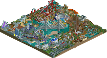
    so in an emergency if the train were stopped, then it wouldn't clear the circuit? also i'm fairly certain that your immelman twists in the wrong direction, unless you're going for something so uncharacteristically-B&M. from what i can see in the screen though, the bridge looks pretty cool.
  • Magnus%s's Photo
    Dive Loop?
    And don't try to tell me B&M doesn't build that element.

    The element built by Peeee is an Immelmann though. Looks almost like the Sheikra one.
  • gir%s's Photo
    err, i'm not sure where you're getting dive loop from. i've said it was an immelmann, as i'm very well aware it is, but you must've read it wrong. the barrel roll twists in the wrong direction. little details like that put me off.
  • geewhzz%s's Photo
    It was obviously built to be an immelmann, the problem is it twists the wrong way.
  • Peeee%s's Photo
    I know it twists wrong, but i think it looks better when the train goes trough it...
  • Magnus%s's Photo
    Thought you were talking about the direction the train enters the whole element ...
    I am with Peeee on that one though. It looks much better in rct like this. When you have the barrel roll to the other direction it is more realistic, but the flow is much better this way.
    If you do not go for something that is meant to be totally realistic I don't see what is wrong with it twisting that way.
  • tracidEdge%s's Photo
    well, deano, i think it could have definitely been pulled off better to look more finished, whether it was or not.

    also, peeee, look at your foliage. it shows no sophistication or care where or what you placed the plants. it's a random assortment of how the fuck ever many bushes you have there strewn about just about every where it could go, aside some patches of grass and the rocks. by juvenile, i meant newb.
  • Panic%s's Photo
    The dive loop/immelman case is one example where I think it's better to just accept the shortcomings of RCT2 in simulating real life. Having the barrel roll go the other way, although it would make the overall element more faithful to real-life standards, would result in the track banking out of the barrel roll then one tile later banking back the same direction, which both looks horrible and would be horrible to ride. What Peeee did makes more physical sense in the game. I think people are also kind of assuming that the barrel roll represents the part where the immelman starts coming back down and curving out of the loop. But it's just a flat barrel roll. An element with a half loop, a flat barrel roll, and a curve out of it in the opposite direction wouldn't be that unrealistic - I think it exists in a few places actually. LL kind of skews over this issue because you don't have the opportunity to bank the turn coming out, so you don't have to worry as much about the banking of the barrel roll and the turn being in the same direction and looking horrible. See, LL can be superior to RCT2. :p

    Honestly, I also think that making barrel rolls face the "right way" in straight-ahead immelmans and dive loops - to the right if the bottom of the loop is one tile to the left, and vice versa - isn't that big of a deal either. Making it face the "wrong way" always looks way better in game. If anyone here surfed coastergames.net back in the day, Nitro2001 did a "wrong way" dive loop in NoLimits one time that honestly looked a lot cooler than an ordinary dive loop. Just think of it as like a fusion of a dive loop with one of Schwarzkopf's so-steep-they're almost-vertical curving first drops.

    Not to complain or anything, but to put this argument in a general sense, the reason why NE coaster building standards have stagnated for the last 5 years is because "as realistic as possible" has become the gold medal, even when surrounded by fantasy theming with continually evolving standards. Always trying for realism prevents innovation and exploration instead of encouraging it. We can be a bit more creative with our coasters too, can't we?
  • Geoff%s's Photo
    ^Agreed.

    And, I just noticed your sig. Hate it.

    edited out.

    Edited by Panic, 14 June 2007 - 01:33 PM.

  • gir%s's Photo
    Panic, I would argue that realism =/= lack of creativity.

    PS: I couldn't find a real-life example of what you're talking about here. I thought it might exist too, but I still think "because it looks better" is a poor argument, either way.

    Edited by gir, 14 June 2007 - 01:36 PM.

  • Panic%s's Photo
    Realism and creativity can definitely coexist. They coexist in those moments where you figure out some hack or trick or arrangement of things that better represents how an element or coaster or something is in real life. And that's fine. But that happens way too rarely to justify everyone stampeding for realism in coasters. Compare one of the hacked realistic rides in SFWOE to Fright Nights. Compare Levis' coaster from this round with what it would have been like if he had followed up the thrill lift with a completely ordinary, mundane B&M layout with theme-park theming instead of interacting with the masts of a ship.

    I would wager that when you leave behind the shackles of "this needs to look as Dragon-Khan-esque or Medusa-esque as possible" and start doing shit like FN and Unexplainable and Magnus' PT2 swan ride and, I dunno, creating a family adventure ride themed to "Over the River and Through the Woods" or something like that, it's not only more creative in overall concept. From my experience, you enjoy doing it about 20 times more. Maybe that's just me.
  • gir%s's Photo
    (Damnit Panic I keep having to refresh with all your edits! :p)

    After I thought about it for a while, yeah, it's just you. And it's also just me. And it's just everyone else, too, because what it comes down to is personal preference.

    I won't ever like fantasy more than realism, because for me, nothing gets me more excited about RCT than imagining how great something would be like in real life. Fantasy doesn't do it for me, but that doesn't mean I don't think fantasy can be great. But when all that is stripped, what is it? Aesthetics? "but i think it looks better when the train goes trough it..."? Well that's shit, but just keep building fantasy, and keep building realism. Whatever the hell it is, someone will probably like it. Don't build something because it looks good though.

    Edited by gir, 14 June 2007 - 02:06 PM.

  • RCTNW%s's Photo
    Even though I strive for a “realistic” look to my parks, I will always lean towards a smooth and flowing coaster layout in the game even if it goes against “real life” examples such as this.

    James - rctnw