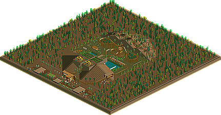
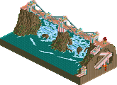
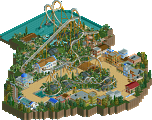
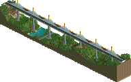
I think 5Dave's was the best, lovely landscaping, brilliantly executed bridge
FKs was my second, I didn't particularly like the colours and style, but the landscaping was pretty good and the stucture and steps were cool
Xin - not enough to it to really contend, the concept was pretty cool, but a lot more could have been done with it.
Chapel - Would have been awesome if you'd had time to complete. You may as well have held it back til the last round and send it in complete. Nice work
Yay, thanks for the great comments in here. Yeah, my entry was kinda small, school is occuping lot of time IMO.
Anyway, here my review of the parks:
Levis: the structure is just too grey, and not enough tall, anyway, something's missing in there. I like the splash down area though.
JK: It's great what you've done here. THis is actually what I call a park, not a prelim. Anyway, you win the spot, so congrats!
Egghead: I really disliked the hack you've done. The boat just doesn't fit in the 'boslegh' track. Also, not enough substance in there. Anyway, I guess you hadn't lot of time to play rct these days, like me...
Strong round this time, I'll have to get my spot with a more serious entry...
J K: Congratulations. Nice entry, albeit a bit long. Loved the atmosphere.
Levis: Lag. Seriously. Unless I can look at your entry in real time, I'm honestly not going to bother. Animated objects should not be overused.
egg_head: Wonderful entry. IMO deserves second place, and is right on J K's heels for first. Most enjoyable rapids ride I've seen in a while.
lucas: Um, where's the rest of the ride? The splash down the temple would've worked well as the climax to a longer ride; as it is, there's really nothing there.
This was one great round. Six entries, 3 of which were very close. Judging from the screens I think I would have gone the same way.
J K- Great entry. Shows a lot of effort and work and has a great feel to it. I like the look of that stadium on the bottom there and the large structure that houses the drop is pulled off very well. I can see how the ride would be a little long but that's just a minor gripe.
Levis- You pretty much know my thoughts on this =). Awesome job and you did that rct3 park justice. Looking at it again I'd say the main thing that keeps it down from first for me is that the whole outpost area just doesn't really come together. You can look at the screen and pick out 10 little things that are really cool (the pumps, turbens, cog wheels, waterfalls, etc.) but when you look at it as a whole, it does feel a little jumbled. I also think a little bit of landscaping would have helped as well. It may have been a little better perched on a rocky outcrop or something.
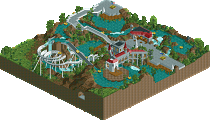
egg- VERY nice landscaping and foliage. Great job there. The station building is great as well along with the other couple of buildings. Everything is pleasantly detailed. Not too much not too little. The ride itself is pretty cool as well, with the bobsled track. A rather unique idea I haven't seen in rct. Too bad the rapids cars don't bank tho . It just wasn't quite big enough to win imo. I hope you have enough time to get another entry in because you're knocking at the door to the PT3.
To the other 3... you guys did well. Don't give up, you had some tough competition here.
Man... I don't envy the one who has to choose the Bonus Spots . Already 3 people worthy of it...
JK: very nice park -for Lol! this is not just a ride, but a complete park-, in your typical style and colours, which have a great atmosphere. Many beautiful details and very beautifully placed as well. yes, I also loved that stadium, and the buildng for the inside part of the ride, and the THIRA-sign on the backside (lovely surprise there was still so much to see on the "backside".) Indeed, ride is a bit long , and I guess the largest part of time will be spend sitting on these two huge lift-hills, but the nice layout and great surroundings outside for sure make up for this A deserved win imo.
Levis: Enjoyed this ride. Many nice founds to be discovered there, and I think I sure would like to ride it. yes, I can see you really tried to use less animated scenery, but it is still a lot. (LoL!) . Does not give me a noticeable lag, just I think 1/3 of it is not necessary. And yes, some landscaping would have been nice....still a very nice entry.
Egg: could not open yours (someting I have to look for into my game, I know), so I'll do with the screen: looking afwully attractive, but also looks if there's a bit too little of it and you needed some more time to really finish it. Like that bobsled idea! Think I would have placed you second however (which would not make any difference for this prelim, but ok!)
The others: either too small (the ride, Lucas) or too unfinished, but not bad attempts at all.
Lucas, you're ride had a unique drop, and the underwater bit was executed nicely. Since it's really just one building, one drop, one of everything, i don't think you had much of a chance of winning though. And the building was, just one color. Mix it up a little!
Egg-head. You're ride had the most potential. The way the slides were created reminded me of my slides way back when, but executed with some beautiful supports, and some lovely foliage. Now the paths weren't necessarily bad, they might even be just as good. But it all just doesn't really fit with each other and come together as a whole. And i know, when you can create something like this, you can do that much better.
Levis.. I detested your entry from the moment i saw it. It's hideous. Even though i'd normally just close rct and load the next one up.. i checked some of the stuff out. Now, there are some nice details there. And some nice executed ones at that. But the overall picture is just too ugly for me, sorry. The second placing, still, isn't that far off. After all, this was the most interesting ride (even though i had to go through a lot of trouble to even look at it). Mmm..
JK- This is stunningly beautiful. So beautiful, that in fact, i agree with you as a winner.. even though there is really nothing there that interests me in the slightest aside from everything looking aestetic. Congrats, though.
Haven't looked because I can't find my rct2 disk, so i'll just comment from the screens. Thanks to whoever put the screens up, please continue to do so.
Bridges - Dave should have won. That kind of landscape is SO hard to pull off, and you did it very well indeed. Not quite perfect, but as close as i've seen for a while. The pink thing didn't interest me in the slightest.
Waterrides - J K, that's beautiful. Really nice, you've come a LONG way. You definitely deserve to be in the PT. Levis, not my cup of tea i'm afraid. Looks too sterile, lacks life. Egghead, very nice again, great idea with the bobsled. It's one of those things where I look at it, and wonder why no one has done that before. It works perfectly.
I think dave and egghead built entries deserving entry in the PT, I hope they get accepted in other rounds or get a bonus spot.
I'm slowly downloading the rides right now (stupid dial-up), but I think I'll take the time to thank everyone for the encouragement. I've been studying different types of archy, and hopefully I've improved.
Like I mentioned before, I will be skipping the inverted coaster round, so that's one less entry everyone will have to worry about.
29thCookie - Great entry. Really liked the foliage. If this was a garden entry, you'd have it, hands down.
Lucas92 - Really good. It reminds me of the Aztec city of gold. How did you get the whole underwater thing to work though. That's pretty cool.
egg_head - Awesome. Loved the custom track for the rapids. What would have been really cool was if you made the rafts tilt as they went around corners. But still, great architecture and great theme!
Levis - Personally, I thought yours was the best. It has a ton of detail (had to wipe off the keyboard from all the drool), and it actually looked "alive." All the moving parts gave it a certain feeling that seperated it from the rest of the entries. Any angle you look at it, theres something nifty to look at, or watch.
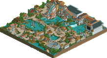
JK - Freakin awesome entry, dude. The architecture was pulled off very well for the theme you were going for. It had kind of a "piratey/atlantis" feel to it. I really enjoyed looking at all of the details that were put into it. You defenitely deserved a spot in the finals. Congrats, and good luck there!
Metropole was right: My entry wasn't nearly good enough to compete, and I'm surprised that Kumba put me at 5th.
Have only had time to look at the top three (sorry to the othersbut time is very limited for me right now)
egg_head - I loved the station and the realistic look to it. I think it had potential but still need a bit more work to it.
Levis - This was one of those hit or miss entries. I did like some of the aspects of the track with the inline twist but overall, it was just not my cup of tea so to speak. I do applaud the effort as it really showed what you can do with the game. Keep it going as I know you will be in the finals!
J K - Nice entry and really enjoyed the look around. The one thing that I was disappointed in was the actual layout as the second lift was a waste IMO and not sure what purpoe it served. With that said, I did like the station work and the drop. Overall, a well deserved win and welcome to the finals!
29thCookie: Way to cramped, but overall, it was okay. Xin: I liked your first prelim entry better, but nice try anyway. Good choice regarding the inverted coaster round. Lucas92: The ride was too short to win, IMO, but the theming was pretty good none the less. I wasn't too fond of the big mass of gold that made up most of the map, but that would have been fixed if the rest was finished. As for the ride shortness, with this length, I would have made this look more like Perilous Plunge. egg_head: This was really good, but I see these prelims as being more like designs with other rides, shops, and such. I think that the ride itself that you built was the best, but the surrounding area is what really seperated this entry from the other two that beat it. And by the way, Xin, you can't make the round boats "tilt." Levis: Not my style, but the 4-D pumps were sweet. IMO, yes, there were too many animated objects. J K: Congratulations! This was, by far, the best entry; I loved the atmosphere! I agree with Emergo about the awesome "backside."
I think dave and egghead built entries deserving entry in the PT, I hope they get accepted in other rounds or get a bonus spot.
I can't agree that egg should have won, it was just way to small and you need to put in more work. Dave is another story, he was like even with FK imo, so I called in Magnus (and actually Jem I was hoping to see you online, but when I saw him on I remembered that he won the round last time so it seemed right + he's stuff which is a must).
I should point out that both 5Dave and egg turned in there entries like a week before there were due. In neither case did it hurt their placement (and I doubt it ever would unless the race is extremely close and even a second judge is stuck), but I do frown on that a little and it is a small thing that I may consider when I judge. Sending it in then it pretty saying "Well I could do more, but here you go". So in the future it's a better idea to hang on to your entires so I won't know that.
OK, that's ridiculous. You should judge an entry objectively. What if they had to go away for a week, and so turned it in before that? You should really think about what you say sometimes.
And I never said Egghead should have won, I didn't think that either. I just think the quality of his entry is on a par with a parkmaker's quality, therefore I hope he gets in some other way.
Thanks Turtle, from you that means a lot. I think I can get in somehow so don't you worry. I already have pretty cool plans for the actual PT3 park. Even if I don't get in I might use the bench to make a decent sized solo out of it. Thanks for the reviews of my waterride everybody. I'll use them to improve on certain aspects. BTW: I made a logo for mine and told Kumba to include it to the zip but he forgot. I'll just post it here:
or thinks it done and sends it in so he can work on other things (like a next prelim or a solo) without being distracted all the time by this finnished park which is laying there and makes you think if you forget something ....
Whatever, im not saying it's going to hurt anyones chances, coz overall it's like 1% of what goes into my decision, but if you don't give me the chance to think your being lazy then bam your prelim is 1% better
1,093 Comments
Metropole Offline
I think 5Dave's was the best, lovely landscaping, brilliantly executed bridge
FKs was my second, I didn't particularly like the colours and style, but the landscaping was pretty good and the stucture and steps were cool
Xin - not enough to it to really contend, the concept was pretty cool, but a lot more could have been done with it.
Chapel - Would have been awesome if you'd had time to complete. You may as well have held it back til the last round and send it in complete. Nice work
Will take a look at the water rides in due time.
lucas92 Offline
Anyway, here my review of the parks:
Levis: the structure is just too grey, and not enough tall, anyway, something's missing in there. I like the splash down area though.
JK: It's great what you've done here. THis is actually what I call a park, not a prelim. Anyway, you win the spot, so congrats!
Egghead: I really disliked the hack you've done. The boat just doesn't fit in the 'boslegh' track. Also, not enough substance in there. Anyway, I guess you hadn't lot of time to play rct these days, like me...
Strong round this time, I'll have to get my spot with a more serious entry...
ACEfanatic02 Offline
Levis: Lag. Seriously. Unless I can look at your entry in real time, I'm honestly not going to bother. Animated objects should not be overused.
egg_head: Wonderful entry. IMO deserves second place, and is right on J K's heels for first. Most enjoyable rapids ride I've seen in a while.
lucas: Um, where's the rest of the ride? The splash down the temple would've worked well as the climax to a longer ride; as it is, there's really nothing there.
Will look at the others later.
-ACE
Levis Offline
hey, I used less animated objects than last time ... and its still to much ?
Louis! Offline
J K
Levis
egg_head
Milo Offline
This was one great round. Six entries, 3 of which were very close. Judging from the screens I think I would have gone the same way.
J K- Great entry. Shows a lot of effort and work and has a great feel to it. I like the look of that stadium on the bottom there and the large structure that houses the drop is pulled off very well. I can see how the ride would be a little long but that's just a minor gripe.
Levis- You pretty much know my thoughts on this =). Awesome job and you did that rct3 park justice. Looking at it again I'd say the main thing that keeps it down from first for me is that the whole outpost area just doesn't really come together. You can look at the screen and pick out 10 little things that are really cool (the pumps, turbens, cog wheels, waterfalls, etc.) but when you look at it as a whole, it does feel a little jumbled. I also think a little bit of landscaping would have helped as well. It may have been a little better perched on a rocky outcrop or something.
egg- VERY nice landscaping and foliage. Great job there. The station building is great as well along with the other couple of buildings. Everything is pleasantly detailed. Not too much not too little. The ride itself is pretty cool as well, with the bobsled track. A rather unique idea I haven't seen in rct. Too bad the rapids cars don't bank tho . It just wasn't quite big enough to win imo. I hope you have enough time to get another entry in because you're knocking at the door to the PT3.
To the other 3... you guys did well. Don't give up, you had some tough competition here.
Man... I don't envy the one who has to choose the Bonus Spots . Already 3 people worthy of it...
Emergo Offline
JK: very nice park -for Lol! this is not just a ride, but a complete park-, in your typical style and colours, which have a great atmosphere. Many beautiful details and very beautifully placed as well.
yes, I also loved that stadium, and the buildng for the inside part of the ride, and the THIRA-sign on the backside (lovely surprise there was still so much to see on the "backside".)
Indeed, ride is a bit long , and I guess the largest part of time will be spend sitting on these two huge lift-hills, but the nice layout and great surroundings outside for sure make up for this
A deserved win imo.
Levis: Enjoyed this ride. Many nice founds to be discovered there, and I think I sure would like to ride it. yes, I can see you really tried to use less animated scenery, but it is still a lot. (LoL!) . Does not give me a noticeable lag, just I think 1/3 of it is not necessary.
And yes, some landscaping would have been nice....still a very nice entry.
Egg: could not open yours (someting I have to look for into my game, I know), so I'll do with the screen: looking afwully attractive, but also looks if there's a bit too little of it and you needed some more time to really finish it. Like that bobsled idea! Think I would have placed you second however (which would not make any difference for this prelim, but ok!)
The others: either too small (the ride, Lucas) or too unfinished, but not bad attempts at all.
Thanks all for your time and work for these.
Emergo
Evil WME Offline
Lucas, you're ride had a unique drop, and the underwater bit was executed nicely. Since it's really just one building, one drop, one of everything, i don't think you had much of a chance of winning though. And the building was, just one color. Mix it up a little!
Egg-head. You're ride had the most potential. The way the slides were created reminded me of my slides way back when, but executed with some beautiful supports, and some lovely foliage. Now the paths weren't necessarily bad, they might even be just as good. But it all just doesn't really fit with each other and come together as a whole. And i know, when you can create something like this, you can do that much better.
Levis.. I detested your entry from the moment i saw it. It's hideous. Even though i'd normally just close rct and load the next one up.. i checked some of the stuff out. Now, there are some nice details there. And some nice executed ones at that. But the overall picture is just too ugly for me, sorry. The second placing, still, isn't that far off. After all, this was the most interesting ride (even though i had to go through a lot of trouble to even look at it). Mmm..
JK- This is stunningly beautiful. So beautiful, that in fact, i agree with you as a winner.. even though there is really nothing there that interests me in the slightest aside from everything looking aestetic. Congrats, though.
Turtle Offline
Bridges - Dave should have won. That kind of landscape is SO hard to pull off, and you did it very well indeed. Not quite perfect, but as close as i've seen for a while. The pink thing didn't interest me in the slightest.
Waterrides - J K, that's beautiful. Really nice, you've come a LONG way. You definitely deserve to be in the PT. Levis, not my cup of tea i'm afraid. Looks too sterile, lacks life. Egghead, very nice again, great idea with the bobsled. It's one of those things where I look at it, and wonder why no one has done that before. It works perfectly.
I think dave and egghead built entries deserving entry in the PT, I hope they get accepted in other rounds or get a bonus spot.
FullMetal Offline
Like I mentioned before, I will be skipping the inverted coaster round, so that's one less entry everyone will have to worry about.
FullMetal Offline
29thCookie - Great entry. Really liked the foliage. If this was a garden entry, you'd have it, hands down.
Lucas92 - Really good. It reminds me of the Aztec city of gold. How did you get the whole underwater thing to work though. That's pretty cool.
egg_head - Awesome. Loved the custom track for the rapids. What would have been really cool was if you made the rafts tilt as they went around corners. But still, great architecture and great theme!
Levis - Personally, I thought yours was the best. It has a ton of detail (had to wipe off the keyboard from all the drool), and it actually looked "alive." All the moving parts gave it a certain feeling that seperated it from the rest of the entries. Any angle you look at it, theres something nifty to look at, or watch.
JK - Freakin awesome entry, dude. The architecture was pulled off very well for the theme you were going for. It had kind of a "piratey/atlantis" feel to it. I really enjoyed looking at all of the details that were put into it. You defenitely deserved a spot in the finals. Congrats, and good luck there!
Metropole was right: My entry wasn't nearly good enough to compete, and I'm surprised that Kumba put me at 5th.
RCTNW Offline
egg_head - I loved the station and the realistic look to it. I think it had potential but still need a bit more work to it.
Levis - This was one of those hit or miss entries. I did like some of the aspects of the track with the inline twist but overall, it was just not my cup of tea so to speak. I do applaud the effort as it really showed what you can do with the game. Keep it going as I know you will be in the finals!
J K - Nice entry and really enjoyed the look around. The one thing that I was disappointed in was the actual layout as the second lift was a waste IMO and not sure what purpoe it served. With that said, I did like the station work and the drop. Overall, a well deserved win and welcome to the finals!
James - rctnw
disneylhand Offline
Xin: I liked your first prelim entry better, but nice try anyway. Good choice regarding the inverted coaster round.
Lucas92: The ride was too short to win, IMO, but the theming was pretty good none the less. I wasn't too fond of the big mass of gold that made up most of the map, but that would have been fixed if the rest was finished. As for the ride shortness, with this length, I would have made this look more like Perilous Plunge.
egg_head: This was really good, but I see these prelims as being more like designs with other rides, shops, and such. I think that the ride itself that you built was the best, but the surrounding area is what really seperated this entry from the other two that beat it. And by the way, Xin, you can't make the round boats "tilt."
Levis: Not my style, but the 4-D pumps were sweet. IMO, yes, there were too many animated objects.
J K: Congratulations! This was, by far, the best entry; I loved the atmosphere! I agree with Emergo about the awesome "backside."
-disneylhand
Kumba Offline
I can't agree that egg should have won, it was just way to small and you need to put in more work. Dave is another story, he was like even with FK imo, so I called in Magnus (and actually Jem I was hoping to see you online, but when I saw him on I remembered that he won the round last time so it seemed right + he's stuff which is a must).
I should point out that both 5Dave and egg turned in there entries like a week before there were due. In neither case did it hurt their placement (and I doubt it ever would unless the race is extremely close and even a second judge is stuck), but I do frown on that a little and it is a small thing that I may consider when I judge. Sending it in then it pretty saying "Well I could do more, but here you go". So in the future it's a better idea to hang on to your entires so I won't know that.
Turtle Offline
And I never said Egghead should have won, I didn't think that either. I just think the quality of his entry is on a par with a parkmaker's quality, therefore I hope he gets in some other way.
egg_head Offline
Thanks for the reviews of my waterride everybody. I'll use them to improve on certain aspects.
BTW: I made a logo for mine and told Kumba to include it to the zip but he forgot. I'll just post it here:
geewhzz Offline
Kumba Offline
Levis Offline
Kumba Offline