Park / valhalla
-
 01-December 08
- Views 5,513
- Downloads 942
- Fans 4
- Comments 18
-

-
 76.82%(required: 65%)
 Design

Fr3ak 90% geewhzz 90% Xcoaster 85% 5dave 80% FullMetal 80% Magnus 80% posix 80% zodiac 80% chapelz 70% Milo 70% CedarPoint6 65% Evil WME 65% RCTFAN 55% 76.82% -
4 fans
 Fans of this park
-
 Full-Size Map
-
 Download Park
942
-
 Tags
Tags
![park_4074 [H2H8 R1] Wit's End](https://www.nedesigns.com/uploads/parks/4074/aerialt3814.png)
![park_3341 [H2H7 R2] Carreira da Índia](https://www.nedesigns.com/uploads/parks/3341/aerialt2950.png)
I thought this was excellent none-the-less, though I'm still waiting on that solo of yours.
anyway, rrp, i'm very glad to see a really legendary old name can still amaze today. thanks a lot for your contribution.
Kevin Enns Offline
deleted
Edited by Kevin Enns, 29 September 2017 - 10:52 AM.
Kevin Enns Offline
deleted
Edited by Kevin Enns, 29 September 2017 - 10:52 AM.
That's how it should've been posted.
And kinda dissapointed. I was thinking it'd be the wooden coaster he showed off last month.
Corkscrewed Offline
Maybe I should go work on WDE or something.
Nicely done, RRP. Classic work. Nothing too moldbreaking, but just flat out quality.
Thats been submitted,just waiting to see if its won an accolade
Cheers,this was kind of a learning curve for me again so im glad you've noticed the main thing i was trying to achieve with this design
I totally fell in love with the water coaster going trough the banked turn
with the bobsled coaster round it, beautiful!
Congrats on the win!
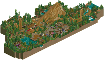
The supporting rides were really nicely done too. Good custom flat. And simulator. And the drop tower was very well presented; you took a ride which is traditionally hard to theme and made it look really great. The archy is just how I like it - conveys a theme, has style, but is realistic for a theme park and not over-detailed. Particularly liked how you 'covered' some of the stalls and incorporated them into the buildings; the gift shop for example. The pub/ale house was cool too. As already mentioned, the 'negative space' is pulled off very well too. I think that's the main point I'm driving home really in this 'review'; whilst the ride is really good and fun to watch, the stand-out feature of the whole map is the general presentation and execution.
nice to see you back at it an doing as usual, nice work. what i can get from the screens looks very nice, quaint an all about the ride.
This was overall an amazing piece of work. The atmosphere, the ride itself, the architecture, the foliage, everything just felt so damn real. I could easily see this being part of a much bigger park. If you could do this on a large scale park it could be quite possibly the best piece of work RCT has ever seen. The use of negative space and sprawling foliage were just amazing, even more well done on Castle Howard. One thing I was curious about was the woody, it seemed to be an out and back with the turnaround where you put it, yet the path that leads off to the rest of the park don't go anywhere near it. Probably minor, and you didn't really think about it when building it.
With that being said, I felt a bit let down by The Fun Factory especially after having seen these two most recent designs from you. My guess is that these designs were started after that park was well underway. I just didn't get as excited when viewing that park, maybe it was because it was unfinished, I don't know. Parts of it were good, though, and I might put my comments in that topic later.
I'm really eager to see what you have going now...
Im glad everyone seemed to like at least some parts of this design.Im sorry you werent that keen on the fun factory though gee.As you said i did start it long before i did both of these designs and in turn was no where near as experienced with the game as i feel i am after these smaller efforts