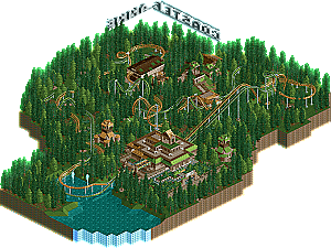
Park / Ares vs. Appollon
-
 28-June 07
- Views 939,936
- Downloads 627
- Fans 0
- Comments 1,093

-
 No fans of this park
-
 Download Park
627
-
 Tags
Tags
 28-June 07

 No fans of this park
 Download Park
627
 Tags
Tags
 Similar Parks
 Members Reading
I really enjoyed the entries. Each one was really unique.
Xin, nice effort, and I'm sure you'll get better eventually, even though the bridge wasn't bad at all.
FK, how does it feel to have a guaranteed spot in the finals so early?
5dave, you prolly know what I think. Excellent job.
but I want to say congrats to FK already
to bad you didn't win dave but I'll guess you had planned that a bit already
btw: good to see that the fantasy is winning ground again
congrats to all that entered. loved the bridges.
5Dave-your bridge was just so detailed and well constructed. all of the parts fit very well. it looked very realistic and very modern architecture-ish. i loved the supports as well as how you managed to vary each with different piece configurations holding them together. great work.
Xin-your bridge defintly had alot of atmopsphere. but it was almost boring. lots of red and black. for your bridge you had nice structure but you lacked detail. you buildings were nice but they could have been elaborated on much more with windows, layering, and deco blocks. i agree with peee that the gliches chould have been avoided. good work overall though
Chapelz-your bridge was very black. i felt it had a nice structue and a great feel to it but it lacked detail on the main beams for support. you had some detail here and there that worked nice. i loved the moving signs with colored arrows. just so cool!! i thought the bridge looked nice but just needed to be refined more. Good Work altogether!!
again congrats
And Question-Kumba can i continue to enter in the prelims even though i already got into PT3?? ive already started on a water ride and was just wondering??
FK+Coastermind
Really not much point in doing one tho. Insted finish what your doing and send it in for design. There will be something much more useful for you too do soon anyways
FullMetal Offline
5Dave -- Awesome. I love the way it looks! It's just so real!
Xin -- I gave my best effort, and placed third. I'm happy with that. I'll hopefully do better next time.
Chapelz -- You probably would've stomped my ass if you're bridge was finished. It's really nice though.
Great job everyone!
Thanks Fisch!
FK+Coastermind
I liked all 4 bridges, and I think it's nice to see they all have a different style, where judging could be very hard, as it's based on personal preference in the end..
FK: Although fantasy isn't really my thing, I kinda like what you have going; Lots of nice bright colors and details.. What I dislike were those landblock arches which had to support the main bridge structure.. Now it's kinda semi-fantasy/or semi realism, and looks like you couldn't make a choice which way you want to go... Anyway nice job and congrats getting in the PT!
5dave; As usual, very nice work.. I'm sure you will get in with another round if you have the determination.. I really like the realistic touches on the bridge, such as the walkway down, the supporting job, landscaping, and details here and there.. Maybe the one-sided/monotonous upper part of the bridge brought it down a notch, but imo it's on the same level as FK's..
Xin: I always love to see horror themes, so automatically I liked your bridge
Chapelz; You really seem to be a productive guy; recently won RU and now this bridge. Somewhat small in comparison with the other entries, but quality wise, it was right up with the others.. Really misses out in the color departmant, but I love the landscaping.. The grassy hills make for a nice realistic quaint setting.. Also like the touch with the scrolling signs.. Overall good job, and I'm sure you'll get in with another entry if you want to..
Great start of a new PT season!
SF
5Dave - Even though you didn't get the win, I would have given yout he nod on this one. This reminds me a bit of my entry from last year in that you were going with massive scale and ultra realism. I can appreciate the effort it took to do those supports over and over and over again. I have a question as to what was your insperation for this bridge? I remember seeing a mega bridge on the discovery channel but I don't remember where it was in real life. The landscapping and general idea is spot on with what I saw on TV. If we are thinking the same thing, well done indeed.
xin - Not bad for what it was and it did fit the theme you were going for. The problem is you need to step it up here and take the detail work to another level. Keep at it though
Chapelz - This had potential and I would have loved to see the final version. I liked the moving light work on the side of the bridge. Hope to see more from you.
Again congrats to FK. Even though I would have placed you second this round, it would have been a very very close second.
James - rctnw
Chapelz: your bridge was looking pretty good; I liked the structure...it's a shame you couldn't finish it.
Xin: maybe some more details would have helped, but I think it's a good start.
5dave: well, you know my thoughts...I think that the structure is amazing and I really like the modern feel. Maybe, it was a little bit repetitive so heh, but it showed effort by you.
FK: Congrats man!
Anyway, congrats to FK for being the first non-parkmaker who gets into the PT3 and good luck to the other contestants in the rest of the prelims; keep going guys, and keep doing your best
Anyway, congrats to FK for getting in.
Edit: I'm 90% sure last PT's prelims had their own topics... that works better imo.
Then again, I also find FK's bridge substandard. It's much too overwrought with detail for that style of bridge. That's amplified by what I have to say is a retina-searing color scheme. If you're going to use bright colors, use them as accents. The base scheme should always be toned down.
5dave's entry was the best, IMO, but it still didn't wow me. So much more could be done with it.
...shit, I'm turning into Posix.
-ACE
Thanks for all your replies!
@RCTNW: Indeed, the bridge is inspired by the "Viaduct de Millau", glad you recognised it
FK: Your bridge was very charming and detailled. The colours were a bit much I think, and I'm not quite sure how the cannon in the underground works... But it deserved the win - a very nice fantasy bridge.
Xin: I was positively surprised by your entry. The whole fire-river was very cool and must have been very time-consuming
Chapelz: I like the modern touch the bridge has. The screens you've shown really look the same. It was a bit black and unfinished, as you said - would love to see it finished though.
It was a great round, thanks to all my opponents
"MFG"
@ dave -> you know what I think about your bridge
@ Xin -> I couldn't open yours because you didn't export your scenery and I dont want to download the DP scenery again ....
@ Chapelz -> you need my diagonal sloped building blocks for those things I think
Congrats FK too.
In opening the map I was a bit shocked at the colour
5Dave: great bridge also. I loved how you chose a very modern and stylish one for your inspiration, and I think I know how difficult they are to represent in RCT (tried a bit of that in Azuris City, and it by far did not turn out how I wanted it to be..).
"The Viaduct" lacked a little something on which I still cannot put my finger upon (Lol!! can just use a few of my fingers yet, so that must be it!!), but nevertheless a fine piece of work also, must have been a close call to decide.......
And please, do at least another prelim, I'm sure you'll get in and you doubtlessly deserve that and can do it (MFG
Chapelz and Xin: I could not open both of your entries. Both lacked the same object for me and I fear that might be due to cleaning up my ObjData months ago before my hit. Will go and fix it and have a look at it later. (That pics of the bridge of your inspiration look awesome however, Chapelz)
Lots of fun and luck to everyone who'll make an entry for the still-to-come prelims!
Emergo.
And for the ones who need screens I'll do the 2 that I could view:
FK+Coastermind: The bridge to Crystaria:
5dave: The Viaduct:
FK- I really like that bridge man and a deserved win... the colors are fine to mean and i love the stairs up to it and the overall structure....great little details as well. I would have loved to face this one =P
5Dave- I just love the setting for it... great job and it was pretty much a toss up between the realistic and fantasy bridge for me. Hopefully you'll get in on another round.
Xin's entry (thanks to liam voor making the screen).
I don't like this entry that much... the landscaping is very blocky and the archy doesn't appeal to me that much either