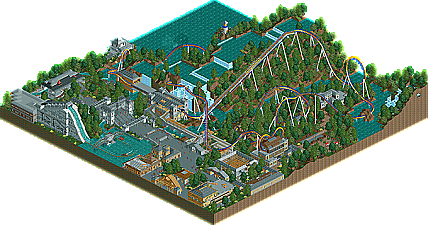
Park / Endareau
-
 12-June 07
- Views 939,936
- Downloads 544
- Fans 0
- Comments 1,093

-
 No fans of this park
-
 Download Park
544
-
 Tags
Tags
 12-June 07

 No fans of this park
 Download Park
544
 Tags
Tags
 Similar Parks
 Members Reading
I should get the results up tonight or tomorrow night (my first day of Summer classes starts tomorrow).
Now let's see what I got...
Did you get my submission from krohn@krohnindustries.net?
Expect the results in about 24 hours guys. I am sorry for the delay, but I needed a break
FullMetal Offline
EDIT: Never mind- I'm working on a ride for the 'any of the above' round.
Edited by RaPiPo, 28 June 2007 - 10:33 AM.
Best Dueling Coasters
A surprisingly strong round this week. In the end a rush of entires can't top one I received about a month ago from 5Dave. Dave shows out with the most solid entry featuring a wonderful duel, great timing, awesome theming and some very nice buildings. Splash-0 pulls out a second place finish with an awesome yet a little to D&D and Gotheberg influenced entry. Great work, maybe the best second placer yet, however the dueling elements were just not as strong as Daves. Pineapple lands in third with a surprisingly good entry. Very nice work on the layouts, supports and theming, however the pacing was bad, the map looked fairly unfinished and the water ride altho pretty good can't be judged. Our forth place entry was not made by a girl. It was made by CoasterAnne, but even tho the duel was decent the trees hurt the entry badly. Lastly we have X_Fusion who shows up with an odd n00bish looking entry, but shows a few good ideas. Great round guys, and good luck to 5Dave in the PT3 Finals!
1. The Breezing Spirits by 5dave
2. Jaguar by Splash-0
3. Dueling Dragons: Lustria by Pineapple
4. Ares vs. Appollon by CoasterAnne
5. Dueling Park by X_Fusion
Next will be the bonus round and I am expecting some pretty nice entries
Preliminary Rounds - Due Date:
FK+Coastermind Created The Best Bridge (May 14)
J K Created The Best Water Ride (May 21)
Geoff Created The Best Inverted Coaster (May 28)
Ling & Vekoma9 Created The Best Wooden Coaster (June 4)
Peeee Created The Best B&M (June 11)
Deanosrs Created The Best Adventure Ride (June 18)
5Dave Created The Best Dueling Coasters (June 25)
Create Any of the Above, a.k.a. "The Bonus Round") (July 2)
Wildcard! Create anything you want (July 9)
disneylhand Offline
-disneylhand
Edited by disneylhand, 20 December 2007 - 03:43 PM.
Splash-0's was too short although had the best themeing imo, Pineapple's had a nice layout but I didn't really get the themeing, CoasterAnne is getting better but needs to have some ideas to put into the game, rather than just churning out ride after ride of tt eaved stations and over treed rides.
Right off to work... congrats 5Dave, you are a skilled parkmaker but you'll need some better ideas to place high in the pro tour.
It was just an incredibly - and I do mean incredibly - unoriginal entry. I enjoy seeing little personal touches in RCT parks, things like DRC's parkmap, or custom stuff build with trakitecture, of stuff that can't be categorised... just new ideas that push the limit of the game. I look at this, and although I can appreciate it is built by someone who most definitely knows their way around the game.... it doesn't inspire me at all in the way something made by cBass or Phatage would.
Pineappel's entry was a nice surprise to me, I really liked it. Somehow looked like something Geoff would pull off. But the thing that I liked the most about your entry was the theming and not the layout itself, so that was a little disappointing. But overall a good entry.
Coasteranna, please do not tree you entry because it makes it look boring and uninspiring even though the layout was not that bad at all. You had some nice dueling elements which were nice to see and showed some skills, but the flat ground with trees just brought it down for me.
X fusion's entry would have been better in my opinion if he had used the compact inverted coaster instead of the one he used now. Next time do not add so many straight parts to your layout because it is not really fun to watch and to ride as well. But well it showed some nice ideas and I think that you have potential. Keep building!
I'm not 100% happy with my own entry layout wise. I built it too quickly and lacks the real dueling action...When i started it i didn't know exactly what i was going for and well yeah it shows that. Plus the fact that i haven't played the game in a long time so i had to get back into rct. I might enter the bonus round as i started something already but time is short.
Thanks for all the comments so far!
@deano: Sorry that the entry was too unoriginal to you. I must agree to r_e though. Only 1 building in the queue doesn't serve any purpose, all others do, though. Maybe you didn't catch all the details though. The ride had many "personal touches" I think. I'm just not a fan of trackitecture and stuff like that. I prefer more clean, realistic and not uber-hacked parkmaking. The finals entry will be much better, I promise
@Splash-0: Thanks for your comment. I really liked your ride. I got pretty nervous when I saw your post that you'll join this round too.
The entries:
Splash-0:
I like the whole look of it, gave a nice fresh medieval feeling. Although the coasters were a bit too much "Duelling dragons"-like. Not a bad thing, but I think duelling inverted coasters in a medieval theme were done so many times before. The coasters layout wasn't the best either. There weren't many near-misses and it seemed a bit rushed, as you said. But I like that symmetry-part. Must be very aesthetically to see in real-life. I really liked your entry nontheless. So please enter another round
Pineapple
I saw some screens of your coaster before. You're really improving very fast, that's also why we accepted you in Majesty
CoasterAnne
Very dense forest you have there. You should use more different trees and maybe you could add more open areas too. I looked messy somehow. You have these crazy quarter-tile buildings but you can't see them properly because it's all brown and green. And the trees are blocking the view. The layout was nice, although very slow in most parts. I liked that trick-track track(?) at the end of the ride. Hope to see more entries from you, though.
X-Fusion
Not much to comment there. It has only one near-miss, but the coaster is neither synchronized nor duelling. But you've got some nice ideas, like the terraced park layout and the greenhouse. So keep improving!
"MFG"
Oh, and what happened to Krohn's entry?
Edited by deanosrs, 29 June 2007 - 10:27 AM.
Deano – Most of the time I totally agree with your comments however I have to disagree with you on this one. Inspiration comes in many different forms and will differ from person to person. What you may not see as inspirational may infact be very inspirational to someone else. I for one found the layout very inspiring to me as it had been awhile since I saw a really good dueling coaster and one I could see in any real world park. Yes the themeing was nothing earth shattering or gimmicky but it was very solid in execution IMO. Although I agree that the “WOW” factor parks are not around as often as they once were back in the prime of NE, entries like this are though appreciated and can have that “WOW” factor to some. Besides, bottom line is as long as the Parkmaker is proud of it, what else really matters.
James - rctnw
5Dave deserves the win because his theming was the best of all the entries. None of these layouts were good.
His layout was very strong with excellent timing and some nice elements. The surroundings were generic, but decent in which there was nothing really outstanding to comment on.
I could tell Splash-O's was rushed, for it was a bit of a disapointment for me, because he is an underappreciated parkmaker around here ... Port Azure was an awesome park. Anyways, the layouts weren't as good as his layouts usually are, but the theming was nice and had more atmosphere than 5Dave's.
Honestly, I didn't look at the other three, but I don't think there should be any controversy in this round.
Edited by Jazz, 29 June 2007 - 01:56 PM.
5Dave- I really liked this one. Great layout, theming, archy, and all that junk. I disagree that it is like Chimera. I think. I can't really remember Chimera.
Splash-O- your entry gave a good atmosphere, but there wasn't many buildings and so I couldn't really judge your archy. Otherwise, it was a bit slow at times, but still pleasant.
Pineapple- I think yours could have placed second if it wasn't so unfinished. I also think those castles and spires clashed with your other theming and brought it down a notch. Otherwise, I wish I could make that. I really need to practice.
Coasteranne- Yes! No invert or B&M! Thank you! It was very nice, but slow at times. The trees greatly brought it down, but there were little details and ideas that really looked nice and I think that you are a very underrated parkmaker. But why are you 'Anne' if you're a boy?
X Fusion- looks like my old stuff. If the layout was better, it would really impact your entry. Otherwise, the archy was blocky and sort of ugly, although you had a pretty good roof selection. I've always been big on roofs.
One or two of the buildings were pretty well-done, but the coasters, landscaping, and general atmosphere were very, very bad. Sorry. 3/10
Dueling Dragons-Lustria
Scenery wasn't great, the rides only dueled two or three times, and the supports weren't as good as I had hoped. However the burned-down church-like building for the station was awesome. +3 for that. 5/10
Ares vs. Appollon
Awesome dueling, pretty nice architecture (although it's the same as your previous stuff), and some cool layouts. Unfortunately, the foliage and repetitiveness of your archy brought this entry down a bit. 6/10
Jaguar
Awesome timing, good theming, and great supports. Unfortunately the atmosphere lacked just a bit. Pretty good, but fell short of amazing. 8/10
The Breezing Spirits
Lovely queue, ride looks like a lot of fun, and the architecture shows a lot of talent. This entry is a well-deserved first place. 9.5/10