- Views 18,921
- Downloads 2,264
- Fans 2
- Comments 37
-
-
 85.63%(required: none)
 Design

inthemanual 95% robbie92 90% Xeccah 90% 5dave 85% Austin55 85% Cocoa 85% Liampie 85% MCI 85% Stoksy 80% Poke 75% 85.63% -
2 fans
 Fans of this park
-
 Full-Size Map
-
 Download Park
2,264
-
 Tags
Tags
![park_4178 [H2H8 Grand Finals] Heaven's End](https://www.nedesigns.com/uploads/parks/4178/aerialt3929.png)
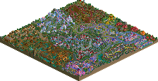
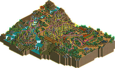
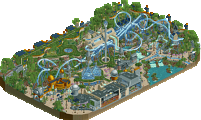
geewhzz is really becoming a parkmaking force here at NE. It started with his amazing work in H2H4 that was strong enough to make him an MVP candidate in his rookie season. Then he showed even more impressive work a few months ago when he landed an NE design with Kindred. Now he's back with Salga, an amazing B&M Flyer that puts him into the PT3 Finals.
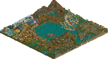
This Fisch guy really is making a hell of a late push to go into the PT3 has one of the top non-NE Parkmakers. Not only does he get an NE design today, but he also lands an SRU with a club park he was involved in. Anyways now he shows up and brings something to the table that has been experimented with many times, but never pulled off quite this well. Buccaneer is a B&M that is built without any custom scenery!
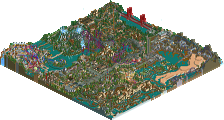
This guy again? Was int that just a fluke when he won a few months ago? Well it seems this DelLagos fellow really has some talent as he sneaks in and grabs not only an NE Design, but one of the last spots in the PT3 Finals. This time he brings us Yggdrasil, which my just be the most fugly word ever, but (unless wikipedia deceives me) actually refers to a mythological ask tree.
More updates coming soon!
Buccaneer was great and I loved the fact that it was so nice and yet just default scenery
Salga was supportafied(making up words here) a bit full of itself. It was really good just seemed to be too many supports and a lack of foliage. But still good..
Overall Buccaneer was my favourite:)
Bucanner- this was really cool. It had a great layout except the very end. It was a bit slow, but overall those supports are extremely original. Good use of scenery fisch.
Salga- I was hoping more from you Geewhzz. Kindred was a 1000 times better than this. This had an ugly color, but I loved that Tatsu type turn on that hill. I also loved that station, the bathroom and that pretzel. the rest was not your best. It was good, but those parts I just mention, brought my attention the most.
They all look very good (especially excited about Salga). Will check them out after I get through the recent topics.
disneylhand Offline
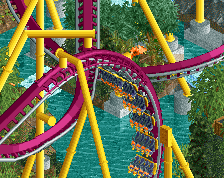
Salga: By far the best of the three designs, IMO. There were fantastic details everywhere, making this one of the most realistic rides I have ever seen built in RCT2. I did, however, find that the immense detail made it hard to look around for me; it would be a much better experience from a guest's point of view. The layout was quite good and looked fun to ride. You didn't just recreate elements from previously built flyers from real life, which I have been told is a good thing. I don't think I ever have seen so many steep turns on any coaster-ever. And I never would have guessed that I would see so many on a flying coaster
Buccaneer: I understand that making a design-quality park without custom scenery is considered by many at this site a feat, but I have yet to figure out why somebody would choose to inflict those restrictions upon them. To me, it surely does not look any better than a 'normal' park... Well, I think I've said enough, as it seems to be a matter of opinion. I still think that you had a good concept and layout, but I feel that you weren't "building to your full potential", if you will.
Yggdrasil: This one, I personally did not care for. The layout seemed quite funky, some supports did too. The block brake killed nearly the entire ride. Yes, the jousting arena was very good, but I feel that it wasn't innovative enough; and almost many could make the same thing, if not a better version. The underground cave/dragon area was done poorly, and what was that random piece of track scenery? It did nothing for me, and actually took away from the overall experience. Although the bulk of this park did not fit design standards in my eyes, I do see why other aspects pulled it through to gain the award it received.
Good luck in the PT3 all of you. I look forward to seeing your entries.
-disneylhand
A true flyer shouldn't spend pretty much all of it's time in the flying position? What bullshit.
Salga was one of the best coasters I've in-game for quite some time. The attention to detail that geewhzzzz has is a million to none. I can barely comprehend the majority of the details in any one angle of any spot of architecture or coaster. Seriously people, of all the "realistic" parkmakers he's my absolute favorite because he actually makes it look good in the game while also giving everything he touches the "imagine yourself standing in it" quality. I like the unconventional color scheme; most real coaster have cartoony colors. SO WHAT!?
Anyway I'll get to the other designs tomarrow; if I feel like it.
Ride6
ps- Where's my pro tour 3 bench!? I've been ready for it for the last week!
I was saying that there was no point in which it was in lieing position... It may as well have been an invert
But bear in mind I've only ridden air...
And now I just looked at a few real life ones... and see that they are just as boring, always in flying mode
Edited by JJ, 11 July 2007 - 12:27 AM.
Havent checked out the other 2 yet. Im willing to bet they wont touch Salga, but Ill wait until Ive seen that too make up my mind.
And I wasn't complaining about supports! They were excellent, I just didn't like it because that is all the coaster seemed to be, supports, I could barely see the ride.
Edited by JJ, 11 July 2007 - 12:59 AM.
Fatha' Offline
http://www.rcdb.com/....htm?picture=18
You can hardly see the supports, and that's a big turn in lying. I think with the supports you just put them in too bright a colour for me.
Not sure about the use of the 4D track as well, is that how real pretzel loops look? I'm uneducated.
Still, Salga was worthy of design imo. It was pretty neat...
Other two, maybe bucaneer was worthy cos it was custom scenery, but wasn't impressed with the 3rd, the custom sign was a little rank it and it was devoid of atmosphere, as Kumba pointed out. The layout was completely generic as well.
Edited by deanosrs, 11 July 2007 - 03:07 AM.
Fisch is a really talent when it comes to make scenery look good. He obviously made that here, because when I first opened the Park I hadn't realized yet that it was without CSO's... Then there was a really wow-Factor when i found out.
My favorite Design in the Bunch.
Salga. Well I knew that from Scratch because i helped Geewzz with that. I said him a tropical Theming would be really nice for it as he already had this colorsheme set. I also helped with the Theming and i enjoyed every bit of it. It was a pleasure to work with you gee and I'd like to bring this interaction further after the PT3 is over.
Well, if you liked the Toilets or the Queue or the custom Sign or the Flat Rideb - That's where I had my hands on.
Wasn't quite enough to write my name with geewzz' together on the page, but so what...
Yggdrasil. Well... Failed in my eyes. I never was a fan of Toxicity and I will never be a Fan of this one here. The Theme didn't fit the name, the Coasterlayout was shitty (BBS didn't worked at all), and the Themingwas al copied by Facemans Duelling Dragons which are themselves copies of Me - two years ago (just kidding). I didn't liked it tho.
All in all I'm just glad it is a cool Update and had had my Fingers on 2 of them. The 2 good ones
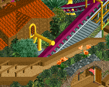
The entrance area of the coaster was the best part of the design in my opinion. Very well executed, nice queue line and great architecture. The colour sheme made this one special. Some private lessons with colours would help me a lot.
The layout of the coaster had a good flow and I think it would be nice to ride, especially because of the interaction with the landscape. I do not know if I like the lift at the end and some parts in the lying position would have made the layout a little more interesting.
The strong contrast of the supports, the height and the twisted layout made it look oversupported, though it was not. From the aesthetic point of view it didn't look good though.
The long path to the entrance of the coaster wasn't on the same level as the plaza in my eyes. Some more building and variety would have been good, as it looked a bit dead like this.
Still this one is a great design with some very creative architecture and nice track. Congrats on a well deserved design and hopefully some nice PT3 action from your side.
Buccaneer: Could go into history as the last design without custom objects or set a new trend of building without custom objects. Layout was ok, though the Cobra Roll looked way too fast. I loved the small airtime bumps in this one. Reminds me a lot of the Black Mamba.
The theming was very interesting and you achieved a nice atmosphere with this one. Very interesting to see what can be done without all the new objects.
Looking forward to see what you can do with custom objects. Hopefully in the PT3 finals.
Yggdrasil: I totally have to agree with egg_head on this one. It was big, but the coaster layout was nothing more than a standard B&M layout with a lot of problems to get back to the station in a flowing way. You should have fixed the BBS by a longer waiting time of the train in the station. The architecture reminds me a lot of Euroscape. Considering the age of this one and the possibilities we have now I don't think that is design worthy.
I wonder why this coaster won design and muuuh's one some month ago, with a similar theme, but a lot better executed, was rejected. There seems to be some sort of double standard at the moment and I don't think it is a good idea to lower the design standards to have a lot of people qualify for the PT3 Finals. This also is a slap into the face of the people taking part in the prelims as they are working hard(er) and might not get in the Finals in the end.
This one was better than your first design, but there is still a long way ahead of you for making good parks.