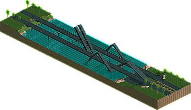
Park / (26)cjour bridge
-
 15-May 07
- Views 939,936
- Downloads 615
- Fans 0
- Comments 1,093

-
 No fans of this park
-
 Download Park
615
-
 Tags
Tags
 15-May 07

 No fans of this park
 Download Park
615
 Tags
Tags
 Similar Parks
 Members Reading
that lift was so extreme. never thought i would see a new hack again. thank you.
i somewhat disagree with the judging, but oh well, everyone has his opinion.
i would just like to say that "Alien-Invasion" and "Black Hole" both had very well executed concepts, in my opinion.
and deano those lights/lamps in yours were very nice.
Zodiac-this entry was very good as well. the archy was nice and had lots of detail but alittle awkward and irregular in spots. the coaster had a nice layout. some of the landscaping was nice but other parts were alittle out of place. the coaster interacted well with the park. great entry
Levis-WOW that elevator was awesome. i have no idea how you did that but it was great. the thing that held your entry back was your archy. the ship looked nice but it wasnt anything exceptional. also the coaster layout was kinda dissapointing after the elevator. the rest was hard to follow and boring. if you could combine your hacking skills with more structural and detailed archy you could become elite. right now your archy is holding you back. great entry.
deanosrs-your entry wasnt my favorite either. your coaster layout was great and the inverted coaster rooves were very cool. your archy was nice and have some great structure but lacked detail and in some places either was incomplete or looked like it. the peepablity was nice and the lamps you made look great. i think this park could have won had it been more complete. great entry!!
Peee-this park was IMO the winner due to the coaster. this park had some great detail and structure but most of the buildings were blocks. while the archy was nice its wasnt amazing compared to the others. the coaster was really what made this the best. great flow and it looked great. i didnt get the biggest greek feel from all the foliage and the archy wasnt spot on for greece but its was close. Congrats on the Win. look forward to seeing you in the Finals!
FK
It looks freaking awesome.
Im guessing you didnt read this part
Deano – Welcome back. I really hope to see more from you as I always liked your work. The problem with the entry was mainly due to your absence IMO. This would have been an easy qualifier back when you were in your prime however park builders have really taken it up a notch thanks to the objects in use today. I think had you used toon’s supports and pulled away from the LL influence on this, it might have stood a good chance to get the win. I also agree that the lamps were pulled off very well. Keep at it though.
Levis – I still can’t believe what you can do to the game. To even think how much time you put into pulling that off is amazing and blows my mind. As for the entry, I liked the ship but the coaster layout aside from the lift didn’t do anything for me. Even a semi-solid layout might have put this over the top. With that said though, Thanks for keeping the spark with the game and showing us what still can be done.
DD – I loved the green alien however the rest just missed with me. Keep at it though. It shows potential.
James - rctnw
I will reply and post my thoughts on the other entries in due course, excuse my hangover...
*edit*
DD - this is probably runner-up quality in a bigger park. Just that Phatage and cBass kind of rinsed the alien theme, it's not really one anyone can do well after them in PT1 qualifying! Nice alien though, and a good drop hole for the coaster's first drop. I enjoyed a quick look.
Zodiac - a great layout, if a little slow at one place at the end. My main issue with the trees wasn't their quantity but the choice of trees - they were all the same height and style! Vary it up a bit and it will look a lot better. Also I'd use dirt over grass in a similar situation, I don't think grass looks good jagged. The architecture was maybe a little bit bleached grey, but stil pleasurable. A good effort.
Levis - that hack is ridiculous. Absolutely absurd! IMO you deserve a bonus spot more than anyone for that alone. However the layout wasn't great, it could have done with leaving the ship, I'd have done it as a pirate invasion to a coastline of pretty buildings, and as the coaster goes through them kind of destroying the buildings. As it was the coaster wasn't visible for lots of it and some without supports which never looks great. However I really enjoyed checking it out, try again and I think a bonus spot is yours.
Peeee - this was a very quaint ride that answered the competition very well, I can see why it was chosen over my entry. The layout was the best of the round, no questions asked, and the rest of the entry was sufficient to carry it through. I particularly liked the touch of a monorail implying the rest of a park, and the landscaping was done very well. A coaster I'd love to ride in real life, so can't ask for more than that! Congrats.
Now for comments on oberon...
Generally how this ride came about, was I was going to enter the adventure ride (and still may do) but was getting bored and mucking around in RCT. The concept came from trying to build the architecture into the land as much as possible. The big tall building near the cobra roll and the entrance show this the best. However, half way through building I got kind of bored so the grass plateaus are just to avoid a bit of landscaping work. And I'm never going to build anything like this again, I don't think... well, maybe not after my next entry anyway! Unfortunately the two things I seem to suck at are custom supports and landscaping so will try and work on them.
Pyro - fair call on the landscaping but personally I liked the inverted covers.... I had a lift hill custom tunnel for a while but got rid of it in favour of the invert track, it looks cool from the right angle. Basically was just trying to theme the ride in every possible way once I'd become bored! I can see what you mean about it being a bit kind of blaaa visually, it does need focus - the reason for that is my main incentive for building was the architecture not the ride.
Gwazi - cheers, but the layout wasn't up to much... one way of putting it would be that this wouldn't be built in real life, and Peee's would.
Six Frags - yes I was thinking exactly that about the woodie round. Kumba, let's play a game - I'll do one more entry better than this and you make sure one way or another I qualify, then everyone's happy!
Ling - the bare space was, as i'd have written in a readme if I'd had time, was because this was set in the base of the asian mountains (somewhere...) with arabic kind of buildings. With alot of fantasy thrown in, of course. I didn't want to tree that high - one of my favourite things about the bare landscape actually, is if you rotate it to look at it from the fort corner, ie, where the queue is, the view resembles what it would if you were looking down on the ride from the top of the mountain.
Levis - this was so I could show the queue around the fort when the train passed through. Could of course have paused it later... I have to disagree with you over the buildings. They were meant to be literally carved out of the rock so by definition couldn't have that many colours. The barrel roll was awful, I know, I just didn't have time to finish the layout properly.
Posix - cheers, something tells me you will like my next entry, by the way...
FK+Coastermind - I don't think the architecture lacked detail, far from it. Take another look at the entrance building. I think that's the perfect detail compromise for RCT2... it looked incomplete because, well, it was!
RCTNW - hi..! And cheers. Yep I just used the PT2 workbench, I hate making my own, so didn't have decent supports. I need to experiment and muck around with them.
Finally. Surely I must now hold a record for most failed pro tour qualification attempts? Or at least prelim 2nd places!!! ;-)
And a screen or three...
Edited by deanosrs, 13 June 2007 - 03:32 AM.
deanosrs: Well, apart from those blocky meadows, your landscaping was great. The layout was nice, it flowed nicely and the pacing was good. The building were nice, though i thought you used too much brown. The only thing I really disliked was the use of the Inverted-Coaster track, a bit pointless IMO.
Levis: Ok, I guess I don't have to say you the hack was great. I also loved the ship and the whole idea behind it. The only let-down was the layout for me. However, you really have to get in the Pro Tour, you deserve it, man!
Zodiac: The landscaping as well as your layout was nice, but I missed some interaction with the paths. But I thought you building could have been better, most of them only have 1 stage, but I thought the details were nice.
OLE (from the screen): The layout looks ok. I like that hill after the first drop but the thing i dislike are the 3 loops in a row. I can't really comment on the rest as my knowledge on LL is equal zero. lol
dr dirt: Serious, that alien is awesome. The station was very nice, I liked the details there and the whole structure was cool. I think if it was a bit bigger, it could have placed higher.
And here are the screens someone wanted:
FullMetal Offline
Also, I'm shocked that I'm in 5th place for the bonus spot. How does that work, anyway?
FullMetal Offline
Levis: Your ship is awsome! I too like the hack very much
Pee: too much ugly blue flowers but the rest was beuty!
deanosrs: finish it!
FK
They make appositive yours!