Park / Le Viaduct
-
 15-May 07
- Views 939,936
- Downloads 770
- Fans 2
- Comments 1,093
-
2 fans
 Fans of this park
-
 Download Park
770
-
 Objects
90
-
 Tags
Tags
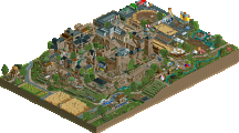
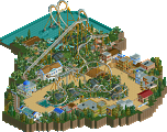
![park_3338 [H2H7 R2] World's Fair](https://www.nedesigns.com/uploads/parks/3338/aerialt3037.png)
Checking the prelims out now. Btw it's Mystery Creek but whatever. Congrats J_K. I knew it all the way!
No I don't, where are you sending it and what's your E-mail? maybe gmail has you blocked or something *shrug*
Congrats on the win
Your entry looked very nice. it had a good atmosphere and the colors where chosen good to.
The archytecture was done nicely but I should have put a little more extra details in it (I know you can).
what I especially like is the big black "screen" on the building, it just looked so good and gave a really good feeling to that building.
the foilage is done good to.
what I might have changed was that you make some more large buildings also.
you've got one large building as entrance and the rest are small buildings, maybe it would have been nicer if you had added one or two more large buildings.
and a minor detail is that you've got floating stones on the water....that shouldn't be possible.
Eggy
mmm...expected a bit more from this one.
the station was really nice but I had hoped you used a bit more archytecture in the rest of the park.
still its a really good entry, the ride has a nice atmosphere and the hacks where done nice to
You've really got a unique style and I also like it that you found a nice way to use my 1/16 building blocks
I think we shouldn't be afraid that you wont make it to the main contest
---
I will look at the other later.
Thanks Levis for the review. I checked the Parks out and I must say I'm not ashamed to place below these two jewels of Waterrides.
J_K: I expected that kind of theme since you told me you'd enter. You have refined that theme so well since your solo and Tierre Aventure. Some details were really great as the statue in the pool at the turn of the ride (though you could've put the stones underwater too like Leo mentioned above. The Custom sign for the ride was a nice touch too, though I'm afraid it isn't well put there at the back of the House ^^. Loved that though!
Levis: Great Ride you have there, although I was not quite sure on the theme. Loved things as the ferris wheels as turbines and the pumps et cetera. Deserving second place.
Xin: Kudos for entering every round 'till now! I liked the theming that was there, but that was not much. I also thought the ride was kinda long. Don't give up here man.
29thcookie: I liked what was there but things like more architechture or even custom supports for the ride would help it alot. But that'll come with time. Since this seems to be your very first released work (atleast here at NE) I thought it had athmosphere.
Congrats on everybody who entered! You made that round what it is.
B. maybe it's an idea to just put all the files in one zip
c. I'll comment on the entries later
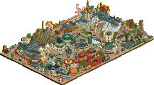
J K - Devinately deserved first place, it was really nice and had a great atmosphere. It was nice to see you made it into a small park, of sorts.
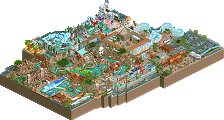
Levis - It wasn't really my cup of tea. There wasn't really anything that caught my attention, apart from the 4-D coaster pumpy things! It confused me a lot aswell, I couldn't concentrate on one area I was all jumbled up.
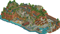
egg_head - It was really nicely done, as well as being relatively unique. It was definately a brilliant idea, shame the area wasn't any bigger as it would have really made me smile, more than it did in the first place. IMO this should have been placed above Levis' entry, however I can see why it wasn't.
I shall have a look at the other three shortly.
Edited by Pineapple, 22 May 2007 - 12:49 PM.
JK
egg_head
Levis
lucas92
Xin
29thcookie
Didn't really like Levis' Was a cluster, couldn't see it
I see you haven’t finish this park, that’s pity. It’s a nice idea, but you could get more of it. The buildings are too simply and empty and on the roof you forgot some fences. The entry from the splash doesn’t look good by that other building.
The temple looks good but it missed some detail and need more colors.
I don’t like the way you finish the splash. I think you better could him above the water, I missed the splash.
And the objects underwater aren’t good hack there. I can see them through the water, and that is sad.
Egg Head:
I couldn’t open you’re park, I missing objects.
Leo:
this idea is really great created with good hack.
I like the pumps and that you use a lot of different tracks on one coaster.
Some of you’re hacks are careless and that is pity. I can see the original track of the coaster through the waterfall (from the splash) and I can see some objects through the pipes.
It looks very good, but It’s maybe to much grey.
JK:
wow what a beautiful park and a quite rightly winner. I found only one thing I doesn’t like. That is de trackture from the wooden coaster that you use fore the show.
Great work.
Lucas: I liked your Idea but some things bugged me as the underwater splash. That could've done better. It also was a very short ride...
egg's entry I loved totally and it was nice and refreshing to see some "advanced" styles of the rapids ride. For people that don't pay attention to the industry Intamin has been doing some neat things with new-age raft rides. Your style is just flat out awesome, egg.
29thcookie: some more buildings would've helped...there was a nice atmosphere, but the buildings lacked, and architecture is a main aspect of the game so heh.
Xin: I see that you're very anxious huh?
Lucas: nice entry, I didn't like very much the colors (too much gold) and the mixed land types, I mean, sand, rocks, grass, dirt...they didn't fit very well. Also, the layout of the ride was kinda...hmm...boring...just a lift hill and a drop, nothing else? Anyway, hope you give it another try...I'm looking forward to your work.
egg_head: You know my thoughts. Lovely architecture, in quality terms, but weak, in quantity terms. I really like your style, and the ride with the hacked bobsleigh track was a creative idea, but there wasn't really enough stuff for getting first place
Levis: what a structure mate! Really liked the futuristic/mechanic theme you pulled off. I also liked all the hacks you made on this little park, specially "Pump", I liked that ride. The layout was a good aspect of Toxica Aquatica aswell...if it was made in real life, I think it'd be a hell of a ride...I mean, wow...that layout looked very exciting and thrilling. Anyway, good job on completing it and hope to see more from you in the prelims. Keep going and confrats for the 2nd place!
J_K: "...they are very hard competition..." Well, you are the winner
Anyway, congrats for the win and for getting into the PT3. Now, you are with the big dogs
Congrats everybody for getting those entries in and for doing a great job...can't wait for the next round.
For me, Thira deserved the win. Just because it was solid all the way around. Good ride, solid architecture, and the largest and most completed of all the entries. Egg_head's and Levis's were basically a tie for me. Levis's was fantastic. Great idea, and a fun ride there with some good ideas. The structure itself was maybe just a little too blocky... but I don't know another way it could've been pulled off.
Egg's was incredible. I wouldn't have complained if this had gotten the win. I absolutely loved everything about it. The landscaping, the foliage. Amazing. The ride was a lot of fun to watch, too. Of all the entires I've looked at Mystery Creek the most, and am positive that I will be looking at it some more. It's a real treat.
Congrats JK, and the rest on an awesome round!
Egg- Loved the park alot i was hoping to see more architecture in some spots as it looked a tad bare at times. As ive told you before the foliage was absolutly amazing, i mean it was top notch. I also loved the overall ride and it was really nice to watch. Its so cool that you have sortof combined a rapids,water coaster and river ride all in the same layout. Alot of nice little hacks as well. I love your style of parkmaking and i know your'll get into the pro tour with the next round you enter.
Levis- Woah massive ammount of detail gone in here. I can't really decide whether to put your entry over eggs. I don't think i'll ever decide to be fair because both entries were just as nice. I loved some of the things you did. I did'nt so much like the huge pipes with all the smoke. I don't know why i just guess i felt they were a bit awkward. With egg i know your'll get into the pro tour with another round and im really excited to see what your going to come up with next. oh yeah and how good were your hacks as well. the ferris wheels and the pumps really were funky.
Lucas- Nice main structure you had although i felt the ride was over a bit too soon. It must be pretty cool going underwater into a transparent tunnel so that was nice from the riders point of view. The brown/gold i think was a bit too much on one building i think you should have used the lighter texture with flashes of the one you choose. It still worked well to be honest i guess it was just a personal peeve of mine. Nice entry overall.
Xin and 29th Cookie- I like your enthusiasm and im really hoping to see another entry from you. Nice entries guys.
Thanks to Geewhzz for making that amazing bench, i modified it a bit as a tryout for my next solo. I know the items i hav'nt used so this prelim was a nice way to find out which items i need to use in my next park. It was also a really nice break from my solo however much i like building on it. It was just nice to try a few different ideas out. Things i need to improve on are my ideas and how i execute them. Like egg said it would of been better for the logo to be in view on the front of the ride. I need better planning but im working on that.
Thanks fro all the comments so far. Its a relief to be in the pro tour this early.
J K
Levis - Very nice, and very fantasy. Also, that opening message was hilarious.
egg head - Prolly my favorite entry. I loved your hacks so much.
lucas92 - I guess this means you are out of the May RR?
Xin - Nice enthusiam. Too bad you didn't finish.
29thCookie - I liked everything except the ride itself.
Edited by Gwazi, 22 May 2007 - 02:44 PM.
What he said.
i agree with the order. and in my comments ill explain why
J K- i think the factors that put yours on top were the size of the park as well as the atmospher. your atmosphere was jsut wonderful. everything came together and had so much detail in everything. as said the archy lacked in some places but there was some good detail parts in there that made up for it. the other part was the amount of work. yes levis' must have taken alot of work too, but this park had a comination of rides and shows and indoor detail and food and just alot of stuff that helped complet the look. loved the signs, the trident(guessing that is what it was meant to be) the farris wheel. great stuff!! congrats again
Levis-your park was so creative. i knew you said you were inspired by that RCT3 park but i never though you would recreate it!! you did that park alot of justice. your hacking here was at its best. all the different working parts really made this island look like a working machine. all the colors and littles detailes to show electricity and wokring parts was great. the ride layout was a bit crazy but its looked exciting. the flow was alittle confusing overall though. i think what kept your park above Egg_heads was your hacked rides and amount of work. not everything was done well structurally or detail wise but the different peices fit together well and created a great overall work. great work!!
Egg_Head-from first looks this park was soo good and then you kept looking and its unfinishedness sorta let me down. what you had was great. the main building was wonderful with all the deail, yet small. the detail in the shop and around the ride was wonderful. the layout was IMO better then that of Levis' but not as well covered. the bobsled hack though cool sorta looked boring at the speeds. it got fast but then slowed down really quickly. at the end of all that momentum there was barly a splash! again the unfinishedness of the path that the goes to the ride was a bit of a let down. it was nice but lacked detail and color. it made that whole side of the park boring. the rock surfaces were nice and the foliage was good but i just didnt feel the asme atmosphere as the other. loved the detail that was there. great entry!!
Lucas-nice idea and colors but it lacked detail and completness. i didnt like the stilts for the beginning of the ride. the hill was great but its was short and kinda boring. it needed more.
Xin-The ride was ridiculously long and not planned well. there was some improvment in archy and detail but its was so unfinished
29thCookie-boring. great foliage but that was almost all their was. needed to be bigger and more thought out
congrats again J K. great entries everyone!!
FK+Coastermind
and all others making an entry.
Still have to view them, so comments later.
And to the non-winners in this round: give it another try if you find time and concentration, most of you seemed so close, but yea.....only one can win.
Emergo