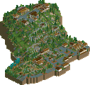
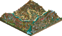
Park / NeMica-Forgotten Land

26 Comments

  • posix%s's Photo

    Posted Image

    (click logo to go to page)

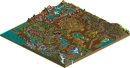
    In fifth place, we present to you NeMica-Forgotten Land by FK+Coastermind. This topic is meant for commenting purposes. Please make sure to visit the park's page, too!
  • Tolsimir%s's Photo
    Wow. 4-1 have to be grandiose!
  • turbin3%s's Photo
    Wow, the coasters and the whole theme are fab! :-o

    Great work!
  • Gwazi%s's Photo
    Fifth place? The other entries must have been really good. I really like this, good job on it FK. My only complaint would be that throughout the park, the foliage and landscaping was virtually the same. It kinda gave a monotonous feel, not exactly making a distinction between each area.

    Despite that, I really enjoyed this entry.
  • Bacchus%s's Photo
    I completely agree with gwazi.
    Nice work!
  • CoasterForce%s's Photo
    huge quality increase from the previous two, without a doubt. however i'd echo the previous claim that it all seemed monotonous. you seem to be afraid to deviate from the same few pieces of foliage and use of 1/4 blocks, and to really push your parkmaking to the next level you have to take chances and step out of your comfort zone.
  • Roomie%s's Photo
    Wow. lovely little park. I really liked some of the ride layouts actually. they seemed to take realistic layouts but add a bit of creative flare which gave some really interesting designs.
  • RRP%s's Photo
    ^^I don't think the land blocks are a problem its the foliage and the textures that are.
    This for me was really hit and miss,i loved the coasters and the interaction they had with evferything.The landscaping and buildings were also great however i thought the amount of brown landscaping used partially ruined the entry.For example if you change all of the land under the b+m flyer to grass its immediately more pleasant on the eyes.The foliage also let it down,for the first time ever id actually like to see more trees!
    Id love to rework this entry with my own landscaping and foliage.hint hint
  • X_Fusion%s's Photo
    Now, a theme park complete and very beautiful. :lol:

    FK + Coastermind Congratulations!!

    Very Good!!
  • trav%s's Photo
    Fuck me.

    I'm impressed. The areas around Red Dragon and Merdia were fantastic.
  • FullMetal%s's Photo
    I'd post my thoughts, but most of the them are conveyed in the write-up, which I had the honor of doing. (Big thanks to disneylhand for helping me out with that!)

    All of my other opinions have been stated by others in one form or another.

    And yes, the best is yet to come... ;)
  • inVersed%s's Photo
    Havent really played this game much lately, but i decided to boot it up and look at this park. It was fabulous. So many wonderful details, i loved the station and theming of Merdia and the temple coaster.
  • Steve%s's Photo

    Id love to rework this entry with my own landscaping and foliage.hint hint

    I'm never going to get you to finish that solo, am I? Can I bribe you? Ahaha. Kidding.

    Great work, FK. I'd take RRP up on that offer! ;D
  • spartan%s's Photo
    This is one of the parks that I was really looking forward to in the competition and it didn't disappoint. All the layouts and themeing was wonderful, and as always your archy was very nicely detailed. Kinda reminded me of Karizima. My favorite area was the asian one as it seemed to distinguish itself from the others that kinda blended together. My only problems with it was the lack of trees and all the landblocks, when you use that many all that dirt gets monotonous. Overall it was great, if it got 5th there must be some really amazing stuff ahead.
  • Nokia%s's Photo
    i love love love LOVE this.
    the ride layouts were amazing and the interaction,.
    but im surprised this didnt place higher.
  • Ride6%s's Photo
    Excellent entry. Strong atmosphere throughout most of it, great architecture, great rides, colors, etc. The annoyances are few in my book:

    1) The coasters didn't stagger their trains properly, it's not that hard to put "minimum wait time" up to 40 seconds or so.
    2) The many times aforementioned landscaping/foliage. The issue there isn't that it's monotonous, but that a small selection of 1/4 tile-sized objects just don't look full next to coasters, paths, etc, within the context of the game. Real parks are built on very monotonous pieces of land, but most of them do have trees scattered about, and a good deal more grass.

    As for things I loved there's bits like the swooping turn-around for in the interlocking corkscrews on the floorless... The bridges and waterfalls there just sell it... Wonderful. The actual land-height variation throughout was decent, though a bit more of it could've spilled over onto the pathing layout (which was largely flat). Anyway this was a brilliantly done entry, very refined... It likely would've placed in the top 10 (if not the top five) of the PT2, or PT, both of which had unimaginably high average quality entry-to-entry. It's good to see that this Pro Tour will be keeping up the tradition in quality, if not in number.

    Ride6
  • JJ%s's Photo
    nokiaa how can you be surprised if you haven't seen the rest
  • Xcoaster%s's Photo
    I really liked this park. It was my third favorite in the competition (as seen in my score being dropped, alas).
    EDIT: Actually, according to the scores, it was my second. I was drawn between this and BGNAm, but went with this since it was finished.
  • JJ%s's Photo
    To be honest I wasn't really a fan of this park. It just didn't work for me. Nothing really came together. It was all too much and it just felt soooo random, yes there were some nice details but they didn't match what was around it. Also the landscaping was too over the top and I think the foliage could have been better. More full tile landscaping and more than just the dirt would have been good. I personally preferred the style in Camcorder's park but would rate this just one point higher based on the fact that it is finished. Am agreeing with the order of things so far :)
  • posix%s's Photo
    i'm very happy to see so many comments coming in. i suppose it's the hype of a contest that draws more attention than a "regular" release.

    huge quality increase from the previous two, without a doubt.

    very true. what i'd like everyone to focus on a little is the difference in score. sixth place "metal masters" got 9.23 while nemica got 13.15. on the scale of 20 points max, this means a 42.47% increase in quality. so it's quite a leap.