Park / Pangaea
-
 18-November 08
- Views 8,829
- Downloads 1,049
- Fans 1
- Comments 36
-

-
 71.43%(required: 65%)
 Pro Tour 3

CedarPoint6 90% chapelz 90% Kumba 90% FullMetal 85% Magnus 85% Xcoaster 80% Fr3ak 75% Evil WME 70% RCTFAN 70% zodiac 70% Milo 65% geewhzz 60% posix 60% nin 50% postit 50% ChillerHockey33 45% 71.43% -
1 fan
 Fans of this park
-
 Full-Size Map
-
 Download Park
1,049
-
 Tags
Tags
Since you don't understand my rebuttal, I'll have to provide some terminology to help illustrate exactly what I mean:
In order to understand just what I mean, picture a phone system in which there's five phones, each one smaller than the last, each phone progressively smaller and contained within the last, like a box within a box within another box....
There's only one phone line though, and there's speakers within speakers, microphones within microphones. Each one is considered to be part of the same system and yet for practical reasons, we declare each one to be unique.
Each phone can be compared to a self understood level of reality. For the sake of convenience, I'll just call them lines.
Line 0-human perception itself
Line 1-the world as we declare ourselves to understand it
Line 2-a fantasy world which we pretend to understand through line 1
Line 3-a world completely imagined based on what we perceive in line 2
Line 4-We're not sure what it is, but take it for granted
What you've effectively done is declare Jazz to be at fault for putting part of what you fantasize into the real world. What I'm saying is that it's all the real world, and you indifferently put something you now seem to hate into your own depiction of the real world, and thus can't be taken at your word when you make such a big deal out of something that you thought so little of in your own work. You're belittling your hatred of generic themes in your publicly shared fantasy and are outraged when you see it in the real world.
This is the last time that I'll go to such great lengths to explain my position, since you all just enjoy mocking me for your own entertainment like wind chimes sounding during a breeze. Enjoy it while it lasts as you're so compelled to already.
Edited by Ge-Ride, 19 November 2008 - 03:22 PM.
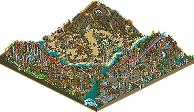
The chinese area was probably the poorest in the park, but the rollercoaster had a good layout. The architecture was really similair to the first area though.
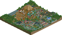
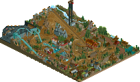
My favorite area was Egypt. The woodie had a cool layout, the architecture was nice, the interaction, good, and the atmosphere good as well. It didn't exactly feel like Egypt, but it was nice. However, once again, the architecture was still similair to the rest of the park.
Overall a really nice park, deserving of 3rd place easily
But you make too many 2*2 buildings again Jazz. But it's not really a problem because there seems to be less people playing rct2 these days.
Impressive. I might get to play Rct2 again. Maybe.
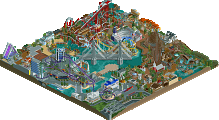
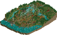
anyway, a brief summary about the park's history. i have to say that the focus of this park was definitely in the coasters. the theming, while not stunningly innovative, was something i spent a good amount of time on, but definitely not as much as the layouts. the main purpose of pangaea was to emphasize the three terrain-based coasters, situated in their three respective environments.
i worked on this off and on over an extended period of time, eventually deciding to finish it off as the deadline came closer. i was not able to finish every detail, but overall i was satisfied with the product, because it contains some of my best work to date. that being said, i cannot guarantee much more work coming from me in the future, due to lack of interest and time. thanks again for the feedback, as always its appreciated, and i enjoyed fulfilling the role as the "dark horse" in this contest.
Edited by Jazz, 19 November 2008 - 07:14 PM.
I see what you mean, the coasters look amazing as well as the landscaping, although I cant say the same for foliage. The buildings didn't seem to be anything special, but mostly just added to the coasters as a background, although there were quite a few nice details. The themes weren't executed as well as they could have, China didnt really look like China to me, although that could just be because I am used to a generic asian theme. Overall, great job, the more I look at it the better it gets.
Are there going to be any parkmaker spots given in this contest? I mean this park might not warrant parkmaker status itself, but the fact it got third in a contest, as well as Jazz's previous parks, it seems like something that should be considered.
Cant wait to see the parks at 1 and 2, looks like its between 5dave and...someone else.
But you like it. You like being able to create a little turbulence in a world that doesn't affect the one you really live in, a world that you are more confident because you cannot see anybody else in person. And yet when you take advantage of this world, it is only to criticize others taking advantage of it.
dumb
Edited by Ge-Ride, 20 November 2008 - 01:12 AM.
But more importantly, when you come on here and post inflammatory and derogatory things, you don't have the right to be offended when we throw it back at you. Just because you do it in an intellectual manner doesn't mean it's any less of either.
Nobody likes pretension and nobody likes psuedointellectuals. You're toeing the line of becoming both.
Really nicely done. Has a nice NE-style feel to it.
I somehow liked the Egyptian area the most. The woody was awesome, it reminded me a bit of the one in Terra Mitica. The interaction was really nice. The archy didn't looked Arabian to me (maybe because of the slanted roofs and such) but still I liked the look of it.
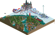
The Norwegian area didn't really scream Norway to me, it was more Medieval mixed with pirates imo. That invert was really nice. Reminded me of JK's solo somehow. The idea of the swinging ship was nice, but why were the sails turned to the side?
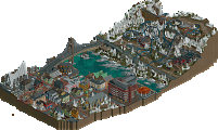
The Chinese area was my second favorite. The layout of that B&M was really nice. I liked that hillside with the integrated rapid ride. Good work.
IMO the park was nothing breath-taking but still nice to look at. The themes are somehow getting old. (Chinese area with B&M sitdown, Egyptian area with Woody, Viking area with Invert)
What I didn't like was also that many buildings saved no purpose at all. Also some of the queues were way too short. Especially at the coasters. And I missed a remarkable kiddy coaster or at least a nice kiddy ride.
Great work. I'm glad the ProTour turned out that well despite all the problems we had.
"MFG"
All the layouts were excelent especially the Invert as it just flowed so well.
It was an honour to make the logo for such an amazing park maker, it was great to see some work from you again.
China was messy and didn't looked finished on a few spots. Norway didn't feel like Norway and was quite boring. Egypt was amazing, I just loved it!
China and Norway are good, Egypt is awesome. Overall good.
Congrats on #3!
why does it that me and liam agree nearly every time when it comes to these older parks? yeah, egypt area is amazing. that's the level of stuff i want to achieve in soa. everything else kinda sucks though
TBH feels like a 4 years too late ripoff of Turtle and Artist's spotlights. Its probably always been right there with Gwazi's park for me, outside of Canthose PT3 was pretty disappointing. Still a solid park but not anything notable.
In a lot of ways I think this is the least-Jazz Jazz park.