Park / Pangaea
-
 18-November 08
- Views 8,768
- Downloads 1,048
- Fans 1
- Comments 36
-

-
 71.43%(required: 65%)
 Pro Tour 3

CedarPoint6 90% chapelz 90% Kumba 90% FullMetal 85% Magnus 85% Xcoaster 80% Fr3ak 75% Evil WME 70% RCTFAN 70% zodiac 70% Milo 65% geewhzz 60% posix 60% nin 50% postit 50% ChillerHockey33 45% 71.43% -
1 fan
 Fans of this park
-
 Full-Size Map
-
 Download Park
1,048
-
 Tags
Tags
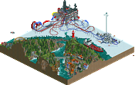
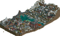
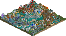
(click logo to go to page)
In third place, we present to you Pangaea by Jazz. This topic is meant for commenting purposes. Please make sure to visit the park's page, too!
Again, let's compare this entry with the #4 ranked "Terra Antico". Pangaea got a score of 14.62 and Terra Antico had 13.69. This means only a 6.79% increase in quality over Terra Antico. Yet another very close decision. Congratulations Jazz!
I am impressed ... Jazz very well.
Good job!
so.. i can't view this since i don't have RCT2, but i did a quick look with the aerial view. i gotta say, everything looks great, but i just need to give you props on a very specific thing that i thought was terrific: the castle deco on top of the supports for the norway coaster. superb.
Congrats on a well deserved third place and some of the best coasters i've seen in ages
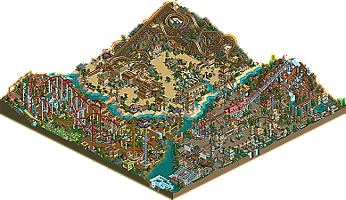
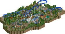
Norwegian section - Beautiful entrance area, some of the architecture was a bit samey to be honest but I enjoyed the coaster very much. One thing I did notice was THE worst support for a corkscrew on the last corkscrew, which I found quite funny. The swinging ship is lovely too, added a lot to the area.
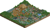
Egypt - First thing I thought was that it's a great path layout here, winding through the area, framing the rides. The wooden is fantastic, great speed throughout, although I found the ending rather forced, just to get back to the station. It was a pity, probably constrained by the pathing layout, because the first three quarters were fantastic. Some of the architecture was brilliant, some was pretty similar to the Norwegian section in form, which was strange.
China - My favorite area, although it's the most raw. The whole thing looks almost cobbled together, but what comes out is fantastic. The massive coaster, sprawling almost haphazardly over anything and everything, brilliant. The foliage throughout is perfect. The architecture is not great here to be honest, but it doesn't really matter because the atmosphere is so good. It reminded me of a Coaster Ed park, and there's not much higher praise than that.
Overall a lot of it was very good, some of it was average, and some was brilliant. I guess this is reflected in the score. It all came together though, which I really liked. One thing which is interesting is the fact that all the coasters have pretty much the same layout (i.e. lift up a massive hill, rest of layout sprawling down that layout, with a couple of large drops down in the middle). They were all very good, but I don't know, maybe try something different?
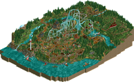
i really didnt like the waterfalls by the floorless coaster, it just didnt seem real natural and flowie.
i area i liked the most would had to have been norway, even though i thought it could have used just a little more foliage
i also think that you could have redone most of what you did with the quater-tile landblocks.
Xcoaster Offline
I had this one tied with Terra in 4th, as I felt they were about equal in '"good but not great"' status, and I couldn't decide between them. Funny though, for a while I had actually thought Nemica was by Jazz, even though I didn't know he was entering.
EDIT: n/m, after looking at the scores I guess I gave this one a slight voting edge in the end, making Terra my 5th.
Nice logo, btw. That's the first time I've noticed it. I was expected the old one.
Anyways, this is yet more evidence that while the entries are few, they are of good, solid quality.
In SF: WOE's Medusa, there's things like statues and a sign that cautions the viewers to look out below as they travel through a tunnel under the station, which isn't enough of a theme to communicate the legend of Medusa to somebody unfamiliar. Personally, I think that Pangea Ultima would have been a good metaphor, and thus a better name.
Edited by Ge-Ride, 19 November 2008 - 12:24 AM.
Thought this was a nifty little park. I really enjoyed the wooden coaster; it was actually one of the first coasters in a while to almost "frighten" me while watching it. The drops and turns were just so huge. Great work on that. Everything else in the park was exceptional. Nothing too overly impressive but still nothing that lets you down. A very solid effort, Jazz.
actually now looking back on this, you could argue that you did in fact give him feedback and criticism, but that post just came as distasteful to me.
hm. whatever, then.
we're all sat around commenting about a theme park made in a computer game... none of us are cool
Inspiational stuff.
I automatically assumed that Kumba's vote was dropped because he couldn't figure out how to use a 1-20 rating scale.
As for the park, kudos to whoever made the logo, and I like the name. I've always enjoyed the park names that jazz comes up with. Mossflower Wood has alwasy been one of my favorites.
I'm getting an error when I try to open the park's zip file, so I need to download again when I get home tonight... I'll comment more then.