Park / The Masterpiece
-
 13-September 05
-
 The Masterpiece
- Views 10,506
- Downloads 6,133
- Fans 4
- Comments 52
-

-
 83.75%(required: none)
 Gold
Gold

Cocoa 90% no Stoksy 90% no 5dave 85% no Ling 85% no MCI 85% no Poke 85% no inthemanual 80% no Liampie 80% no Sulakke 80% no Xeccah 70% no 83.75% 0.00% -
4 fans
 Fans of this park
-
 Full-Size Map
-
 Download Park
6,133
-
 Tags
Tags
Metro
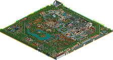
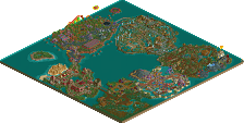
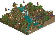
This was a fun park, and well made, with lots of nice detail. Nothing really surprised me though, and much of it felt too familiar. That said, I won't be churning out any megaparks anytime soon so maybe I should just stfu.
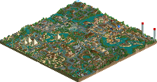
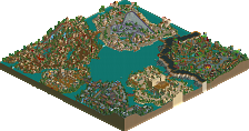
I’m going to give my opinion about every area, going clockwise through the park:
Entrance area: Nice, calm environment. I think you could have made it a bit bigger by building a coaster there or something just to make it a little more interesting.
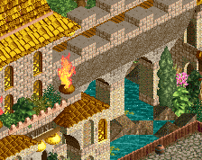
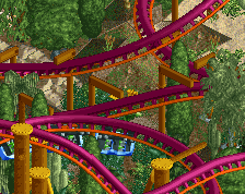
Arabian Knights: One of the better area’s imo. The suspended coaster had a really good lay-out, cool supports and had some very good interaction with the rest of the area. The architecture was good here and I just liked the general theme. Not to forget that Osiris was amazing. Although I must admit that Legend Of Isis was quite poor in quality compared to every other ride in the park but none the less, the area was just good.
Myth: Ok for some reason I didn’t like this area. The coaster that is situated in this area went horribly slow through a couple of inversions and the coaster just stood out too much. The architecture was quite repetitive, 2x2 buildings everywhere what kind of bored me. But on the other hand it did feature one really cool ride called the Magnus Collosus so well done for that.
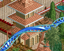
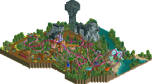
The Dragons Lair: Probably my favorite area in the park. It showed some really good skills, interesting rides and hacks. The invert had a solid lay-out but with an excellent interaction with the other rides and footpaths. I really enjoyed looking at this area. The architecture and the landscaping were excellent as well. Kudos for that.
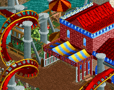
Bays of Tropica and Kingdome of Speed: The first area was a bit too small but still nice. The vertical drop coaster Tropica was not mindblowing or anything but just fun to watch. But the 2 areas were to close together if you ask me, I’d have just left Bays Of Tropica out because now it looks somehow messy. Kingdome of Speed was really good though, firstly I like the idea a lot and the launched Giga Coaster was just interesting to see. No complain there
Western Frontiers: Not a real fan of this area, but I suppose this was one of the first areas you’ve built so I understand. The partly landscaped woody was pretty cool and interacted nicely with Klondike Falls in the beginning. Klondike Falls btw was the best ride of this area imo.
Toadstool village: I sort of had the same feelings when looking at this as Western Frontiers. The other side of the park was just 10x as good so it takes away my interests fairly quickly.
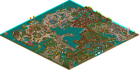
In general I think that it’s a great park X250, especially the left part. Don’t get me wrong about what I said of ‘Myth’ I still think that it shows some real skills to build that but it just didn’t appeal to me that much. Anyway, I loved how much attention you paid to detail on some places like the park map (in front of the park) for example with the bit of water in the middle.
I can somehow understand why it didn’t win spotlight just like BP because the difference is so huge between the right and the left part of the park. Don’t take that as an insult because this shows how much you’ve improved and I’m 100% that of you’re next park will win spotlight. Keep this parkmaking level up you’ve got now and I think you’ll become a parkmaker pretty soon.
Edited by Splash-0, 13 September 2005 - 02:14 PM.
with that said, this was wonderful, x250. Definitely one of the better rct2 parks, in my opinion.
RMM Offline
Get it?
The park was great tho... I loved the colors and the coasters were so bright and all. I think they layouts can be improved and all tho. The naming sucked as said before too. It definately wasnt bad.
I gotta look into this park some more, i really like some of the touches. The invert, although i don't like the swerving layout, had a lovely themed MCBR. Beautiful, reminded me of artist personally. I really gotta spend more time theming my own coasters. The thing is, from what i gather so far, you sort of treat coasters as theming. They're kind of like the majority of theming here, pointless. As they're obviously not made to thrill, but to look decently (and imo, often failing at that). Now I know it was definitely "above par" compared to some other parks, so i definitely think the 'super' title is justed. Yet making this a spotlight would be controversial, imo. I think i feel the same about the next runner up (/spotlight) as well. Everyone just really really wants a spotlight that really impresses now. This park impresses the majority of the site yet I'm sure a lot find it just another park. An attempt even to make a 'good' park, not a vision to make a park how you want to make a park. I know i'm definitely starting to fall into the catogory 'philosophize more about rct than actually building in it', and i hate that, but nonetheless i feel like i know now more then ever what to do in rct. Worse, actually, is that i know what not to do and I have this theory that i might not really get out of how to do what i want to do because it is slightly impossible. I don't think all of this applies to this park, but i want to look at it some more indepth, to actually find out if it has more depth than i thought at first glance.
Every bit of this park is filled with such high quality, and it never ceases to dissapoint. The more I looked through this park, the better it got. The atmosphere is so fun, beautiful and refined. Every idea you wanted your guests to see, is executed perfectly and vividly, (ie: Bays of Tropica).
I can't wait to go back into the game, and look at it more. The only problem I have are the names, which don't match the quality you have here. Marvelous job, and I can't wait to see more from you. You have definitely given me a euphoric trip through some of the best work I have seen in rct2 to date.
Corkscrewed Offline
Euphoria is the feeling of extreme happiness.
positives:
-good use of color; nothing over-top, but not too boring either
-great coaster layouts, for the most part; really the foundation of the park
-excellent custom rides, especially the top spin (altho it woulda been nice to see it operational)
-good architecture forms with superb attention to detail (good 1/4-tile work)
-decent foliage, although it was pretty uniform throughout the park
-good park organization, although slightly confusing in areas, it still worked
-good variety of ride types (thrill, kiddie, family, water, flat, transport)
negatives:
-naming (as already mentioned)....and Tropicana? (i thought that was in Mystic Sands :/)
-slightly messy in areas and/or unneeded/unrelated theming/objects (Western Frontier especially)
-duplicate ride types (found 2 enterprises, 2 twists, 2 swinging ships...etc), yet not too distracting
-undistinguished theming, meaning each area felt slightly similar to the next in some way or another
-the "footpath" queues...more of a personal thing, but they look so unnatural to me
-some of the custom supports worked for me, others didn't, but they seemed incomplete in spots
Favorite ride: Grand Prix (nice work Tyandor)
Favorite area: Kingdom Of Speed
Overall, a tremendous park despite some obvious faults, imo. Although I want to, I can't say its spotlight quality, so I think SRU fits it well. While the theming was good, each area lacked a certain quality that made it different from the next area. I also think the naming brought it down a bit. But still, an amazing NE debut for you X; definitely much better than my debut here. Can't wait to see whats next!
They had me learn 150 vocab words a week, mind you. It's not like I studied them anyways.
EDIT: wait, nevermind I had it right. Did I write euphorical or euphoric?
X, I know you have it in you to evolve into something more special than another Artist clone (no offence, we just don't need 10 of you) and with your whole career a head of you there's plenty of time.
No bad, but I find it a bit hard to enjoy anyway.
ride6
(yay 400th post!)
I'll be brutally honest, this park (for me) was too similar to Artists' works. When you compare them park to park, they are pretty similar in style and layout. Perhaps to the extent where if one of the them released a new park, but didn't say which one of them made it, it would probaby be hard to tell who's it actually was (apart from X's have some awesome custom rides and artists would probably be a little neater)
But yeshli, I have to say that I find Turtle's work very different. Firstly, I prefer it. While IoE did deserve spotlight, it probably only just got it, whereas with Turtle's park, there was no doubt in my mind that this was a spotlight winner when i saw it before release. Same with Bijou Magique. His architecture forms are completely different, much more complex, using many more textures. I'm not necesarily saying that it's better, but it is very different. I also find his archtiecture to be generally large with much more variation in shape (lots of 2x2 etc. in Artist and X's parks-look at King's Rialto, my least favourite section in the park in the masterpiece) I find Turtle to have a very unique architecture style. I also find Turtle's work somehow more organised than that of X250. He doesn't seem to cram sections full of rides or do adventure rides with loadsa hacked scenery around etc. which artist and X250 seem to do. Everything Turtle makes is somehow glazed with absolute quality and I really don't know how he does it *envy*
On the other hand, I find both x250 and artist are amazing parkmakers also and I think with both of their new parks they may come out of the shell so to speak and we may see some true individuality.
Metro
I know my style is a little messy and un-organised, but thats just me. In real life all my shit is messy, and i am probably the most unorganised person you will ever meet... However, i will organise my next park properly to make sure all the areas and rides fit in perfect, and do not look out of place. I have no intention of making it 'neater' though, 'cos to be fair, no real-life theme park is perfect.
I myself, really do not see how i resemble Turtle or artist at all. Their work in my eyes is far superior, so I suppose i should take them as compliments lol.
[ps:- Also thanks to Magnus who 'took care' of my park whilst i was on holiday.]
*ready to let anger out on PT2*
-X-