Park / Bayfront Parc
-
 07-February 05
- Views 10,092
- Downloads 3,708
- Fans 4
- Comments 51
-
-
 76.88%(required: none)
 Gold
Gold

G Force 85% 5dave 80% Austin55 80% Cocoa 80% Sulakke 80% Liampie 75% nin 75% trav 75% alex 70% posix 70% 76.88% -
4 fans
 Fans of this park
-
 Download Park
3,708
-
 Tags
Tags
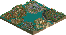
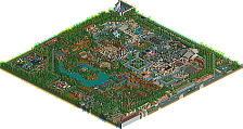
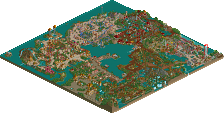
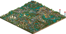
And I'm not moaning too much about the enterence area because the hotel was done nicely enough and the archetecture at lower levels there was very nice.
The everglades are/were the weakest area. Awasome woodie, cool details around the golf course and the fan boat tours were sweet and original touches however the area just looked sloppy and frankly the archetecture was overly boxy. If those boxes were enhansed at bit this area really could've been something...
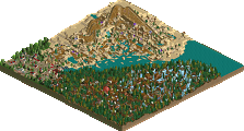
The area with SA's coaster and Erwindale Forest were both excellent. They had amazing atmospheres, great coasters, all kinds of cool theming touches... Other than the lumber building I loved the archetecture and the theming in both. Amazing... These two were of spotlight quality. The rest of the park wasn't but these two were. If you can unleash yourself this way on a smaller map and do 3 or 4 areas this well or better you'll have to win.
Hurricane Highlands was not particularly lovable for me. Just something about it seems stale... The coaster has a nice layout, the waterpark is one of the best I've ever seen ("women must go topless" lol), hell even the archetecture isn't so horrible. I guess the folidge, land/land side textures didn't mix well imo. There's just something about this area that is so excellent and something else that's completely seperate that's just painfully bad. I can't get stuck in the middle somewhere... It's just... ah screw it...
Island 51 was/is a very very cool area. Galaxy is a top-notch hyper, stolden science is a beautiful hack job. Yeah the two halves of the train do eventully move apart but the fact is that it takes a large number of runs for them to do so. Great work that way because I hate it when they're messy. There are a lot of cool touches here, very evolution like and all but it's too plain. Galaxy seemed to give you an excuse not to theme the area half as much as I know you could've and the expo was a major let down. This area was still just shy of making "spotlight standard" imo.
The ufo landing island with the ufo coming in cracked me up with laughter. I looks so much like the balloon thing in City of Dreams that I just couldn't help it. That's prehapse what this park does best, it tributes other great parks in a way that is so funny and enjoyable but still technically impressive. The other island with you and the "Hot Babes" could've used a little more thought. Something as simple as calling one of the "hot babes" "bitchy babe" and another "horny babe" or something could've really gotten a laugh out of me.
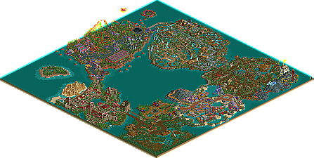
Overall this park is brought up by three spectacular areas and dragged back down by one are that's downright boring, another that just seems to lack something important and another that's just to old to do itself justice. Best of luck next time because I know there will be one...
ride6
Look for screens of that solo (Kumba's Creation) in May (only 4 screens of the whole park tho)
The thing that astounds me most is how you seem to be a never ending stream of fantastic ideas. It's all these little details that did indeed make this park very fun to look at.
Entrance - It was missing a little life, and there was no need for the sandcastle, in my opinion. It seemed like a way of getting cBass in on the whole thing. Good architecture and colours, though.
Everglades - Parts were excellent, it just seemed like you filled the rest up with ugly trees. I know it's the everglades, and there are lots of trees there, but a few more natural spots - rocky outcrops etc. - while not being accurate, would have looked better.
Cove - I can't really get into this area due to all the contrasting colours, but the coaster is very good, and the landscaping is excellent. Nice ideas throughout.
Erwindale - An old theme, but you thought up enough new ideas to make it seem fresh. All the foresty bits were amazing, especially the racing fairies and some of the little shops, but the other parts just missed for me.
Hurricane - A good coaster, with great path interaction, but the lack of any really interesting colours made it seem lifeless. Probably what you would get after a Hurricane, I know, but not aesthetically pleasing.
Island 51 - I liked this area, an excellent coaster which wasn't overloaded with stuff all around it. The architecture (if you can call it that) was good also.
Overall - The thing that holds this back from spotlight is that last little bit of polish, which you are just starting to find with your newest work. Excellent ideas take skill, but it takes more skill to pull them off in a way that looks good. A great park though, and one which I will look at many more times, i'm sure.
You had very good ideas through nearly all attractions but what's with the Alien Expo? I expacted more of it.
Super Runner up is the perfect title for this park imo.
Sounds like it may have been a Spotlight if you hadn't had my input.
BUT for the first time in a LONG time, i have to say i am impressed with this park. must of taken a long time to do. but i'll hand it to you man, you really impressed me.
I really liked the odd bulidings and areas but i think 1 area kind of ruined it for me and that was the Everglades, but overall it wasnt too bad.
The details in the park were fantastic, the fairies, the bird flying around the show, the swamp tours was amazing, I dont usually talk much when i look at parks but that made me just blurt out "cool!".
There were downfalls, I dont think it was outdated, the architecture was just bigger.
also the spelling was bad in some areas..but that is just Kumba.
Overall pretty well made park, better than anything I could do.
Calabash Cove, on the other hand, worked well. I liked the atmosphere, the choice of colors and the coaster was built well and looked fun.
My fave area was Hurricane Highlands - the coaster was marvelous, and whilst others have said that the area lacked something, I think it was pulled off nicely.
Erwindale was absolutely beautiful. Definately the best work you have ever done. I loved it.
The Cove section was nice with a great layout. I enjoyed it, and the path combination you used there really worked for me
Hurricane Highlands I didn't enjoy quite as much. The coaster had a good layout, I just didn't like the colours and it just didn't come together nicely. Not sure why, because the waterpark was good too. The rapids weren't your best
Area 51 I really liked. Stolen Science was cool, although it looked a little messy. Galaxy, despite the poor name was an awesome hyper.
Entrance Area I didn't like at all. I found it dull and uninspired. Didn't match the rest of the park at all.
Everglades was ok with a solid woodie layout and a great idea with the boat thingys. The zoo was tres cool too.
Overall, there were some wonderful details and enjoyable things to look at in the park. However, I felt the architecture was often uninspired. Pretty dull and each building within a section looked very similar. however, Super runner up pretty much sums it up for me. Very close to spotlight.
Metro
X250 - What part had spelling errors? or the most I guess? Turtle spell checked the park and helped me fix most of it, tho I was still unsure on a few, oh well I tried my best...
P_BOB - Agreed, I need more themes like those, the others were not what they could be, but I tend to get sentamentle and lazy witch is not the best combo for fixing things up, however I think I re-did like 5 buildings for the entrance coz that stuff was a full year old in spots.
Steve - I hate to admit it but when makeing the highlands mall I keep looking over at your surf shop
Ed - Im glad you like the detail and innovation, I try hard to have things like that in all my parks. Yeah I did post wayyyyyy to many screens, nag Corky & iris and think I had it won (Tho im not sure if I acted that way?) oh well...
Posix - Wow from you thats best reply I could have hoped for
The Legacy - Im glad you liked it so much. About consistency I kinda tryed not to be very consistent, I made araes in diffrant ways so the park could have something for everyone, and I personaly like building with many styles. With my next and last solo park tho im gona go with themes like EV, and the Dino Digs, imo my best and most detailed innovative works, also the ones I had the most fun with.
slob - I know in the past you have not been very crazy about stuff I did, but thats nice to hear. Thx.
Natelox - Sorry I do not know what you mean by sinage... I agree that stuff was alot of fun to look at, I hope to make more neat things like that in the future.
Turtle - lol, I have ideas non-stop, its just how I am, I still have enof to make another full park thats alot more detailed and cool then BP.
Anolis - Well id say Galaxy is the best coaster in the park by a longshot, then the woodie, then SA', then Hurricane, then Ed's 4D. With the expo I should have fixed up the inside but I was to lazy to re-do the roof...
cBass - Don't say that, your sandcastle rocked!
TheGuardian - Thank you, im glad you really enjoyed it.
Leighx - I guess i'll put you down for a "miss" on the Glades...
OCF - lol, yes you Richie, and JKay played a neat role in the park(c?)
Scorchio - I think the main problem with I-51 was the treeing, that was carppy, I should have re-did it coz it could have been pretty cool, but Archy and ride wise id say is one of the strongest areas, but I can kinda see it miss for some people.
Metro - Well imo that was my best rapids by far, not coz of the station, but the detail and layout, I can't really put my finger on it but I loved that ride. The entrance I disagree again, it had detail like the other sections and good ideas too, maybe take another look or something? But hey you like most of it so we are cool
Thanx to everyone for the replys, keep them coming.
Kumba
I hate words like this
Please don't leave rct for the next 50 years
Damn right I did, hardest job I've ever had lol.
My favorite part of the park was the Cove section.
Cobledash Cove (I think?)-Wow, everything was great. The colours clashed, but in a good way. I liked the show idea, very imaginative. The coaster design was very good. I even like the little bit of landscaping that was there.
HurricaneHighlands- If Cobledash Cove didn't exsist (sp?) this would be my favorite part of any park I've ever seen. The archy was outstanding, the colours went together like Morcombe and Wise, as did the coaster and landscaping. The coaster design was one of the best I've seen. The landscaping just seemed to work with the coaster, but I don't see how. I liked the little mini flying helicopter, that made me laugh
Entrance- It was ok, but not as good as the two areas above. I didn't see the point of the coaster track on the roof of HQ though......I thought CBass sandcastle ruined this area as well (No offense
Area 51- Wow, this is the major let down of the park, I usually love futuristic themes, but this was quite poor. I didn't see the point of the roof that you could take away, there was nothing inside the building. The coaster layout was not very good (Galaxy) and kinda shocked me. I did like the lim launched though. The go karts hack was neat as well.
Erdwindle-Hmm, this is either you love it or you hate it, and i'm sorry to say that i'm one of the latter group. The trees weren't too good, the structures were blocky in some places but quite good in other places. The main things that let it down were the two coasters in the black rock.
Everglades-Worst part of the park, only thing it had going for it was the coaster layout. Archy was worse than the rest of the park, the walls seemed kinda boring, and there wasn't much landscaping.
Zoo-Very good, i'm not classing it as part of the Everglades because it was too good for the Everglades. Very funny and archy was brilliant, I liked the hacked bird flying round.
Overall, I'd give this 8.5/10, and it should have been a spotlight.
This was a well deserved super runner-up. Congrats.