Park / Bayfront Parc
-
 07-February 05
- Views 9,409
- Downloads 3,599
- Fans 4
- Comments 51
-
-
 76.88%(required: none)
 Gold
Gold

G Force 85% 5dave 80% Austin55 80% Cocoa 80% Sulakke 80% Liampie 75% nin 75% trav 75% alex 70% posix 70% 76.88% -
4 fans
 Fans of this park
-
 Download Park
3,599
-
 Tags
Tags


Corkscrewed Offline
Post your comments here, because if you don't, Kumba will haunt you and your family through AIM!!!!!!!!
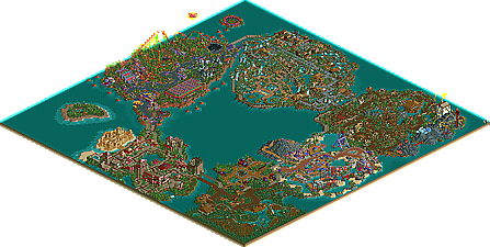
Besides hurrican bay, where the walled up water looked too artificial for what its surrounded by, and erwindale, the sections seemed a little small. They archy was nice and had a great style, the colors on island 51 were great, the space ship rental, and alien expo, which the roof pattern was pretty cool, but the expo was empty, just a ride and a rocket, nothing more. cBass' sand castle was excellent, nice spot on there, big cypress was an excellent wooden, great layout and placment, but again the area it was in was lifeless and small, the map seemed dominated by the water.
i think you did nice but i know you can do better, this was a big map and the areas were quite small, im hoping to see you back with another runner up to one up this one. just a few flaws in my eyes but overall it was enjoyable, just not like the Kumba im use too seeing.
the ice palace is my fav! you had worked with so much love to the detail, i think.
and your ideas are amazing.
the Monkes, Corkscrewed and Iris are funny
i think the galaxy area was the worst area, but looks ok.
sometimes I asked myself, why it isn`t a spotlight.
Good luck for your next park, Kumba.
muuuh
Ok I will admit this park is not really my best stuff, alot is out of date but I sent it in becoz it turned out just how I pictured it. I had a vision for the park and pulled it off, thing is that vision is over a year old.. People will bitch about the entrance, the everglads and other things, but after a year I just kinda wanted to move on. I will admit I thought id win spotlight anyways, all the testers said it was a lock to win, but just my luck only Corky and iris thought otherwise
I aint to mad about it tho, I know it aint my best shit, but the thing that bugs me is that nothing beat it and its just "not spotlight worthy"
I hope you guys enjoy the park, yeah I clearly went to big on map size so you do get a good deal of water. My fav area is EV by me & Ed, I think this area holds my best work, like Treeeats witch imo is the only true example of me building at 100%
Anyways im glad after 400+ days its released. I hope you can all give some feedback or I will hunt you down via AIM
Again enjoy the park and please reply so I may flame you or something. IE:Corky that logo bites!
P.S. The cove is not a joint section, all SA did was the coasters layout, all that themeing and archy is by me.
Kumba
This is definetly your best work to date Kumba. I really liked how you made an atmosphere in each section and the architecture was awsome through out the park.
Entrance area: Although some of the buildings seemed blocky at times, it was still a pretty good area. The sandcastle wasn't as good as I'd hope.
Everglades: The coaster was pretty cool and the architecture was as well but other than that it seemed like that it was empty compared to the other areas. I liked the idea though.
Calabash Cove: My favorite area is defiently this one.
The colors went perfectly together and that coaster reminded me of Shockwave that was at SFGAM and Vortex at PKI. I also liked how you built the shark tank into the landscaping.
Overall this area was definetly had a awsome atmosphere and felt welcoming. Nice job!
Erwindale Forest: My 2nd favorite area. If this isn't considered a forest than what can be? It is the best forest area I've seen since Ed's Erwindale. I liked that whole fire ride as well. Nice job!
Btw, the racing faries kicked ass.
Hurricane Highlands: As Cork said, the use of landscaping and architecture was very good. A few places seemed a bit random but after a Hurricane things do look random so it works. This is my 3rd favorite area.
Island 51: This wasn't as good as I expected it to be. Some architecture was good while others weren't. I wasn't that impressed with Stolen Science. It was alright but it wasn't as good as when you 1st showed it.
This is definetly a hit or miss area.
Overall, awsome job Kumba. Your architecture, landscaping, and use of hacks definetly made this park great. I think you could have gotten Spotlight if you put a little more into it but you definetly deserve a Super Runner Up.
Great job and congrats!
I had a quick go-through this morning. I thought I'd post.
I have to admit, I thought the Island 51 area wasn't too good, in fact I thought it looked very odd. The cooaster was cool, but every thing else in the area wasn't of my liking.
The entrance was nicely done. Even if it was out of date, I still liked it, I actually thought cBass's castle ruined it.
My favourite part of the park was Hurricane, one of the best coasters I've seen, I just loved the layout, especially the turnaround-around the water slide, it was very nicely done.
Other parts that I liked were:
-The adventure ride around the shape of the woodie (cant remember the name), The woodie was okay at the beginning, but I thought that it was too slow after passing below the loop.
-The Erwindale section was fabulous. full stop.
So, all in all, It was a great park, with a few bad spots. But well worth super runner up.
Good job Kumba, and suck my balls.
Erwindale
Best area of any park i have ever seen. Simply amazing detail and the whole 'hackiness' of the area is pretty cool too.
Island 51
My second fav area, full of bright vibrant colours and neat hacking. Stolen Science was stunning, no idea how it worked but it was great fun to look at! The lost go-karts ride made me laugh, some great ideas in this area and they were very well executed!
Calabash Cove
Unique theme, i love the idea of the shark tank. The coaster was great, a little slow in places but still decent. The custom-ride in the area was superb, a little large in contrast with the rest of the park though.
Hurricane Highlands
An area with its own scenery, the coaster was really well paced until the end where it seemed to lack a little speed. The archy was below your usual standard, but i think this was probably one of your first areas or summat. Still, a great area to look at!
Entrance
Nice, nothing too special for an entrance but seemed to fit the rest of this spectacular park.
Everglades
Didn't like this area sorry, seemed a little simple compared to your Erwindale area- a bit of a lack of detail. However, what a fantastic wooden coaster!
Just watch your spelling in places, i remember a sign in one area which said: "Bapfront parc", which made me happy. Erwindale forest as i said before is the best area in any park i have ever seen- never have i seen such detail. Amazing park Kumba, probably just shy of a spotlight in this case but would have definitly got it if i were judging.
Can't wait to see what else you have up your sleeve.
-X-
Kumba, you should stick to themes like that one, erwindale, and hurricane harbor. The entrance wasn't too shabby either, but the rest of the themes I felt weren't up to par with the rest.
Great job, Kumba, and congratulations.
I think more than anything else, this isn't spotlight because Kumba posted too many pics, maybe nagged a few too many times, and acted like he'd already won it on more than one occasion. Well anyway like I said many times before, the park speaks for itself, whether it's a spotlight or a runner-up or something else. This is really something to be proud of and I'm proud to be a part of it, in my own small way.
the only area that showed little promise was the one with the wooden twister.
So perhaps you only have yourself to blame.
Still, it is one of the greatest RCT2 parks created and perhaps the best ever park not make spotlight. It just shows how good you have to be to make spotlight, and makes me realise that parkmakers like me will never be sunbathing under that glorious light.
Congratulations, maybe next time your undeniable talent will be rewarded with the prize a parkmaker of your quality deserves. (Hell if there is not there is no hope for most of us).
i honestly enjoyed it Kumba, and congratulations on your much deserved super runner-up.
I can't wait to see it!