Park / Vales of Crypt
-
 14-July 04
- Views 23,131
- Downloads 707
- Fans 1
- Comments 48
-

-
 74.09%(required: none)
 Gold
Gold

csw 80% Liampie 80% Milo 80% alex 75% Cocoa 75% G Force 75% Ling 75% RWE 75% Scoop 75% Jaguar 70% Poke 70% 5dave 65% posix 65% 74.09% -
 Description
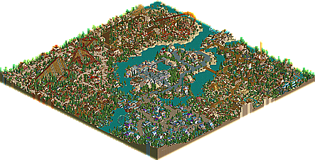
The best NE Runner-Up we've had in quite some time comes from one of the last hopefuls left in the LL rebellion. Mortician, formerly known as Coasterct Nick finally brings his highly anticipated first solo park since being crowned an NE Parkmaker in last year's NE Awards. Known as "Project Crypto" through it's construction, it developed a seemingly cult following in the Advertising District, and now comes out about 8 months after it began construction. In some ways it's just your standard 'themed area' park, but you can see Mort's talent increase through each area. Some beautiful theming and architecture, some creative rides and great variety through the areas...the one problem Mort never seemed to be able to avoid. Evil WME also stops in and contributes a hacked theater show in the middle of the park.
-
1 fan
 Fans of this park
-
 Download Park
707
-
 Tags
Tags
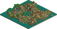
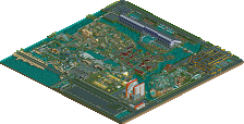
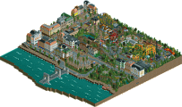
Tulesian Islands was nice enough. The sewer and jungle areas were the best- especially Mantis's wooden coaster... the coloring in both sections was great. The sewer area was probably a little better, but the adventure ride was disappointing... too much underground track. The rest of the park wasn't particularly memorable, but well done...
EC:LV was... a little too much for my tastes. There's so much detail, so much to look at, so many shapes, so many colors, so much movement... it all meshes into one big mess. If you separated them some more- rivers, trees, empty spaces... it would be much easier to enjoy... the ideas are definitely there, but the execution was poor. The coasters were just too spread out and too unrealistic... but the virginia reel was well done.
My favorite so far is the Nascar park- it was just brilliant. Everything was done so cleanly, so perfectly- the grass (I even wish there would have been more of it!) added so much to it. The hotels and convention center were great, but more detail (for example, plants, tables, chairs, etc. on the balconies) would make it a bit better. I loved all of the coasters- all of them, every part of them. Even that first drop on the inverts was just perfect. I would really love to visit this park in real life.
Overall, nice job... Nascar was probably my favorite of the bunch, but this one isn't close behind.
Great park guys, glad I could help you out with the logo, and glad you like it.
I think that having a large parking lot, a road, and three hotels is overkill...and unnecessary. The orange and white hotel, however, is one of the best hotels I've seen in rct; great details and very realistic. The dueling LIMs were really cool, I loved all of the elements. The entrance area was wonderful except for the buildings directly beyond it, they were a bit too blocky for me. The station for the woodie was also kind of blocky. Most of your coaster designs are too spread out and awkward looking because they just don't seem to fit with the surroundings. The bumper cars and their structures were really good. The dueling splash boats were cool and original. The quad duelers were really nice. I loved the water park area...especially the slides. I didn't really like the huge black and yellow building...it was too blocky looking and somewhat boring. The purple hotel was cool but very repetitive...the glass part was amazing. Overall the park was a little messy but had many great parts.
Entertainment City: Las Vegas:
Crazy! Again, glad I could make a logo for you, and glad you like it.
The entrance is spectacular...although the green and black used behind the entrance doesn't fit with basically anything else in the park. This park is much more organized than Thrill Zone...but you could still benefit from a bit more orgnization. Planet Galactica is a really good building. It seems you do really well on your larger structures and not as good on your smaller ones...it seems like you try to cram too much detail into the small buildings. The station for Entropy is amazing...the coaster is not layed out well though. I think the main thing you need to work on for coasters is the transitions from element to element...try to make it have a nicer flow from one to the next...but still, you did improve in that area with this park. The space section looks really good as does Fremont Street (I especially liked the blue path coverings and the carousel building). I didn't really like the wooden area; just too much brown and too much of the same roofing. Hoover Dam was great but the coaster almost gets in the way of the setting and dam. The asian area was amazing, one of the best I've seen. King Tut station was great and the Egypt area overall was beautiful. I loved everything about Circus Circus...just amazing. Fraktal Faktory is a great ride and themed very well. Great job JKay.
Vales of Crypt:
Cool park mort. The duelers were alright...but a couple elements weren't timed very well imo. Volcano Beach Adventures was good but pretty bare...nice buildings in the area though. Sociocide is an amazing coaster. Most of your architecture throughout the park is well done and detailed just the right amount. The treeing is a bit weird though. The entrance is wonderful...I especially love the main building. Digital Mind Field is really well done. I didn't like the Aqua-Zone building; too many square shapes and too repetitive. Sandstorm Witness was too awkward looking imo. Trezatu is simply amazing. I love the adventure feel to it and how it weaves through the surroundings. The boggler show and area is fun to look at...RE-Bot and E3ROR are funny and creative.
Tulesian Islands:
I have to ask thorp, why is the park name Flatland Bench? lol...I didn't particularly like the entrance area, the buildings were too small and dull. Unorthodox Cafe looked amazing and fit well with the hotel. I didn't like the use of go-kart track for roofing...it looked too weird. I also didn't like the flat coaster track awnings in most places. Rain Train was well done and had a great overgrown, foresty feel to it. Amazon Cafe was great; I loved the water falls. Forbidomazpta has a cool layout and good speed throughout (I also like its theming). The Forbidden City entrance is unique and awesome. Dance of the Gods is an amazing coaster although the surrounding architecture is not very good. Hajj is cool. I didn't like Kimiko though (sry Mantis). Overall, the architecture was just too small and dull...but the rides were mostly amazing.
Entertainment City: LA - JKay
I think the best thing to do for this is my likes and dislikes (Steve Style)
Likes:
Ying Yang and surrounding area - They were the best coasters in the park, the oriental theming was unique and top notch
Colours - They all worked really well. I especially liked how you implemented bright coloured lights into wooden areas and made them look excellent. Especially on that pirate style building (whisky something) that was my favourite pieces of architecture in the park.
Hoover Dam - Very impressive, and pulled of to perfection. I simply loved it
Foliaging - On the most part, really worked well and pulled your eyes towards the park as opposed the land areas. Always good.
Dislikes:
Landscaping in general - Most of the landscaping was pretty awkward and didn't flow very well. A little to random and distracting at times.
Coaster designs - The flying cowboy especially. Has to be one of the worst invert layouts i've ever seen (sorry) it was just some very slow turns going right, then left, then right, then left and looked like an eyesore, very awkward, unenjoyable to ride and unsmooth. The Lunar Excursion layout was quite good, as were the Woodies. I disliked the hoover dam coaster layout. A little sharp and unsmooth in places (such as before the barrel roll over the the dam) Definately your weakest spot.
Coaster choices - You overused b&m's. 3 types of steel twist? There are other options you could have used.
Unorganisation - It was really hard to find your way around the park. Once you have rotated the camera angle once, you are doomed for eternity. You get lost as the park has no real order. Would really have benefitted from being spaced out a little more with some space between the areas.
This park was extremely enjoyable to look out, but the coaster layouts really brought this down for me. But still, a deserved super runner up!
NASCAR Experience - RWadams + RCTNW
On the whole, an extremely impressive park. The architecture was fantastic. Especially (of course) the exemplerary (sp?) hotels. Absolutely beautiful. The water park was really well done. loved the queue lines for the flumes.
Onto the actual park. I loved the quad duelers. The best coasters in the park. Extremely well pulled of and an absolute blast to watch. The inverts i disliked. The slow decline of the first drop looked poor and the rides didn't seem to have much to them. The flyers I didn't enjoy really either as, although the layouts were good, i didn't like the whole symetrical idea where the rides were just reflected clones of eachother. The woodies were astounding, fast paced through out, great timing and excellent near misses. A little awkward in places i felt.
What I really disliked about this park was the landscaping. It wasn't flowing at all. Too jagged and the land textures were too dull which kinda detracted from the brightness of the architecture and the towering tremendous rides.
The foliaging was also quite dull, which i wouldn't have gone for in such a large scale *wow factor* park. I guess it adds to the realism, but I feel less of the dull greens and more of the more vibrant greens would have worked better alongside more lush land textures.
Other than that, great park guys. It really was a joy to look at, and of course, I will be looking at it over and over again.
Well done to all of you for making some super.........super runner ups! Great job!
Metro