Park / Vales of Crypt
-
 14-July 04
- Views 22,832
- Downloads 698
- Fans 1
- Comments 48
-

-
 74.09%(required: none)
 Gold
Gold

csw 80% Liampie 80% Milo 80% alex 75% Cocoa 75% G Force 75% Ling 75% RWE 75% Scoop 75% Jaguar 70% Poke 70% 5dave 65% posix 65% 74.09% -
 Description
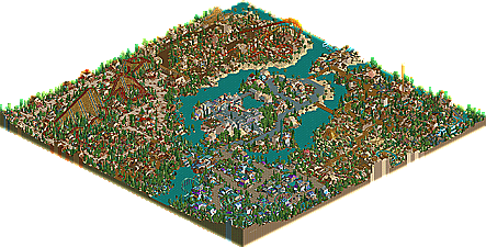
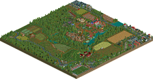
The best NE Runner-Up we've had in quite some time comes from one of the last hopefuls left in the LL rebellion. Mortician, formerly known as Coasterct Nick finally brings his highly anticipated first solo park since being crowned an NE Parkmaker in last year's NE Awards. Known as "Project Crypto" through it's construction, it developed a seemingly cult following in the Advertising District, and now comes out about 8 months after it began construction. In some ways it's just your standard 'themed area' park, but you can see Mort's talent increase through each area. Some beautiful theming and architecture, some creative rides and great variety through the areas...the one problem Mort never seemed to be able to avoid. Evil WME also stops in and contributes a hacked theater show in the middle of the park.
-
1 fan
 Fans of this park
-
 Download Park
698
-
 Tags
Tags
![park_3367 [H2H7 R4] The Wild West](https://www.nedesigns.com/uploads/parks/3367/aerialt3772.png)
Super Runner-Ups
Vales of Crypt by Mortician
NASCAR Experience by RCTNW and rwadams
Entertainment City: Las Vegas by JKay
Runner-Up
Tulesian Islands by thorpedo
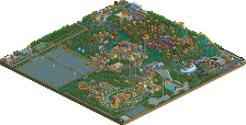
We have an absolutely amazing round of runner-ups these week. Two RCT2 parks and two LL ones. We have Mortician bringing his full scale quality NE Debut to the table with Vales of Crypt, aka "Project Crypto" and thorpedo finally completing a full park in Tulesian Islands, aka "Project Fuzz". As for the sequel, we have two mammoth projects. Starting off with RCTM's latest group park...the beautiful and original NASCAR Experience by RCTNW & rwadams, and finally JKay's second runner-up in two weeks, Entertainment City: Las Vegas. We have realism (in places), we have complete fantasy, we have quad-dueling B&M coasters, flickering lights, sewer explorers, and one of the best LL parks to be released in a while. What more could you ask for?
Ok, here's my reviews anyway. They'll all be up eventually, I'm just doing them one by one.
Entertainment City: Las Vegas by jKay
I didn't find this park to be as vast an improvement over Thrillzone as I had hoped. The style is still exactly the same, and I didn't find the coasters especially to be any better. Just to explain what I mean.... it's things like this which you could iron out:
I think that, just once, you could really benefit from trying to recreate a coaster. I find all yours to be very "rct" - they sprawl out over areas, with unusual inversions and often uneccesarily banked straights, going left-right-left-right. This probably sounds really critical, so sorry 'bout that... but anyway, I think you should try a coaster, give it more space, and get some big inversions in there, like big loops and cobra rolls. That could be seen as "conforming" or something, but my point is that if you're not careful then this style could get boring and overdone. Still, that doesn't mean to say that I didn't enjoy the coasters - they were certainly fun, and I'm sure you enjoyed building them. That's just what I personally think is currently holding them back.
As already pointed out, the Hoover Dam was absolutely awesome. I'm still not entirely sure myself how you managed to make the pieces offline by the small margin that you did. The entrance architecture was brilliant as well, you mix colours as well as anyone else. I think perhaps you overuse the standard textures of coloured marble/castle and wood a little too much in some areas. Some of the custom textures could work well also from time to time. I think this may have been partly caused by all the lights you used, which were great. If you had overused them, it could have slowed things down too much like Kevin's Volcanica or Kumba's Darwood Grove, but you had them about right. If I had to pick out an area that I didn't particularly like, it would be the western one. The coaster wasn't great and it was poorly named, and the area didn't do anything that made you want to look at it more than once, which, for instance, your Hoover Dam did do. I just think you need to give yourself more space still... every square of both your solos is full of something. Some well placed water, open grass or just treed areas could do your parks wonders here and there.
I still really think that this park proves you have skill to build to the highest of levels: but planning and better ideas need to be used to give your parks that extra something imo. Sorry if I went over the top with the suggestions and stuff. I loved the park, but I think there's a whole load of jKay talent still to be unleashed.
NASCAR Experience by RCTNW and rwadams
I really enjoyed the park. The coaster design especially was usually very, very good. I loved the way that the wooden duelers, and the 4-way B&M's actually looked like a race track, and the trains stayed right next to each other all the way through the circuit. The only coaster I'd single out as having a slightly worse design would be the grey and blue invert duelers. Just flipping the track designs like that doesn't really work for me, duelers should spend more time next to each other imo. I think the open grass was slightly overplayed here as well. Also, the splash boats you guys built in the far corner of the park looked a little rushed with the floating supports and simplified entrance building.
Along with most of the coasters, the highlight of the park was predictably the hotels and resort complexes imo. rwadams' glass front hotel was by far the best imo, whereas the biggest structure in the park was a bit repetitive (and must have been incredibly boring to build) this one was innovative, different and still realistic. Also, the entrance to the park has to go down as one of the best ever. It had atmosphere, which is something I feel a lot of rctm work lacks, and more detail than other parts of the park. I don't know if more time was spent on this area, but it certainly looked like it...
Nice park, I don't think I would personally have considered it for spotlight, it's not "intricate" enough for my tastes.... but nonetheless it completely deserves the super runner up... congrats.
Entertainment City......! BEST!
Seriously - while he doesn't quite yet have the "ironed" perfectionism of a parkmaker, he is getting EXTREMELY close in my eyes.
I think these are some of the best runnerups I've seen in a while...
What I'm nutting over is this...
Jpeg's cannot be animated, yet it is... weird.
The reason for the bit of grass is because Roger and RCTNW hit the object limit and had to add some grass here and there.
Crypto: This park was jam packed with awesomeness. Each area had an anti-dull color scheme and idea. I really liked the coasters, great dueling inverts, great adventure ride, great steel twister, not as good on the woodie. The park looks great, full of substance and good-lookingness.
NASCAR: see later
ECLV: I am fascinated by this park, as it is something that I would be most likely to build out of the 4. It kinda gets me thinking.
Jkay obviously went for something new, bright, different, colorful, and flashy with this park. He suceeded. The whoa belly and carousel complex are great examples of detailed peices of RCT excellence. I loved little bits and snips like this. However, this whole thing raises a discussion with me...which I would argue that myself, micool, and kai are also part of. There are certain "rules" in RCT...and this park breaks some of them. For example, not having like a triple helix and then a double helix inside. This is a very RCTish thing to do, that nobody would ever do in real life. Fantasy parkmaking breaks a lot of the rules of real life...and this is what seperates fantasy, semi-realistic, and realistic. Realistic would look like something in real life...semi-realistic would be a creative theme that there is no reason that someone couldn't make a similar real theme park, just nobody has yet, and then there is fantasy, which can exist only in the game/in imagination. Personally...I'm interested in the blur between fantasy and reality. That power tower and that carousel complex, both of which grabbed my attention, could be built in real life. And I love them for that...great work. Some of the coasters...with sprawling layouts, triple helixes, etc, just wouldn't. Coasters just don't look like that in real life. Anyways...I really liked this park...I just wish that JKay could make more realistic coaster designs is what I'm getting at...still wild and creative and unorthodox, but possible. I guess thats why Mala is so good? Great park and it made me think...thanks JKAY.
Tulesian Islands: Good job for finishing, thorpyface. Um...ya, I liked mantis's coaster/area the best...mantis rules. As for the other areas, I didn't sense a big variety in themes, the sewer area being an exception. I STILL like that corkscrew coaster in the egypt area...and I agree with iris that that area looks really nice. The other areas seemed to me to be either a brighter or darker take on the same tropicalesque theme. The Sewer ride, the corkscrew, and mantis' woodie are the only memorable rides tho :-(...the mine train, steel twister, and invert didn't really have anything to make them standout on the map at all. Good job on a good looking park, I look forward to your next project in...4 years? :-p.
Thorp.- Brilliant work. The entrance was crafted so incredibly well. The open feeling was just awsome. The Kimiko coaster was brilliant, along with it's landscaping. Although it was kind of small, Rain Train was my favorite coaster in the entire park. I love how it was themed and the color scheme in that area was pretty good. Dance Of Gods was awsome too. Architecture was nice throughout the entire park, especially in the sewage area. Terrific job Thorp.
Brilliant parks, congrats.
-X-
Vales Of Crypt is a very well crafted park, especially in the Sociocide and Volcano areas. I really enjoyed those duelers and the woodie in those two areas, and the architecture was very good. The Tech area was well done, but I wasn't feeling the colour/theme at all. It was very...grating? I kind of like tech areas to be classy and to have that sheen - this one was very difficult to get into in that respect. The coaster was great, though. I didn't really enjoy the adventure ride, mainly because of the tedious backward section. The river ride was also a bit disappointing, because the big drop led right underwater - the satisfying splash was hidden from view! The central area was great (WME - is that other LL park you had still going?!). Great job, Mort - here's to more LL presence at the site!
I'll check out the rct2 parks later.
Tulesian Islands by Thropedo- Nice enterence, however for what it has in niceness it lacks in atmosphere. It just seems to be there, and that's all. The fantacy parkmaking areas of Kimiko and Twister Sewers, while being complete opposite (light and dark) were both excellent. And Mantis did an excellent job on the layout of the Kimiko Coaster. Some of the little touches scattered about here and there, like the "enchanted tree" were really cool. Unfortunently those are the only parts of the park that I found interesting. The remainder looked like Thorp was trying to conform to realism and/or immitate others. Quite a bit of the park looked outdated too. Hopefully Thorp can finish a solo in less than the year and some that this took, next time, that is.
Vales of Cript- Mortition- The best runner up since Oceania, easy. Very cool and atmospheric throughout. No real standout coasters though. Streamin' Lava wasn't exactly the duelers that I was hoping for but the woodie, Sociocide, was far better than anything I was expecting. The enterence was excellent, almost like DDI, only darker and more sinister. I like. The futeristic area looked like was I would expect to see for Spiderman, if he was still around. It really doesn't carry it's age too badly. The newest area with the pick flowers and the adventure corkscrew was the best IMO. And no worries Mort, POH will get spotlight.
ride6
Awesome park here, Mort. I loved every bit of it. It has some awesome theming, ideas, foliage, everything. I loved the adventure ride, too. I like how it jumped over the over track. The only thing I didn't like was how incredibly slow the duelers went through those corkscrews (the adventure ride was a little slow, too). Anyway, looking forward to PoH. Update that thing sooner rather than later, man.
Nascar
Loved every bit of this park. It had it all: coasters, hotels, water park, everything, and you guys put them in such great locations to make the park really flow. I enjoyed all the neat little details (RCTNW's pool has a swim-up bar!) as well. Work on your landscaping though, It's looking a tad messy. And Roger's hotel owned the rest of the park, that thing was kicking ass all over the place. Well, great park, looking forward to the next one.
Thats all I looked at for now. JKay's and Thorp's look very nice though.
ride6
Thanks to all who have commented or downloaded the park. And thanks iris for the super runner-up award. I'm still in awe of all the positive feedback so far.
I have yet to d/l NASCAR Experience, but am quite excited about it. The screens iris chose are quite incredible. Congrats NW & rog.
I can't say much about the LL parks, but they also look amazing. Congrats to both these LL'ers on their NE debut parks.
Thank you for your thoughts so far.
Richie Offline
Overall i loved the park, you used the lights very well. Even if it did slow my computer down
NASCAR: I cant say im much of a fan. Ive never really been a fan of any RCTM parks, and this didnt make me want to be. You guys seem to build parks for the architecture... I mean the hotel are cool, but then too many are just a waste of space/objects. If you stuck to one hotel you would have been clear of the object limit. The coasters didnt really impress me. They all seemed spread out and awkward. The only one that kinda worked for me was the 4 duellers(2 floorless. 2 sitdown) but even that didnt make me think wow. I think in your next park you should just forget about hotels and water parks, and build a theme park!! Im not saying it sucked, the architecture was awsome(ALL OF IT), just really a waste on the most part.