Park / Coral Creek Adventure World
-
 06-November 03
- Views 29,509
- Downloads 651
- Fans 1
- Comments 79
-
-
 73.13%(required: none)
 Gold
Gold

Ling 85% 5dave 80% ][ntamin22 80% Jaguar 75% RWE 75% Liampie 70% posix 70% Scoop 70% Cocoa 65% G Force 65% 73.13% -
1 fan
 Fans of this park
-
 Download Park
651
-
 Tags
Tags
Coming up next to NE...The 100 Greatest Rides and the NE Invitational results!
RCT2
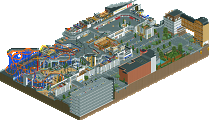
John Williams: Through The Ages by Marshy and Metropole
LL Parks
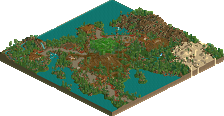
The Burning Secret by Themeparkmaster
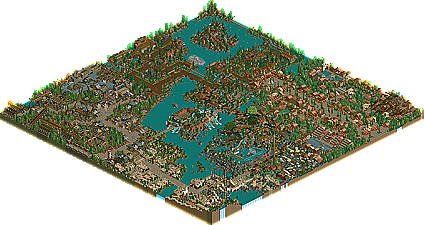
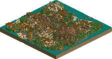
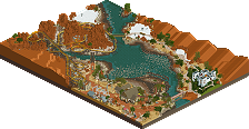
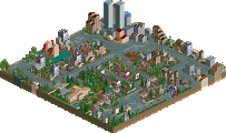
Coral Creek Adventure World by Benni
Chronicles by Andrew
The Happy Place by Micool
I loved the Happy Place, and Micool, you know I've loved all of your work. I can't wait to see what you come up with next, and I also can't wait to test it
Benni, keep it up. If you keep at it, you could ultimitely become a legend in the game.
Andrew, I've really become a fan as of late, but this park just seals the deal. Great job.
In any case --
Chronicles -- I liked it. Alot. Fantastic job Andrew, had a great feel to it.
Happy Place -- Micool -- great ideas, maybe i'm not intelluctual enough to get them? I can see the ingenious, just not my cup of tea, congrads all the same.
BS -- Surprisningly, not how i remembered it from the screens? In any case, it look great, maybe not as it could have been if you hadn't 'taken a leave of absence', but nice indeed.
Coral Creek -- Stole the show imo. Benni captured a great atmosphere, and is a master at hacks and using good ideas for hacks. Benni has my vote for next parkmaker....i mean, this and terretina...wow.
Congrads all, tough round, nice dls.
Musings:
1. Marshy said that he loses inspiration a lot for building parks. Then he turns in a park (with Metropole's contribution, of course) themed to one of the world's greatest modern composers, and some great movies, in one. How's that for some inspiration?
2. In this spotlight round we have a Spotlight themed exclusively to movies that have either never or rarely been done before, and a Runner-up that fuses the concept of memorable music with movies (with some original films as well). Two original ideas for film-based parks. In an age where you know what all the big movies are that have been released and it is difficult to find an original one that you can build a unique themed area to. Let's hope people follow these examples. Except then they wouldn't be, because the movies have to be different. Whatever.
Coral Creek - Adventure world, sorry. =) Personally I thought this was easily the most visually impressive and stunning park of the round. Well I shouldn't say personally, it's more of a fact and sort of obvious. The Burning Secret had great coaster hacks, Dreamworks GA had great execution, The Happy Place was more based upon ideas (as usual
I was hoping Chronicle(s) would be released this round because I was looking forward to it. I had the honor of testing it a few times and I was with Andrew through all three entrances...lol. I'm really glad he didn't keep the second one because it was done in a day or two and didn't show the Andrew-superbness that the Oriental area does, IMO. By the way I dunno if you did this on purpose or not Andrew, but this is one of the coolest RCT screenshots I've seen because of it's natural feel and unintentional feel:
I outlined it in red but it doesn't look anywhere near as cool as when you can see the lines in the perspective. Anyway great job Andrew, I love Los Angeles to death and the Black Death really is a great coaster, too bad Elrocko was abducted by himself. He probably feels the same as deano, but at least he never yelled at us. Oh well, I respect their decisions and I truly hope deano will come back someday because I'm never one to say "oh fuck them if they say fuck us, we don't need them." I think deano was well on his way to being one of the elite in rct2 - his hotel was brilliant. Anyway, back to Andrew. The whole park impressed me but I think you have somewhat of the same problem as Freak. If you would just take more time filling your parks with ideas, your parks would flow more and have more character, especially since you've already got the fundamentals and other basics down.
As for me, I'm just happy it's released, finally. I hope you all take time to enjoy the little things in the park, even if it isn't your "cup of tea" - I'm sure for a lot of you it isn't. But I had a whole lot of fun making it, and now if I could just get my own computer in my own room, I would have more time to build, though I doubt I would at this particular moment. I'm taking myself on probation until the Christmas holidays, because I just got my two college class midterms back and got a 70 and 58 percent, which are two of the worst grades I've ever gotten on tests in my life, so I'm going to concentrate on this nightmare they call "life" for a while. I have a NE Pro Tour entry almost done for one of the upcoming contests and hopefully I can get that finished. I thought it was due for this week (lol) but it wasn't so I have much more time to finish it and hopefully I can pull off a win that week - in my opinion it has some of my coolest ideas ever - too bad the coaster doesn't work yet, ha!
Hopefully some of us will find ourselves on the list in the next update.
Great round, and keep up the wonderful RCT1 work.
Long Live Loopy Landscapes.
I'm not feeling too well at the moment (long story, don't ask) so I'm going to have to comment on the parks later but I glanced through them and Benni's park should have won the spotlight. The rides, theming, hacking -- everything was just brilliant. Coral Creek really is a masterpiece. I can't even express in words how much I loved 'Flight of Stardust'. The top 100 rides list hasn't even come out yet and I already have a new #1. The launch tunnel is gorgeous and the layout is flawless. The theming in that whole area is the icing on the cake. I'm drooling just thinking about it. What else, hmm. I loved the waterride with the little moving boats and the mine train was also great. The themed train ride near the entrance was a lot of fun to watch. The building style was simple but the use of custom theming and the great use of color really brought it to life. Benni, this park was brilliant. I can't thank you enough. Here's hoping you'll make another park sometime soon.
Umm...
The Happy Place- Who dropped you as a child? Because they must've done it repeatedly. Seriously. You are the craziest rctmaker person since Mala..and I like it. Control craziness is just what the rctworld needs and you are the future. Praise MiCool. Great park, there was an absence of coasters however..*coughcough*, but a kooky and weird atmosphere.
BS- Great park. I've loved this from the start, even before you took a "leave of absence"..first three areas were awesome, and the fourth one really really really stands out as something great. Satan is probably the coolest coaster I've seen since Pahohoe Flow, and wait! MA made that too! Freaky. Kickass theming by Freak, too. Good job on the park everyone.
Chronicles- WWWOOOOOOOOWWWWWWW...this is awesome. I liked the final version (not uncut) better..its just more beautiful without the Pagoda..and you already did that remember? Anyways..LA stole the show, probably the best themed area I've ever seen....ever. Seriously. Maybe Port of Discovery beats it out a LITTLE...but this is the best area ever. Great LA atmosphere, a weird coaster...and coolness. Cool. Heh.
Coal Creek- I don't know what to think of this. The futuristic area is superb. The entrance of the park is very traditional and beautiful. The rest of the park is soooooo....WEIRD. Little hacks all over the place, not really goin anywhere. Its UBERWEIRD. I think I only like the future and entrance areas. Sorry. However, your coasters are very good....*coughFlightofStardustcough*
Congrats to all for getting runnerup!
hahahahaha
I didn't think it was possible to have two 'eyegasms' on two different runner-up parks but I just did. This time it was The Happy Place. It's unbelievable! I admit I was skeptical. I saw the screens and didn't know what to make of them. My heart was cold and cynical. But now I've seen the light. Thank you Micool! There are tears in my eyes. Tears of joy. This is RCT alchemy. You've turned some colors textures and ride pieces into pure emotion. It's unmistakable. As I was looking at Benni's park I kept thinking, this is the park I've wanted to make for so long but never been able to. As I looked at The Happy Place though I saw a whole new style of parkmaking that has been swept under the carpet for the last couple years and now that it has come out once again, boy is it sweet. So many great ideas. I'll never make a park as good as this one. Never. Micool, I admit I was a skeptic but now I'm ready to join your bandwagon. You fun-loving mad scientist. iris, I'm sorry to say it, but I really think you dropped the ball on this one. OZONE's park was very well done but it's time for fantasy parkmaking to get a little more respect around here.
I remember when we traded parks one or two months ago, and I told you THP was my favourite park in the making. Well, I'm a bit dissapointed you didn't "finish" it, but it's still fucking brilliant. Wow. There's so much cool stuff there, so many great details, and most of all, so much fun. Had less of the map had been filler, I would wholeheartedly endorse this as the real spotlight.
Same goes for Benni's Coral Creek. Extremely innovative. There's some great stuff, and the only thing that holds it back from spotlight is the repetetive entrance. I forsee a parkmaker spot in the near future.
More in dept reviews soon.
Nice job Marshy and Metropole! There's so much to look at here, it's staggering. In general, the architecture is great, and the rides are strongly themed.
Highlights: the landscaping in the Jaws rapids, the supports and path interaction of Superman, the train stations, the parts of Temple of Doom that I could see, that fountain by the E.T. ride, and of course the earthquake-ravaged building.
Not-quite-as-high-lights: the pod racing coaster, and once in a while the buildings could use a little more detail.
One for the ages, though, for sure. Again, nicely done.
And thanks for passing along the Star Wars scenery. I might just make my own SW park now.
p.s. Sorry, but I don't look at LL parks. I'm sure they're great and all, but it's just not my game.
Read the descriptions. It's what I think, dressed in NE journalism. But it's honest.
Ed - glad you liked the parks so much. Seriously LL is alive and is kicking fucking hard, so people had better take notice! The fact that John Williams has 4 times as many d/ls probably shows the way rct2 has a monopoly over newbies, but the LLers among us...WE NEED YOU!
Oh well. John Williams: Through the Ages was very good. Nearly all the rides were well themed at the architecture was generally well-thought out and detailed. I liked the park but i don't love it. Still this is, quite possably the best RCT2 runner-up yet. Of course it can't touch DTA, Wormwood or Euroscape but still very impressive.
ride6
First of all, congratulations on completing such an ambitious project. As I get more and more busy I have more respect for anybody who can finish a full park, especially one of this size. And it's a very good park too. Even very very good. More than worthy of a runner-up spot but there's still a lot that could have been done to give this park more personality.
You set out to do a movie themed park, you really should put more thought into how each ride relates to the movies. The Pod Racing ride was pretty cool though it would have been better if the terrain wasn't a rocky mess. Rocks are good. They look nice in the game, but you really shouldn't overdo it. The canyons should be better defined here. I had to skratch my head at some of your ride choices. Return of the Jedi is a Magic Carpet ride in a green building? Huh? Saving Private Ryan is a monster truck ride? I can understand wanting to use all of the rides, I used to think that way. But if you really want your park to shine you shouldn't have throw away rides like that. They're forgetable and you want your park to be memorable.
Something else I don't like is when indoor coasters don't interact with the scenery. Having a nice building is great, but the ride is wasted if it just winds around inside of a pretty outer shell. I'm annoyed by RCT2's viewing modes because I could tell with the Home Alone ride that there was detail inside of the building that I couldn't see without removing pieces. I hate that. It might be better to go in the direction of having a second version of the park with building cutouts like a couple of people have done in the past. I tend to think of RCT as a canvas and you should try your best to make all of that detail viewable or your wasting your time. It's not your fault that the see through modes don't work anymore now that buildings are scenery rather than land. But I do think it's your responsibility to make your park viewable. That is if you want your parks to be elite which I'm assuming you do.
That aside, I really liked the detail theming and architecture in this park. You two clearly put a lot of thought into the architecture and it has a unique look. It's far removed from typical LL architecture but also very different from the 1/4 tile stuff I've seen from Mala, Timothy Cross, Toon Towner and others. I like the crazy detail of the 1/4 tile stuff but the clean lines and simple forms you've used work well too. There's plenty of room for different styles. Overall the ideas in the architecture are far beyond anything that was possible in LL and that's not an easy thing to do for those of us who cut our teeth building in RCT1 so congratulations for that. It's certainly an acheivment. All the little details in the theming really helped to enhance the atmosphere too. I like all of the details. This obviously took a lot of time.
Lastly, the park is just far too flat. As good as the theming in each area might be, the way the sections fit together is very important in rating a park. Case in point, Raindrop Riviera. Although the problem with that park was too much water. Here, the problem is not enough water or mountains or forest or something to organize the look of the park. The general layout works though it is a bit confusing which sections are where. That's mostly because the park is so big though. One thing that would realy help though is some significant geography. You need a lake or river that connects several areas. Or maybe a large mountain or a series of cliffs. Geography is what ties a park together and this park didn't have enough of it. If you had a mountain I would remember that maybe the Start Wars sections are around the mountain. And maybe I would remember the Harry Potter castle nestled next to a large forest with a suspended coaster weaving through it. Or the Temple of Doom overlooking a nice lake. See how that would make the park more memorable? You have all of the elements here but to elevate them above 'nice' you need to make them memorable. Give them some personality. Geography would help there. And so would what I said earlier about making your rides more memorable.
Anyway, great work you guys. This is a very nice park. Work on giving your rides more personality and tieing everything together with geography and add that to your awesome architectural and theming skills and you'll produce a great park. As is, I like this a lot but I don't love it. You can take comfort in the fact that you don't have very far to go to produce something I will love though.
Chronicle was good in areas, and not so good in others. Troizen was the highlight of the park, although it looked too much like something SA would do or has done. Overall, the whole park looks like it was done trying to imitate SA or Shueculer (sp?). I can understand liking someone's work and taking insperation from it, but this is just a carbon copy. Despite this, I would consider this the best of all the runner ups.
The Burning Secret was disapointing. I know TPM has lots of skill, as he has shown with H2H2 and his hi rollers entry, but this was a few steps below. I know this is because this park has been underconstruction for so long, yet still. The architecure is quite poor and commits a 'sin' (WAYYY too many tiny buildings).
Micool's Happyplace was a bit much. Colours were excesive, poor to no landscaping, poor architecure and poor layout. Really I don't see how this could have been a runner up. If anyone other than micool entered this park, it probably wouldn't have won.
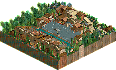
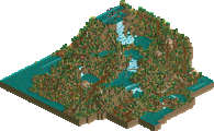
Benni's Coral Creek was okay. Too much repetition, esspically in the first area with the awnings and trees. Nothing really stood out to me. The volcano was very nice, I liked the lava idea, although it possibly could have been done a bit better. The car show was the highlight of the park. I think that if it were longer and had a few more explosions, it could have been a lot better.
@ Freak - Thanks for testing, bud. Not that you give too much advice, but I love praise and compliments, it's always nice, and I can trust you to keep stuff to yourself. You have no idea how rare that is - it seems common in NE - but most of the people I know would send parks and screenshots, if they knew how treasured the originality of them was - off in a chain letter or something. e.g. Turtleman.
@ MM - Well as I said before, that's okay, I knew going into it that it wasn't going to impress everyone. I'm not going to say something dumb like "I build for me, so I'll just blow off what you think" because nice replies always make me more enthusiastic about my parks and such, but I'm not changing my style, ever. Anyway, it isn't that difficult to understand, it's pretty simple stuff actually. Most of the theming is really recognizable, like the candy canes, the caramel apple pop, the sports fields, the monkey, etc. I was just having fun.
@ Thorpedo - Thanks for the compliments.
@ gir - Good. That's the point.
@ Coaster Ed - To be honest that's the best compliment I've ever gotten RCT wise. Obviously you are the most touted RCT artist in the "business" - you're the most popular anyway, and iris got pissed when I selected you first in h2h3 - but the point is that you said "I'll never make a park that good." Obviously I disagree but for any established parkmaker to say that it's incredible, because everyone knows their own capabilities. If it was a newbie or something I would've said something like "keep your head up, you'll get better" but I don't think anyone would consider you to be a newbie. Obviously you're in a low point self-esteem wise but still, that made me feel all fuzzy. And about me doing new things with LL - I try my best. I would be ashamed to release anything that didn't have something original, and if I do, smack me. Except MIOADC, that didn't really have anything new, minus the entrance. Well I guess the flower flag was something new. Anyway, thanks, really. It's so cool to be appriciated.
@ sircurse - I know. I really did originally plan to have that much water, because I love water, and if you notice, there's no tree filler space. But the bridges are kind of pathetic. I like them in that for once I was able to keep something simple, but I wanted to make a huge boat system and a big building and stuff. Well right after I finished the toy area - I mean RIGHT as I placed the last banner - I hit the banner limit, and kind of got discouraged. So I just did the "Be Happy" thing off to the side, and did some simple stuff in the middle. Thanks, and I hope it's still your favorite park, released. (In this round) (With the initials THP)
@ mantis - Well I'm sure if you replied to our parks it would be filled with more smilies, less punctuation, and less formality, but thanks for being so enthusiastic about the parks. Oh and I'd like to personally thank you for writing the descriptions because otherwise it probably would've been another week or two before that lazy ass got the parks up.
@ natelox - Well can't get all positive comments I guess. But I don't want you to get the wrong impression, because I'm really into landscaping (MIOADC), my architecture evolved through the park (did you read the readme?) and it's pretty good now IMO, and the layout was purposeful. Dude, that wasn't the point of the park. If RCT really is a canvas then I should be able to paint whatever I want on it. I'm not saying everyone should be able to do lazy modern art style work, where you paint a canvas blue and put some yellow dots on it, but the architecture, and the landscaping, and the architecture, and the coasters, and the atmosphere, were all secondary. I'm fully aware of all the theories and I know them all well thanks. Of course that has slowed my rise severely - after all I've been around longer then 7 or 8 parkmakers - but I wish you could see the ideas through the surface and not be so boxed-minded. I'm not going to say narrow-minded because I would never accuse you of being so, but man, loosen up a bit. That park took me fucking months more work then Chronicles. Okay, fine, if that's the park you like best, I'm not going to attack your opinion, but give me a little credit here. And give benni a little credit as well. Nothing special? C'mon, that was one of the most creative, innovative, and courageous parks I know of! More explosions? I had to open the park like 5 times to see them all. I agree that the entrance was a bit repetitive. And don't get me wrong nate, keep up the opinions, after all, this paragraph would've been worlds shorter if you didn't share your opinion, unlike the rest of these lazy dogs.
Come on guys, I know a lot of you opened the parks, just post a few sentences on each one, or even just one sentence describing them all! I don't post much in the ad district unless I see something I really like, but I always post opinions on a finished park. That's when you should comment on parks. I mean, people didn't praise the Mona Lisa when it was in progress and then forget about it, did they? No! If you're going to lurk around, don't be worthless. I hate that.
Again, thanks for all the nice compliments, and maybe - just maybe - I'll get around to opening JW: Through the Ages. Maybe when I open the NE Pro Tour RCT2 entries, and the RCT2 Hi Rollers entries, etc.
John Williams- I wasnt quite 'feeling' this park. Thats my only comment, becasue to tell you the truth, I looked at this a few days ago and am having trouble remembering it. Please forgive my laziness. Congrats on finishing a giant park though (Cant remember exactly how big it was), I know how hard this is first hand.
Burning Secret- DUDE......... you like, totally ruined my hotel. Sorry, but IMO it looked only about 100,000,000,000,000,000 times better before it was............... shrunken
This park does suffer incredibly from old age, like nate said. When I first viewed this oh-so long ago, I must admit, I was amazed. Still, those "Guardian" and "Kyrax" deulers remain one of my favorite coaster ideas. Being incredibly outdated sure doesent ruin their awesome-ness.
Coral Creek- This park simply inspired me. Not for its themeing or architecture, like others have commented on, but for its ideas. This park has showcased some of the best pyrotechnics since Battlefield RCT. The themeing on the other hand is, just in general, rather ugly in my eyes. I see the talent all right, I just feel it could have been expressed better.
Chronicles- Now I know this is a pretty old park and everything, but I still found it very boring. Andrew, everyone knows you have the talent, I personally would just like to see some other form of a park from you. I.E., not a four corners style of park. You've got to break out of your shell. Try something new.
Just a suggestion.
The Happy Place- Well, you cant really expect a person like me to appreciate a park like this, but I guess its all right for what it is. The park layout REALLY could have used some work, and your architecture was........ well, tiny and insignifigant. Try and make it bigger, more grand, thicker, or whatever in the future.
Hmmm...... most all my comments on these bunch of parks seem very negative. Sorry to be such a pessimist