Park / Busch Gardens North America
-
 20-November 08
- Views 7,996
- Downloads 915
- Fans 1
- Comments 24
-

-
 76.79%(required: 65%)
 Pro Tour 3

FullMetal 90% nin 90% Kumba 85% CedarPoint6 80% ChillerHockey33 80% Fr3ak 80% Magnus 80% posix 80% Xcoaster 80% Evil WME 75% geewhzz 75% Milo 75% RCTFAN 70% zodiac 65% postit 60% chapelz 55% 76.79% -
1 fan
 Fans of this park
-
 Full-Size Map
-
 Download Park
915
-
 Tags
Tags
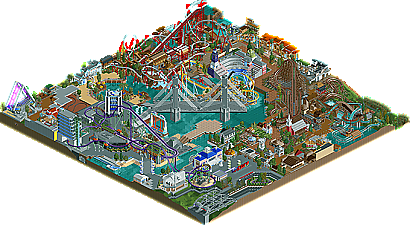
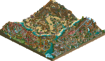
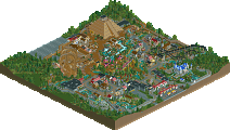
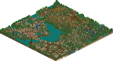
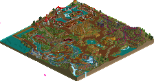
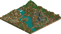
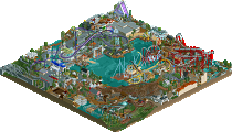
Summed up my thoughts word for word right there. I thought the front half was pretty good and worked really well. The back half really struggled to create a cohesive feel. It felt more like a random collection of ideas put together than actual areas. Most of the individual things were really well done though and I loved the coasters and log flume. The unfinishedness hurt this a little but the under construction areas were actually kind of cool and I don't really think that it should have been dropped several places just because of that. The skill of this and the number one were better than all the other entries by a good margin imo.
Congrats on a #2 spot and I hope to see some more work from you.
The park was a bit messy to look at and I didn't like all the sloppy trackarchitecture and diagonal stuff. In my opinion, it looked better without it. Less confusing and a less sloppy look. I didn't like the flume either. It was the most sloppy ride in the park.
All in all, a well-deserved second place winner. Shame it didn't get finished (yet).
disneylhand Offline
Sorry I'm not going to address everyone individually, but I want to respond to some popular ideas I think I read.
As to the comments of the ideas seeming recycled from other parkmakers' projects, I have had this discussion before (with you, zburns, actually) and I don't personally attribute the similarities to be due to my copying of or taking inspiration from other RCT parks, but rather from the same real parks. This could be just me trying to maintain a higher reputation, though; as far as I know something subconscious is going on in which I'm building what I've seen in RCT. Sometimes I feel like people perceive my work as totally reused, but I don't think/hope this is the case as I only look at parks once, maybe twice. But as I said maybe something I'm not aware of is going on, believe what you choose.
The bridge; turtle hit it directly on the head. It was the first thing in the park (I have the screens to prove it) and it was just an experiment that I happened to build on the PT bench. When I decided to enter the contest, I thought I'd try to make something out of it, but I agree it didn't end up working. I realized this a while ago while building but never got around to doing something with it, like a lot of other stuff in the park..
As for finished-ness, I definitely agree with most of what you have said, and I'd like to think that most of them would have been addressed had I had the time/inspiration to finish the park. This leads me to think that the park is actually a lot less finished than it seems. Maybe we'll see one day if the same problems are present.
As for the mushy 'land' distinctions, I don't really know if this is something I can fix in further work on this park as, to be honest, I don't really want big signs over paths like in a lot of other parks as they don't seem very realistic features of a park to me.
I am proud of most of the architecture in the park.
-disneylhand
What's there, is mostly really good except for the bridge. The ride design is just awesome.
I'm looking forward to seeing more of you, and congrats on #2. It is well-deserved!