-
 X Louis
Go to post #741352
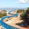
guests would make this look a lot more lively*
-
 X Louis
Go to post #741150
That's got a unique look and color scheme. I actually really like the colors. I'd add some more buildings with a purpose (cafe, gift shop, etc) to balance it out. Maybe experiment with colors for buildings, like a white stucco. The aqua accent color is nice as well.
thanks for the nice words
Nice work! ill be sure to add more architecture in and probably redo half of the paths.
-
 X Louis
Go to post #741149
stations the best part for me and yep the foilage is probably what i'm worse at. Ill definitely have a look.The applegreen works out so damn good here.
The foliage feels a little... uhh... too diverse, I think? It doesn't look all that natural. I love the station though.
Good to have you back on the site again. Keep it up.
-
 X Louis
Go to post #741148
I remember this


-
 X Louis
Go to post #741147
not been here in a while, whats the mekong pallete lolTry it with the Mekong palette.


