-
6ca Go to post #674689
Macro (Park Impression):
The park looks kinda messy from above and has this strange cut-away corner.I thought the same thing and then realized that if you rotate it 90*, it is meant to look like a cut diamond. http://www.diamondex...8-8-442x300.JPG
EDIT: aaaaaand I should read the 4th page before I reply to a post on the first page

-
6ca Go to post #653014
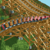
Hulkpower...not the most tactful. Great screen, but it might be nice to add say, a track-colored small footer underneath the supports so that the track actually looks attached to the support.
-
6ca Go to post #649692
Without the brake there, I think the riders would die going through that dive loop at 60+ mph...
-
6ca Go to post #649374
I think this looks fantastic. I'd love to see you add a little bit of snow to this to recapture a bit of the winter theme. I've been to Bryce Canyon and Arches national parks in the winter and the atmosphere is breathtaking, and something I haven't seen many folks really capture as a theme in RCT. I'm also not the biggest fan of that shorter, bushy tree--I'd go with more conifers.
That being said, I can't wait to see the finished product when you finally do release it. The layout on that dive coaster looks great from here. -
6ca Go to post #648891
The foliage and overall feel of the screen is quite dark for a science campus. I think it would look better with lighter, cleaner and more sparse vegetation instead of heavy and dark trees with messy ground cover.
I think simply changing the monorail track walls on the grey building to white might help out with this.

 Contact...


