-
 TwiDragon
Go to post #546795
Suicidecarz - thanks
Jaguarkid140 - thanks as well
Cocoa - Well I'm not really out here to make this park the perfect park or to start some new groundbreaking idea. I know this isn't seen as anything but meh' to the people who vote on the parks for NE, but its a lot better than my previous stuff.
RCTMasta - Well what should I use? Photobucket and Imageshack turned out to be unreliable, any option. Also, I never really liked the coaster track as supports for coasters. If its the box support thats bothersome, I can just use the pipes to do the same thing.
Luigi - At KD there is this adventure cave, I kinda recreated that here as its the "adventure" section
tdub - Yup, Oh yeah, much better than the last NCS park I did. -
 TwiDragon
Go to post #546728
http://cache.rcdb.co...u0ghm62gs8d.jpg
The supports don't spread out like they do in the screen you show. The supports should be going the same flow as the ride. -
 TwiDragon
Go to post #546700
Looper - thanks
Funkeymon - Alright, I gotta. I'll fix that up.
Luigi - Foliage will always be my weak spot so I need to work on that; The second screen is the entrance area, I can fix up the buildings as the roof on the one with the purple wall are a bit odd. Benches have been placed sloppy ins some areas, but rather better in other areas. Improvement will be shown on this in the future for sure. The small building in front of the station for the Flyer; I'm actually still trying to figure out what to do with that. The line never piles up.
Cocoa - Well I kinda knew that NCS has a lot more critisum with it. I got inspired by nin and SF Houiser Station, as well as a lot of older RCT2 parks. I do have old parks posted up, and if you care to look you can see my last completed park = http://coaster-net.c...ted-adventures/ (2009), ever sense I put this park out there, I haven't really done much with the game to really show, but I have followed the community. My attempts with custom scenery go even further park to something like this = http://i40.photobuck...rkOverview2.jpg (2008).
Thanks for all the critisum and what not. I knew I'd get it here if I posted this here.The othere sites I advertise this on just say "looks good" and move on
Heres two more screens, and damn my editing sucks on the first picture, lol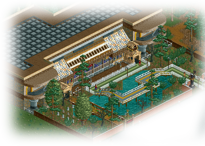
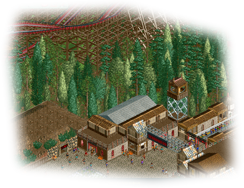
-
 TwiDragon
Go to post #546657
Maybe its just me, but I don't really care for the different types of path blended together like that. Other than that everything checks out perfectly awesome.
I hope this ride isn't fully inspired by Krake, as far as I know the whole ride is the drop, inversion, and a turn to the brake run. Seems rather basic to me.
Can't wait to see the full result. -
 TwiDragon
Go to post #546656
Hmm, this park feels like one of those parks that you would make just to win an in-game scernio objective.. Most of the rides have no flow, no realism, and nothing going for them. The worst one of them all is the yellow vertical coaster. If you want to improve on the coasters you should look at how other park makers do their rides as well as how real rides flow.
As I've never been much of an expert on anything else, I'll let someone else take it from here. However I will say this, we can see the inside of the lake. Using the mt.tool to make a giant hole isn't going to do much good.
