-
hpg Go to post #761597
Lovely.
I wasn’t sure how I felt about that sunflower object before but you’ve sold me on it. -
hpg Go to post #757707
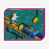
Is it just me or is that slingshot super close to the wild mouse?
There is some really nice micro in here, but I think some of the more macro aspects might be holding it back a bit.
It can definitely be good to give different buildings and areas their own unique character, but I think a few shared motifs here and there could help tie everything together a bit better. -
hpg Go to post #755406
Shipwreck looks great.
Supports are a bit... phallic?
-
hpg Go to post #755261
This I dig. Especially that Skywarp and the glass roof. Very well done.
Do you plan on shoestringing the Skywarp? Looks like it would be a (relatively) easy one to do and that would look even better with peeps.
Think I’m with Liam on the Mako colors though. They sort of clash with the otherwise complementary colors you have going on. -
hpg Go to post #755133
Not a bad point Liam. I think Mondrian himself used a few different blues over the years as well.
Its just always sort of bugged me how the darkest blue in RCTs standard palette is right on the edge somewhere between blue and purple where the color is really susceptible to shifting from one monitor to the next.
Certainly not a huge deal either way. I was mostly just curious to compare the two.
edit: Missed your reply while I was typing mine. It sounds like thats a good route to take. Different objects make the colors appear a bit different as well so there might not be a single ideal color to use for everything.

 Logo Artist


