H2H7 / [H2H7 Finals] - Barons vs Canes vs Atlas vs Laborers
-
 16-July 15
-

 Louis!
Offline
VS

_____________________________________________________________________
Robber Barons - Fantasy Park with Strong Narrative (RCT2)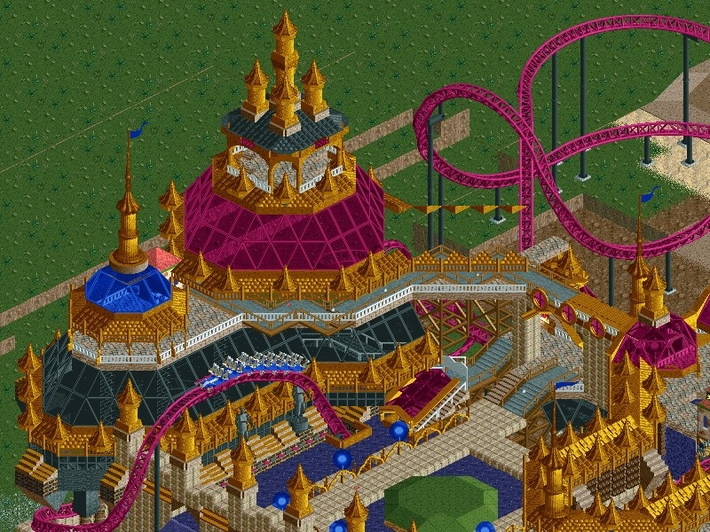
VS
Hurricanes - Paradise Pier (RCT2)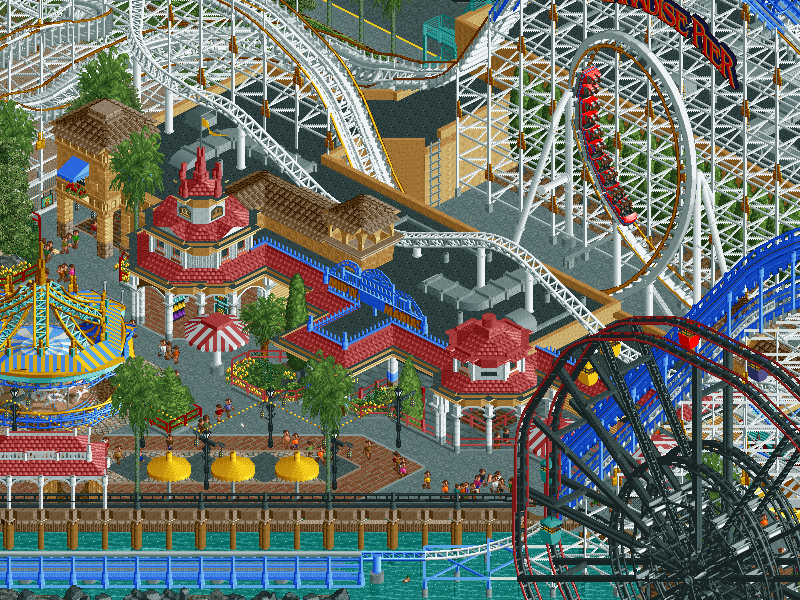
VS
Heaven's Atlas - Asteroid Fields (RCT2)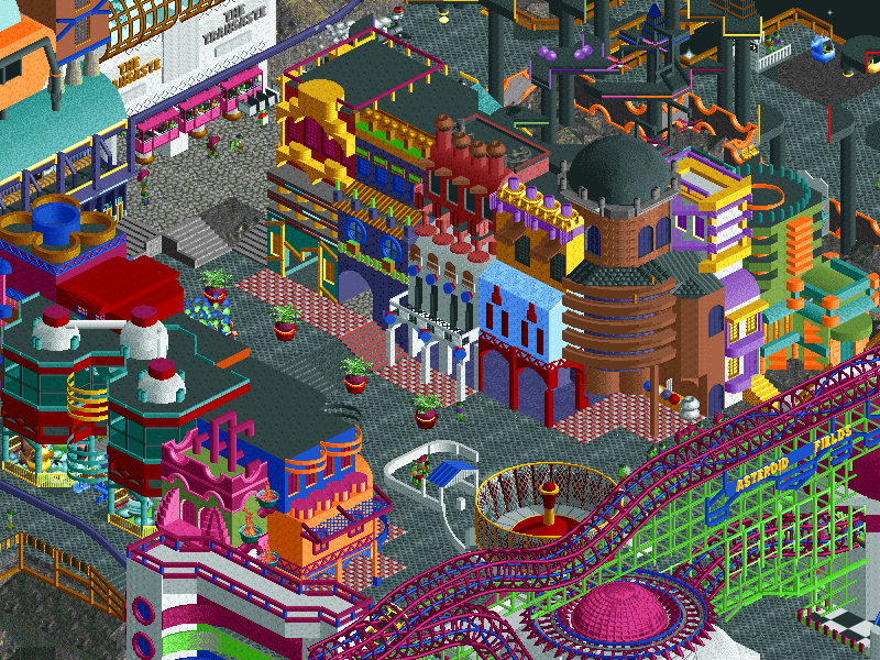
VS
Manual Laborers - DisneyPunk (RCT2)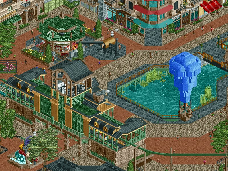
_____________________________________________________________________How to vote:
- This season we're back to using polls to count the votes. THE POLL WILL OPEN IN 24 HOURS.
- The Grand Final is split into several matches, each team facing every park in an individual match: Barons v Canes, Barons v Atlas, Barons v Laborers, Canes v Atlas, Canes v Laborers, Atlas v Laborers.
- If your team is taking part in a particular match up, you may not vote on that match up.
- Any tactical voting from teams will result in an instant disqualification from the tournament.
- You can only vote if you have viewed both parks in game.
- Voting will be monitored and anyone found to be abusing votes in any way will be punished. -

 Austin55
Offline
X7123M3-256 is the real MVP of the finals. He's everywhere.
Some unique looking things going on here, I suspect that had the Semi-finals matches gone the way they were intended we would have had a VERY disastrous finals match.
Cant wait to check these out though. Been a great contest everyone. -
 G Force
Offline
These would of produced some interesting playoff matches for sure. Canes' vs HA would be super realism vs Super fantasy. Laborers v. Barrons would of been comical because of the SciFi/Steampunk elements of DisneyPunk.
Overall, definitely two of these parks are some of the best parks of the season, really high quality stuff by these the 3 teams that finished such great parks. Review will come latter.
-

 Louis!
Offline
There was an issue with missing objects in Paradise Pier. Re-download the park for these.
-

 Six Frags
Offline
Close call between the Canes and ManLab..
I feel DisneyPunk is very disproportional tho. I remember people complained about epws being so disproportional between buildings-peeps, but this is like 10 times more.. It really distracted from the overall quality of the park with those huge buildings. I appreciate all the content in the park tho, it has A LOT more content than any of the other parks, and the theme is an interesting one as well, as it combines 2 favourite themes of mine, Disney and steampunk. Really clever. It's a bit of messy park as well with so many clusters of buildings and rides stuffed in the back of the buildings (which Disney would do btw, so don't know if it's that much of a negative).. Quality of the architecture was very high tho, and it really gave this park an edge over the others imo.
Paradise Pier on the other hand could've used some more of that 'messyness' DisneyPunk had. I felt there was too much water for an H2H Finals park this important. I realize the real paradise pier has as much if not more water, but I wouldn't mind if that wasn't so true to the original park and just cut a bit there in order to have more content. The big black wheel was kinda out of style with the rest of the park and..well.. just ugly. It sticks out while the real wheel is much more of a 'weenie' and eyecatcher of the park.. I liked the coaster tho, nice pacing and elements. I assume those toon's deco corners are meant to represent those little suns on the supports, but I just don't like them and think their kinda ugly too. I did like most of the architecture and pathing though, really has that realistic themepark vibe I usually get from a particular parkmaker..
Asteroid Fields was a bit too much fantasy for me, I just didn't felt that HA vibe the other HA parks had.. I did like the rocks and changed color palette though. Just too much floating random stuff everywhere..
Barons... sigh..
I'll probably view them some more times ingame before voting, and I'll elaborate on my comments as these are just first impressions..
I'm a bit disappointed tho, was expecting more awesomeness after all the extra time and rule changes..
Overall, I'd rate last H2Hs higher I think, although it was still an enjoyable season with some outstanding parks like #diamondheights and Raptor..
-

 Faas
Offline
I loved Asteroid Feels. Green peeps? Horizontal ferris wheel? 45 degree angle launch tower? Intergalactic freeway? Warp portals? So many cool ideas, truly one of the best parks of the contest. I don't think it is that much fantasy somehow, it's how I would imagine a theme park somewhere in outer space. I also like the fact that this is somewhere in a galaxy with no steel roofs!

Paradise pier was truly beautiful, but scores less originality points of course. It captured some of the atmosphere pretty perfect I think (although I have never been there). As Six Frags said, the ferris wheel looked ugly, I never like when they are made of track pieces. I loved the haunted mansion and the wild mouse (that corner overall).
It's a shame the Barons did not finish their park. I had no idea what it should have been (somehting with pueple water?). The bridge looked epic.
I do think the buildings were a bit too big in the Manual Laborer's park as well. However the architecture was pretty awesome! I loved the castle but I didn't understand the coaster that went around/through it? Why did it have such a difficult layout? I loved the twister around the towers coaster, that's always a cool coaster. I didn't understand all the different track types going on for each coaster. but I guess it's a steampunk thing?The toilets in the starbucks were a really cool touch
 .
. -

 chorkiel
Offline
I'll look through all these gems probably more often these couple of days, but on first glance.
HA: Wow. All that movement. And everything built on planets, that's just sick.
HC: Very nice and clean atmosphere. Very spacious in a good way.
ML: Superb architecture, clever concept and a lovely architecture.
RB: What's there is good. Looks/feels a bit like a combination of your R4 and R5 parks. Bummer you didn't finish it.
-

 Six Frags
Offline
I don't think it is that much fantasy somehow, it's how I would imagine a theme park somewhere in outer space.

Now I think a bit more about it, it would've been cool if Asteroid Fields was a bit more realistically fantasy-ish, like if Eclipse didn't have gravity, or if the whole 'park' was inside of some kind of bubble so people could actually breath, or if all those peeps where edited space-entertainers..
edit; Read the readme
 So it appears it's an alien race that can live in absolute vacuum
-

 FredD
Offline
Hope the poll is still open wednesday, going on holiday to Italy in a few hours. Checked the parks out real quick and it looks very promising!
-
 ScOtLaNdS_FiNeSt
Offline
Nice man, Discarding the robber barons just based on the screens because it looks unfinished which is unfortunate, Its gonna be close though between the others. At this point from the screens... If I could open the parks which I can't, Hurricanes park is my winner.
-

 5dave
Offline
Asteroid Fields
Concept:
A park in space... why not? It felt whimsical and somehow I thought about Space Jam (Moron Mountain) and Futurama especially with a lot of moon and sci-fi clichés from the 80-90ies.
Macro (Park Impression):
The park looks really messy and wacky from above, but that's how it should be. Some parts of the park seemed to be cut-off from the rest without much guest-activity but maybe you just opened it for guests, so that's no problem. Maybe adding parts to the bottom of the asteroids would have been interesting as well?
Rides:
I like the random names of the rides, somehow they seemed like aliens trying to speak english/human language and just mimic it, which was kinda funny. The Klumpak ride didn't do much for me, but I guess it was a fitting structure for the entrance. Space pinball was fun and whacky - loved the fact that it's hidden behind the facades so that I noticed it later while viewing. Eclipse and Mörsoc were kinda boring in that setting - too human I should say. This corner is the weakest in the park IMO because it's only offering those two rides and a non-working restaurant. Whoopsyl Slyzkof was more interesting and I liked the gaps through the track. The jetpack-ish details were also a nice touch. The flatrides weren't really exciting for the most part (except the leaning rides on the edge)
Architecture:
The structures were REALLY colorful and unique, you really tried to base the archy of something existing as good as possible. Most of the time the structures felt incoherent though, with some of them really detailed colorful and others more 'bold' or just one color. The station of the invert for example didn't really fit with anything else but I guess it was intentional having one style for each asteroid.
Micro (Details):
Some VERY cool ideas in there. That telescope with the view on earth - amazing, the teleporting through the park, the leaning path, the custom colors (green visitors and grey mud), the sideway ferris wheel - I could go on and on... Really nice and unique ideas throughout the park. The screen didn't do this park justice, as I thought it was pretty boring and sub-par at first, but I was proven wrong! Pity you didn't name some things properly (z-naming is good, but a hint to the rides' purpose would be good, stalls could use names too) and also some rides didn't have ratings which is also avoidable.
Paradise Pier
Concept:
I'm not sure if it's a park inspired by the real thing or a full blown recreation, as I've never been there and can only judge from photos/google maps, but I guess the latter. Really awesome achievement, accurate representation of the park with (nearly) every ride working, everything peep-able and functioning. This shows how far RCT2 has gotten.
Macro (Park Impression):
From the overview - this looks very classy and harmonic altogether. I compared it to the real one and it's really damn close, but I'm missing the Mickey Mouse face at the wheel? Dunno how it would be possible to recreate, but I was looking for that one at least My favorite area of the park has to be the terraces for the firework/lake show in the night. A good idea would have been to include a nighttime version as well and to somehow emulate fireworks+music? Would have been a great idea at least.
Rides:
California Screamin' was amazingly done, perfect execution. The icing on the cake would have been a working duel station and/or a working block brake system, though. Boat hire felt like an easy way imo. Goofy's flying school was also spot on but again missing a working BBS. The custom flatrides were amazing - especially the Swinger and the Zephyr. The Ferris wheel was also impressive, even though it missed the second gimmick cabins, but I guess that's not do-able in RCT.
Architecture:
The buildings were spot on, not too much but also not too little detail, great texture and color choices throughout the park. The interiors were also great and added a lot of depth to the park (Toy Story ride and Mystic Manor being two stand-outs).
Micro (Details):
Again, some of the naming wasn't satisfying (Ride 1, Info 1, Mechanic 1), but I guess you just didn't bother after putting all those hours in the park. But that's just my usual pet-peeve (besides the BBS, haha)... All in all it's a classy park, but also suffers from the usual major problem of recreations - even though it's perfect, it's not original - no original ride ideas, no original stories, no original layouts,... But that's just my subjective problem with recreations in general. I appreciate the time and effort to replicate something to perfection, but I will always credit new concepts more.
Disney Punk
Concept:
Okay, this is ridiculous. Mixing a Disney theme park with Steam Punk?! Insane. BUT - my main problem with the concept is - where are the Disney franchises? I noticed 20.000 leagues under the sea, but no other Jules Verne story. Also no movie (or at least I didn't recognized a Disney movie here) was referenced. Why not Steamify Disney movies? Treasure Planet? So my first euphoria was muffed a bit.
Macro (Park Impression):
From the overview the park hasn't too much colors to offer, most of it had earth-tones, browns, reds and greens, which made the park look kinda dark and not really inviting. Layout looks good, but it's a pity the entrance was placed on the other side of the park leading to distracting peep-filled paths on the map edge and park traffic problems. It was also hard for me to distinguish between the themed areas. The mainstreet looked french but didn't had any Jules Verne stuff in it, the New York area looked similar to the french one and the futuristic didn't really fit to the Jules Verne ride well.
Rides:
Factory Tour was the main ride of the park definitely, but it was a rather boring ride. It's basically going slow all the time with only one bigger exciting drop over the water. The backward parts were a nice thought but didn't use their full potential being squeezed in at the slow parts at the end of the ride. Also the coaster was only running with one train, which is a shame. The Spark Gap Coaster was unique and wacky but not very pleasing to the eyes and I don't think it would be much fun to ride this one, it's Helix - the ride. Coney Island Madness also had a good idea behind it and a solid execution. The many track types make the coaster look somehow messy, also the layout was kinda all over the place. I loved the indoor theming though.
Architecture:
The archy was really nice for the most part, it seemed you started with the high-toned main street and New York (?) area and didn't have enough time to finish the Sci-Fi area properly in the end. The structures had the right amount of detail but not the right amount of color IMO. The castle structure felt bulky somehow (width-height ratio). What I loved were the speak-easy and theatre interiors. The french buildings were also great, even though they were empty. The entrance structure with all the cogwheels was so promising but the park wasn't in the same quality unfortunately.
Micro (Details):
Soime details were really nice like the steampunk cattles, the balloon, the hidden mickeys, the Nautilus and all the interiors of course. Unfortunately the park left a lot to be desired - it felt unfinished and the promising theme didn't fulfill my hopes.
Fantasy Park with blabla
Concept:
Man - this park could have been so good So sad to see an unfinished park in the finals. The concept seems interesting (maybe something linear like the India park?). Would love to see this explained/finished.
Macro (Park Impression):
Loved the colors (blue, violet and gold-combo is amazing) and the landscaping (unique setting and atmosphere there by the dunes). But other than that there's not really much on the map unfortunately.
Rides:
Dragon is cool.
Architecture:
Those temple structures look really nice, maybe there's a slight overuse of the spire object but it kinda works I think. The bridge is also pretty unique.
Micro (Details):
Interesting spots like the purple water/waterfalls, the tree and the dunes really spark my interest and imagination. I wonder what ties those elements together. Didn't like those blue lamps though.
I was surprised to read only one readme from all those parks - why no love for those anymore?
TL;DR: Asteroid fields: wacky fun, Paradise pier: safe perfectionism, Disney Punk: missed chance, Fantasy blabla: winner if finished?
HA vs. HC for me.
"MFG" -
 RCT2day
Offline
What a final round. It was definitely the right call to skip the semi and extend the deadline.
Barons: What a shame, this had huge potential
ManLab: Soooo good, though a little messy
Atlas: I love this team and their parks, just overflowing with brilliant ideas
Canes: #thestormishere
-

 Xeccah
Offline
NE usually poorly represents the innate excitement and appeal that RCT has given so many people over a decade ago excitement and enjoyment in the game. These people, where most of us started out, treated RCT as a fun playtoy foremost; using it as a medium of art wasn't on most players' mind, nor was realistically modeling coasters and theme parks. It's rare for a release here to tap into that sense of sheer fun that dominated assumingly many of our childhoods. It's even rarer to have that same release not skimp out on the ever-increasing standards that we pressure on ourselves to achieve. That's what Asteroid Fields did for me.
The largest strength of this park is that it never takes itself too pretentiously. This sort of fantasy doesn't try to overwhelm the viewer with pretentious surrealism or makes the panelist member judge this as a piece of art that shoehorns coasters in order to stick to the RCT mold. It takes a simple concept and executes it ingeniously without putting the viewer stuck looking at arbitrary details and a constant barrage of architecutre. (That being said, the architecutre that did exist was subtly detailed, eye catching brilliance whose scale or details didn't force the viewer to stare at it). It used rides and hacks to carry the narrative for it, and that dearly paid off in the end. That being said, the coasters, being necessary for this theme to work, were all fantastic. Eclipse was a well paced invert with some of the better interaction points and aestethics i've seen in a layout this compact. The Lake and River-esque batwing was an excellent entrance into the area. Morsoc was also fantastic, if a little fast, but it used the landscaping around it to create terrific height variation that would be a fun ride until the end. The hacked rides and ideas ended up being the main force to push the theme, however, and whether it was a shoestringed wingrider that floats in space, sideways ferris wheels and freefalls, Alien peeps, walkways on the sides of the asteroids, or giant tentacle monsters, every detail provided in this park was made with the sole intent to push the "park in space" theme further into territories that most other builders would be uncomfortable going with.
This isn't a park for everyone, it's a total middle-finger to taking a contest based around a roller coaster simulator serious. None of the little flaws or unfinished bits in this park hurt my perception of it, because mainly it seemed not to care about them itself. Though this park was a risk to build, given what would be the roster of top-notch realism, archy heavy master-class crap that I myself have been guilty of making this season, or the fantasy that yearns the viewer to metaphorically see their park as a work of art, this never let the fun away. I appreciate this so much. -

 ottersalad
Offline
I smiled the entire time reading your post Shotguns.. totally hit the nail on the head. This park screams the most FUN out of any park in the finals. The other two finished parks were too clinical. I got bored with the hyper details. I began out playing RCT because it was fun and I wanted to make cool looking things. Plain and simple. Asteroid Fields was extremely fun and more inspiring as a builder than DisneyPunk or a recreation. I'm so tired of recreations.. no originality. I can't see how a recreation can win, unless we are turning into a community of just making recreations. I get so bored and burned out trying to make realistic parks/rides.
After looking at everything, I loved Asteroid Fields. The cars that traveled the map at times got lost behind black tiles which was kind of annoying. But, everything was unique. The pinball ride was awesome. Really unique, I haven't seen anything like it before. The ferris wheel and the 45 degree angle ride were cool. And I think 5dave was accurate in describing the architecture. The colors were pretty cool too. The neons and the bright colors contrasting with the grey rocks was visually appealing.
I think Paradise Pier had some neat things.. the coaster was nice.. the custom flat rides were cool.. but I did one go-thru around the lake and thought "is that it?" Maybe I need to go back and look again. There was some cool micro details. But, I agree with Six Frags.. the lake was too big. Could've added some original ideas. I think a recreation is quite risky for a H2H final.. orignality > recreations IMO.
DisneyPunk.. wow. The entrance to the park was amazing.. and set a high expectation of disney in an alternate universe with spinning gears.. steam.. glass.. hanging rides. But, the more I explored the map, the more you moved away from that expectation. The castle was cool. But, maybe it was just me, but I couldn't get the coaster to work. Constantly broke down.. would go at 3mph at times.. kind of a let down. And I couldn't figure out the path underneath the path by 20,000 leagues. There was path underneath the steel path, but it was confusing. Things seemed to layer over and obscure things given the large structures. It was confusing to tell what I was looking at, kind of like World's Fair.. no breathing room at times.
And I won't comment on the unfinished park. What was there was cool. I just wish it was finished. Should've given the Rat Pack or the Italian Stallions that spot if you weren't going to finish a park. What a shame.
-

 bigshootergill
Offline
Robber Barons - Fantasy ParkFirst of all, this park seemed very promising. It had the setting of being something unique and fresh. I assume this was going to be a towering city overhanging into the deep valley, as the layout is now. Would be cool to see this park keep going and get finished.High Points:- Landscaping when you first open it was cool, perhaps would have been more refined had the park continued to be built- Never seen that glowing ball/lamp used in a park before, it’s a small detail, just liked it. Could have been used earlier in H2H for some other parks...- Maybe a little too gaudy, but that castle that was started had some unique features to itLow Points:- UnfinishedHurricanes - Paradise PierHigh Points:- I love the stunning architecture and buildings. I think that’s been a running theme for me in this H2H. Wishing I had half those skills. Kudos for the incredible details!- The setting of the park is great, and the fresh design. For example, the rounded portions of pathway over the water were a simple touch that I loved.- Nice airplane!- Very cool custom, operational rides, like Zephyr and Symphony Swings.- This is a park I’m going to open over and over again. Just soaking up the little details is quite enjoyable.Low Points:- California Screamin’ - I like the start to the ride, but some of the elements seemed like no-no’s to me. I’m no coaster buff, so I’m 100% okay if someone corrects me. But long straightaways and the extra speed-boosts throughout the ride kind of ruined it for me.- The never ending attempt to make a homemade ferris wheel rears it’s ugly head. This isn’t maybe a low point, because a huge ferris wheel here is a fantastic idea, but I wasn’t a fan of the construction of it.- Mystic Manor ride, while the architecture was awesome as per Hurricane-park-usual, the ride was a little loop. Nothing to it. Did you run out of time to finish it?Heaven’s Atlas - Asteroid Fields(Since I’m biassed, I’ll go light on the low points. I'm sure you can pick them out yourself.)High Points:- Already there’s a debate over realism vs fantasy (check that one off of the H2H bingo), but I personally admire any quality idea. And while space parks have been attempted in the past, this one is very well executed comparatively.- What stands out to me is how “normal theme-park rides” were used and hacked to make them very space-believable, like the Go-Karts are a flying Saucer Race, Whoopsyl Slyzkof actually comes off the track etc. While it’s not a “ride”, the adaption of a space parking is sweet.- An actual operational telescope that looks into earth. Wow!Low Points:- Nothing that comes to mind!
 Manual LaborersHigh Points:- Once again, I have serious case of architecture envy. My brain can’t figure this kind of stuff out! I try to do anything close to that detailed, it takes me forever and looks like throw up. You guys do it and it looks incredible!- I think my favorite ride was Spark Gap Coaster. It’ll make you dizzy as hell, but it was creative and unique.- At first I thought this park was low on rides, but they’re packed into the buildings a lot, so in that sense it’s well rounded- I do enjoy the steam punk style, could have been more in the park, but I’m not complaining.- Again, this is a park I’ll dig into more in the future.Low Points:- I didn’t really feel like there was a feature ride, a big attraction. The Factory Tour ride seemed like maybe the key ride, but it was slow and agonizing.- Archy may have been too big for my taste, but I guess that’s Disney for ya!Final Words:- It’s been fun to share in my first H2H. I may have only had a small share in our team’s parks, but I’ve learned a ton! Liam is a killer captain, and it was great to be a part of the action. In fact, it’s been a treat to work with the entire team. Thanks so much guys!- There have been some groundbreaking parks this year, the level has been heightened from last H2H. I’d still like to revisit some and write more reviews of some I missed.- And for the finals, it’s 3 great parks grinding it out for top spot. Though I mentioned the low points above, I was being nit picky. I’m thoroughly impressed with the parks Canes and ManLab entered for the finals, can’t wait to see how the voting plays out!- Cheers for a fun few months of RCT excitement!
 Tags
Tags
- No Tags
