H2H7 / [H2H7 Round 5 Match 1] - Italian Stallions vs The Rat Pack
-
 08-June 15
-
 inthemanual
Offline

Round 5 | Match 1 VS
VS 
_____________________________________________________________________
Italian Stallions - Universal Studios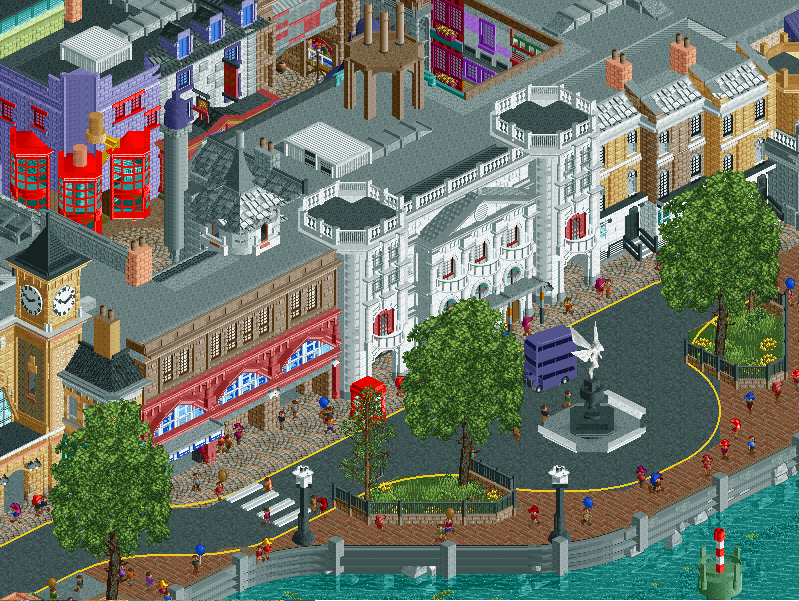
_____________________________________________________________________
How to vote:
- This season we're back to using polls to count the votes. THE POLL WILL OPEN IN 24 HOURS.
- Everyone but players belonging to either team in the match may vote.
- You can only vote if you have viewed both parks in game.
- Voting will be monitored and anyone found to be abusing votes in any way will be punished.
NEW RULE: next match will be posted in 24 hours, on the condition that the first match has at least 15 reviews of both parks. If not, the next match will be posted in 48 hours instead of 24. -

 Austin55
Offline
Stallions that looks DOPE. I wondered if Airtime's screens where a tease of this park.
-

 Dirk Pitt
Offline
Stallions that looks DOPE. I wondered if Airtime's screens where a tease of this park.
It was, so I'll nip it in the bud right now. It wouldn't do the builders of this park any favors if you compare his screen to the finished work you see here. It all was re-done and is original to the builders in this park, so please do them a favor and comment on their own unique work and not Airtime's.
-

 Cocoa
Offline
^hey, I actually prefer this take on it anyway.
downloading now, what an exciting LL vs rct2 matchup, this is where its at

-

 Steve
Offline
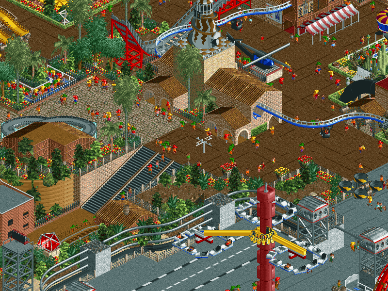
Holy shit that helicopter in the LL park is fucking incredible.
I was wondering when we would see a proper Diagon Alley in RCT2, glad that time has come. From the screen, seems a little over-detailed but not quite enough to hurt it maybe like Port of Entry in Round 1. Looking forward to checking it out in-game. -

 BelgianGuy
Offline
to the person who made those maurer sohne cars on that type of track directly...
THANK YOU! I actually really like the stallions park.
-

 Austin55
Offline
As we go review! The initial thoughts are already in place from the preview screen, this park looks really good and the Airtime influence is obvious. My first thoughts are wondering if Airtime’s dropping left this park in shambles, so I’m hoping ya’ll have it 100% complete. Universal is a really cool theme to go on though.So opening the park.Instant YESSSS. Love the entrance, and getting a peak at Hollywood Dreamin, must resist the urge to follow it first. Gotta let the entrance area sink in. the NYC archy is SOOO GOOD already. The actual Universal arch gate itself is rather a let down though. So far the colors and everything is just working perfectly, I’ve not even scrolled off where the park opens yet. Just from this tiny glance this is one of the best parks of h2h.I scrolled up and to the left for starters, towards Despicable me. More just absolutely perfect architecture, really this is so great. The theming for the Despicable me rides is yet again greatness. The Pharrel theme song from the first one is stuck in my head. I didn't remember a roof off version so I started deleting roof to see inside, but it seems neither of the dark rides is themed on the inside, a slight disappointment. Excellent backstage areas to! You made these super nice to look at, little Liam inspecting the stairs. This whole time Hollywood Dream is off to the side teasing me like a dirty stripper. First though I go and look back through NYC to see if I’ve missed anything and just let it soak in. Those trucks are very cool, great signage and everything. Really really great work.Decide it’s time to watch Hollywood errr NYC Dreamin. Nice twist there haha. It’s train seems to be stuck at the top of the lift oddly, so I close and reopen it, no issues from there. OH SHIT it’s got a duel station, thats cool. And back. Fantastic layout! You captured the ride pretty well, especcially for how small of a map you have. Great airtime, perfectly placed camelback over the entrance, and the twisty finale was a good ending, perhaps paced a bit quickly. The station area is pretty great, you even laid out the B&M brake runs properly which makes me happy haha. Also why does it need spare track, it's not an Intamin.On to the area near the twisty bit of Dreamin, which I figure is Pokemon by the ball logo. I honestly don't know shit about Pokemon so I’m hoping I’m not missing any cool references or anything. That said the area is well designed and enjoyable for even someone who doesn't know anything about Pokemon. Great interiors to.So at this point I just want to stop and say how happy I am with this park already. It’s pretty much my favorite park of this h2h so far already, and I’ve not even seen all of it. This isn't something I expected from the Italians but super happy for you guys, this is greatness.Continuing on to the corner area, not exactly sure what this area is meant to be at first. As soon as I slid over the top spin it was a wash of childhood memories though. Look at Shreks little house thing! So cool, ugh this park is getting better & better.The final area I know is Harry potter, so I scroll over, recognizing the teaser screen. Love the row of flats on the right side. The purple bus is such a fun touch! Is that a WW/TT object? Look at the little phonebooth to, been a few of those. The white and brown buildings are nice, however have that POE issue going on. Going to the “inside section” is just nuts, no idea how ya’ll crammed that much into such a small space, it feels a little cramped, but sells the theme so well and has incredible levels of immersion. The building with the green dome especcialy, fucking ace.So of course the elephant in the room here is that massive box with track stick out from it. Maurer Shone spinner really nice! And you used those new cars to. Again deleted some roofs and walls to see if the inside was done up, no theming but finding supports was a cool surprise! Fun layout overall.I think I’ve now seen the whole park, just looking through it all from other views, zoomed out etc, seeing if I missed things and enjoying it. You guys built this on a huge fucking map! Noticing all the staff names, some good stuff. A bit disappointing “pyrotechnics technician” didn't get to show off his hard work, haha. All the stalls are named, all the rides, etc. Really well organized park. Why was CP6 included with the captains though?Curious what the airtime situation is. I had worried he may have left and caused this park to falter, but obviously not. I'm surprised Louis let him put that screen up, it seems like it was basically a leak. The Harry Potter bits from his screen are obviously similar and the alien looking ride was pretty cool, but I don’t miss it. Airtime is a good player so hopefully we see him successful after h2h, but it’s glad to see his leaving didn't seem to have a negative detriment to this park.So, wrapping up thoughts here, been typing for an hour now. This park is my favorite of h2h7 and I really don’t know what more to say. Congrats Stallions, this is really something to be proud of.
 -

 Cocoa
Offline
wow, two fantastic parks! I honestly don't know where I'll go at the moment so I'll give first impressions.
universal studios:
awesome park. seriously fantastic. architecture is spot on, park is lively, realism is just right in that its detailed but not distractingly so. the london/harry potter area was definitely the best, it felt the most distinctive and had the coolest architecture. diagon alley was really well done. the entrance and NY were also quite good, although the full NY charm didn't quite shine through. nonetheless it felt like a solid area in a studio park, like it should. I loved shrek's house but you should have put it in a place where I could see it from more angles! The castle was also pretty spot on to the one at universal singapore, so good work there. the pokemon area was average I reckon (does universal even have those rights?), I didn't realize it was pokemon till I saw the ball on the floor (and I like pokemon). I think in your attempt to fancy-up and rct-ize the pokemon buildings they sort of lost their form and I only realized what they were in retrospect after clicking on ride/shop names. that said, throughout the park you never lost the consistent, refined realism and finished shine of a great h2h park. and most of all, there is just a fuckton of stuff in this park, I fully expect to go back and find more. kudos guys, seems you've eventually recovered well from the loss of airtime

area 51:
congrats, first of all, on a unique take on a beaten-to-death theme (I suppose thats all I've done this season so far too). This park was also fantastic, another solid LL park that shows it still has it. there's a lot of awesome details in this park that really make it shine, like all of the rockets, planes, spaceships, giant cliff walls, ufos, etc. in particular, I loved the way you used the suspended monorail cars as a curved wall under the curved wooden roof, that worked brilliantly and is absolutely the sort of trick I value in LL, way higher up in my books (in terms of refinement and skill) than exploding a park with codex. This park was also just filled with stuff to look at, lots of movement and peepability is a definite plus (although I don't like the way your method of peepability leaves the paths all broken up). Its definitely filled with that _______ charm, you know who you are haha. I especially loved the superman:krypton coaster style layout, those cliffs worked wonderfully there (although I think they suffered a tad aesthetically around the brown coaster, but still looked impressive) My only real criticism of the park is that it doesn't quite have fantastic flow or that magical 'LL aesthetic' that propels a park into the h2h greats like slime meridian, coaster eds parks, etc.
as I said before, those were first impressions, and I'm gonna have to think a lot more before I vote... especially as this is such a high stakes match!
-
 G Force
Offline
Universal Studios:
Wow, what an incredible park. The coaster was nearly perfect, great layout, interaction, colors, pacing, placement, contender for best steel coaster in my opinion. A wonderful mix of realism while still keeping the architecture and theming fun, lots of DAW vibes for me looking at this park. Great backstage areas and behind the scenes feel, definitely gives off a Hollywood studio feel with the roofs and colors. Very strong atmosphere and NYC feeling in the entrance area, reminds me a lot of Disney’s Hollywood studios. Loved the Diagon Alley and Harry Potter section, a little to cramped for me, but considering the source and placement it definitely works. Loved the Diagon Alley/Gringots coaster and the queue, would have liked to see the building opened up and some more theming but considering all else it’s not a big deal. Loved the Shrek area and coaster, definitely hid his swamp house well but it looked nice and was cool to see implemented. The Pokemon area was well done but still believable, pulled off almost exactly how I would picture it looking IRL. Overall, one of my favorite H2H parks of all time, definitely didn’t expect something of this quality but the builders definitely came through when I mattered most.
Area 52:
Ahhh, Danger Zone, how perfect. Again, what an incredible park. The hacks, architecture, peep ability, some of the best LL in a long time. Loved the coasters, strong Six Flags Fiesta feel with the Floorless that was done perfectly with the tracitecture. The flight school ride was just wonderful, especially considering its LL. That whole area was very well done and definitely my favorite area of the park. Loved the Saturn 5 rocket ride, very well integrated and implemented. The Roswell ride was also very nice, more great tractiecture and theming. Loved the little solar system as well, surprised that hasn’t been done before honestly. LSD ride was also pretty interesting, the Rapid Ride walls definitely worked out perfectly here. Another stellar park, really made it tough for me especially as it’s an LL v RCT2 match. Great job by the builders here who really came through for their team when it really mattered.
Wonderful start to round 5, let’s hope the other two matches can produce four more top notch parks.
-

 Maxwell
Offline
Universal is absolutely stunning, and definitely my favorite park so far! Great job guys!
 Also, rare pepes...
kek
EDIT: After seeing MCI's review video (thanks for doing these by the way it gives some of us a chance to see the LL parks even if we aren't able to see them in game
 ) I think Area 52 is also fantastic! Kudos to the builders of both parks for bringing us such great parks and great competition!
 -

 Kumba
Offline
Area 52 - A fun park for sure and I loved the Danger Zone custom music, tho for the Archer spoof of it, not Top Gun. Some of my favorite parts were Saturn V, Taranis and the awesome flight school flat. The cliffs hacking was very impressive, never seen it taken to that level before. I really enjoyed the humor in the park and how it was something of a joke. Great funny staff names too. However, as a work of RCT and a park we need to rank against another, it was just too random. Past parks like this (Copper Creek comes to midn) have been better and I had hoped to see something like that in this match-up. I enjoyed it, but I think this is only around a 70 or even 65.
Universal Studios - A great little park for sure and the atmosphere was awesome. Great use of colors to add life. Other than that and some of the facades (Despicable Me, MiB, that entry building with my posted sign object in like 8 colors and the entry to NY Dreamin), the park really didn't do too much for me. NY Dreamin just didn't interact with anything and I had to re-start the ride to get it to work. Earlier today on AIM I heard someone say this was better than DAW and I expected to see a pretty epic park, but this is not on that level. It could have been, but with this theme that would take cutout views into the rides and the best I found was a very good support system on Gringotts, which was a very well done coaster. The rest were just 'meh' rides in studio shaped boxes. The food trucks were a good idea, tho the scale was too big and they all looked a little too much alike. The park looked really good on the outside, but for me was missing what it needed to be a truly great park. Overall, maybe 80 or 75.
Great efforts this week guys and it will suck to lose one of you at the end of the vote. You both put up a great fight with these parks. This has been one of the most consistent H2H seasons I can remember and that's mostly thanks to your teams. Yes, combine your records and you are only 2-6, but you have put in solid work each week. Thanks!
-

 chorkiel
Offline
Can't seem to open the Stallions park now so will check that out tomorrow.
For Area 52. To be honest, I didn't really like it that much. There were some really cool ideas in the park. But overall I wasn't too much of a fan of the park overall. It didn't do much for me, to be honest. And even if [player] had participated in earlier rounds, this would most likely still be (at least) top 3 for most obvious builder of the season.
70%
Edit;
I figured out how to open the stallions park. But I have a question.
How are all those properties deemed Universal? I'm not sure if they are all already in a universal park, or something. But Shrek is a dreamworks/paramount property. Harry Potter is a Warner Bros. property. Pokemon also has some of its properties laying within WB.
Not taking that into account when voting, because I couldn't care much less when viewing a park. Overall this was a solid park. But your map was so filled with buildings encompassing rides, rather than some outdoor rides. It felt a bit boring, to be honest. The architecture is quite good and theming was done quite well mostly, but there were barely any interiors. And then there was the world's fair problem of buildings covering each other, making a lot of details fade away when turning the screen.
70%
This is going to be hard voting on. Currently, the stallions have the edge because I pretty much liked it more, but I'm just really not sure yet as the Rat Pack's park is of quite a high technical quality.
-

 Stoksy
Offline
Re: Pokemon http://www.theverge....-licensing-deal
Diagon Alley is a themed area, and Shrek 4D a ride at, Universal Studios Florida.
-

 Liampie
Offline
Area 52
Yay, another LL park! And it's peepable! My thoughts on this park are pretty simple: lots of fun, lots of clever hacks and cool ideas and rides, but not very good looking. I enjoyed all the stuff like the helicopter, the quadcopter, the shuttle, the LSD ride, the suspended monorail stalls, the staff names, the fantastic looking Saturn V, and all stuff like that. Lots of small things scattered over the map. Taranis was good too. But yeah, it's not a pretty park. With less random texture, colour and object choices, this park would've been great. Now it's just good. All in all, good effort!
Universal Studios
(coming soon) -

 Poke
Offline
Area 52
It's a good park and it's peepable LL which is always a plus. The idea was great and it was filled with details and content. The hacks were cool too.I liked Taranis and it had a great layout. However, some parts were forced and I wasn't a big fan of some of the rides like the LSD and the flying car ride. They felt out of place in my opinion. Some parts, like the architecture and the landscaping, were quite unrefined too. Overall, it was a solid park. Well done.
-

 wheres_walto
Offline
Universal Studios (as I explore)
My first thought is that the arches look nice, but they don't seem as epic as I imagine them to be. Placing them against the map edge doesn't allow for an elegant plaza as guests approach either. Right away the architecture and detailing is very good, I like that food truck a lot. NYC Dreaming has a nice layout, lots of path flybys, but I don't like that it stops at the top of the lift hill. More exploring, another great food truck, a PokeBall on the ground (custom music here would have really set this area off, as it stands the ball is recognizable as is the Pokemon Center, but it doesn't feel like a heavily themed area), the interiors you guys built are pretty cool, but I don't like that about a quarter of the map is under large rooved buildings. I love what I can see of Diagon Alley; it needed to be cramped to be done properly, but again I wish there was music to bring the senses together in viewing. I took away the walls of the Gringotts coaster and saw that it was partially supported? Confusing, having a themed interior here would have been great.
Overall, this is a great submission, but I'm not seeing it as the absolute best of the season so far (likely top 5 though). To me it feels like a blend of New Fantasyland and DAW, while not being as refined as DAW (granted, no park is). A bit more time to strengthen weaker areas would have benefited the park greatly, but such is the nature of H2H. Great job Stallions, it's nice to see real effort this late in the season
 Tags
Tags
- No Tags
