H2H7 / [H2H7 Round 4 Match 3] - Italian Stallions vs Heaven's Atlas
-
 25-May 15
-

 Liampie
Offline

Round 4 | Match 3
 VS
VS 
_____________________________________________________________________
Italian Stallions - Parque Los Muertos (RCTLL)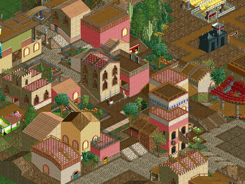
VS
Heaven's Atlas - #diamondheights (RCT2)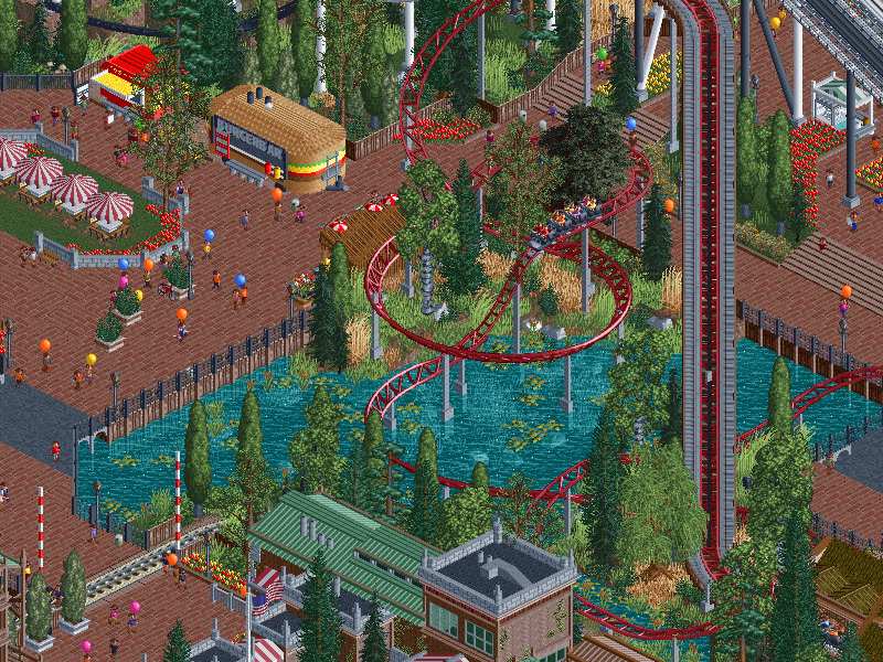
_____________________________________________________________________
How to vote:
- This season we're back to using polls to count the votes. THE POLL WILL OPEN IN 24 HOURS.
- Everyone but players belonging to either team in the match may vote.
- You can only vote if you have viewed both parks in game.
- Voting will be monitored and anyone found to be abusing votes in any way will be punished.
NEW RULE: next match will be posted in 24 hours, on the condition that the first match has at least 15 reviews of both parks. If not, the next match will be posted in 48 hours instead of 24. -

 BelgianGuy
Offline
first glance stallions looks unfinished
will post a full review later
EDIT:
WOW heaven's atlas, this might actually be the most fun thing I've seen in rct for a long time, the nostalgia with a modern aesthetic, brilliant idea and executed to perfection... the phobias where one of the coasters from the original that made you go, my god that's cool, and the other stuff is just so cool and old school that it made me giggle a little,
I really like the little things like the bike racks and everything like that, the buildings you made to represent the huts instead of just having the huts was a really cool addition aswell, you built rct in rct and I really commend you guys for that.
don't have LL atm so can't comment on stallions although the screen posted makes it looks like it's highly unfinished.
-

 Mr.Brightside711
Offline
I think #DH might be my favorite park in H2H7 I've seen so far. It is like the RMC of RCT.
-

 PizzaWurscht
Offline
not nice to see unfinished h2h stuff. #dh is some really cool old school stuff. The architecture is really nice and the idea is soo nice, but its not that special. for me this is a weired match... sorry guys
-

 csw
Offline
Can confirm, Stallions park is highly unfinished. A shame too, it looked like there were some great ideas in there. I do love the church spire and the color combos.
I literally said "Brilliant" out loud when looking at Diamond Heights, it's a fantastic idea and pulled off very well. I love the recreations of the food stalls, and that you did your own take on the original coaster layouts and park layout. Only thing that really bothered me was the title music playing, it felt a bit tacky. Other than that, this is probably top 5 parks of the season for me. Excellent work.
-

 Austin55
Offline
Match 3 first, interesting.
As I go review.Opening park. NAAAAAAAAAA TABABABBABABAAAAAAAAAAAAA TITY BEACH BABA.
I really need to change the music...
Like that its zoomed in on entrance. Looks like a realisitc park thus far. Nice entance area, farily simple, looks very american even without the flag waving about. Bike shop and parking is very cool, lovely detail. Is that a new object?
I'm drawn to the log flume, looking at it first. Love the building and the queue, really fun interaction here between the landscaping, the queue, the flume and the train. The building looks like a CSO version of the wild west hut. Behind that I notice the cso version of the built in huts. Interesting. I'm wondering if this is a rct characture park. Lovely little brick buildings in front of the twist. So far the park is all very high quality.
Scrolling back to the central plaza. Yep, more rct cso buildings. This is weirdly fun. I've gotten peaks at the dueling loopers and the parks namesake makes sense now. Interesting this is done in 2 and not LL. I'm trying to avoid giving them any attention just yet. Focusing on arachnophobia now, such a fun ride. The turn over the begginging of the lift is lots of fun looking.
Alright I'll check the coaster area out now. The bounce house is very colorful and catches the eye, loads of fun. The coasters queue is quite beautiful, as is the station, especially the exit stairs. Just looking while waiting for trains to leave the station. Here one comes..,.
Sweet layout! Love the dueling bits at the begging especcialy, the turn right after the loops is awesome and ofcourse the threading of the loops is way cool. I love how towards the end when the black one is in an airtime hill the white track slaloms underneath. I think the layout maybe loses a bit of momentum at the end, but its way fun, and a great tribute to the original. Its really neat how its set in the lush green area at the center of the park. The diagonal tunnel is great. A tad disappointing they don't hit the brake run at the same time.
The architecture in the food and furnite area is really cool, love the interaction with the black track to. The concert is cool, and love the further cso versions of even more custom buildings. Fun stuff for sure. And love the photo booth and phone booth, really clever.
OK and I've had something come up, will be back to finish this later
-

 Cocoa
Offline
^my music is currently the german protest from the village and the park, super atmospheric

-

 Cocoa
Offline
alright, reviews time, don't want to wait for more matchups!
stallions:
I'll try to give a review based on whats here only, obviously its unfinished. there were some pretty good spots here, like the wrestling ring, some of the landscaping, a bit of the architecture. It had good potential (is it based on that animated movie? whatsitcalled). I didn't get the whole city side, it seemed fun, but I've never thought big buildings like that have ever really worked in LL. Best I've ever seen was the city park from h2h6 but even then they were a bit awkward. On the mexican/ghost side, things were nicer, although the archy didn't really scream aesthetics or "mexico" as much as it probably should have. loved the ghost peeps though.
heaven's atlast:
first of all, loved it! I opened up the real diamond heights and you guys did a seriously great job revamping the layout and attractions. spot on. architecture was really awesome throughout, stellar work. I loved the wild mouse, what you did with that. brilliant. layouts were fabulous, landscaping so pretty, lots of awesome details like the burger truck, bouncing castle, concert, bikes, etc etc. and the filter, love the hipster tag. I have nothing to criticize here, its all just spot on. Love the nostalgia, etc. I'll be returning to this a few more times to really soak in the details

I think you guys just clinched playoffs! Lucky ducks getting easy matchups....
PS, I didn't have headphones, what was the custom music? (was it steve aoki?)
-

 Cocoa
Offline
also, you guys remade the entrance/exit huts with objects? why???haha I love it though
-

 G Force
Offline
Review:
Diamond Heights:
Park is great, filter is not, seemed really unnecessary and annoying, not sure what the point of it was either. Anyways, probably one of the most unique ideas in a while, all the custom food stalls and entrance huts were just great. The stage with dancing peeps was genius, probably going to see that a lot from now on because its just so good. Layout wise, the coasters were unique yet stayed true to the rides from LL which is a very difficult feat and was done beautifully. Loved the atmosphere and vibe of the whole park, it had a great mix of realism and semi-realism that made it fun but still believable. Didn't really seem to have that much content in it, lots of filler foliage and landscaping, but its understandable considering what the park was trying to do. Architecture was just good, noting super interesting or impressive, but nothing that was bad by any means either. Would of liked the park layout to say a little more true to the original, but overall it wasn't really an issue.
Overall, lots of great ideas and a unique concept made the park, definitely my favorite from HA this season.
Stallions:
Headphone users beware... Looked like the park had a lot of potential, the theme was a nice idea and seemed to be working really well in the first half of the park. Not really sure what the idea was in the second half, but the waterpark/slides were a cool addition. Wasn't a big fan of the wooden coaster, but I'm sure the layout would have looked much better if the surrounding were finished. Boxing ring and graveyard were cool and very well implemented, probably would of looked great in the finished version. Would love to see this finished after H2H, not often we get high quality LL parks, so they are greatly desired. Sad to see the Stallion release the first unfinished park of the season, really thought the team was hitting its stride and making a strong push to get back in the playoff picture. Hopefully your week 5 park is extra impressive to make up for it!
My vote is clear, expect most to feel the same about this.
-

 Ling
Offline
Shame about the Stallions park. We haven't had a good proper Spanish theme in a while. I assume the guests are supposed to represent the bull run? The "... is lost and can't find the park exit" messages were just appallingly loud, though. Woodie looked nice. Without names on some of the other things I'm not sure what it was all supposed to be. The church looked very nicely scaled though.
As for #diamondheights, this is basically a love letter to one of the greatest RCT scenarios of all time, and the nostalgia factor is almost unfair. Doppelganger was amazing. The random shifts in theme are exactly how everyone played those old scenarios, but here it's done with exhaustive attention to detail and a refined architectural style. All the eye candy of previous rounds' architecture-centric parks with none of the glitchiness. If anything I think it's a little lacking in water, as Diamond Heights had quite a lot of that. The entrance/exit huts being re-made in CSO is a stroke of brilliance that I just loved. Also loved the recreation of certain OG RCT shop/stall sprites. The Happyland stage was a little out there too, but an amusing way to fit that tidbit of RCT history in there. Agoraphobia and Claustrophobia were the weakest links of the park, I think. Not sticking to the original designs beyond the dual loops is fine, but they just don't even feel similar after that. Claustrophobia is kind of underground in places and Agoraphobia swoops over the path once, but otherwise there's nothing super special. The ending flourish by the queue is very nice, though. Arachnophobia is awesome and so is Snake River Falls. This park is almost perfect, but in a very strange way. If it hadn't been named as a tribute to Diamond Heights, it would be an insane and random compilation of very pretty but very out-of-place ideas and themes. Weird how that works out.
-

 Lotte
Offline
what's up with HA's park having other colours? i changed it back to normal in parkdat and I must say that i really prefer that version
-

 Poke
Offline
Diamond Heights is definitely one of my favourite parks so far. The whole idea is just amazing and you executed it perfectly. The coaster layouts were great, lovely interaction overall, and the dueling between the phobias was brilliant. The architecture was good, I liked it especially around Doppelganger. The way you executed all the food stalls and souvenir stalls was just fantastic. I liked the foliage and landscaping, that was nice. Lovely details throughout the park and that happy land contest was really clever, although it didn't really fit in with the rest of the park. Yeah, I can agree with csw that the entrance music was a bit choppy but that's just a minor thing. Overall, amazing park!!
-

 Six Frags
Offline
I don't think the contrast between a good and bad park has ever been so high as in this match-up..
Loved every bit of Diamond Heights; the custom RCT1 music, the bikes in front of the entrance, the shops referring to those plopable shops, the improved coaster designs while still true to the original rct1 counterparts, the atmosphere, the architecture, the landscaping... I just wish there was more

I'll just refrain from saying anything about Parque Los Muertos as I could hurt someone's feelings, tho its title pretty much sums up how I feel about the park unfortunately..
-

 RCTER2
Offline
why you call that Diamond Heights? Just because it has some rides with the same name of DH? For me it's a totally different park. I thought it should have the same landscape of DM but it's a plain.
-

 Cocoa
Offline
^the actual organization of the landscaping and layout is actually quite similar, albeit more stylized and compact. Check them out side by side and i thought it was pretty obvious.
 Tags
Tags
- No Tags
