H2H7 / [H2H7 Round 2 Match 1] - Robber Barons vs Manual Laborers
-
 29-April 15
-

 Liampie
Offline

Round 2 | Match 1
 VS
VS 
_____________________________________________________________________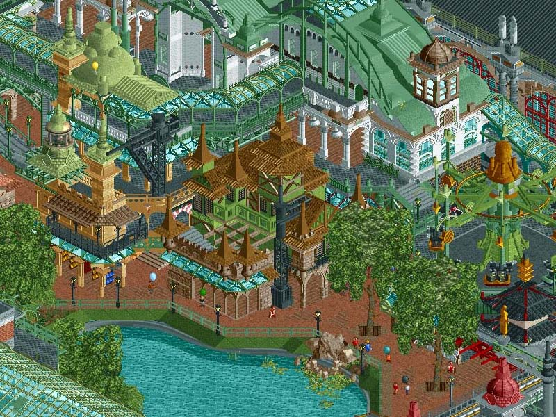
Robber Barons - World's Fair (RCT2)
VS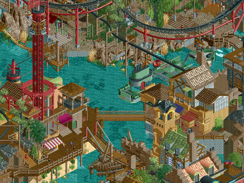
Manual Laborers - Bermuda: The Lost Colony (RCT2)
_____________________________________________________________________How to vote:
- This season we're back to using polls to count the votes. THE POLL WILL OPEN IN 24 HOURS.
- Everyone but players belonging to either team in the match may vote.
- You can only vote if you have viewed both parks in game.
- Voting will be monitored and anyone found to be abusing votes in any way will be punished. -

 Fisch
Offline
I'm gonna say straight away that I really appreciate both ideas. While Bermuda sounds like a typical "lost island" type park it's really much deeper (I found Pi Patel's inclusion to be pretty funny), and while World's Fair sounds like World Showcase from 2 H2Hs ago it's obviously not just a country or steam punk park but the historical world expo that used to be huge in the late 19th century. Both are unique and creative concepts which for me personally matters a lot more than the actual execution. My vote will follow tomorrow.
Good job to both teams!
-

 GammaZero
Offline
I'm just... impressed. I have no words to express my appreciation. I'll have to look a bit more into the parks to make a solid decision.
I have to say though, if this was in round 1, it'd be one of the best matchups there.
-

 GammaZero
Offline
I need to see the other matches before saying it's the best of round 2, but it's an awesome matchup
-

 Six Frags
Offline
Quite an underwhelming match-up to be honest..
Just out of curiosity, were either of these teams involved in an extension?
World's Fair: A lot going on here, almost too much.. It just feels so stacked on each other with no breathing room, and just giant buildings with kinda random rides in them.. While the architecture was nice overall there were some horribly unfinished spots in there too (like the bottom middle part when you open the file).. Also, I was bashed pretty harshly for my traffic crashing into each other in the London Olympics park last H2H, so I can't give a free pass on those trams clashing into each other here

Bermuda: While I appreciate the atmosphere and the themeing, I just feel like I've seen a lot of things in here before. Like those towers at the entrance are almost exact copies of those towers in Sea of Sagas, the path work and water sides reminds me of those in Port of Entry and those air balloons of Corsair Veredian.. I also dislike the huge amount of those LotR rocks being used, they just don't fit in rct2 imo. Those black 1k rocks on top of the volcano don't really look that good either..
Maybe it's just the insane amount of quality of the r1 parks, but I was expecting more from these teams..
I think I'll have to look a few more times before voting, but atm I like Bermuda just a little bit better.
-

 G Force
Offline
Ahh, finally after 3 extra days of waiting. The biggest match up of R2 is here and quite honestly I can not say that I am impressed.
Bermuda -
A cool concept, not sure if it has been done in RCT like his, at least this well. The crashed planes were the best part of the park, however, they are the only parts of the park that truly impress me. Well, I should say, other than the peepable Windseeker, which is extremely cool.
To me, when I see a concept like this, my first though is, how would I approach this or rather, what is the best way of approaching it. With a concept like this, I would have liked to see more emphasis on the Bermuda feel, on the story line. A lot of the content in the park, while extremely well made, isn't exactly interesting or new. I feel like I have seem similar buildings, color and atmosphere before. The rides where all well build, themed and seemed to fit. The car tours section, which is probably the area that seems the most real or full, to me. Overall, the park was well built and featured a good concept, however, the execution of the concept could have been better and made the park more interesting.
Worlds Fair-
When the name for the park was released, my initial though was that this park was going to be incredible. The concept, which was something I have wanted to do for a long time, as it is one of the purest, if you will, concepts there is since the worlds fairs of the 1880s and 1890s inspired the moder amusement park. However, again, the execution of the idea could have been better.
The park was simply too crowded, while the main tower, and exhibition halls were very cool and interesting to look at, it was simply to difficult to appreciate them due to the overload of structures and things cramped in the small area. Again, to me, this concept could have been handled differently to greater effect, especially for a park of this size. Now, i understand that my view of the concept is probably different that the builders and I shouldn't vote based simply on that. However, the combination of the unfinished areas, overcrowded architecture, constant error trappers, and poor peep ability in the park makes it hard for me to appreciate the work that was done.
While neither of the parks lived up to expectations for me, I still enjoyed them both and definitely have my favorite.
Well done to both teams. -
 Mr.Brightside711
Offline
I love this match. I'm left with a pretty hard decision on which one to vote for... I'll have to sleep on it.
-

 csw
Offline
First impressions:
World's Fair - a bit cramped, but I love the architectural style and it really captures a World's Fair atmosphere.
Bermuda - I love the backstory, the tropical feel is great. The crashed airplanes are to die for.
-

 Austin55
Offline
Robbers, loved the park.
I really kinda found it hard to focus on a lot of the architecture outside, I'm not sure if it was just busy or cramped or disjointed or a bit of all 3. It feels like one of those things where in still and cropped screens it would probably look a lot better. And at times I was very confused as to what it was meant to be stylistically, some buildings look like country pavilions but no idea what the countries are, like near the entrance. Oh yeh and there was a shit ton of flashy shit like POE had
 This makes it sound downy and sad but overall I did love a lot of it, just felt amiss. The rides on the outside were awesome! That air race is bonkers good (despite not working, amateurs
  ) and the rocket rods thingo was a lot of fun to.
Once inside the exhibits It's awesome! Everything becomes so coherent and kinda makes more sense, and the way each was themed was very cool (the transit and animals ones I loved the most) loved the rides in them, exccept evidently gigavolt would'nt work? Not sure if this was just me, could'nt even get it to run on test mode. My favorite bit was the trains from ya'lls team logo in the transit one. It was really disappointing the other one was evidently unfinished as I really loved these.I feel like I've said a lot of negative things but yeh, I really freaking loved this park.
BTW I love how despite being insanely different ideas they have a few odd similarities.
Both have hot air ballons.
Both have suspended monorails
Both use that electric object a lot
Both parks are sick IMO.
-

 Dirk Pitt
Offline
loved the rides in them, exccept evidently gigavolt would'nt work? Not sure if this was just me, could'nt even get it to run on test mode.
It happened to me, I closed the ride, resetted it as in cleared the train and ran it again, it worked. You have to re-cycle it for some reason.
-

 Stoksy
Offline
I swear there's a "world's fair-esque" park every H2H, maybe I'm just remembering World Showcase as being in every H2H haha. Anyways, excited for Round 2 and I'm excited to check these out in-game.
 Tags
Tags
- No Tags


