Micro Madness 2014 / [MM2014 R3] 5dave vs. inthemanual vs. JJayMForce
-
 24-August 14
-

 Louis!
Offline
How to vote?
limited space, unlimited madness
Semi Finals
__________________________________________________________________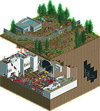
5dave (#1) - Heart of Darkness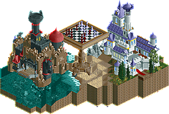
inthemanual (#4) - Sacrifice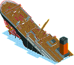
JJayMForce (#3) - Wheres Waldo Disaster
__________________________________________________________________
First of all, check out all the entries in this match. If you can't view one or more entries, for example if you don't own LL, then please, do NOT vote.
Once you've viewed all 3, select your favourite in the poll above.
After 3 days, we will close the poll and the highest scoring entry will proceed to the next round.
Comments on the individual parks have been disabled, so please leave your comments below.
Anyone found to be voting on their own match up will be disqualified from voting.
Anyone found to be voting when they cannot view all 3 entries will be banned from NE.
Votes are public and so any cheating of the system, betrayal of honesty or mistrust will be picked up on and will be dealt with. -

 Lotte
Offline
this one is going to be tough! from the overview inthemanual seems to have improved the initial colours quite a bit (it's not so cold anymore, yay!
 )
) -

 Faas
Offline
This is a tough one.
Inthemanual has cool buildings and structures, but it has no life whatsoever. As soon as there is nothing moving in a micro it's all really static and plain.
JJmayforce has no moving stuff as well and the trackitecture is really messy. The idea is really cool though.
5Dave's entry has the most life and the most stuff going on, but I have no idea what it is themed after, so it looks a bit random to me.
I need some more time. -

 Ling
Offline
Disaster was messy, glitchy, and just overall not very interesting. Not even white water, or normal water? Good scale but I guess the rest was just unfinished. Sacrifice was actually quite lovely in all respects. Interesting architecture, interesting concept (albeit maybe a bit tired in other mediums), and a pleasant setting. However, as Faas mentioned, there was just so little life to it. I'm not sure how you could have added life (maybe peeps walking around below, one or two rides in each building with shops and stalls to give the effect of the chess game deciding the fate of the smaller, less significant people below?), but it was the only thing holding this entry back. Heart of Darkness was chaotic as well, and I'm certain I don't understand what the point was. Average coaster layout backed up by some fantastic hacking and an intriguing setting. This one and Sacrifice are very close for me.
I think I have to give it to 5dave, just for being more "complete". I do want inthemanual to realize just how awesome it is to get this far and still come this close to taking down one of the old guard.
-

 Louis!
Offline
Apologies I fucked up the poll.
If you have already voted, either try and revote to include your second favourite or just post your second favourite and I'll count it at the end.
I think it's only going to affect you guys above me, so just edit your second vote into your post
Sorry guys! -

 Ling
Offline
Didn't know it was supposed to be that way. My second vote goes to inthemanual, in case it wasn't obvious.
-

 FK+Coastermind
Offline
JJayMForce-really fun idea, and very 'sculpture'-esque so i like it. While i think the ship's structure was done really well considering the difficulty of banked or non-horizontal things. The details; however, fell alittle short, and some of the angles of the ship just looked plain messy. If those had been a little smoother, which some finer details, this could have killed it, but there are definitely disadvantages to this angle of construction.
inthemanual-I'm so glad you managed to finish this, it really is a very unique and interesting concept. The castles were great, though i do think some of the forms are off. The black castle though is fantastic, from the statue to the glass windows, it just oozes of atmosphere. Only thing that held this back from being the best, IMO, is the lack of smaller details and activity. It just needed some life to it, be it coasters (duelers maybe) or peeps or something to add some movement. Well done though, the chess tie-in is wonderful.
5Dave-What really made this one the best, IMO, is something 5Dave does so well, which is making sure even the smallest ideas or parks have great energy and movement. The coaster was fun, brought life to it, not my favorite layout, but being able to see it through the ground was brilliant. That land-wall backed by a black-tile wall, brilliant layering. I do think this came across as very rough and angular, lacking some of the more textured smoothed edges common of rct today, but overall it was just the most complete. Well done good sir
Vote: 1st-5Dave; 2nd-inthemanual
FK
-
 JJayMForce
Offline
Looks like this round will be my exit, as I don't see people voting my way again, so i'm just going to speak my mind, then be done with this. Don't mean to make drama, this is just how I feel.
rant alert
Spoiler -

 Stoksy
Offline
5Dave: Unlike last round, the reference (if there was one) was lost on me. I still really liked this though, although I think that a number of details were lacking. Most of the buildings were very simple without much really going on, I understood what you were trying to achieve with the elevator but I didn't think it was executed particularly well (just looked a little messy). I actually really like the coaster, and like Fk said the layering and execution of the 'darkness' was very impressive.
inthemanual: Really cool idea in my opinion and executed quite well. Felt that the colours of the chess pieces were a little odd (personally changed them to specifically black and white with dull red and gold trim respectively which looked better). The two buildings were structurally well built but that was it really. As people have already said; the one thing that held this back was the lack of 'life'. I think some staff representing the people from the readme would have helped, and perhaps even allowing guests to explore to respective castles. I think (which has been a problem on all my entries so far) that a coaster would have ruined the atmosphere that you had, but some sort of movement would have helped dramatically.
JJayMForce: Was this finished? You say that the things you would have done differently don't take too much away from the park but I disagree. The cleanliness would have made this soo much more impressive, other than the angle shown in the overview all other angles look really messy; with random colours, supports, and track pieces not blending together at all. Furthermore, without any water there was even less 'life' in an already quite lifeless park. It's uninteresting because nothing is going on, there are frozen guests randomly placed on an angle - nothing is changing while I'm looking at the park which results in my interest being lost quite quickly. In my opinion; had you implemented all the things that you mentioned this would have been so much better. You say that the feedback you've gotten makes you less likely to come up with something inventive or unique but it's not the ideas that are bad (this was a brilliantly innovative idea) but the execution is lacking. While it's good to see that you're liking what you're building, other people have opinions that might differ. If a majority of people are constantly giving you similar feedback, are you sure it's still them who are wrong? I don't mean to offend you in any way, it just seems (and please correct me if I'm wrong) that you're suggesting that if you think that your work is of good quality then people are wrong to critique it...
Anyways, solid round! Ended up voting for 5Dave though because the other entries lacked 'life.'
-

 Faas
Offline
I forgot to add a second vote, and it goes to JJay, who should have won from me in the previous round.
 -
 inthemanual
Offline
Why is this poll private but the other one public? I wanna know who loves me </3
-

 inthemanual
Offline
Yeah, I just noticed that. For some reason I thought I saw the votes on the other one, but I hadn't voted yet.
Point still stands. I wanna know who loves me </3 -

 inthemanual
Offline
And @JJ, I've known Ling for a little while, and I can comfortably say that he wasn't complimenting my position in the tournament while ignoring that you were in an identical one, but that he was complimenting my work this round as it compares to 5dave's. He's implying that 5dave (one of the old guard) would be going all out at this stage in the tournament, and that it impressed him that my work had managed to make it a tough decision for him.
I don't think he meant to insult your work in any way, and neither do I.
I'll provide some analysis on all 3 of these parks after the voting is closed. I only chose to speak up about this now, because I don't want votes thrown or for JJ to give up due to a miscommunication. -

 wheres_walto
Offline
Unbelievable round by all 3 entrants.
I'll start with JJ: this was just a fantastic idea. I've seen shipwrecks in rct and large scale boats as well, but never anything quite like this. The way you used different angles to achieve the look you wanted was very well done. My only problem was that the visual kinda collapsed in the different camera angles (peeps floating/falling to their death?, sloppy looking track for the hull. This was a very very good entry, but unfortunately you were up against 2 also very good ones.
5dave- It seems like you're really picking it up again, which is great to see. Your entry reminded me of Portal 2 to be honest, with the giant hatch-like opening for the coaster to travel through and the dystopia above ground. I was very impressed overall by everything's functionality, it seemed like everything I saw contributed in some way.
inthemanual- So you're one of my new favorite players. This entry was phenomenal. You might possibly be the only person on the site capable of matching Avanine's style. Everything was beautiful; both the black and white sides were gorgeous, particularly the black knight statue. You get my top vote., now hurry up with that ferris wheel!
-

 Ling
Offline
Also, me and Itm are in the same situation in the tournament, so to congratulate one and ignore the other, right in front of him, is just plain rude, man.
I genuinely thought your entry was unfinished. My praise there was just that it was incredibly difficult for me to decide between those two entries. Of course you both made it to round 3; no one is trying to diminish that achievement.
You have been bashing my parks the entire competition, quite vocally. I believe my parks have been of good quality, and to a high standard for the site, so for you to say these things, as a judge, is just ridiculous to me.
This is completely untrue. You were my first pick in Round 1 and my second pick in Round 2, where I actually only had positive things to say, and had an incredibly hard time choosing between you or Faas. I don't really understand this reaction.
-

 JJayMForce
Offline
By the way, nice entries Itm and 5dave, I hope to comment on them, later on.
@ Ling
You are right about the past rounds. Sorry to attack you. I just feel a bit defensive overall.
-

 trav
Offline
I think the main thing we need to take out of this competition is that itm should forever be a fantasy player rather than realism.
 Tags
Tags
- No Tags