Micro Madness 2014 / [MM2014 R2] inthemanual vs. Corkscrewy vs. FK+Coastermind
-
 30-July 14
-

 Liampie
Offline

limited space, unlimited madness
Round 2
__________________________________________________________________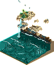
inthemanual (#4) - Oasis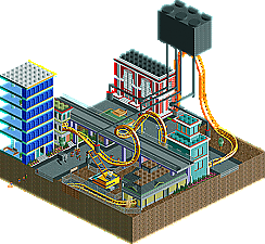
Corkscrewy (#5) - Battle for Bricksberg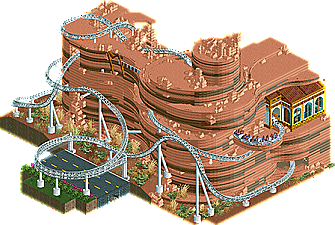
FK+Coastermind (#2) - The Mirage Hotel & Casino's White Lightning
__________________________________________________________________How to vote?
First of all, check out all the entries in this match. If you can't view one or more entries, for example if you don't own LL, then please, do NOT vote.
Once you've viewed all 3, select your favourite in the poll above.
After 3 days, we will close the poll and the highest scoring entry will proceed to the next round.
Comments on the individual parks have been disabled, so please leave your comments below.
Anyone found to be voting on their own match up will be disqualified from voting.
Anyone found to be voting when they cannot view all 3 entries will be banned from NE.
Votes are public and so any cheating of the system, betrayal of honesty or mistrust will be picked up on and will be dealt with. -

 zxbiohazardzx
Offline
i really love the FK+Coastermind entry here, the pink really works out better then expected
for me the oasis does not cut it, its a nice landscape, but just not wow enough for me
Battle for Bricksberg does not wow me either, but the cramped up coaster scored it a minor 2nd for me
-

 Faas
Offline
Thanks.
1. FK - Awesome rollercoaster. The trippy thing was unnecessary for me because you convinced me without it, but props for the dedication.
2. inthemanual - Cool idea with the animals, but not enough contentwise to win.3. Corkscrewy - I thought the layout was too short and the buildings were too blocky.
-
 Corkscrewy
Offline
Well it is based off the lego movie. Haha and extremely rushed and unfinished. I had so many ideas I wanted to do in this but just ran out of time and wanted to get something submitted.
 -

 wheres_walto
Offline
Cork, not a bad entry. It was really cute and I picked up right away what you were going for, but there wasn't a whole lot to look at and the execution just didn't quite put me into the world you were creating.
FK... I absolutely loved your submission. I opened yours first and basically concluded that nothing was likely to sway my decision until I opened inthemanual's park.
Oasis is exactly what I've tried to capture countless times but failed: real nature. Something about the way the buzzards are circling overhead and the seemingly unpredictable way the shark glides through the water creates this feeling of total hopelessness for Kumba. Your park sucked me in so effectively that I had to go back and open FK's again because I had no idea who to vote for.
And I still don't. FK's is prettier and showcases the prototypical skills of elite players, but I felt more immersed in manual's.
In by far the hardest vote of the contest, I'm voting inthemanual.
-

 Ling
Offline
A walrus, huh?
 Oasis was easily the most visually gorgeous map in this match. lol'd at Kumba drowning. Shark was well-done, as was the wreck. Not sure what the theme was, if there was any...? A bit empty though, unfortunately.
White Lightning had a lovely layout, and I liked a lot of the details on the station and supports. Lovely sign on the outside, too. Hard to call this match.
Vote: FK+Coastermind
-

 5dave
Offline
Battle for Bricksberg - Corkscrewy
remember that scene from the movie. I hoped there was more chaotic battle going on, right now it kinda feels unfinished and lacks dynamic. I like the street scene in general (buildings, multi layered roads) and especially that one facade of the red building. Other than that, there wasn't much to see unfortunately. The coaster wasn't really good either. But the idea capturing that scene is really nice!
Oasis - Inthemanual
Really strong concept and great execution, the way you brought those animals to life was fantastic! The atmosphere is really unique and I like that little fantasy twist with the landscape evolving vertically - great idea! But I wished there was something more to see - maybe a duelling shark-prey coaster would be more interesting, or some hacks that go off in a specific order. Awesome stuff, though!
The Mirage Hotel & Casino's White Lightning - FK+Coastermind
Woah, that's a really cool micro you got there! While I'm mostly not a fan of trackitecture and obsessive monorail-hacking, this works really well! It really looks and feels like canyon-structures rather than hundreds of monorails! I didn't really understand if this is part of the hotel, the hotel itself, artificial or real mountain but it looked really great nontheless - the readme says it replaced a garage, but it would have been nice to get a glimpse how it connects to something or remains of the garage. The coaster is a bit too fast and intense and the druggy stuff wasn't really necessary, but really great work all in all!
"MFG" -

 Corkscrewy
Offline
Thanks man. Like I said. It was insanely rushed. I did have plans to add actual batteling and making stuff flying around above the streets like in the movie just ran out of time I guess.
 -
 inthemanual
Offline
Mine was rushed as well. I finished it in one day, and pulled an all-nighter to get it finished. I was on vacation for the first half of this, and struggling to find a job for the second half, and thus severly limited my RCT time. There was a lot more to the idea that didn't get included, including a coaster. Apologies for what might be a disappointing entry after my previous submission.
If I do make it on, my R3 and R4 entries will be much stronger, on par with if not better than Earl Grey.
-
 Stoksy
Offline
Inthemanual: Dammit itm; you did the buzzards soooo much better than I did haha. I think that this would have benefited from a cutaway of the underwater, as this would have allowed you to add some more colour. I did delete a wall and all of the underwater plant life was dark green, which I think was a little too monotonous. Not sure if I agree with the desert -> sea relation but nonetheless the buzzards and the shark were really well done. Would have loved to see how this would have turned out if you had more time!
Corkscrewy: This just made me want to see the Lego Movie again. Looked quite unfinished really, was a decent idea but other than the roofs didn't really get much of a Lego feel from the park. I kind of knew what was intended by it but (and I assume this was due to time constraints) felt that you didn't go with the idea enough. Perhaps you could have included the meeting of all the characters? or added in something about all the robot legos?
Fk: Holy balls! Despite spending 79 in-game years on this I would have loved to have seen some more interior. It would have been a really good contrast between the outside and then you've got the casino/hotel actually inside the rock structure. The 'other' entry of this was...interesting. I kind of understood the reasoning (or maybe I didn't) as a reference the hallucinating a mirage, but felt it could have been combined on the same map by doing it more subtly. ie having something ridiculous, colourful, and crazy but it can only be viewed from one angle. The use of monorail was so perfect in conveying how those types of rock form, kudos!
Yet another difficult one; I think that Fk just pips itm here though.
-
 Coasterbill
Offline
Battle for Bricksberg: I like the idea but there wasn't much to this one.
Oasis: The more I stared at this the more I liked it. The shark's movements are very believable and it was very well done... Kumba drowning was hilarious and the birds were really convincing. This was one of the few micros I spent more than a few minutes viewing and after awhile it really sucks you in. Great concept and execution... in most rounds I'd have picked this entry.
White Lightning: This is probably the best entry in Micro Madness so far except for maybe Earl Grey. I've never seen such a good southwestern theme in RCT. This was beautiful to look at... absolutely stunning. For someone who dislikes realism you really nailed this realistic design (I didn't care so much for the trippy one but that's just a matter of taste). The transition from monorail track to the colored 1k ruins and roof pieces is absolutely flawless. I guess my only complaints are that the coaster is a bit fast and the station building is kind of out of place but I understand you probably wanted to get some color in there and I couldn't really think of a better solution. It just doesn't give off a southwestern vibe.
Those are minor complaints though, this is a stunning entry. That little rock shelf under the turn out of the station... I mean holy shit.
-

 inthemanual
Offline
I'm a fair bit surprised at all the reactions here. First of all, with FK's park: the trippy version is what makes it for me. The daytime version is ordinary; it's good RCT, but it's not anything with a huge wow factor. Yeah, the cliffs took a lot of effort, but I think there a few things that could have been done to make them better. You also wrote about it's history, but don't really show that in the park. The trippy version is perfect though. It's drugged out, it's interesting, it's fresh and exciting, it's so FK, and what really leads me to think this was a great micro.
And nobody seems to agree with me there.
And I'm also a fair bit surprised about the reactions to my own work. I thought this was nowhere near the level of FK's, in time and effort, in creativity, or in execution, but several of you have called this a close matchup, and a few even voted for me. I'm also surprised that the focus tends to be on the animals in my park, and not the oasis, seeing as I spent a lot of time making sure I got the feel right on the oasis, and the animals were done fairly quickly and effortlessly, aside from the error traps I got while trying to make them work. The shark surfacing under the waterfall was a very nice coincidence, and I really loved that it happened, but it was in no way intentional.
Anyways, congrats FK, and again, apologies for the lack of quality due to rushing this. -
 Chocotopian
Offline
3. Battle for Bricksburg.
Yep, this is one reference I did get
 The micromanger looked great, and the trees were very good in their simple, circular, bricklike form. However, I did feel that this was heavily lacking in action, and that a coaster alone did not do the area justice. Perhaps a duel with a rival coaster (as BadCop or something) would’ve added intensity, or even some form of chaos on the ground level. Additionally, I’m not sure the buildings have translated well. I mean, you’re essentially building with bricks to recreate other bricks that have been built into buildings... I just think that building at this small a scale, where every single open top block can’t have a stud, doesn’t effectively convey Lego bricks. It was a nice try, but I don’t think it translated well.
2. Oasis.
The whole underwater area was glorious – the plants, the shark, the ship... all executed really well and was a fresh idea to look at, given that it was the focal point in my opinion. The buzzards looked great and the uppermost island was pleasant. Perhaps a bit more destruction, or rather evidence of destruction instead of completely removed buildings, would’ve made the land section more interesting.
1. The Mirage Hotel & Casino’s White Lightning
This was a very sneaky way at getting round the size limit in my opinion
 but I was impressed nonetheless. A great, original idea and excellent excuse for unusual colour schemes. The rockwork through monorail track was impressive, and the change in staff names was a nice touch too. I wasn’t too bothered by the coaster itself, but the idea won it for me. Voted 1st.
 -

 Liampie
Offline
Voting Closed
Winner: FK+Coastermind with 21 votes (proceeds to next round)
Runner-up: inthemanual with 7 votes (proceeds to wildcards)
3rd place: Corkscrewy with 1 vote (is eliminated from Micro Madness 2014)
 Tags
Tags
- No Tags


