Micro Madness 2014 / [MM2014 R2] Faas vs. JJayMForce vs. Ride6
-
 30-July 14
-

 Liampie
Offline

limited space, unlimited madness
Round 2
__________________________________________________________________
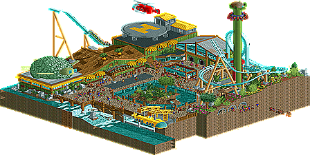
Faas (#4) - Turtle Rescue and Discovery Center
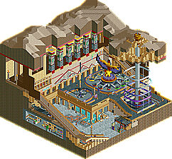
JJayMForece (#3) - Hathor's Realm
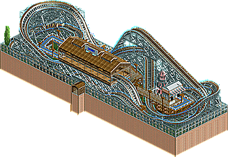
Ride (#3) - Comet Court
__________________________________________________________________
How to vote?
First of all, check out all the entries in this match. If you can't view one or more entries, for example if you don't own LL, then please, do NOT vote.
Once you've viewed all 3, select your favourite in the poll above.
After 3 days, we will close the poll and the highest scoring entry will proceed to the next round.
Comments on the individual parks have been disabled, so please leave your comments below.
Anyone found to be voting on their own match up will be disqualified from voting.
Anyone found to be voting when they cannot view all 3 entries will be banned from NE.
Votes are public and so any cheating of the system, betrayal of honesty or mistrust will be picked up on and will be dealt with. -

 5dave
Offline
Comet Court - Ride6
Nice layout, but otherwise there wasn't that much to see unfortunately. Peeps or a solid theme would have been cool. Definately one of the best coasters of the contest, but that isn't enough to make it pop IMO.
Hathor's Realm - JJayMForce
Another awesome entry from you! Great work, it feels like a temple but also some sort of mall at the same time. I think a small coaster (think Tokyo Joypolis, Supersonic Odyssey or Mindbender) would have added, but isn't that necessary. What's there is really nice, custom rides, architecture, statues,... top notch stuff! Really great stuff!
Turtle Rescue and Discovery Center - Faas
Who doesn't love Turtles...?! What I love most of this was the attention to detail and all those little vehicles (submarine, helicopter,...) - they added so much to this! The buildings were a bit boring and maybe a second tracked ride would have added something (submarine ride?), but it was really nice nontheless. Very strong entry!
"MFG"
-

 Faas
Offline
Really cool entry JJMayForce! It makes me happy and sad at the same time..
 .
.
It's a shame you didn't change all the sign names and that there is a lot of puke in the back, but you have the most votes now and I don't see that change in the future. -

 FredD
Offline
Easy to chose the winner: Faas! My favorite micro this contest so far. Very original idea and superb execution! Loved the Schwarzkopf coaster, the helicopter (pad), the yellow submarine, the 3D cinema turtle... almost everything! JJayMForce's micro was also original and good, but you have bad luck there's someone in your group who did just better than you...
While it was interesting to see how you got so much coaster on such a small piece of land Ride6, it was disappointing there wasn't something else to see...
-

 wheres_walto
Offline
ride6, it wasn't bad by any means and I especially thought the pre-lift drop and turn was pretty cool, but you ran into two seriously good parks this round.
JJ, this was a really cool park. Very Lenox Mall in places but with a unique twist. I see a lot of cleverness in your work: the flat path rooves (I've never even thought of that before) and the mountain facade on the main wall of the plaza in particular stood out to me. The custom flats were gorgeous, but I would have loved to see some type of coaster flying above the guests heads. Also, a few handymen would have done wonders!
Faas, what you had was phenomenal. The colors popped off the screen and I was very impressed with the coaster and supports. But the overview was misleading in that I expected a lot more content in the park. The helicopter and submarine were very impressive and I want so bad for you to move on to the next round but I just liked JJ's park a tiny bit more.
It's a real shame you can't both move on..
-

 zxbiohazardzx
Offline
Comet is a good ride, but just doesnt have the wow factor to win this round for me
Hathors realm has lots of detail that i love, but i dont have a connection with the theme, thus it doesnt score as good as to my winner for this round
my vote went to Faas, lovely vivid colors, good coaster, good stuff
-

 Ling
Offline
Great atmosphere in Turtle Rescue and Discovery Center. Supports and colors were great. The tropical zoo style is pulled off so well. The turtle burgers though

I love the colors and scale of Hathor's Realm. Reminds me so much of how casinos in Vegas are on the inside, particularly Caesar's Palace and the Luxor. I'm not a huge fan of the big path that sweeps around the front side but I guess it's necessary for peep circulation. I liked how the different levels worked, too. Everything is the right size.
Comet had a lovely layout, but there's just too little else here. Path/park layout is weird and the colors need some context to make sense I think.
Vote: Faas
-

 FK+Coastermind
Offline
Ride6-i like it, but obviously it lacked the innovative glitter of the other two. Did like the pre-chainhill bit, seemed fun.
Faas-this was wonderful, and compositionally very well done. The coaster added some fun, though i had to admit, with this and louis, i feel like reverse-launchers just aren't very fun for the viewer, while they are for a rider. The vehicles were well done and highly detailed, which for me made the buildings seem far less detailed. I kept thinking the architecture should be as intricate as the vehicles, which was the only drawback for me.
JJayMForce-my only complaint would be a little readme or backstory would have been nice. Like 5dave, i struggled with whether this was a park or a just a fantasy temple, and just the smallest changes or hints could have cleared that up. The rides were fantastic. Yeah i coaster would have been nice, but that custom flat was beautiful and the sculpting! The little details in this won my vote, it just felt like it was a higher quality and more modern rct then the other two.
vote: JJayMForce
-

 Stoksy
Offline
Really difficult decision:
Faas: So many great ideas here, the helicopter and submarine were particularly cool little details. I thought that the cinema was top notch, and liked that you took the time to make the top of the drop tower look like a turtle also. In my opinion this was a little too busy for my tastes, I felt that fewer guests would have helped this as at the moment almost every path is just covered with them.
JJayMForce: The egyptian(?) sculpture for that custom flat ride was really well done! Unfortunately, other than that and the columns holding up the roof nothing really stood out to me. I especially thought that the entrance [where the black path with vomit all over it] lacked a level of cleanliness that the rest of the micro had. I think that if the inside had the same amount of effort put in as that cutaway then this would have been a definite winner for me. If you're going to use a cutaway it should be show something that adds a lot to the theme/idea that you're going for, and I don't really think that you accomplished it here. Nonetheless, really enjoyed the custom flat and the 'behind the scenes' under the walkway.
Ride6: As is always the case, if a coaster is the entire focal point of the park then it really needs to interact with some surroundings. Although the layout was decent, I felt that because the coaster was basically the only thing on the map not matter how good it was I think it will almost always lose out to the implementation of several good ideas. Just my opinion.
Ended up giving it to Faas, but it was ridiculously close.
-

 posix
Offline
Voted JJMForce too. Both impressive micro and macro features on a micro = win.
Faas, good effort. You need a breakthrough in your game but you're steadily developing towards it. Due to your colour choices, you're like a modern day interpretation of traditional LL "NE Style" by x-sector and Pyro. I like it.
-
 Coasterbill
Offline
Comet Court: Nice layout but there's not too much else going on in this one.
Hathor's Realm: This one was very nice, I loved the custom flat and the sculpture on top of it. I like that you used Fisherman's lights too as I think these are an under-utilized scenery object. They add a lot of fun and charm. Overall a really nice entry.
Turtle Rescue and Discovery Center: I ended up voting for this one though it was close. Faas has a perfect style for Micro Madness as he always builds small and charming parks. Because of that style this micro seemed very complete as there was a lot crammed into a pretty small space. I loved the submarine and the helicopter... especially the helicopter as it was really a moment of brilliance since it added a splash of color to a park that would have been too green otherwise but since it was disconnected from the park itself it didn't look forced.
The best thing in the whole park was probably the theater made to look like a turtle. That whole building was great. The little turtle tanks by the restrooms were a subtle yet really nice touch also.
-

 Liampie
Offline
Comet Court: great fucking layout. Truly great. Shame there's not much more on the map. In the past you've shown great talent for theming and interactions, but we haven't seen much of that since like 2007... Frozen Heights was reminiscent of this era. I think you would've fared much better in this contest if you went with a more fantastical style. A layout like this coupled with cool theming could've done wonders. Any reason for this? Grew bored of theming, or was it time issues?
Turtle Rescue and Discovery Center: I like this a lot. Each of the three turtles sculptures was great, and I loved the cartoony helicopter and submarine. For the rest it was alright, but nothing mindblowing. Typical solid Faas-stuff, 65%-esque.
Hathor's Realm: I can't believe you're not winning, JJay. This thing shows so much skill! It's a shame the rides aren't working, but they look amazing. Probably the best custom flat I've ever seen. Combined with an awesome sculpture. Unique theme (Realism (mall) and fantasy (Egyptian underground shit) crossover) too; the idea alone is very very impressive. I'll be rooting for you in the wildcards. -
 Chocotopian
Offline
3. Comet Court.
I was very impressed with the length of the layout, and the fact that there’s an additional track and flat ride in there too. The support work was very realistic and very cleanly done, and the station was simple but effective. Beyond this though, I wasn’t really engrossed much further. After one lap, I felt I’d seen it all, and didn’t find much to explore. As a compact coaster, it was excellent, but as a micro, I felt that more ideas (or even structures, landscaping or foliage) were needed.
2. Hathor’s Realm.
I did a bit of research, and found that Hathor (among other things) is the patron saint of miners. Thus it made sense for this to be underground, so that was a neat idea. The way you executed this was good too, but along with this I felt that there was still opportunity for you to place things on top of the land (even if just a few shrubs or desert wanderers). The custom rides were cleanly done, and the Ascension ride was very fitting. There were some nice scenery touches too, like the dog fountains and the colourful pillars. The feel I was getting from the area was that of a remote tourist attraction, like a rich casino in the middle of nowhere, and in a way that kind of clashed with what I was expecting. I can’t really explain why, but I think I would’ve preferred it to be more true to the Egyptian theme, rather than that of a development cashing in on the theme... if you get what I’m saying? Either way though, a good entry.
1. Turtle Rescue and Discovery Centre.
This was the clear winner for me. It was both serious enough to be believable, and silly enough to be fun. The submarine and helicopter were tremendously well done, with their forms and details captured perfectly with so few elements. The coaster was a decent length and had good interaction, and the support rides were a nice compliment. The whole area had a warm, lush, tropical feel to it, with an excellent selection of colours and foliage. A damn near perfect entry for me.
-

 Faas
Offline
Thank you all for voting on me and for your kind replies.
I didn't expect to go through (at least that's what it definately loooks like now), because i thought JJayMforce's entry was better.
However, I will be touring eastern Europe these weeks and hanging out at a festival, so unless the deadline for next round is extended, I won't be able to send anything in.
I figured it would be better to say right now instead of leaving an empty spot at the end.
Long story short, organisers, if the deadline is not extended, feel free to give my third round spot to someone else, in which I guess JJayMforce is the best option? -

 Ride6
Offline
It was mostly a matter of time... I had a couple ambitious ideas for this round but couldn't muster up the inspiration to actually construct them with all the turmoil in my personal life. I lost my job; on good terms, it was due to workload shifts and strict headcount restrictions, but it really threw me emotionally and I had to spend time getting my resume and references up to snuff and back out there. I also spent a lot of time crunching numbers to make sure I could cost for the next couple months, and talking to friends about crashing in guest bedrooms since my lease expires September 27th, and unemployment is no time to be signing a lease.
Between the actual time that stuff took and the general malaise of working for a job you know is ending (I got two week's notice to wrap up a couple projects... I wanted to play nice because money and references). I actually wanted/needed some time off, so it all kinda works out okay, but still...
So basically I had a weekend to build the entry. I had the option of pursuing something ambitious and getting it half finished at best, and probably unrefined, or something like this. I figured I would go for the complete entry. Truthfully, while micro madness does fit my desire to do wacky things without having to spend a million hours getting it looking half-way decent only to have half the community declare it "dated", it really doesn't suit my strengths, which are mostly in coaster design and landscaping. I figured I'd rather bow out gracefully with something complete.
*shrugs*
Ride6
-

 Liampie
Offline
Voting Closed
Winner: Faas with 21 votes (proceeds to next round)
Runner-up: JJayMForce with 11 votes (proceeds to wildcards)
3rd place: Ride6 with 0 votes (is eliminated from Micro Madness 2014)
-

 Lotte
Offline
are you guys really going to want a no show from faas? or did he PM you about going to try to finish anyways?
-
 JJayMForce
Offline
Sorry for the later reply, decided to post a followup on my park.
Fass, sucks you won't be able to compete later on. gg, man.
Just wanted to say thanks for all the comments. I wrote a long winded response about my park etc... if anyone cares to read it:Spoiler
 Tags
Tags
- No Tags

