Micro Madness 2014 / [MM2014 R1] 5Dave vs. FredD vs. Corkscrewy vs. CHE
-
 08-July 14
-

 Liampie
Offline

limited space, unlimited madness
Round 1
__________________________________________________________________
CHE (#8} - Brasil!
__________________________________________________________________How to vote?
First of all, check out all the entries in this match. If you can't view one or more entries, for example if you don't own LL, then please, do NOT vote.
Once you've viewed all 4, select your favourite and second favourite in the polls above.
After 3 days, we will close the poll, the results of the two polls will be added together, and the 2 highest scoring entries will proceed to the next round.
Comments on the individual parks have been disabled, so please leave your comments below.
Anyone found to be voting on their own match up will be disqualified from voting.
Anyone found to be voting when they cannot view all 4 entries will be banned from NE.
Votes are public and so any cheating of the system, betrayal of honesty or mistrust will be picked up on and will be dealt with. -

 5dave
Offline
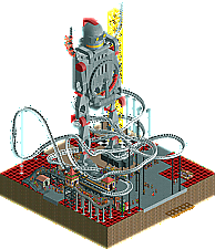
Sorry for the unfinishedness, guys! Between uni finals & dues, hosting couchsurfers, a trip to Stuttgart and family festivities I couldn't find that much time unfortunately.
Most of this was built during the 8h train ride to Stuttgart and back. It will be finished after the contest, even though Robbie seems to have a similar idea for a theme...

"MFG"
-
 Chocotopian
Offline
4. Skyscraper.
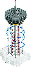
It was certainly interesting to look at, but I don't think I quite understood the smoke effect at the bottom. If it was just an effect, that's fine, but I'm afraid it confused me as to what setting the skyscraper was in. I think this could've also benefited from having peeps in the park and on the ride. Regarding the tower; while there was some nice detailing on the top of it, the tower itself and supporting poles were too plain for me, and some additional interaction between them and the coaster would've be nice.
3. Vertigo.
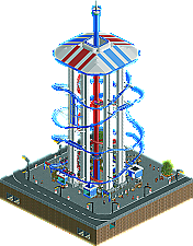
Uncanny that these two entries should appear side by side, and also somewhat unfortunate as it meant comparing them against each other rather than admiring their originality. Anyway, I think the surrounding area you built gave it a good context, and the details on the planters, supports and roof were great. The central drop tower also added some more movement to the structure, and it was interesting to watch the train and tower car rise together.
2. The Guardian.
A fantastic idea, but the unfinishedness just kept it back from me. The robot had a very Iron Giant feel to it, so I couldn't help but like it, and the rides on its different levels was awesome (especially the looper on its stomach - a great effect). I seriously wanted to see the rest of Metropolis, as the sci-fi theme would've really done it for me.
1. Brasil!
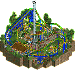
It was somewhat basic, but it was brilliantly done! The colours were excellent (obviously the colours of the flag, but each was exhibited in a balanced and non-overpowering way), and the layout of the coaster was smooth and natural. A great atmosphere all over, with the plants chosen carefully to suit the theme. The free kick tower was great too. The idea of the carriage being the player, running up to take the shot... superb stuff! Warm, inviting, fun - a very well done entry.
-
 RCT2day
Offline
^I went almost exactly the opposite way as you.
4.) Che: I didn't get this. It seemed just like a mediocre coaster with mediocre surroundings. Sorry, I just wasn't a fan.
3.) FredD: In this round, I had to compare the Polercoasters and this one definitely didn't have much detail and didn't really seem finished. The drop tower in the middle was nice though.
2.) 5Dave: great idea and I totally saw that same Iron Giant feel to it. Would have been cool to see it finished, which held me back from my #1 spot.
1.) Corkscrewy: This was clean, realistic, and just good. Nothing phenomenal but good enough to make it past this round I feel. I like the cloud thing at the bottom (but not everyone will get it). Nice job,
-

 Chocotopian
Offline
Jeeeesus Christ.... it's a tower through the clouds. Man I feel dumb. Sorry Corkscrewy, I completely missed that. It totally makes sense now and is a pretty clever way of creating unseen height in your entry. (If it's any consolation, I would've ranked it tied third, so I still stand by my vote)
-

 Ling
Offline
I don't know what I've ever had a situation where I didn't really feel any of the entries deserved to move on. I know 5dave is capable of amazing work, but it's the least finished entry. CHE's is the most empty but also makes the most sense. FredD's entry is likely the most all-around complete but lacks polish and imagination. The very top section of Corkscrewy's tower is promising but the coaster is lackluster and I think you need something more than just some fog to give it imposing presence and sense of scale. I'm not really comfortable putting them in order because I feel these are all on essentially the same level ultimately, but if I had to rank them:
1. FredD
2. 5Dave
3. Corkscrewy
4. CHE -

 Ride6
Offline
4. Skyscraper - Which I always read as "sky scrapper" before changing my mind. But all left-hand turns!!! We sure like going counter-clockwise don't we!?!?!?!?!
 The actual top of the tower was the best part of this by a country mile. It was very nicely done, very elegant. The coaster was "meh", the lack of peeps made things rather lifeless and there wasn't much else to focus on. *shrugs* The clouds were a cool idea, but I feel they would've been more convincing in less of a boxy shape...
3. Brazil - Not a bad little coaster... It even manages to turn both left and right which can be a trick on maps of this size *cough*. I also appreciated that this lil' park had some negative space and wasn't overtly trying to fill everything. Unfortunately an okay coaster (good even, considering the space) and some pleasant atmosphere isn't going to cut the mustard with this level of competition. Don't get discouraged though! Its a promising introduction (even if you've done stuff before, I've been in and out too much to notice).
2. The Guardian - I really didn't want to give it to this one since it's so incomplete, but it left me wanting more. The coaster was the best of this group, though still not particularly good by normal standards (non-micro). The giant robot (the Guardian, I would assume) was eye-catching and the missile control ride looked like fun, even if it's basically a poor man's impulse coaster.

1. Vertigo - All right-hand turns!!! We sure like going clockwise don't we!?!?! At least it balances out Skyscraper's lefts!
 *shrug* I liked the execution here significantly better, what with the streetlamps, sewers, metro, lil' ticket booths, and peeps. Even though I'm not the biggest fan of the coaster I feel that I must give it a nod. I don't like the entry that much in and of itself, but the level of refinement and completeness leads me to want to see more.
Ride6
-

 Xeccah
Offline
Looking solely at the overviews, Likely 5dave and fredD will win. Still, of course I'll DL them and then vote on it.
This also means I get to go up against nin for my round. Time to kick kyle's ass, because apparently I couldn't with darren's.

-

 Stoksy
Offline
5Dave: Would have been the best by a mile if you had finished. Really brilliant example of how to incorporate many elements into a small space. The coaster was really solid, and the robot was simply fantastic. Really cool interaction between the rides [superlooper and invert] and the statue. Wish this were finished.
FredD: It's difficult when there's two skyscraper entries. I felt that this one could have been better, I would have simply enclosed the entire drop tower + lift hill so it actually looked like a skyscraper. I think that, in conjunction with the nice touches on the ground and underground levels would have made this seem more 'finished' to me.
Corkscrewy: The better of the two skyscraper structures. Although I quite liked the innovation behind having the structure come out of the clouds I think it would have been cool to go even further and have a lower layer. Like Fred, I would have liked to see you build the walls of the structure as I think this would have made it look more impressive.
CHE: This was quite pleasant I thought. It's difficult to portray the soccer idea without having an actual field but the atmosphere was quite nice here I thought. Some nice colours here [although that can be attributed to whoever chose the colours for the Brazilian flag] which made for a decent entry.
-

 Coasterbill
Offline
I had actually started working on a Poler Coaster for my round 1 entry. I guess it's a good thing I went with something different as I wasn't the only one with that idea.
 -

 Louis!
Offline
1) 5dave
Shame it was so unfinished because it was a really unique idea and entry. I really liked this, and even though it was so bare, I still gave it 1st place.
2) CHE
Nice little micro from a totally unknown player. I liked the layout, I liked that you didn't go for a square map. The whole entry had a great flow to it and I really enjoyed it. Nice job.
3) Cork
Now comes the battle of the towers. I felt yours was a better entry because I felt you did a better job of the tower. The execution of it was great, just a shame the coaster wasn't anything special because the structure was lovely. Also, the clouds were a nice idea, but they didn't look too good, that's what held you back in my opinion.
4) Fred
Again, a great idea, I just felt your execution wasn't as strong as Cork's. Yours had a better layout, and better ground, but the actual tower itself wasn't as strong. It was nice to see you do something totally different though, it would have been unique, had you not happen to go up against someone with the same idea lol
-

 Faas
Offline
1. 5Dave.
Although it was unfinished, the robot alone was cool enough to secure my number one spot. You're lucky it's not a really strong round.
2. FredD.
The tower was more believable, although a bit flimsy (is that a word?). Step up your game for the next round.
3. CHE.
Cool entry, I don't know you and you pleasantly surprised me.
4. Corkscblabla.
Good tower, but a bit lifeless and boring because of no peeps. -
Airtime Offline
Corksrewy's tower was far superior surely? It was more realistic and believable. Whilst the cloud idea was interesting I thought it could of been better executed but the layout was a lot smoother and cleaner than Fred's. The roof was also better and more aesthetically pleasing than Fred's.
5dave's layout was quite nice so was CHE's. Fred's lower area was also nice.
-

 trav
Offline
I have to agree that Corkscrewy's was by far the best here. The actual top of the tower was very nicely done.
-

 FredD
Offline
What a coincidence we have 2 tower coasters in one group...
Che made a nice surprise, it's colorful and has an actual theme. Though it's my least favorite in this group. I did miss something special in it. What a shame 5Dave couldn't finish his micro. Great builder, and what's there looks amazing. But does the votes on his unfinished micro means it's so good or the other ones were bad... No offense to 5Dave and the other ones in my group.
Well, corkscrewy, what are the odds you also have built a tower coaster. Our coasters even share the same color scheme! I have to say the top your tower is much better than mine. I wanted to build something more detailed on the roof but decided not to. I was wrong, this looks much better. The liked the idea of the clouds, though I didn't feel it was executed very good. I also missed supporters on your coaster. I'm curious to find out who will win these battle of the towers!
I should have been not so lazy, thinking it will work for the first round... Will step my game up if I advance to the second round. I was thinking about building a metro station in it, but decided not to because that would be unnecessary work. Lol, should have built it...
Did nobody noticed the Red Devils?

-

 Kumba
Offline
As much as I love 5Dave, he really has no business having the votes he does right now. You owe us all a fantastic entry in R2 my friend!
-

 Louis!
Offline
Voting Closed
Winner: 5dave with 22 points
Runner-Up: Corkscrewy with 16.5 points
3rd Place: FredD with 16 points
4th Place: CHE with 8 points5dave & Corkscrewy go through to Round 2
Please be aware that FK screwed up his vote and thus the poll doesn't accurately depict the actual result. The result takes into account FK's adjusted vote.
 Tags
Tags
- No Tags
