Micro Madness 2014 / [MM2014 R1] Airtime vs. Faas. vs. Chocotopian vs. bdawgtk1982
-
 08-July 14
-

 Liampie
Offline

limited space, unlimited madness
Round 1
__________________________________________________________________
Airtime (#1) - Thompson's Pier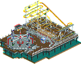
Faas (#4) - The Great Vilnius Hotel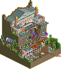
Chocotopian (#5) - 7 Little Sins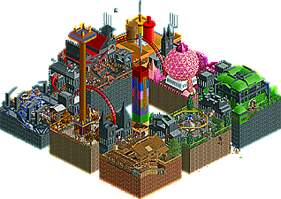
bdawgtk1982 (#8} - Obsidian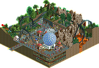
__________________________________________________________________How to vote?
First of all, check out all the entries in this match. If you can't view one or more entries, for example if you don't own LL, then please, do NOT vote.
Once you've viewed all 4, select your favourite and second favourite in the polls above.
After 3 days, we will close the poll, the results of the two polls will be added together, and the 2 highest scoring entries will proceed to the next round.
Comments on the individual parks have been disabled, so please leave your comments below.
Anyone found to be voting on their own match up will be disqualified from voting.
Anyone found to be voting when they cannot view all 4 entries will be banned from NE.
Votes are public and so any cheating of the system, betrayal of honesty or mistrust will be picked up on and will be dealt with. -

 Faas
Offline
Fuck, this is a tough matchup. Of course I´ve got the matchup where everybody finishes, haha!
Good luck, I won´t vote on this round because I´m in it. -
 Coasterbill
Offline
I'm away on vacation so I can't vote as I can't view these in game but that Air Race Airtime made is fucking amazing.
 -

 wheres_walto
Offline
So great to see a 4-man matchup! From the overviews this looked like it would be a really tough vote, but once I opened them up in-game it wasn't too difficult for me to choose. I'll start off with the 2 I didn't vote for:
Chocotopian-
I thought you had a really creative idea. I myself considered doing a quilt-style park with different sections, but I don't think that there is enough space on a micro to really do 7 sections any kind of justice. The ride names were all very clever, but unfortunately that was the only way I could determine which sin you were representing. I didn't much care for the colors overall, but I suppose it was important to be quilt-like to differentiate between each section.
bdawg-
From the overview I thought I might vote for this park. I'm a sucker for those HP rocks and thick foliage, and I loved the color scheme with the black coaster and the lava. But when I opened it up your inexperience showed. Many tiles contained nothing but plain grass and a tree, and I didn't like the Drill Bit ride at all. There was also a lot of gray path. Overall, I was impressed, I had never heard of you before, but I definitely think your best work is still to come.
airtime-
When did you get so good? Even though your micro had not a ton of content, it was obvious just how skilled you are at realistic building. If you go far in this contest, I think you might very well earn my player of the year vote. I can't really find much to nitpick other than your park being essentially only one level. With only 15x15 to work with, the best entries in this competition are going to be those that manage to build vertically. Going forward I want to see you experiment with different ideas, but seeing your work definitely makes me want to step up my game.
Faas-
I voted yours as my favorite. The whole entry was very nicely put together, especially the bottom level; it was very Cocoa-esque with the colors and it made me want to see what else you'll put out for this contest. One thing I didn't like so much though was the back wall being plain vertical faces, but that's just picking out any little flaws I can find.
Great work everyone, I'm really looking forward to seeing what else is to come!
-

 Faas
Offline
Thanks wheres_walto! My entry is based on a movie if you didn't know. I hope lots of people saw the movie.
-
 Stoksy
Offline
I should apologise to Airtime for posting the screen of my wild mouse earlier haha.
Looks an interesting matchup, from the overviews seems that the parks are from completely different ends of the spectrum. I think that Chocotopian's is the most innovative in my opinion but will wait until I view the parks in game before voting.
-

 Version1
Offline
Okay, I had the chance to view them ingame and I would say, that it was overall a pretty good round (at least from my perspective). Here's my Ranking:
4. Obsidian:
While the idea behind the submission isn't bad at all, I am not the biggest fan of the execution. Especially the mix of NCSO and CSO seemed a little strange to me. There were some decisions that I don't like, for instance using the flower lamps or building no station or building for the coaster whatsoever. But I think bdawgtk1982 has some potential, but it isn't enough for this years contest.
3. 7 Little Sins:
When I first vewed the park I instantly loved the Idea to use several islands to show different themes/topics. I am just not sure if the "7 sins" theme is a good choice. Although some of the sins are pretty well implemented (pride for example), some of them were really hard to recognize without the names of the attractions and booths. It's still arguably the most creative entry for this round and for me pretty close to Airtime's entry.
2. Thompson's Pier:
It's realistic, it's very good, I like it. But...I don't like how it's not very creative. Sure the Flatride is pretty cool and the mouse layout is really great, but especially in micros I wish to get something creative, something that showcases how much you can do with little space. This just feels like a small part of a park that easily fits in the micro restrictions. I ended up voting this just because the execution is better than the execution of "7 Little Sins".
1. The Great Vilnus Hotel:
Faas combines a good execution with a great idea and a very fitting micro concept. I was kinda expecting something like this being submitted for the contest, but why not. It's a very good concept for a micro park and very well executed. I liked the architecture and basically everything else too. Very good entry.
-

 Liampie
Offline
Airtime: fucking brilliant. If someone ever is to finish RRP's Southport, it should be you. Perfection.
Faas: lots of fun. So much content! I love The Grand Budapest Hotel and this park did it justice. A bit quirky like the movie.
Chocotopian: another lovely entry. I'm sorry I voted for Faas and Airtime, because I really loved yours. I think you portrayed each sin really well, except for greed. All the others made sense. Gluttony has brilliant architecture. Lastly I think the music contributed a lot to the atmosphere. Hopefully you'll get some more votes because this deserves some recognition... It's much better than just the overview suggests.
bdawgtk1982: not bad at all! Execution is sloppy in places, especially around the 3d cinema (no theming at all?), but it looks pretty cool as a whole. I don't think you'll make it through this round but it's a good showing nonetheless and I look forward to any other work you may produce in the future.
Superior execution: Airtime
Superior ideas: Chocotopian
Superior combination of those two: Faas -

 Lotte
Offline
a tiny bit disappointed with faas' entry that he did not have a huge open cave in the back, could've been really awesome. though i did think it was the best one, better than for example airtime's entry which showed an immense amount of skill, but still was only a wild mouse with a hacked flatride. i did enjoy the supports though of the wildmouse. overall i think it was good, but not good enough to beat faas.
-

 bdawgtk1982
Offline
Dang. After seeing what I got matched up against, there is no surprise that I didn't make it to the next round. Great work everyone. My original idea was to do something themed off of Journey to the Center of the Earth. I changed it last minute because I felt like I didn't know enough about the story to make something of it. It was hard to come up for ideas for the competition. I didn't expect that.
Since I was in this round I wont vote either.
-

 ida
Offline
1 - Chocotopian
I'm not entirely sure what all that sin stuff is, as i have nothing to do with religion or anything (it has to do with that, right?), but i love how you made a few super small sections for your micro! It's really a nice idea and it's an awesome use of all the colours and everything. Everything really pops out and it's very unique. There's detail everywhere and although some could say it's kinda messy, i loved it.
2 - Airtime
Nice, i really like the use of the airplane cars as a flat ride. It's very detailed and all, i like the details everywhere. The wildmouse looks very nice too. It's really realistic and all, but that makes it kind of plain to me, a bit more boring than Chocotopian's entry.
3 - Faas
Not a big fan. It's definitely okay, but the boring dirt cliffs and everything everywhere just put me off. Some more variation and detailing on there would'nt have hurt, tbh. The buildings are nice, but then there's the hotel itself, which to me looks really repetitive. Again, it has a plain roof (although the curved slopes are a nice touch). It's nice, but those large plain spots just keep it off.
4 - bdawgtk1982
Eh... It's not terrible, but i'm kinda skeptic about your park. If it weren't for the rocks and the fire objects, it could've been mostly in NCSO. And all those repeated fences everywhere... I can't really explain why i don't like it that much, but it looks really bland.
-

 FredD
Offline
4. bdawgtk1982
I'm sorry I don't know you, so I had low expectations. But your micro was not bad. A very decent coaster layout for a micro and you have chosen a nice theme. I liked the rock work and the lava. But as Liam said, execution could be better. The cinema and the other flat ride just seemed planted down like they are placed on a fair. I would've opted for invisible shops because they were kinda annoying and misplaced. I placed you 4th in this group but you should be proud of yourself. You made a nice micro and showed us your potential.
3. Chocotopian
From this group, you came up with the most original idea! That's clever, also the way you have portrayed the themes of your micro is executed nicely. Especially gluttony, that was the best part. Maybe in another group you would have gone trough... Sorry man...
2. Airtime
Picking #2 and #1 wasn't easy in this group. Chocotopian has a really nice micro but with Faas & Airtime we have got 2 more top micros. Airtime, everything was executed technically perfect! I love the concept of a pier with rides on, so I like the idea. I also think it's fantastic you made a Zamperla/Gerstlauer air race ride! Didn't seen one of those in RCT yet while those rides are pretty popular irl. But the reason I didn't pick you as #1 is because I liked the idea of Faas more...
1. Faas
Still making everything you make look cute he?! It is also technically perfect and for me it wins from Airtime's micro because the concept of your micro is more appealing to me. I loved the name of the coffee cups btw. Congratulations!
Wow, immediately a high level in the first group^! Excited to see the other entries!
-

 Six Frags
Offline
Love the hacking and cleanness in airtime's entry.
Faas' entry had great atmosphere, choco had a great idea but lacked in the execution and bdawgtk's entry could've used some more content and/or atmosphere.
-
tdub96 Offline
This was definitely the closest match-up of the first round, and damn I wish I could vote for top 3 instead of just 2. In the end though, had to go with Airtime at #1 for an absolutely fantastic display of micro realism. You've really come into your own in terms of parkmaking recently, and this is a perfect example. Gave Faas the nod at #2, because it really encompassed the MM contest: packing as much fun as you can into such small space. If you were in any other group, without question (in my eyes), I'd be voting Faas' micro as the #1. Airtime's entry is just that good.
-

 trav
Offline
I'll put mine in order:
1. Faas;
Wow, I really really liked this, easily my favourite of this matchup, possibly of the whole round. It almost reminded me of something Cocoa would make with the colours you used at the bottom, and I loved the idea of the maze in the back. I haven't seen the film but I know vaguely what it's about so I could relate a few of the ideas and of course, the fact that the hotel actually looks like the one from the film. My only issue is that the hotel was a little underdetailed compared to the buildings at the bottom, but overall, very very solid start.
80%
2. Airtime;
Not much in the way of content, but what was there was really nice. The atmosphere was quite stale due to there not really being anything to create atmosphere, but yeah you obviously know what you're doing when it comes to the realistic details and that malarkey. The flat was gorgeous though, very well done there.
70%
3. Chocotopian;
The concept of this is fantastic but sadly I wasn't a big fan of the execution. I can see what you were trying to do with this, but dark/horror stuff doesn't really look that great in Rct, and in this case it looked a bit too messy for me. Still, the actual concept here is probably one of my favourites of the first round so far.
50%
4. Bdawgtk;
This shows a lot of potential! You obviously have a knack for interaction, as a few things were brilliantly placed (Barrel roll, queueline path, the tunnel over the path with the coaster shooting over the top of it). However, I think that you do need to work on the actual theming aspect of your game as it didn't really have much. Again, I can see what you were going for, and it's difficult to portray a theme like this on a map this small, but it could have really benefited from some steampunkyness or something like that, or even just a bit of architecture, possibly instead of one of the rides. I haven't seen you around before though, so definitely a good way to introduce yourself to the community.
45%
-

 ottersalad
Offline
Faas: I haven't seen the movie yet. Great micro... I still can't find the boy with the apple.
Airtime: This is an awesome realistic micro.. but it is just too sterile.. does that make sense? It is well made, but there isn't much life in the micro. I spent a lot of time looking at the micro.. but mostly at the wild mouse supports. There are a few planters and there are peeps, but it doesn't have a lot of life. Anyone, please correct me if I'm wrong. I still voted this #2 because it is very realistic, but I would've voted this 3rd in Liampie's and Stoksy's group.
Choctopian: I like your entry, it is very creative, but I think your concept would've been better vertically constructed.
Bdawgtk: Your micro is nice, but I agree with others that your theming is lacking. Also, there isn't any need for the food and drink stalls.
 Tags
Tags
- No Tags
