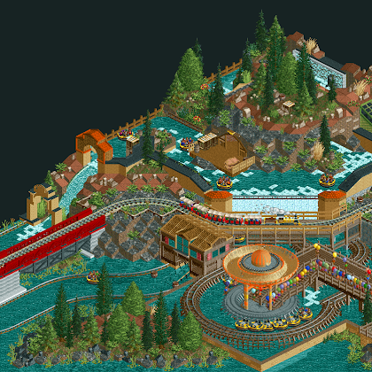
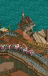
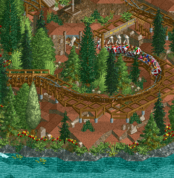
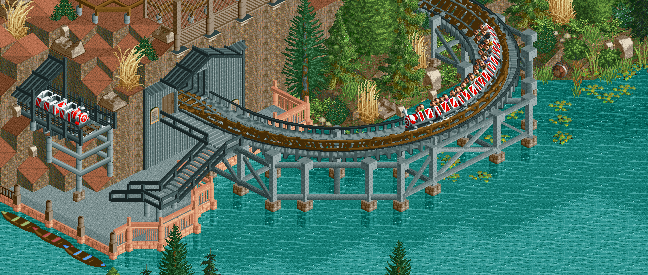
Fiesta! / Fiestaland
-
 08-January 12
-

 wheres_walto
Offline
You are really fucking good at this game. Highly detailed, but more importantly, extremely nice to look at
 -

 Splitvision
Offline
Gotta say I really love your style, perfect blend of detailing and atmosphere. Nothing feels forced or out of place. Awesome work man!
 -

 Liampie
Offline
I really like it, especially the landscaping in the last few screens. The rapids' station area is a complete mess though, sorry. Weird shapes for this context and orange clashes with red.
 -

 Cena
Offline
Not too keen on the layout but the rest is superb.
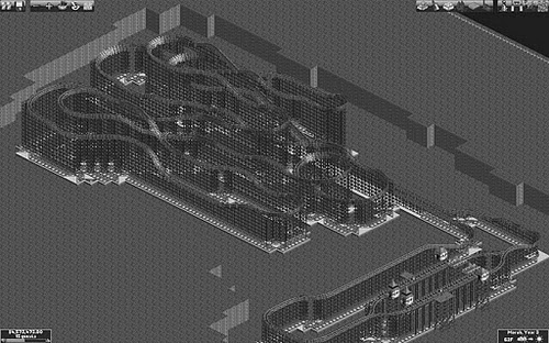
Layout seems weird because this is what it looks just before I made the layouts invisible. With landscaping it looks very awesome if I have to say myself. Plus, now you see the tunnel as well.Near perfection... Can't wait to view this in-game.
You gotta wait a few more months, I am aiming for a spring/summer release.Gotta say I really love your style, perfect blend of detailing and atmosphere. Nothing feels forced or out of place. Awesome work man!
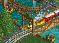
That is what I was going for. Thanks a lot Split. If you need hacking assistance again, PM or email me.Pretty amazing themeing going on, loving the peeps also
Peeps just need to be in every release over here. Too bad not everyone adds them...I really like it, especially the landscaping in the last few screens. The rapids' station area is a complete mess though, sorry. Weird shapes for this context and orange clashes with red.
Thanks. It was red before. Look at rctholland/rctland for how it looked before. I am still having doubts about what is the right color for it.
Thanks.Looks great so far, so much details!
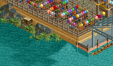
awsome!! i dont like the glass though in the 5th and 6th screens. imo glass never looks good with wood. other than that i love it all. your supports for the mine train are influencial.
Thanks Well. Me neither about the glass, but there really isn't a solution to it. And I dont like putting more time in objects then in playing.
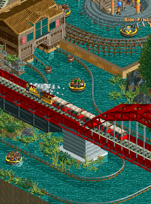
 Awesome work! I'm just still not convinced by that bridge colour it looks like it's drawing nearly all the attention from the rest of the map..
Hmm, I will think about changing the color
Thank you Wheres_Walto, Nitrous Oxide, Gijssie 1234
 Tags
Tags
- No Tags
